Premium & Landing Page Template
Shield is a split-screen home and property insurance landing page built for lead generation. It walks visitors through three side-by-side comparisons that expose coverage gaps, then captures leads through a progressive three-step form and a gated PDF checklist. The design follows a Corporate Precision theme with an Arctic White palette and authoritative navy typography.
by Rocket studio
Quick summary
Shield is a single-page, split-screen template for a home and property insurance provider. It uses a Comparison Journey structure to show visitors exactly where their current coverage falls short. From the hero fold through three tightly argued comparison sections, every scroll tightens the case for acting. Lead capture closes the page with a three-step form and a secondary PDF gate.
Who this template is for
This template is designed for home and property insurance brands that need to convert skeptical, information-overloaded visitors into qualified leads. It works especially well for carriers serving clients who have been declined elsewhere or who are entering the market for the first time.
- First-time homebuyers navigating closing paperwork and unfamiliar policy language
- Landlords managing multi-property portfolios who need fast, clear policy comparisons
- Families in wildfire corridors or flood plains who have been dropped by a previous carrier
What problem this template solves
Most homeowners assume their current policy is sufficient. The gap between that assumption and the real cost of a total loss is the core problem this template addresses. It gives insurance brands a structured way to make that gap visible and actionable before the visitor leaves the page.
- Visitors arrive without understanding replacement cost versus standard coverage limits
- Complex policy language causes confusion and delays the decision to switch or upgrade
- High-risk-zone clients feel unwelcome elsewhere and need a provider willing to engage directly
What you get with this template
You get a fully structured, desktop-first landing page with five distinct content sections and a linear single-row footer. Every section is purposefully built around conversion, from the oversized headline at the fold to the progressive lead-capture form at the bottom.
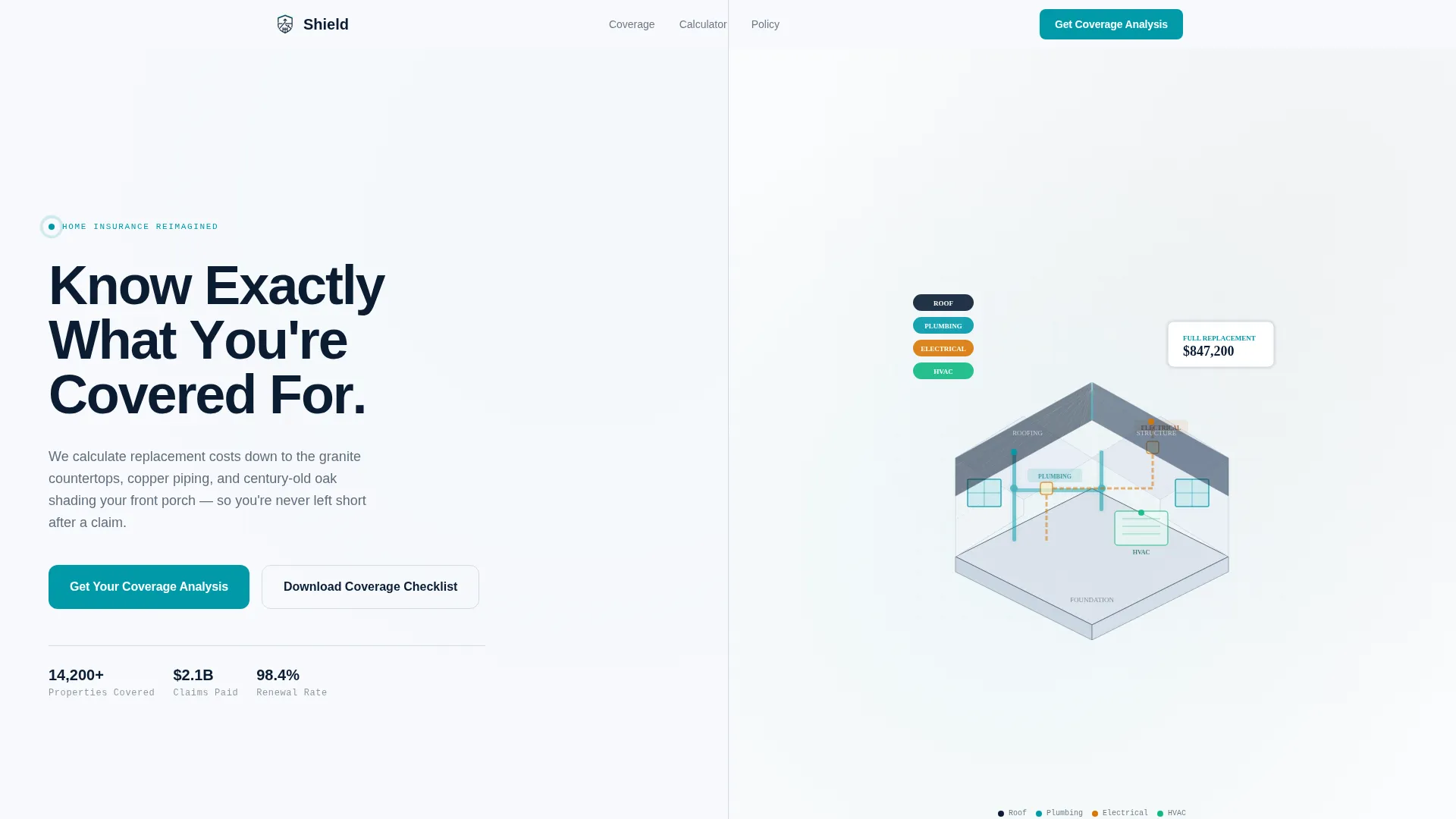
- A 50/50 split-screen hero with a giant navy headline and an isometric home cross-section illustration
- Three sequential comparison sections covering replacement cost, premium calculation, and plain-language policy excerpts
- A dual-path lead generation section combining a three-step progressive form with a gated PDF checklist download
Feature list
This template is built around a set of specific, prompt-defined capabilities that work together to build trust and capture leads.
Split-Screen Comparison Layout
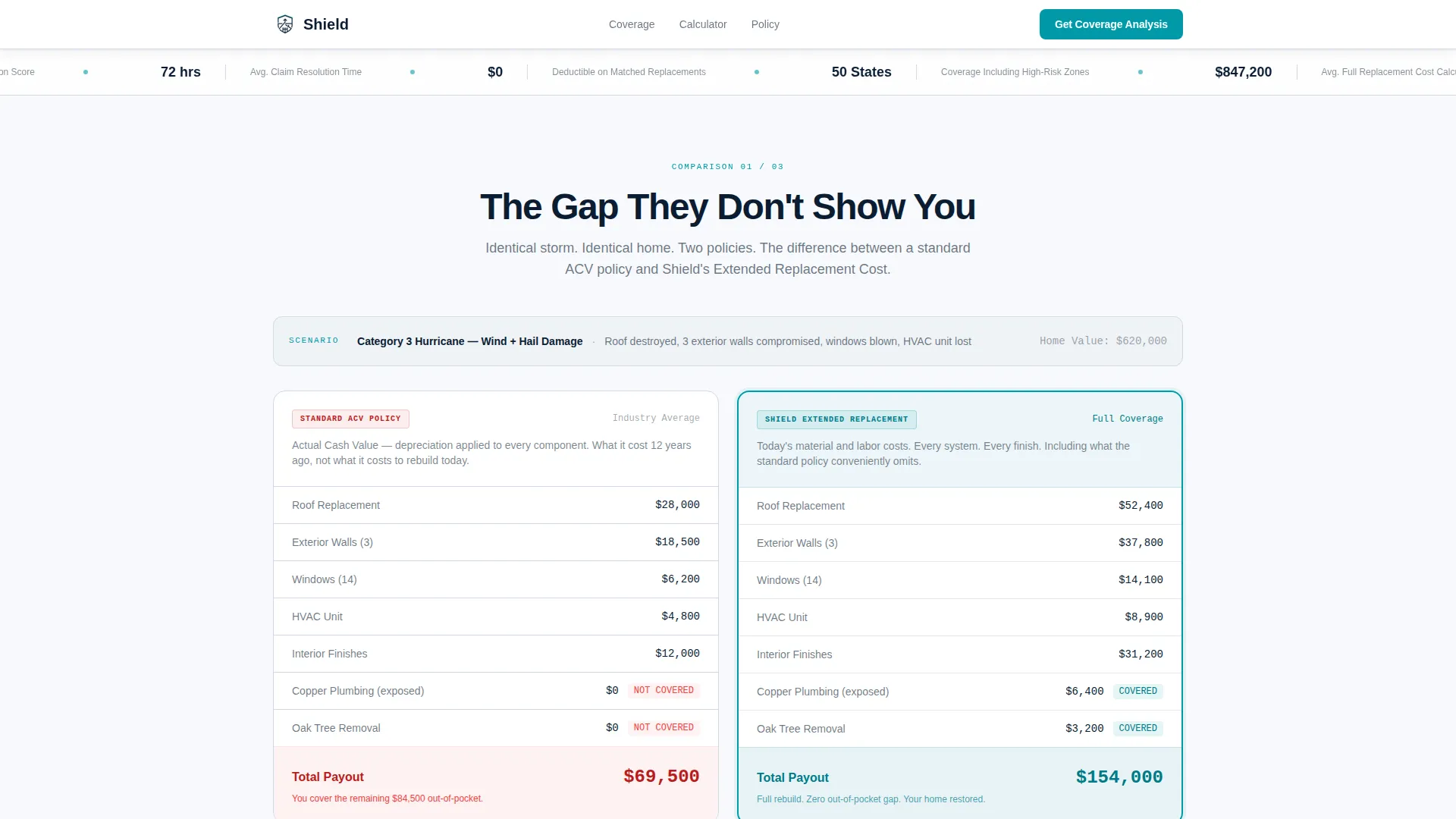
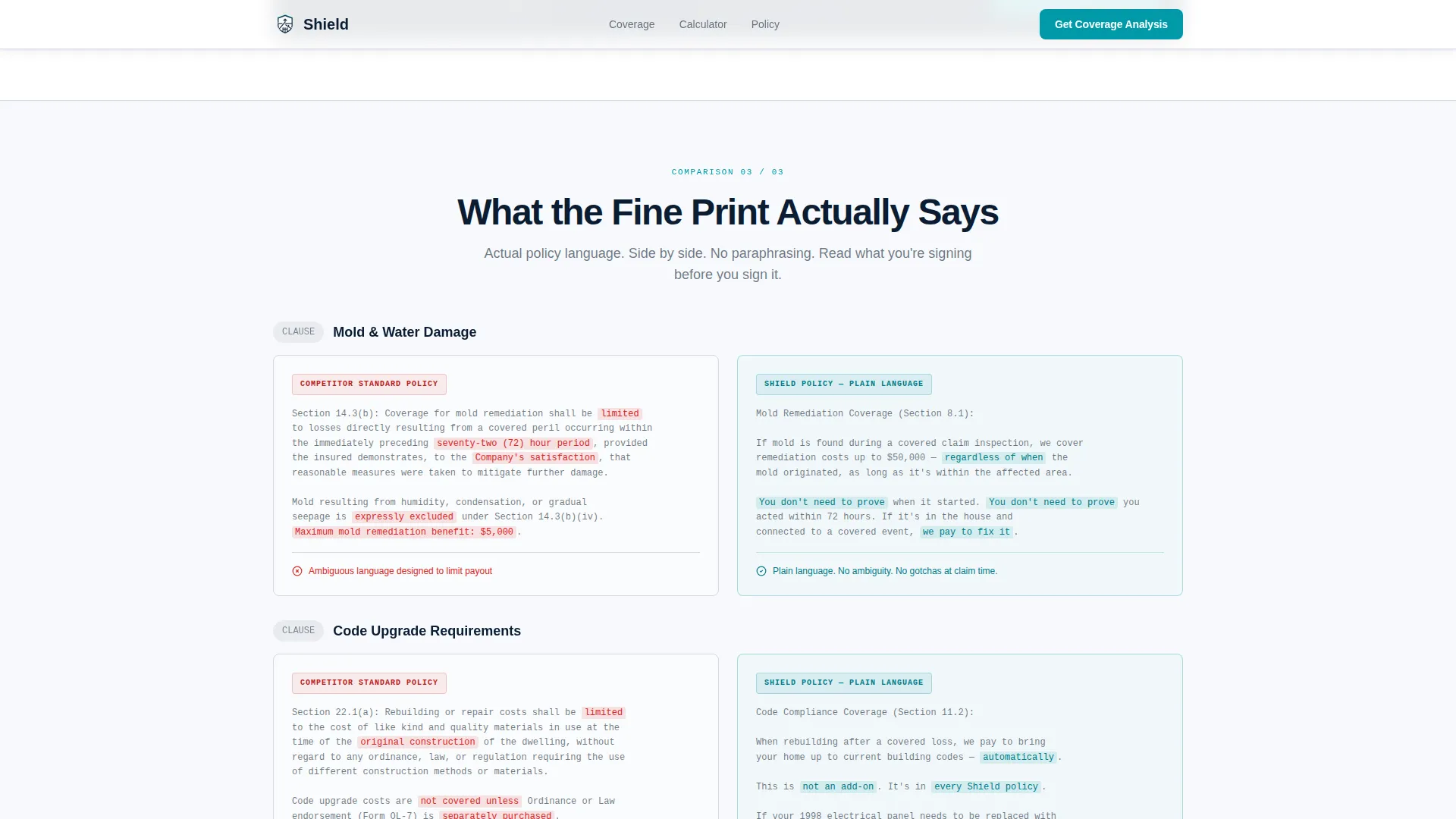
Each comparison section presents two positions side by side. The structure moves from standard versus extended replacement cost, to bundled versus standalone premiums, to competitor fine print versus plain-language clauses. The escalation is intentional and sequential.
Live Premium Toggle Calculator
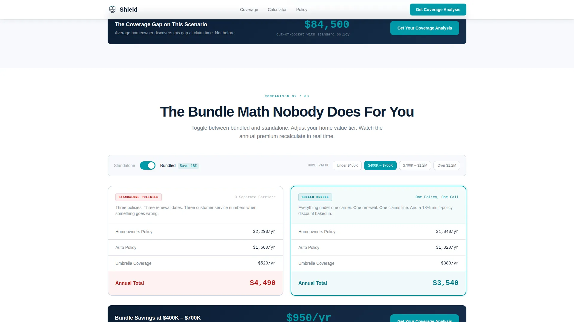
The bundled versus standalone comparison section includes an interactive toggle. Visitors can switch between policy configurations and watch annual premium estimates recalculate in real time. The interaction makes the financial difference immediate and concrete.
Three-Step Progressive Lead Form
The lead capture form breaks the process into three focused steps. Step one collects property type and zip code. Step two asks for estimated home value and current carrier. Step three captures name, email, and preferred contact time. The staged approach reduces friction.
Gated PDF Checklist Download
A secondary conversion path offers a downloadable Coverage Gap Checklist. It is gated behind email capture only, making it accessible to visitors who are not yet ready to speak with an agent but are willing to self-educate.
GSAP ScrollTrigger Animations
The template uses high-intensity animation throughout. Stagger reveals, character-by-character headline builds, and scroll-triggered transitions are handled via GSAP ScrollTrigger. Interactive sections use client-side components while static sections use server components for stability.
Isometric Home Cross-Section Illustration
The hero right panel features a clean, isometric illustration of a home dissected by system. Roof, walls, plumbing, and electrical are each subtly color-coded. The visual communicates coverage granularity without using stock photography or lifestyle imagery.
Page sections overview
| Section | Purpose |
|---|---|
| Hero Split | Headline and isometric home illustration introduce the coverage precision concept |
| Coverage Gap Split | Standard policy versus extended replacement cost, shown with real dollar scenarios |
| Premium Calculator Split | Bundled versus standalone toggle with live annual premium recalculation |
| Plain Language Split | Competitor fine print versus Shield plain-language clause, actual excerpts side by side |
| Lead Generation | Three-step progressive form plus gated PDF checklist for dual-path conversion |
| Footer | Linear single-row footer with navigational and legal baseline |
Design & branding system
The visual identity follows a Corporate Precision theme. The palette is deliberately cold and document-like, built to communicate authority rather than warmth. Typography reinforces the same sense of precision.
- Color system: glacier white (#F7F9FC) as the dominant background, policy-ink navy (#0B1D33) for headlines and body text, permafrost gray (#D1D9E6) for dividers and secondary surfaces, and claim-alert teal (#0099A8) for calls to action, toggles, and interactive highlights
- Typography: Plus Jakarta Sans at heavy weight for headings, DM Sans for body copy, and JetBrains Mono for data values and numerical displays
Mobile & speed optimization
The template is designed desktop-first to match the deliberate, document-like experience of a closing table. Full mobile responsiveness is included so the comparison journey and lead forms work cleanly on smaller screens.
- Server Components handle all static sections to keep initial load stable
- Client Components are scoped only to interactive sections such as the live toggle calculator and the three-step form
How this template helps you convert
Every design and content decision in this template is oriented toward moving a hesitant visitor to a committed lead. The structure builds a logical, escalating case before asking for anything.
- The Comparison Journey creates a progressive argument across three splits, starting with underinsurance awareness, moving to cost proof, and ending with policy-language clarity, so that inaction feels genuinely reckless by the time the form appears.
- The dual-path conversion section captures leads at two levels of readiness: visitors ready to talk submit the three-step form, while visitors still evaluating download the PDF checklist and enter the email funnel at a lower commitment threshold.
Other information about this template
This template is localized for the United States market. All currency displays use USD, dates follow the MM/DD/YYYY format, and measurements use imperial units. The animation level is set to high, with GSAP ScrollTrigger powering scroll-based reveals and the character-by-character headline build in the hero section.
- The template style is Split Screen (50/50), with each section maintaining equal visual weight between the two panels
- The header concept is Giant Headline Left, where oversized tightly tracked navy type occupies the left panel at full fold height
- The creative direction is a Comparison Journey, meaning each section reframes what the visitor believes about their current coverage before presenting an alternative
Theme
Corporate Precision
Creative direction
Comparison Journey
Color system
Arctic White
Style
Split Screen (50/50)
Direction
Lead Generation
Page Sections
Split-screen Comparison Layout
Live Premium Toggle Calculator
Three-step Progressive Lead Form
Gated PDF Checklist Download
GSAP Scrolltrigger Animations
Isometric Home Cross-section Illustration
Related questions
What kind of business is this landing page built for?
Does this template include an interactive premium calculator?
How does the lead generation section work?
Is the template desktop-first or mobile-first?
Can this template be used without stock photography?



