Housing Government Professional Website Template
Roster is a stats-first civic landing page template built for county housing offices. It leads with animated outcome data, organizes services into a clean card grid, and guides families, veterans, and landlords toward the right next step. The design feels like a well-run government lobby: calm, trustworthy, and built to move people forward without confusion.
by Rocket studio
Quick summary
Roster is a modular card grid landing page template designed for county housing offices that serve their community through voucher programs, waitlist management, and unit inspections. It opens with a live infographic header, displays program outcomes as bold animated numbers, and funnels every visitor into a clear action path. The template earns trust before it asks for anything.
Who this template is for
This template is built for public-sector teams responsible for housing assistance programs at the county or city level. It speaks directly to the staff who oversee day-to-day operations and to the residents and landlords who depend on those services.
- Housing authority staff who manage voucher programs, waitlists, and unit inspections for their community
- Low-income families, single parents, elderly veterans, and other community members who need a clear, jargon-free starting point
- Landlords seeking to register residential units and track Housing Assistance Payment deposits
What problem this template solves
County housing offices often serve the highest-need populations in a city, yet their digital presence can feel like an afterthought. Visitors land on dense pages full of bureaucratic language, broken forms, and no sense of how the system actually works. That friction costs real people real time.
- Community members cannot quickly find whether they qualify, where to apply, or how to check their waitlist position
- Landlords and property managers waste calls to the office asking questions a well-organized page could answer instantly
- The department loses credibility when its web presence does not reflect the quality of the services it actually delivers
What you get with this template
Roster gives a county housing office a full single-page framework that leads with data, organizes services into scannable clusters, and moves visitors toward a decision. Every section is built to serve a specific audience need without requiring visitors to dig.
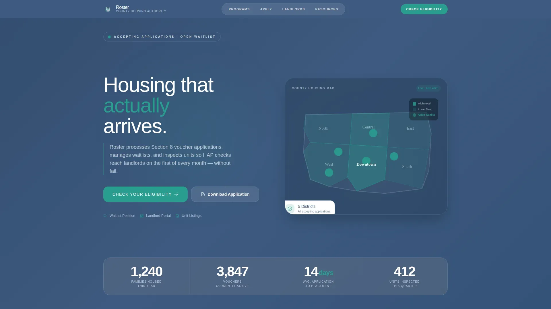
- An animated infographic hero with a county map and four live stat counters displaying families housed, active vouchers, average placement days, and units inspected this quarter
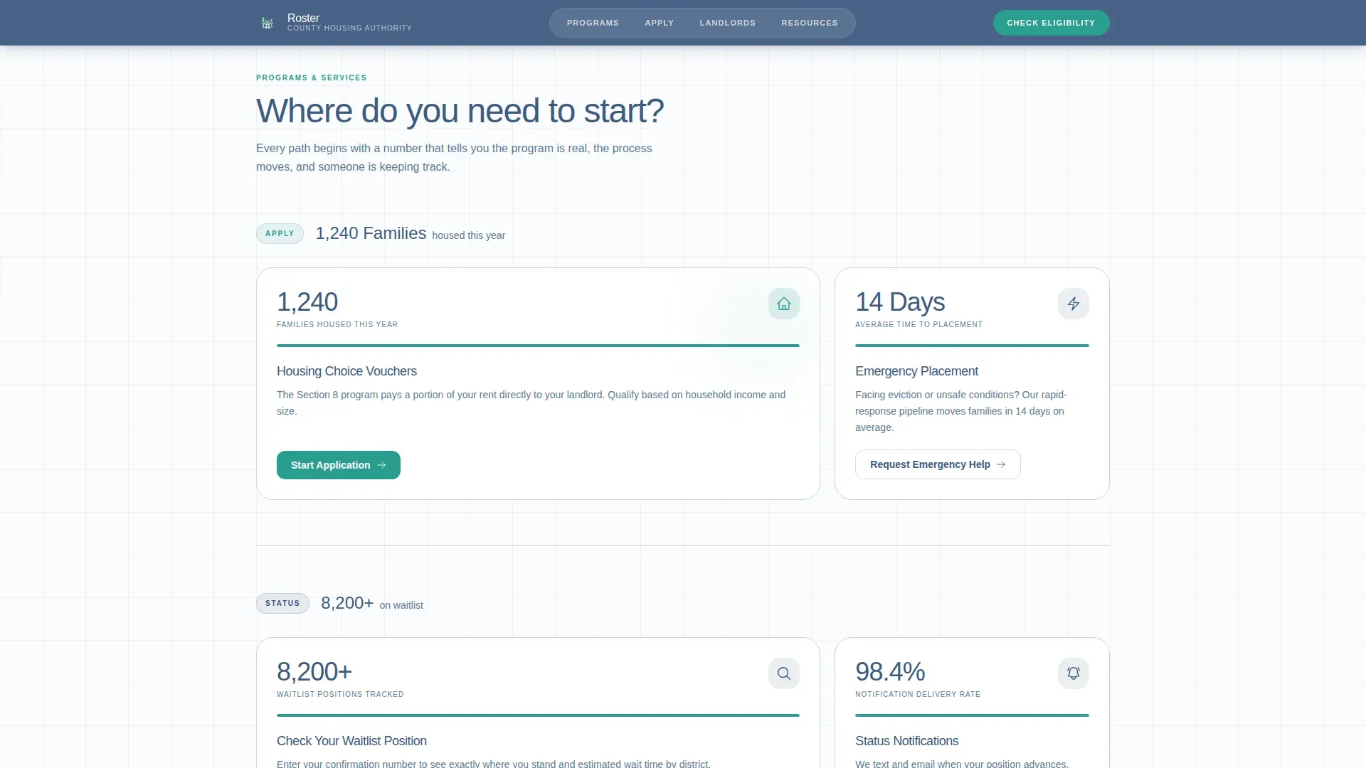
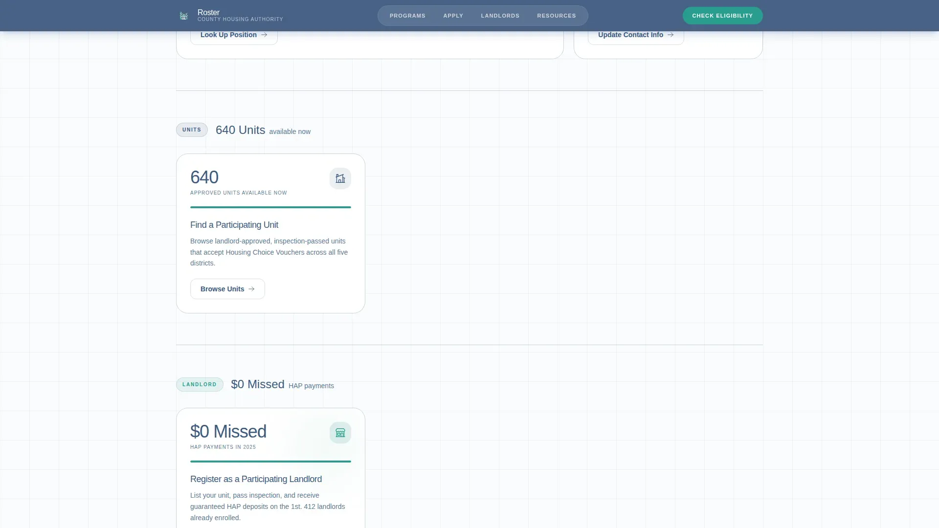
- A bento-style card grid organized into four action clusters: Apply, Check Status, Find a Unit, and Landlord Resources, each introduced by a single bold statistic
- An inline three-question eligibility pre-screener covering household size, monthly income, and current housing status, plus secondary tiles for downloading the application packet, looking up waitlist position, and registering as a participating landlord
Feature list
This section walks through the core built-in components that define the Roster template. Each feature is drawn directly from the template design brief.
Animated Stat Counter Hero
The header is a living infographic built on a slate blue background. A county map shaded by housing need anchors the layout. Four large animated counters display key program data: families housed this year, vouchers currently active, average days from application to placement, and units inspected this quarter. The map pulses at zip codes with open waitlists, making community data feel current rather than archived. This approach follows best practice for county housing roster landing pages, which should feature a clear, authoritative headline and immediate visual display of key statistics.
Stats-First Card Grid
Every card in the modular bento grid leads with a number before it leads with a noun. "1,240 Families Housed" sits above the Housing Choice Voucher program description. "14 Days Average" introduces the emergency placement pipeline. Cards are generously spaced so the layout breathes. The grid organizes into four clusters that focus visitor attention on the right action: Apply, Check Status, Find a Unit, and Landlord Resources. Each cluster opens with one bold statistic that earns the visitor's focus before asking for it.
Inline Eligibility Pre-Screener
The primary call to action is "Check Your Eligibility," which leads into a three-question inline form. Visitors answer household size, monthly income, and current housing status. The form is designed to let visitors save form progress and return without losing their answers, reducing drop-off for users on mobile devices or in low-connectivity situations. Tracking form progress this way respects the real conditions of the people the office serves.
Secondary Action Tiles
Below the pre-screener, three clearly labeled secondary paths give every visitor a direct next step. "Download Application Packet" serves families ready to begin the formal process. "Look Up Your Waitlist Position" addresses one of the highest-volume questions a housing department receives. "Register as a Participating Landlord" opens a dedicated path for property owners who want to partner with the program. These tiles reduce inbound calls and support staff workload.
Stats Impact Section
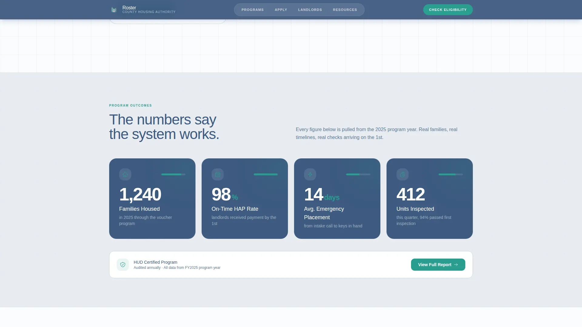
A dedicated full-width section displays large program-outcome numbers with plain-language labels. This is where the office can lead with proof: Housing First initiatives in county settings are measured by their ability to maintain housing stability and reduce public service costs. Research shows over 85% of housed clients maintain or reduce hospitalizations, and 100% maintain or increase their income over time. Presenting this data prominently builds trust with community members before they ever reach a form.
Resources and FAQ Accordion
The lower section of the page displays download cards for key documents and a collapsible FAQ accordion. Plain-language definitions are provided throughout to avoid jargon and ensure community members can interpret the information without prior knowledge of government programs. A single prominent call to action, such as "Download Full Annual Report," is included as a final next step before the footer.
Page sections overview
| Section | Purpose |
|---|---|
| Hero Infographic Header | Display animated counters and pulsing county map to show live program data |
| Action Cluster Grid | Organize Apply, Check Status, Find a Unit, and Landlord Resources into a scannable bento card layout |
| Stats Impact Block | Present large outcome numbers with plain labels to build credibility |
| Eligibility Pre-Screener | Capture household size, income, and housing status through a three-question inline form |
| Secondary Action Tiles | Provide direct paths for downloading packets, checking waitlist position, and landlord registration |
| Resources Download Cards | Display downloadable documents and guides for applicants and landlords |
| FAQ Accordion | Answer common questions using plain language without jargon |
| Footer Row | Deliver department contact details, links, and legal notices in a linear single-row layout |
Design & branding system
The visual identity follows a Civic Service theme that feels like a freshly printed government pamphlet on quality cardstock. Nothing here is decorative for its own sake. Every color and spacing decision serves the community members trying to get something done.
- The Cloud Canvas color system uses soft administrative gray (#E8ECF1) for card backgrounds, trustworthy slate blue (#3D5A80) for headers and navigation, accessible white (#FAFBFD) for breathing room between modules, and action-forward teal (#2A9D8F) exclusively on buttons and progress indicators
- Typography pairs Plus Jakarta Sans for headers with DM Sans for body text, keeping the hierarchy clean and the reading experience comfortable at any viewport
- Spacing is generous throughout: cards are padded so the grid never feels like a wall of text, and each section has enough white space to let the data lead without visual competition
Mobile & speed optimization
Mobile responsiveness is critical for this template. Many residents access county housing services via smartphones, often in waiting rooms, on buses, or at home with limited data. The Roster template is built mobile-first throughout.
- Counter animations, float effects, scroll reveals, and shimmer transitions are handled by client-side components, while static content uses server-side rendering to keep initial load fast
- The card grid reflows cleanly on small screens, and every action tile remains tappable without zooming or horizontal scrolling
- The eligibility pre-screener is optimized for thumb navigation, and the ability to save form progress means users who step away mid-session do not lose their answers when they return
How this template helps you convert
Roster is built around one idea: show outcomes first, then ask for action. By the time a visitor reaches the eligibility form, they have already seen the data that proves the system works. That sequence is deliberate and effective.
- The animated hero immediately displays real program performance data, so community members and landlords understand within seconds that this county office delivers results, not just promises
- The stats-first card grid introduces every service with a number, which gives visitors enough context to self-identify the right path before they click, reducing misdirected requests to department staff
- The inline pre-screener and clearly labeled secondary tiles reduce the distance between intent and action, so whether someone wants to begin an application, check their position, or partner as a landlord, the next step is always one visible tap away
Other information about this template
Roster draws on best practices from leading local government performance dashboard design across the country. Cities and counties that lead with transparent data consistently build more trust with their communities. The following context helps explain the broader framework this template fits into.
- Local government performance dashboards enhance transparency and accountability by tracking strategic goals and outcomes. The Roster template applies this same principle to housing services, letting the department display its performance data publicly and consistently.
- County-level housing rosters typically prioritize high-need populations through justice system referrals or coordinated entry. Approximately 90% of households in housing programs are classified as very low-income, often earning less than 50% of the Area Median Income. The template is designed to serve this population with clarity and dignity.
- Some county-coordinated programs report active rosters exceeding initial goals, such as 190 active clients against a goal of 150. Displaying data like this in the hero section demonstrates the kind of community engagement that builds long-term public confidence.
- Large counties have produced over 17,000 regulated units designed to serve households earning 65% to 70% of the Area Median Income. Five-year homelessness reduction plans often aim for a 50% reduction in unsheltered homelessness. Roster gives offices a visual framework to communicate progress toward these kinds of targets.
- The HUD Comprehensive Housing Affordability Strategy provides custom Census tabulations on housing problems at the county level. High-performing county offices maintain Section 8 active voucher utilization rates above 92%. These are the kinds of numbers the Stats Impact section is built to display.
- All real and personal property subject to a general property tax is classified for taxation purposes. Residential properties used for homestead purposes are classified as class 1a, while class 4a covers residential real estate containing four or more units used as a residence for rental periods of 30 days or more. Class 4c property is devoted to commercial temporary and seasonal residential occupancy for recreation purposes. Understanding these property tax classifications can affect how landlords assess the cost and benefits of participating in a housing voucher program. The conditional use of certain land classifications is relevant when county offices evaluate units for program eligibility.
- Class 2b rural vacant land consists of parcels that are unplatted real estate, rural in character, and not used for agricultural purposes. Class 2a agricultural land, which must be contiguous acreage of ten acres or more used for agricultural purposes during the preceding year, has a classification rate of one percent of market value unless it is part of an agricultural homestead. Issues such as soil erosion on agricultural parcels can affect the classification and viability of land for residential development. The net tax capacity of a property can be directly affected by its classification, which influences the broader revenue picture for county housing programs.
- The template is well suited for county offices that want to support community engagement initiatives beyond the page itself. Community meetings, town halls, and neighborhood outreach events can be promoted directly through the resources section or the FAQ accordion. Community Connectors and part-time outreach staff employed by community-based organizations can use the template to lead residents toward services available in the neighborhoods they serve.
- Buncombe County operates 16 active Community Engagement Markets that provide food and resources to the public at no cost. These markets were started in 2014 by Community Service Navigators and are coordinated by part-time Community Connectors with deep knowledge of the communities they serve. Health screenings and other community resources are occasionally available at these markets. A template like Roster can support similar community engagement efforts by serving as a central digital hub where community members find both housing and broader resource information in one place.
- The City of Bloomington's strategic plans were co-created with over 400 community voices. Bloomington's performance dashboard tracks progress toward outcomes identified in that plan. The City of Minnetonka's dashboard provides quarterly progress updates organized by department. Washington County created an ARPA dashboard to track the distribution and outcomes of federal funds, emphasizing transparency. The City of Irving provides two performance dashboards to show progress against their strategic plans. These examples illustrate how local government offices across the country are determined to move beyond static web pages and toward data-rich, community-focused digital communications. Roster brings that same thinking to housing services.
- The best local government dashboards provide clear context, focused key performance indicators, and consistent updates to make complex data understandable for residents. Effective dashboards should transparently report setbacks or missed targets and be updated consistently. Publicly available government dashboards help build trust with the community and engage employees at every level of the department. Roster is designed with this standard in mind.
- Municipal job listings for housing departments frequently include full time and part time roles in finance, administration, and community outreach. Local governments frequently seek qualified candidates with strong analytical skills for positions such as accountants, clerks, and administrative assistants. Employees in these roles are responsible for payroll processing, records management, and the preparation of compliance reports. Staff with certification in housing administration or financial management are particularly sought after. A well-designed public-facing page like Roster can also support internal department communications by serving as a reference point for employed staff who need to direct residents to the right resources quickly.
- Interactive data visualizations such as trend lines for occupancy, demographic breakdowns, and expense distributions are recommended components for a housing roster. Roster's animated counters and map infographic fulfill this function without requiring technical knowledge from the team managing the page.
- The arrow slideshow component is available within the template's modular card system. The arrow slideshow can be used in the resources section to cycle through downloadable documents or seasonal program updates. Using the arrow slideshow keeps the page compact while still giving visitors access to a full range of materials. The arrow slideshow pattern is particularly useful for displaying rotating landlord resources or program news without adding visual clutter.
- Career development resources and recreational program listings can be added to the resources download section if the office also serves broader community well being goals beyond housing placement. The sustainability of a county's housing program is often determined by how well it communicates its value to the public and to the city government that funds it. Roster makes that communication clear, consistent, and advance-ready for annual reporting cycles.
- Community engagement is the throughline of every section in this template. From the pulsing county map at the top of the page to the FAQ accordion at the bottom, every element is designed to reduce the distance between a community member and the help they are looking for. Community engagement at this level requires more than a phone number on a footer. It requires a page that feels like the office is already ready for the visit. Roster delivers that.
Theme
Civic Service
Creative direction
Stats-First Impact
Color system
Cloud Canvas
Style
Card Grid (Modular)
Direction
Content/Resource
Page Sections
Animated Infographic Hero Header
Stats-first Modular Card Grid
Inline Eligibility Pre-screener
Secondary Action Tiles
Stats Impact Full-width Block
Resources Section and FAQ Accordion
Related questions
Who is this landing page template designed for?
Can visitors save their progress in the eligibility form?
What sections are included in this template?
How does the stats-first design approach build trust with visitors?
Is this template suitable for a government agency that also serves landlords?