Veterans Services Government Professional Website Template
Muster is a modular card grid landing page built for municipal veterans services offices that need to earn donor trust through radical financial transparency. It guides visitors from a documentary-style hero section through service cards, a veteran referral form, per-service cost receipts, and a donation form with preset amounts tied to real case costs.
by Rocket studio
Quick summary
Muster is a single-page landing page template built for municipal veterans services offices. It combines a documentary-style hero, a modular service card grid, a financial transparency section, and a donation form. Every design decision is focused on one goal: show visitors exactly where their money goes before you ask for it.
Who this template is for
This template is built for teams running local or municipal veterans services programs that need to fundraise online while also directing veterans to the right support. It fits organizations that serve recently separated service members, Vietnam-era veterans, and Gold Star spouses, and need a page that speaks clearly to both donors and the veterans themselves.
- Municipal veterans services offices raising funds from local donors
- Veteran-serving nonprofit organizations and government-adjacent agencies
- Caseworkers and veteran service officers (VSOs) who need a referral intake point online
What problem this template solves
Most fundraising landing pages for veterans services ask for money before they earn trust. They use vague mission statements, stock photography, and opaque financial messaging. Veterans and donors alike find these pages hard to understand and easy to dismiss. Visitors leave without donating, and veterans leave without a clear next step.
This template solves that by doing the opposite. It leads with proof, then asks for support.
- Donors cannot easily find clear answers about how their contribution is used
- Veterans cannot quickly identify which specific service applies to their situation
- Organizations struggle to deliver a page that speaks to two very different audiences at once
What you get with this template
You get a fully structured, single-page layout built around the principle that transparency is the strongest fundraising tool a veterans office can use. The page is ready to deploy and customize, with every section pre-planned to carry a specific job in the visitor journey.
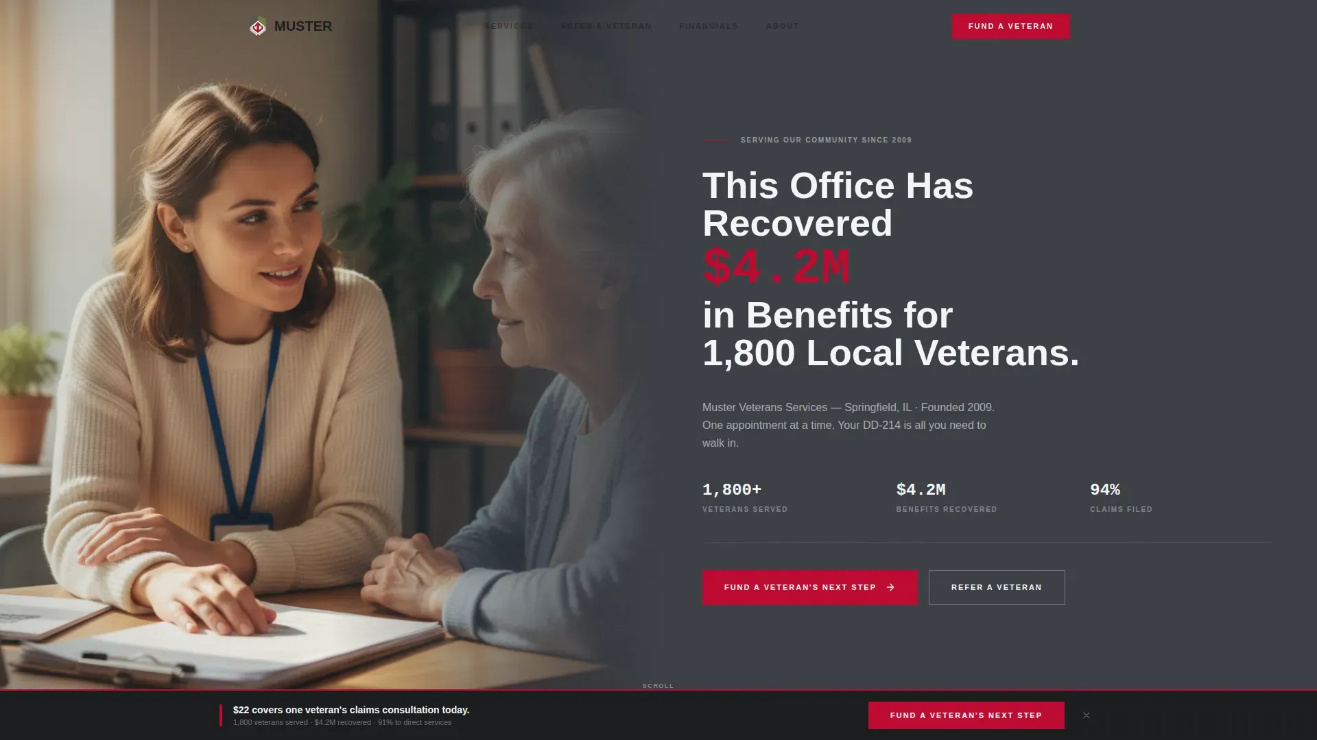
- A documentary-style half-page hero with a bold stat headline and a primary donation call to action
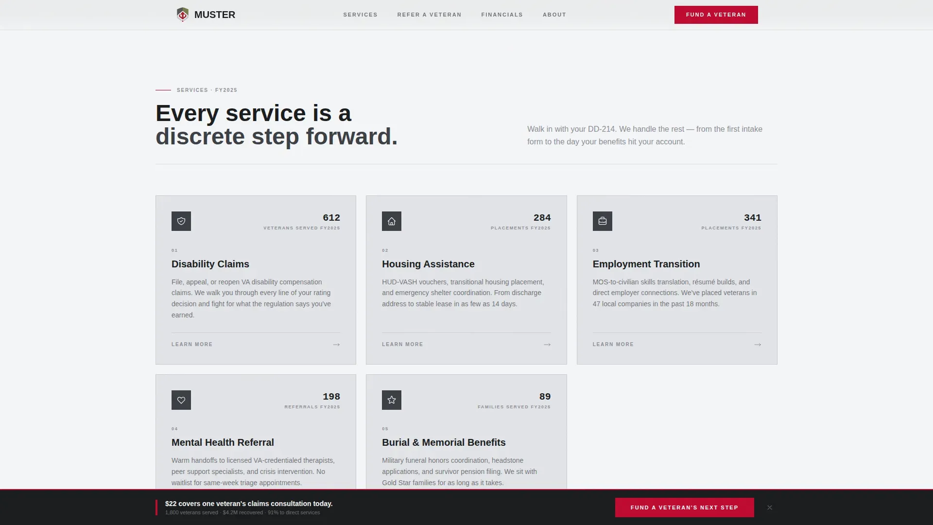
- A five-card service grid with fiscal-year usage badges, a veteran referral form, and a financial transparency section with animated bar chart cards
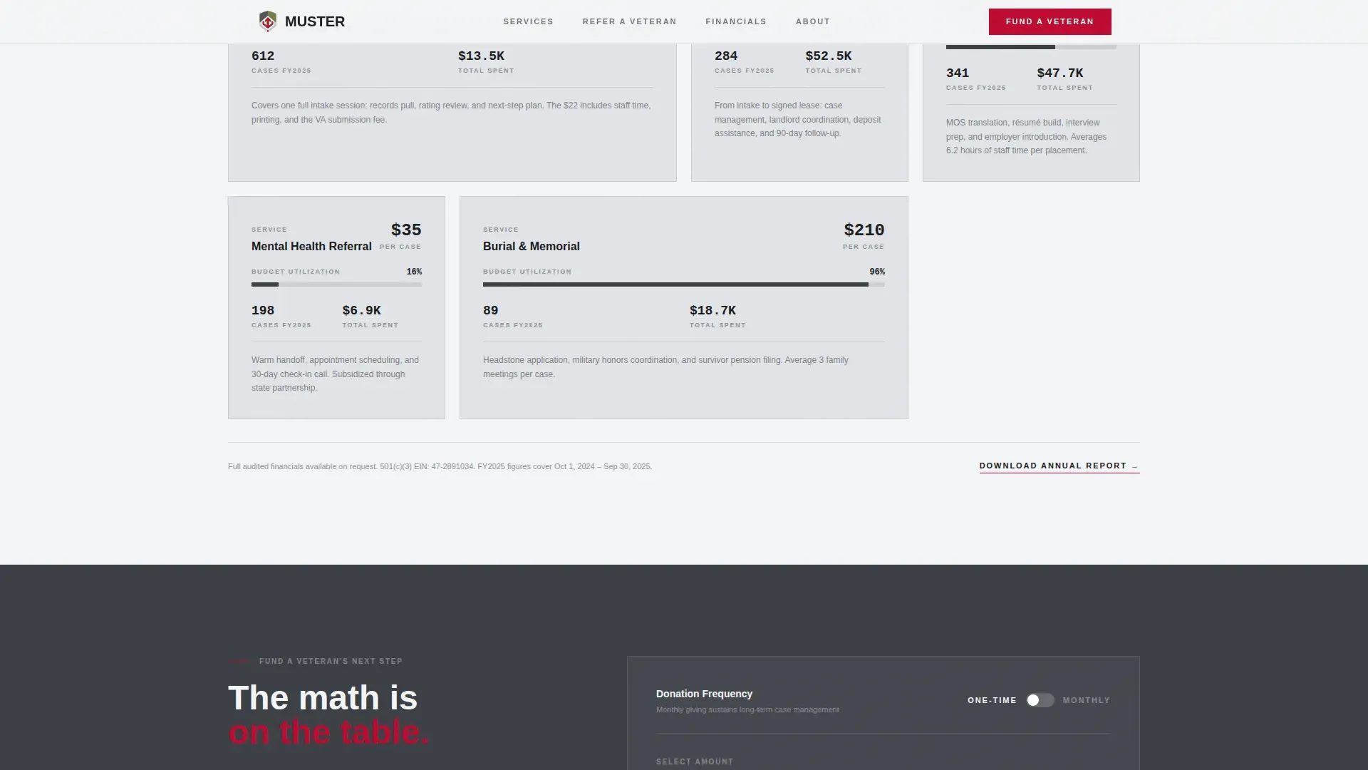
- A donation form offering preset amounts tied to real service costs, a custom amount field, and a monthly recurring toggle
Feature list
This template is built with six core functional elements. Each one serves a distinct purpose in moving visitors toward donation or referral submission.
Documentary Hero with Stat Headline
The hero splits the page in half. The left side holds a documentary-grade photograph of a real caseworker mid-conversation with a veteran. The right side carries a bold headline anchored to a concrete statistic: $4.2 million recovered for 1,800 local veterans. The design structure places the most critical information above the fold, following an inverted pyramid approach that veteran-focused content design practices recommend.
Modular Service Card Grid
Five cards cover Claims Filing, Housing Assistance, Employment Transition, Mental Health Referral, and Burial and Memorial Benefits. Each card displays a numeric badge showing how many veterans used that service last fiscal year. This section helps visitors quickly identify the right service without reading dense text. The card structure also delivers an easy-to-scan overview that reduces cognitive load for users arriving with specific questions.
Veteran Referral Form
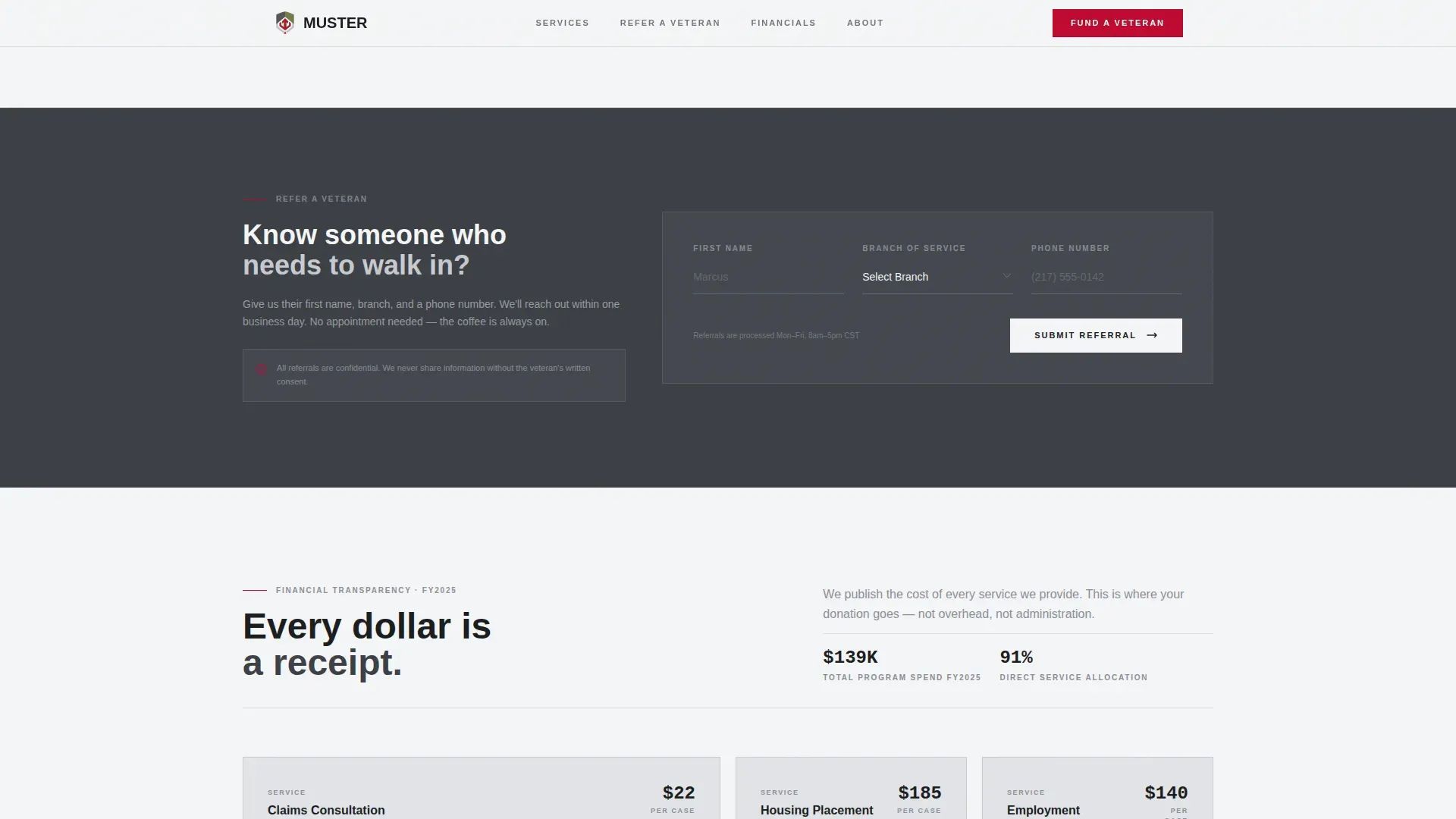
A three-field form collecting first name, branch, and phone number sits between the service grid and the financial transparency section. It is positioned to catch visitors who came to help a specific person rather than donate. The form is intentionally minimal. Short forms tend to get submitted more reliably than long ones, so this section keeps the data collection to only what is needed to make the referral work.
Financial Transparency Card Grid
After the service grid, the page shifts into a financial receipts section. Cards display exactly where donated dollars go, rendered as simple bar charts inside each card. Examples include $22 per claims consultation and $185 per housing placement. This section builds the case for donation by showing the math before making the ask. Every card is literally a receipt.
Donation Form with Preset Amounts
The donation section offers preset amounts tied to real service costs, so donors understand the direct impact of each contribution. A custom amount field and a single monthly recurring toggle round out the form. The primary call to action reads "Fund a Veteran's Next Step" in service-ribbon red, appearing first beneath the hero stats and again as a persistent bottom bar after the transparency cards.
Persistent Donation Bottom Bar
After users scroll through the financial transparency cards, a persistent bottom bar keeps the donation call to action visible. This element ensures donors do not have to scroll back up to act. It reinforces the message at the moment when trust has been fully built by the transparency section above it.
Page sections overview
| Section | Purpose |
|---|---|
| Hero split layout | Establish credibility with a stat headline and primary donation call to action |
| Services card grid | Map each veteran service to a discrete, badged card |
| Veteran referral form | Capture referral details for a specific veteran in three fields |
| Financial transparency grid | Show per-service costs as animated bar chart cards |
| Donation form | Accept preset or custom donations with a monthly recurring option |
| Persistent bottom bar | Keep the donation call to action visible after the transparency section |
| Footer linear row | Deliver basic office links and contact details in a single row |
Design & branding system
The design follows a Corporate Precision theme using a Monochrome Steel color system. Every color choice is deliberate. The palette reads like a pressed Class-A uniform: starched, sober, and earning trust through absence of flash.
- Gunmetal (#3B3F45) and administrative white (#F4F5F7) alternate as background colors; card surfaces float in light gray (#E2E4E8) with hairline borders; body text sits in near-black (#1A1C1E)
- Service-ribbon red (#BF0A30) is reserved exclusively for donation calls to action and urgent callouts, so the color carries full weight every time it appears
- Typography uses DM Sans for headlines and body text, and JetBrains Mono for all numerical data and statistics, creating a clear visual distinction between narrative content and hard numbers
Mobile & speed optimization
The template is built desktop-first, reflecting the reality that many municipal office visitors and local donors browse on desktop. Full mobile support is included so the page functions correctly for veterans accessing it on a phone.
- Staggered card entry animations use GSAP scroll reveals, keeping interactions smooth without overwhelming the content
- The hero uses a line-reveal animation, and a marquee element runs supporting stats to maintain attention on scroll
- Forms are designed to be submitted easily on both desktop and mobile, with large touch targets that support users on smaller screens
How this template helps you convert
This page is built around a transparent fundraising structure that earns trust before it makes a request. The sequence is deliberate: prove the work, show the cost, then ask for the contribution.
- The hero leads with verified impact data, so donors understand the scale of the work before they read anything else. This approach follows the inverted pyramid structure recommended for veteran-facing web content.
- The financial transparency card grid shows exactly what each donated dollar funds, with specific dollar amounts per service. Donors who understand the direct impact of their contribution are more ready to give. This section is what separates this page from generic fundraising campaigns.
- The veteran referral form creates a secondary conversion path for visitors who are not ready to donate but want to help a specific person. Capturing that referral keeps the organization in contact with a warm lead who may become a donor later.
Other information about this template
The Muster transparent process veterans services landing page template is one of a broader set of templates designed to serve government-adjacent and mission-driven organizations. It is worth understanding the full context of where this template fits, both in terms of veteran services design standards and historical naming context.
- The name "Muster" carries historical meaning: muster rolls are official military records used to document service and pay. These documents can be ordered online from the National Archives and Records Administration (NARA) using NATF 86 forms. They remain essential for genealogical research and for veterans who need documentation to support benefits applications.
- The Department of Veterans Affairs (VA) has invested heavily in human-centered design principles and real-time data to rebuild trust after the 2014 Phoenix wait time scandal. The VA's Veterans Experience Office now runs approximately 150 near-real-time customer experience surveys. The VA's trust score for outpatient health care has risen to 92 percent. These practices set the standard for what veteran-serving agencies, including municipal offices using templates like this one, should aim to deliver.
- Approximately 1 in 4 veterans live with a service-connected disability. Forms built into veteran-facing landing pages must be accessible to all users, including those who rely on screen readers, keyboard navigation, or other assistive technologies. Forms must be designed with accessibility in mind from the start, not added as an afterthought. Inaccessible forms create real barriers that prevent veterans from reaching the benefits they have earned.
- The VA aims to deliver personalized communications to veterans based on service branch, age group, and other factors. This template supports that direction by giving organizations a clear, structured platform to address specific audience segments through its card grid design and referral form data collection fields.
- High readability practices, including bold text for emphasis, high color contrast, and large targets for touch interactions, are built into the design system of this template. These principles align with web content design standards recommended for veteran-facing digital services.
- Muster is built desktop-first with strong mobile optimization. Developers can customize every section, and teams can adapt the content to match their own city, founding year, and service statistics. The template supports a wide range of deployment workflows for veteran-focused applications.
Theme
Corporate Precision
Creative direction
Transparent Process
Color system
Monochrome Steel
Style
Card Grid (Modular)
Direction
Donation/Fundraising
Page Sections
Documentary Hero with Bold Stat Headline
Modular Service Card Grid with Usage Badges
Financial Transparency Bar Chart Cards
Veteran Referral Form
Donation Form with Preset Cost Amounts
Persistent Donation Bottom Bar
Related questions
Who is the primary audience for this landing page?
What forms are included in this template?
Can I customize the service cards and cost figures?
How does the transparent fundraising approach work?
Is this template suitable for a government municipal office?