Military Credit Union Landing Page Template
Muster is a single-column military credit union landing page built for active duty service members, military spouses, and transitioning veterans. It pairs a deep charcoal and amber color system with a Problem-to-Solution scroll arc, interactive mini-calculators, and a persistent call-to-action bar. The result is a focused, high-trust page that earns the click before it ever asks for anything.
by Rocket studio
Quick summary
Muster is a single-column flow landing page template built specifically for a military credit union. It opens with an infinite-scroll logo bar, an animated savings counter, and a bold headline. From there, it walks visitors through three real financial pain points and answers each one with a dedicated product section and interactive mini-calculator. Every design decision serves one goal: earn the pre-qualification click from the people who serve this country.
Who this template is for
This template is built for credit union teams that serve the military community. It speaks directly to the financial realities of active duty life, relocation, and transition without requiring explanation.
- Active duty service members from E-4 through O-3 who need banking that moves with their orders
- Military spouses managing household finances and accounts solo during deployment
- Transitioning veterans navigating their first civilian loan, mortgage, or credit product after separation
What problem this template solves
Most bank websites are built for civilians. They don't reflect the payment gaps, relocation cycles, or credit timing issues that military families face. A generic credit union website loses trust before the second scroll.
- Predatory lenders near base gates target service members with high-interest payment traps
- Frozen accounts and broken direct deposit chains during overseas moves damage financial well being
- Permanent credit score gaps caused by PCS timing leave families without access to fair loan rates
What you get with this template
You get a complete, single-column landing page structured to guide military families from problem awareness to pre-qualification click. Every section is intentional, and every design detail reinforces trust.
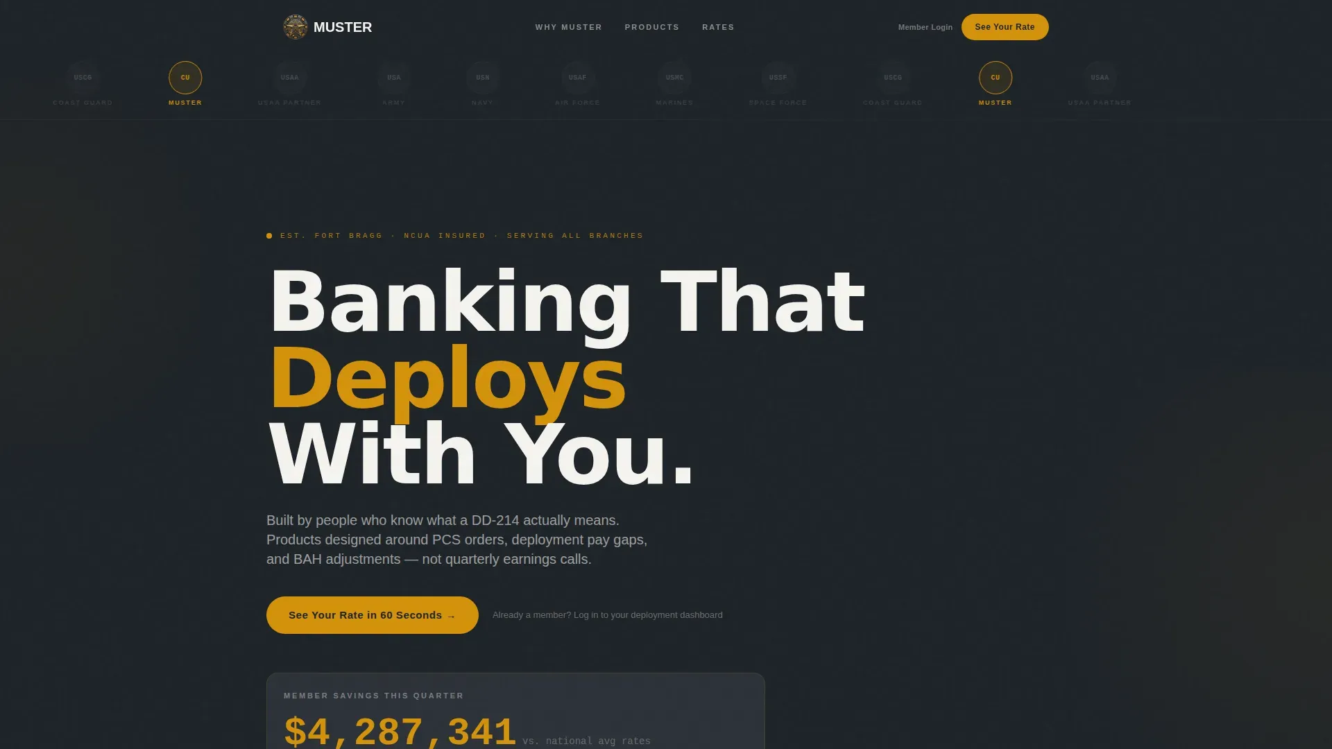
- A hero section with an infinite-scroll military branch logo bar, animated savings counter, and primary call-to-action
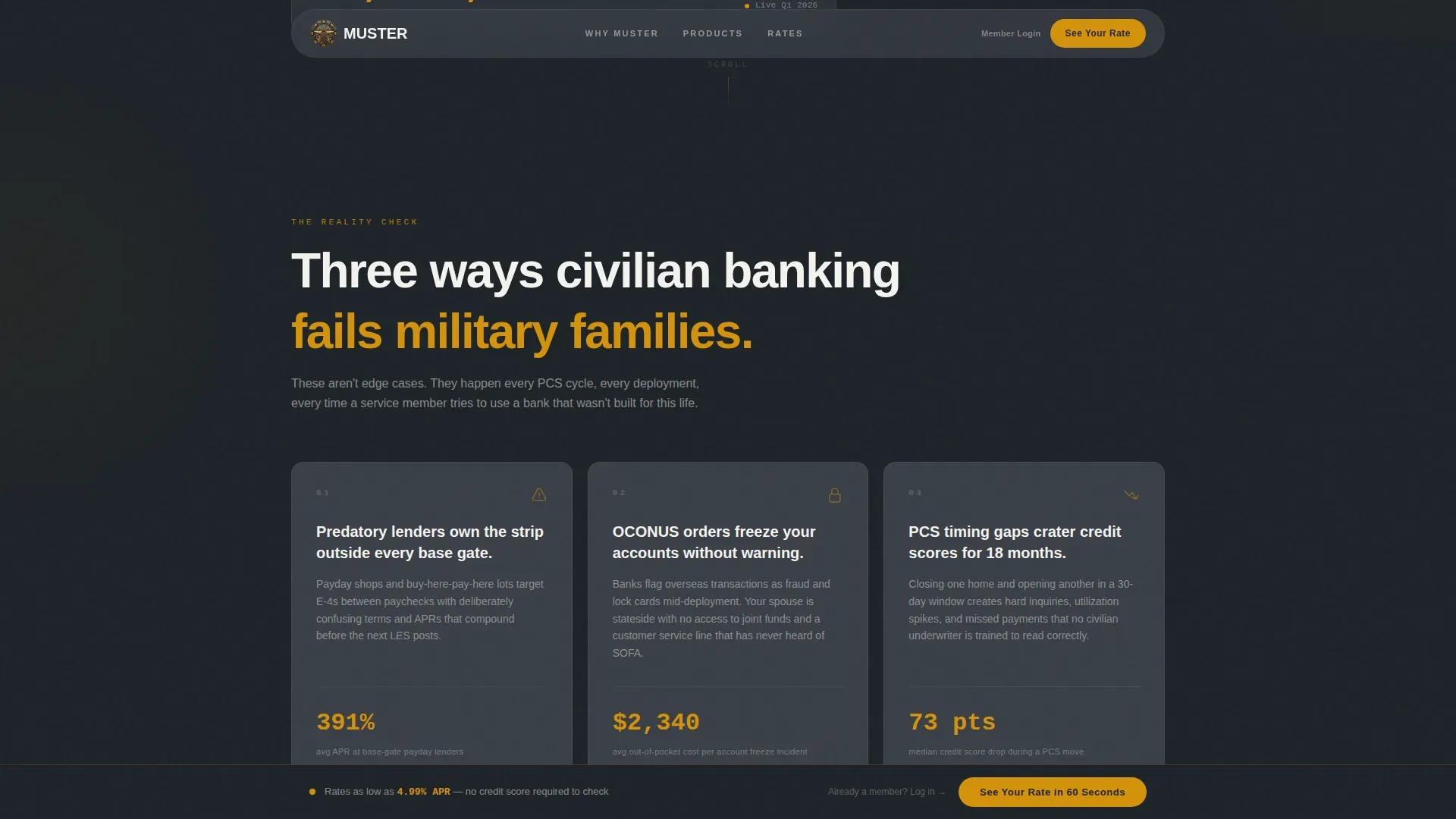
- Three problem cards with real dollar figures, followed by solution sections with interactive mini-calculators for each product
- A rate comparison section, social proof block with member testimonials, and a persistent bottom call-to-action bar
Feature list
This template includes the following core features, each designed to serve the specific needs of a military credit union landing page.
Infinite Logo Scroll Header
The header opens with a horizontal strip of desaturated military branch emblems in an infinite loop. The credit union's own mark sits centered and rendered in full amber. A single bold headline, "Banking That Deploys With You", anchors the section beneath it.
Animated Savings Counter
An animated counter ticks upward in real time showing total member savings this quarter. This detail replaces vague marketing language with actual numbers, giving users an immediate reason to stay and keep reading.
Problem Arc with Dollar-Figure Cards
Three charcoal cards surface the financial emergencies that crush military families: predatory lending near base gates, frozen accounts during overseas moves, and credit score damage from PCS timing gaps. Each card carries a real dollar figure, making the pain concrete and credible.
Interactive Product Mini-Calculators
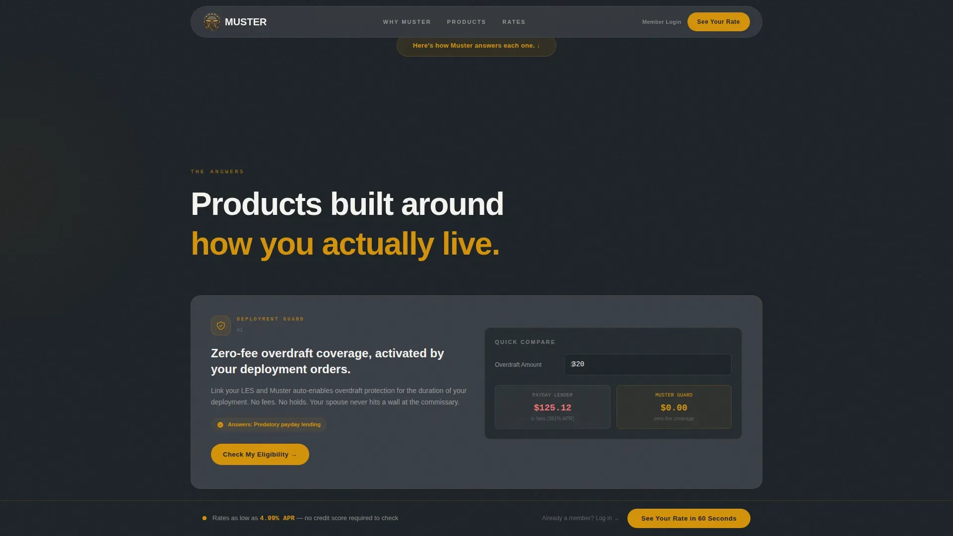
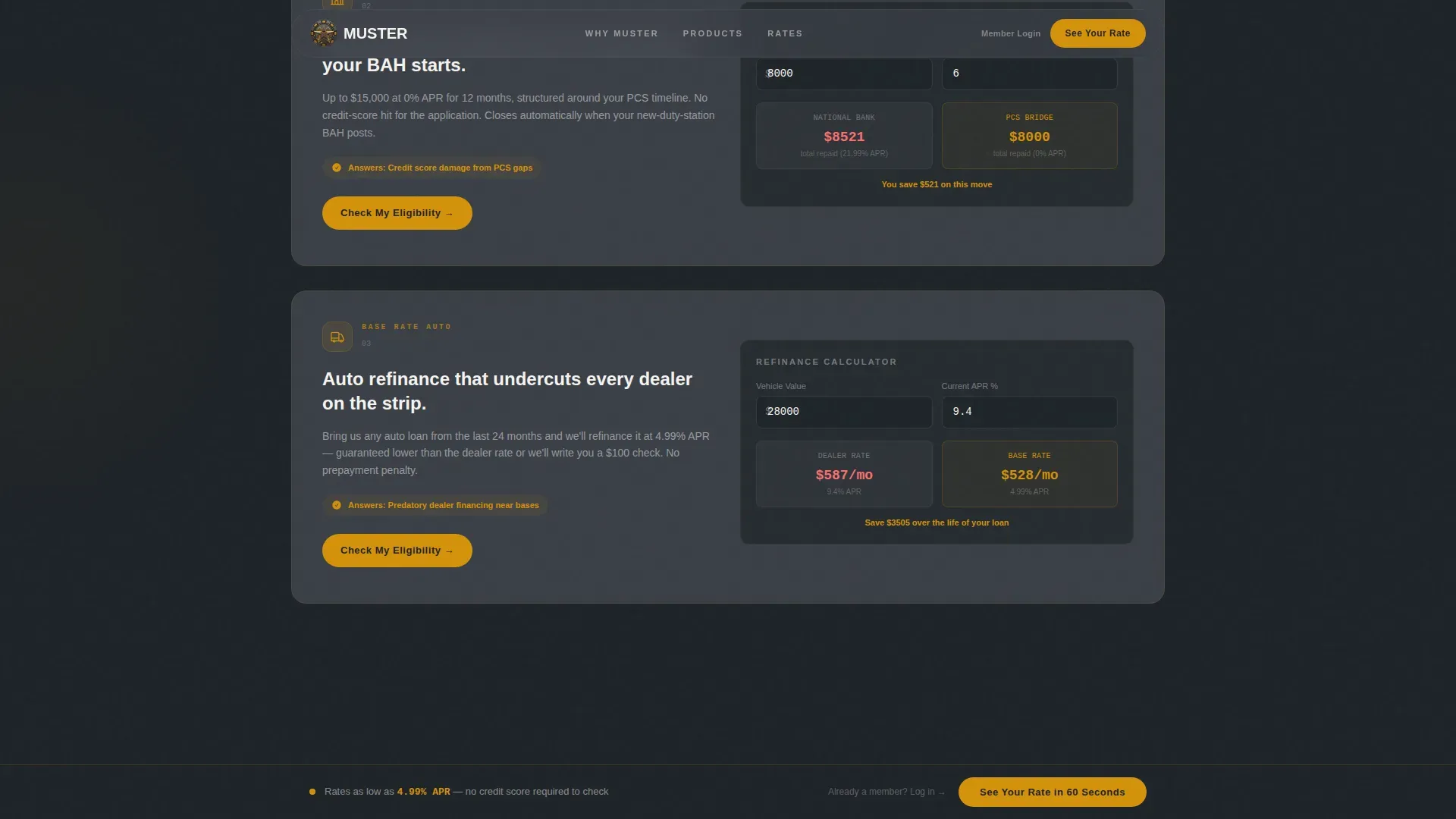
Each solution section includes a mini-calculator so visitors can interact with rates and see personalized comparisons. This builds momentum as users move down the page, turning passive reading into active engagement before any form appears.
Rate Comparison Section
A side-by-side table shows Muster rates against national bank averages. Visitors see the math before they are ever asked to act. This section does the convincing so the call-to-action doesn't have to.
Persistent Bottom Call-to-Action Bar
After the first scroll, a fixed amber bar anchors to the bottom of the viewport. It carries the primary call-to-action and a secondary text link for returning members. The bar stays visible without interrupting the reading experience.
Page sections overview
| Section | Purpose |
|---|---|
| Logo bar hero | Establish trust with branch emblems, headline, and animated savings counter |
| Problem arc cards | Surface three military financial pain points with real dollar figures |
| Deployment Guard section | Present overdraft shield product with interactive mini-calculator |
| PCS Bridge section | Introduce zero-interest relocation loan with rate calculator |
| Base Rate section | Show auto refinance product and comparison against dealer rates |
| Rate comparison table | Display Muster versus national bank averages side by side |
| Social proof block | Member testimonials with rank and branch, plus aggregate savings stats |
| Footer row | Single linear footer with essential links and contact details |
Design & branding system
The visual identity channels a dark institutional aesthetic with a single flash of warmth. The palette feels like a polished challenge coin catching light in a dim ready room: grounded and credible, but with clear energy at every action point.
- Deep gunmetal charcoal (#1E2328) as the primary background, with tactical slate (#3A3F47) for card surfaces and section dividers
- Warm amber (#D4920B) across every interactive element: buttons, rate highlights, progress indicators, and the persistent call-to-action bar
- DM Sans for headings and JetBrains Mono for data, rates, and counters, keeping financial details readable and distinct
Mobile & speed optimization
Over 50 percent of credit union visitors use mobile devices. Military personnel often rely on phones while on the move, during training, or deployed. This template is built mobile-first to serve users wherever they are.
- GSAP ScrollTrigger animations reveal sections progressively, keeping the scroll experience smooth on smaller screens
- Client Components handle the calculators and counter animations while static sections use Server Components, balancing interactivity with load efficiency
- The persistent call-to-action bar is sized and positioned for thumb-reach on mobile, reducing effort at the conversion moment
How this template helps you convert
A good credit union website guides visitors toward meaningful actions without friction. This template is structured to earn trust at every scroll and reduce hesitation before the click.
- The page leads with real numbers, the animated counter and dollar-figure problem cards establish credibility before any product is mentioned, so visitors arrive at the solution sections already convinced that the credit union understands their situation.
- The interactive mini-calculators let visitors manage their own comparison process, creating a personal connection to the numbers and removing the need to trust marketing copy alone.
- The primary call-to-action, "See Your Rate in 60 Seconds", appears above the fold and again as a fixed bar, so the path to pre-qualification is always visible without disrupting the reading flow.
Other information about this template
This template is a strong fit for any credit union team planning a new website or refreshing an existing credit union website to better serve the military community. A skilled website design and development team can adapt the layout and brand colors quickly. The design examples built into the template demonstrate how a clean, focused site can communicate identity and commitment without visual clutter.
- The muster military banking credit union landing page template is designed around the Veterans Benefits Banking Program (VBBP) ecosystem, with space for resources covering financial education, certified financial counselors, and financial wellness guidance for veterans and their families
- Personal and business banking services can be linked from the footer or homepage without disrupting the landing page flow; the single-column structure keeps users focused on the pre-qualification path while leaving room to link to broader services including business banking, online banking, and mobile banking tools
- The template supports content covering a home equity line, VA loan benefits, direct deposit setup, and opening accounts for new members; additionally, it can accommodate financial well being program details and links to resources like free financial counseling from certified financial counselors
- Trust signals recommended for the site include NCUA insurance display, security badges, and member testimonials with rank and branch; every extra field removed from forms can improve conversion, so the template deliberately carries no on-page form, routing visitors to a clean pre-qualification flow instead
- Communities and financial institutions exploring design examples for a great credit union web presence will find this template's dark Startup Velocity theme and amber energy system a clear departure from generic bank website templates
Theme
Startup Velocity
Creative direction
Problem→Solution Arc
Color system
Charcoal & Amber
Style
Single Column Flow
Direction
Click-Through
Page Sections
Infinite Military Branch Logo Scroll
Animated Member Savings Counter
Problem Arc with Dollar-figure Cards
Product Sections with Mini-calculators
Rate Comparison Table
Persistent Viewport Call-to-action Bar
Related questions
Who is this landing page template designed for?
Can I adapt the product sections to match my credit union's own offerings?
Does the template include the interactive mini-calculators?
How does the persistent call-to-action bar work?
Is this template suitable for a credit union planning a website redesign?



