Refined Watch Store Landing Page Template
Horologist is a refined watch landing page built for serious collectors. It guides visitors from entry-level timepieces through aspirational upgrades using a scroll-driven comparison journey, a mechanical countdown header, and an Alcantara-inspired visual identity. The sticky comparison drawer, expandable detail panels, and curated bundle section make the upgrade path feel natural and earned.
by Rocket studio
Quick summary
Horologist is a single-page watch retail template designed around an educational upgrade journey. It opens with a dramatic mechanical-dial countdown header and guides collectors step by step from reliable everyday pieces to exhibition caseback automatics and column-wheel chronographs. Every section builds aspiration through honest comparison rather than pressure.
Who this template is for
This template suits watch retailers, boutique curators, and independent dealers who sell to knowledgeable buyers. It speaks to collectors who already own a solid daily wearer and are ready to move into finishing, complications, or in-house movements.
- Watch boutiques offering a tiered product range from entry to premium
- Independent retailers running limited restocks or exclusive pre-order windows
- Concierge-style shops that offer fittings or video consultations alongside online browsing
What problem this template solves
Most watch retail pages treat every visitor the same. They show a grid of products, add a price, and hope something clicks. That approach frustrates collectors who already know what they own and want to understand what comes next.
- Visitors cannot see a clear upgrade path between price tiers
- Product detail pages rarely show movement macros, lume shots, or side-by-side spec comparisons
- There is no guided mechanism to help a buyer feel the logical step between an entry piece and a premium one
What you get with this template
You get a full single-page layout that walks collectors through a curated upgrade experience from first scroll to final purchase decision. Every component is designed to educate and build desire simultaneously.
- A mechanical countdown header with real-time sweep seconds and overlay typography
- Two tiered product galleries with expandable detail panels showing movement close-ups and spec comparisons
- A sticky comparison drawer, a concierge booking path, and a curated bundle closer with installment pricing
Feature list
This template includes purpose-built sections and interaction patterns drawn directly from the brief. Each feature serves the collector audience and the upgrade-first retail model.
Mechanical Countdown Header
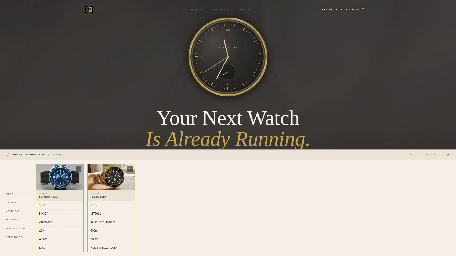
The page opens with a watch dial rendered at large scale. The seconds hand sweeps in real time and sub-dials tick visibly. A condensed serif headline overlays the dial: "Your Next Watch Is Already Running." The dial then slowly pulls back to reveal a full watch on a suede strap resting on folded linen. A countdown references a limited restock or pre-order window, giving the clock face narrative weight.
Tiered Comparison Gallery
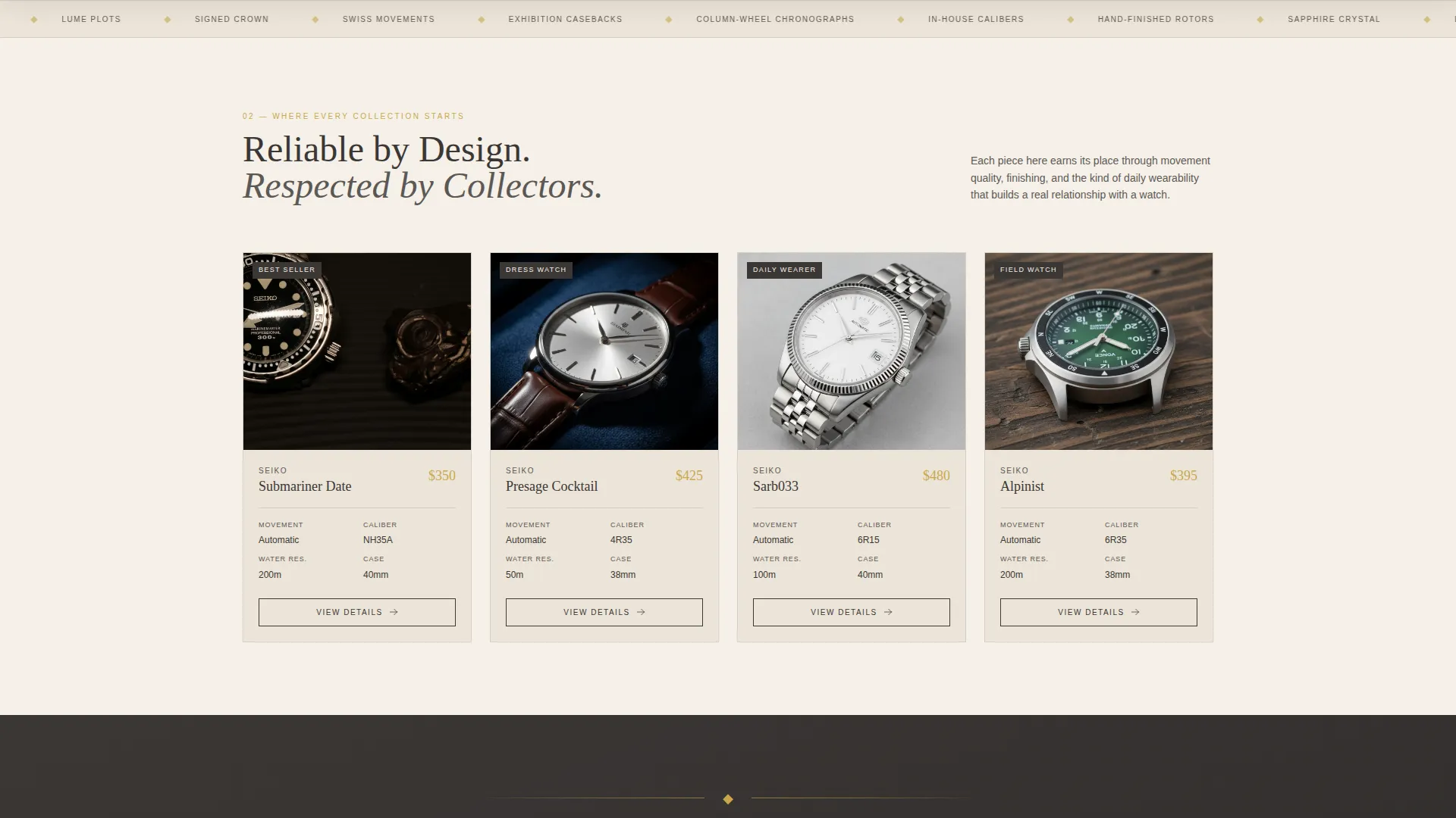
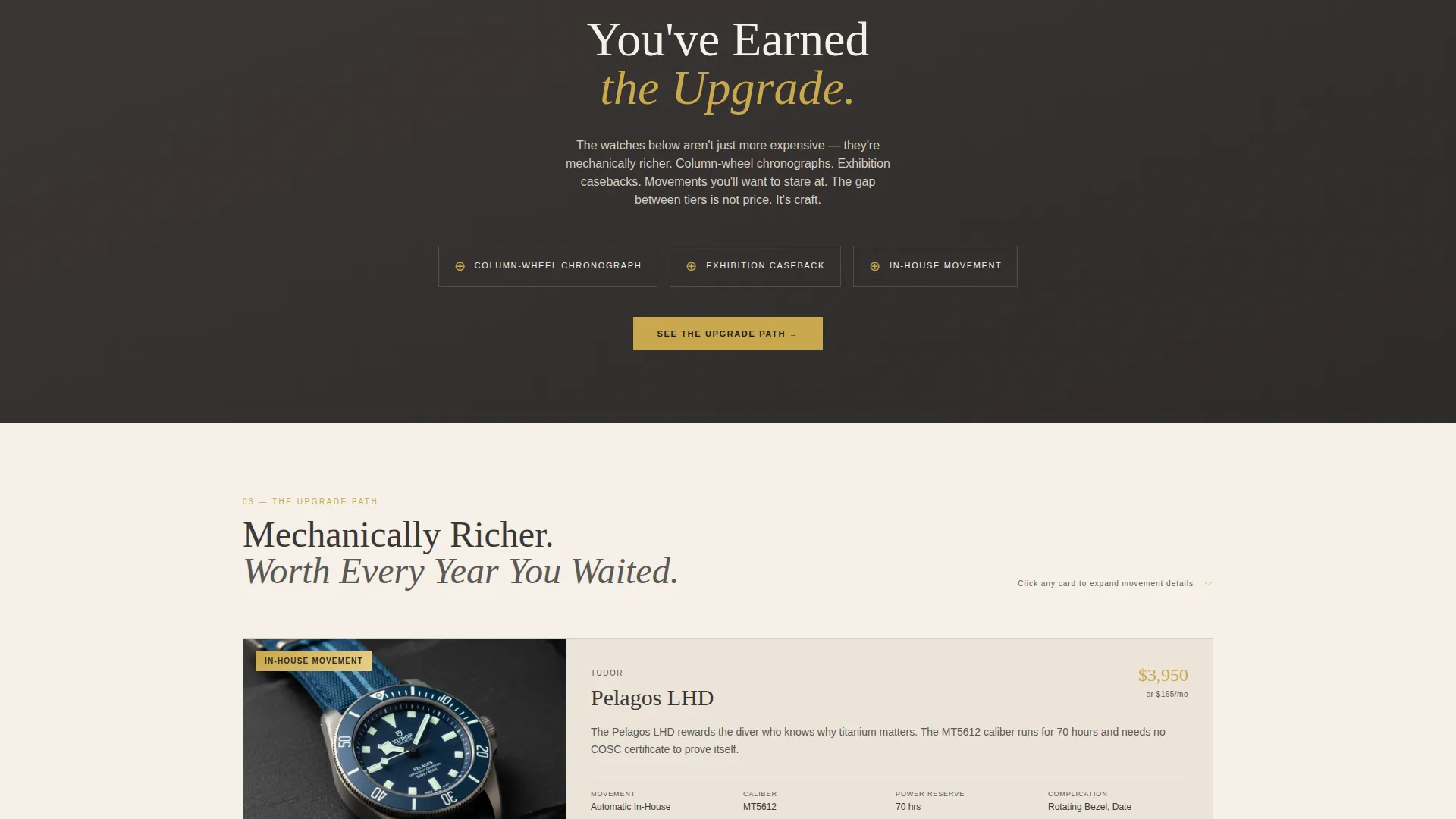
The scroll journey begins with an entry-level gallery showing reliable everyday pieces priced under a defined threshold. Each piece displays movement type and water resistance in a clean grid. A transition line reading "You've earned the upgrade" separates this gallery from the mid-range tier, where column-wheel chronographs and exhibition caseback pieces are featured with expanded detail panels.
Expandable Watch Detail Panels
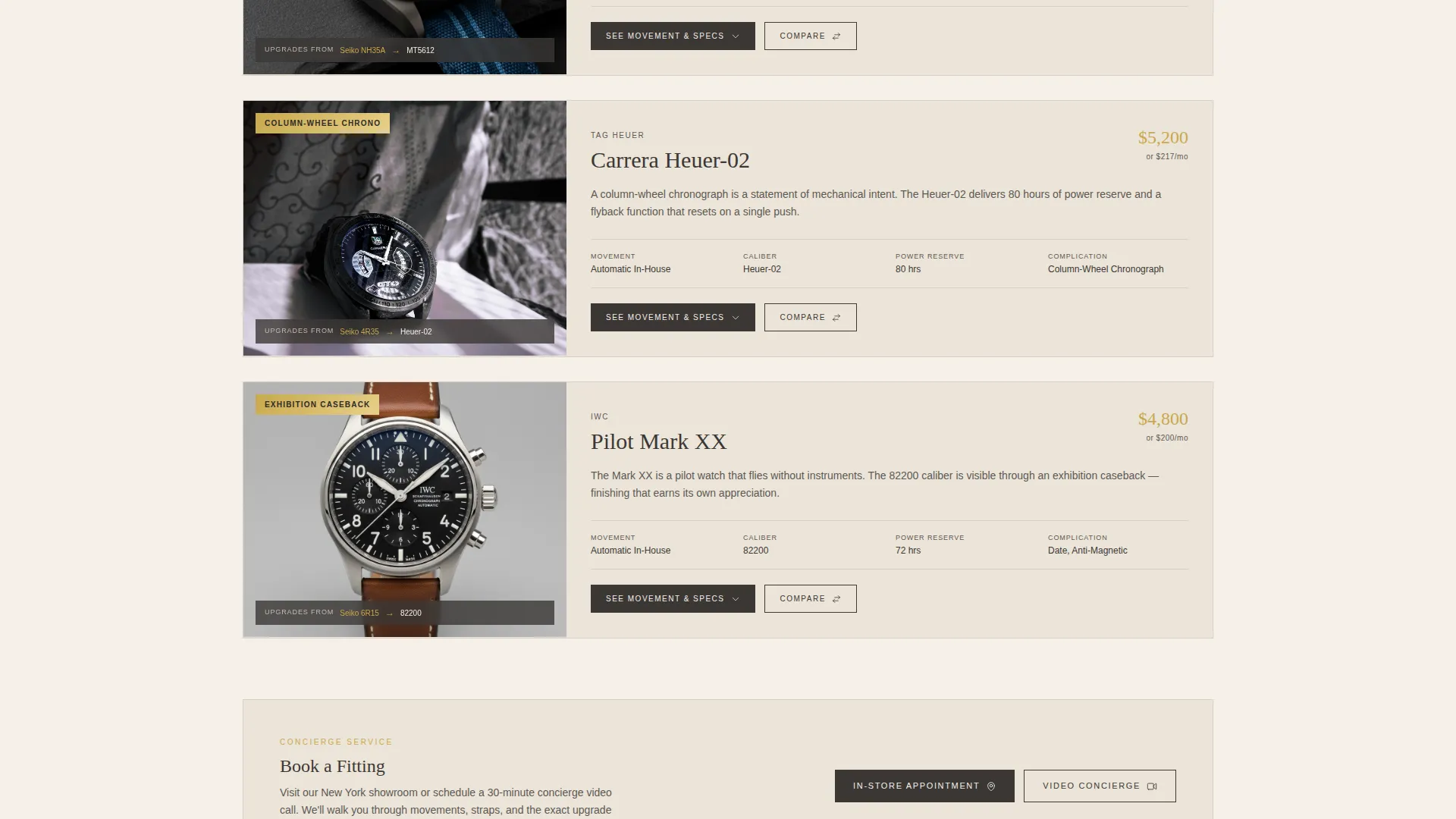
Each mid-range watch card opens into a full detail panel. The panel includes a movement macro photograph, a lume shot, and a side-by-side spec comparison against the entry piece it replaces. An "Upgrade From" tag links the premium watch directly to its entry-level counterpart, making the step feel reasoned rather than indulgent.
Sticky Comparison Drawer
A persistent drawer anchored to the bottom of the page holds up to two watches side by side. Specs are auto-populated when a visitor adds a watch to the drawer. The primary call to action, "Trade Up Your Wrist," sits inside this drawer and stays visible throughout the scroll.
Concierge Booking Path
A secondary call to action, "Book a Fitting," serves local visitors and remote buyers. It supports either an in-store appointment or a concierge video call, giving the page a personal-service dimension that suits premium retail.
Bundle Closer Section
The final section presents a curated upgrade bundle: watch, strap, and travel case sold together. A single "Complete the Set" button anchors the offer. The installment price is displayed in the faded gilt accent color, making the financial step feel considered and attainable.
Page sections overview
| Section | Purpose |
|---|---|
| Mechanical Countdown Header | Opens with a live watch dial and pre-order or restock timer |
| Entry Gallery | Showcases everyday pieces under a set price with key specs |
| Upgrade Transition Line | Marks the editorial shift from entry tier to premium |
| Mid-Range Gallery | Presents column-wheel and exhibition caseback watches |
| Watch Detail Panels | Expands each card with movement macro, lume shot, and specs |
| Sticky Comparison Drawer | Holds two watches side by side with a primary call to action |
| Concierge Booking | Offers fitting appointments or video consultations |
| Bundle Closer | Presents watch, strap, and case as a single curated set |
Design & branding system
The visual identity follows a Neo-Retro theme using a palette called Cloud Canvas. The combination of soft parchment, warm fog, charcoal patina, and a single faded gilt accent reads like a 1960s watchmaker's catalogue printed on heavy cotton stock.
- Core palette: soft parchment (#F5F0E8), warm fog (#D6CFC4), charcoal patina (#3B3735), and faded gilt (#C9A84C) reserved for price callouts, upgrade badges, and hover states
- Typography uses condensed serif faces that feel period-appropriate without being nostalgic
- Tactile surface cues such as folded linen and suede strap photography reinforce the physical warmth of the palette
Mobile & speed optimization
The layout is built to remain legible and navigable on smaller screens without losing the drama of the large-scale dial header or the utility of the comparison drawer.
- The sticky comparison drawer adapts to mobile viewports so the primary call to action stays reachable throughout the scroll
- Expandable detail panels are structured to open cleanly on touch devices without layout breakage
- The tiered gallery grids reflow for single-column browsing while keeping movement type and water resistance specs visible
How this template helps you convert
This template replaces passive product browsing with an active upgrade narrative. Every section moves the collector one step closer to a decision they already feel ready to make.
- The comparison journey lowers resistance by framing premium pieces as logical next steps rather than impulsive purchases, using "Upgrade From" tags and side-by-side spec panels to build confidence.
- The sticky comparison drawer and bundle closer keep the purchase action visible and accessible from any point in the scroll, reducing the distance between intent and commitment.
Other information about this template
This template is categorized under Retail and E-Commerce, specifically within the Jewelry and Accessories Store subcategory. It is a strong fit for scroll-reveal-style single-page layouts where progressive disclosure is the primary storytelling device.
- The template style is Scroll Reveal with progressive section-by-section discovery, matching the comparison journey structure
- The header concept is a Countdown Timer tied to mechanical watch dial animation rather than a generic sale clock
- The creative direction follows a tiered elevation model, moving visitors from their current product tier upward through aspiration and education
- This layout is well suited to seasonal restock drops, limited pre-order windows, and curated collection launches where scarcity and curation both matter
Theme
Luxe Minimal
Creative direction
Before/After Reveal
Color system
Citrus Burst
Style
Scroll Reveal (Progressive)
Direction
Quiz/Assessment
Page Sections
Mechanical Countdown Header
Tiered Comparison Gallery
Expandable Watch Detail Panels
Sticky Comparison Drawer
Concierge Booking Path
Curated Bundle Closer
Related questions
Can I use this template for a single brand or a multi-brand store?
Does the countdown timer work for any type of limited event?
How does the sticky comparison drawer work for buyers?
Is the concierge booking path suitable for online-only retailers?
Can I customize the bundle section for different product combinations?



