Watch Designer Portfolio Landing Page Template
The Horology landing page template is built for watch designers who need a portfolio that commands attention before a single word is read. An obsidian-and-gold bento grid layout, a bold centered headline, and award-recognition project cards work together to show mastery first and invite commissions second. One page. No forms. Pure presence.
by Rocket studio
Quick summary
Horology is a single-page bento grid landing page template crafted for independent watch designers and horological consultants. It pairs a typographic hero header with an asymmetric project grid, interstitial quotes, and a click-through structure that drives visitors toward a case study or a commission inquiry. The visual language is dark, precise, and unmistakably luxury.
Who this template is for
This template is built for working designers in the watch and luxury product space. It suits anyone who needs a portfolio that speaks to sophisticated, high-value clients before asking them to act.
- Independent watch designers pitching Swiss maisons or luxury conglomerates
- Microbrand founders who design in-house and need a credible face for their work
- Horological consultants presenting a curated body of commissions and patents
What problem this template solves
Most portfolio templates are built for generalists. They scatter attention, rely on carousels, and bury the most important credential under navigation. A watch designer working at the level of commissioned dials and award nominations cannot afford a generic presentation.
- Generic layouts dilute the sense of prestige that luxury clients expect
- Flat grid structures treat a student sketch and a Baselworld debut with equal visual weight
- No clear escalation path means visitors leave without understanding the designer's arc
What you get with this template
You get a fully structured single-page layout that mirrors the deliberate pace of luxury brand communication. Every section earns its place, and the page builds credibility incrementally before asking visitors to take any action.
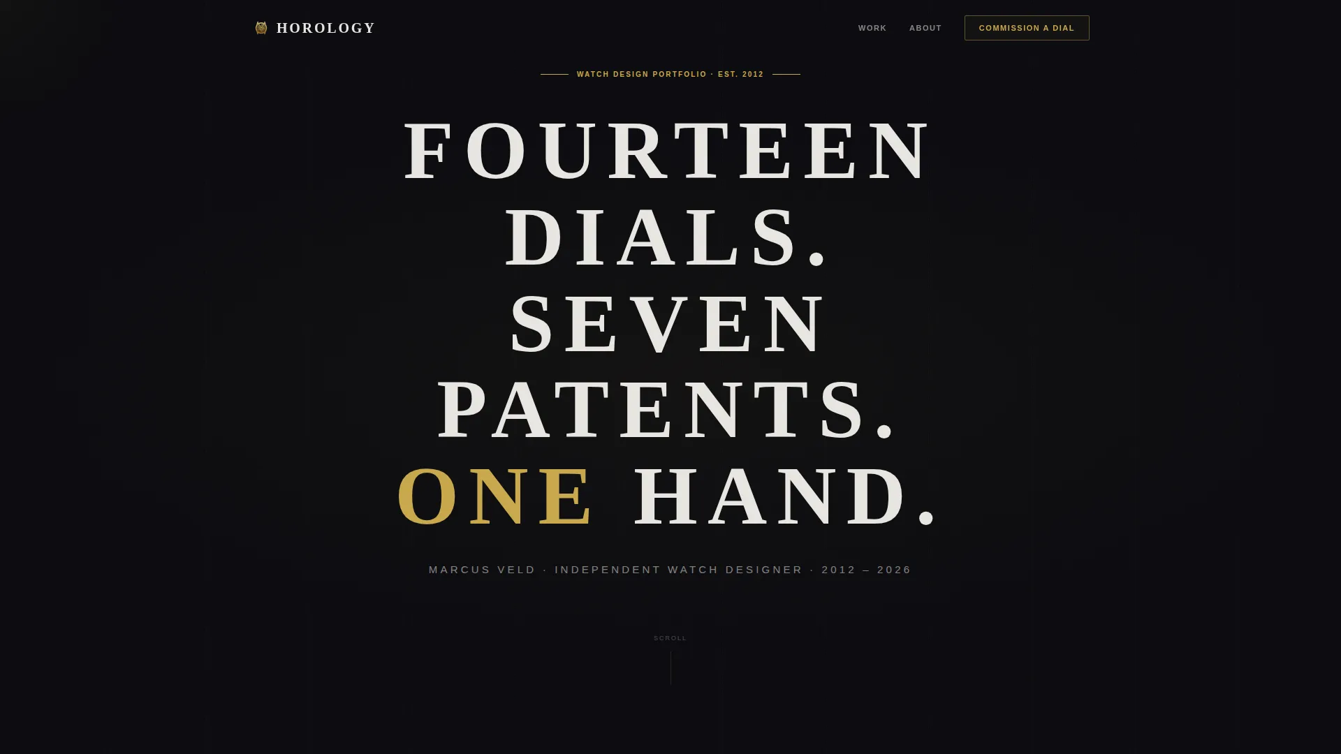
- A centered typographic hero header with a tracked, weighted serif headline and a gold accent word
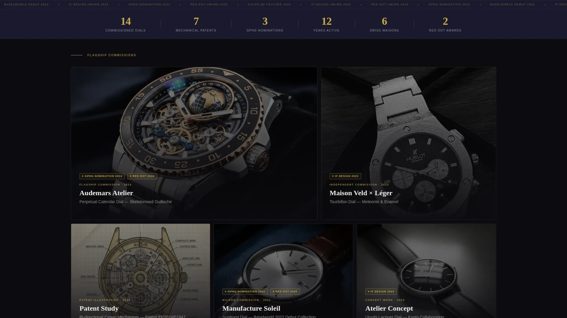
- An asymmetric bento grid of project cards with hero shots, brand names, and award badge clusters
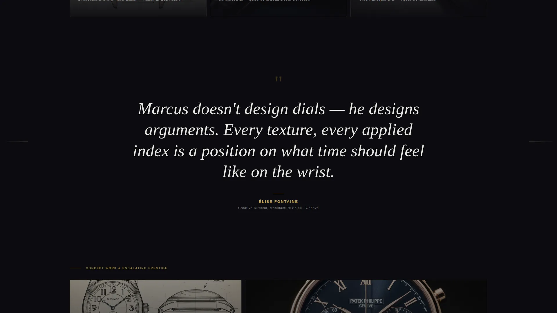
- Full-width interstitial quote sections and a persistent navigation call-to-action button
Feature list
This template ships with a focused set of purposeful components. Each one serves the watch designer portfolio use case directly.
Typographic Hero Header
The header is a single large serif headline set on pure obsidian black with no imagery. Wide letter tracking, heavy weight, and a single gold-accented word make the typography itself function as a design statement. A one-line dial-white subtitle names the designer and years active beneath it.
Asymmetric Bento Grid
The project grid uses large cells for flagship commissions and smaller cells for concept work and patent illustrations. This visual hierarchy communicates prestige at a glance, letting the most significant work dominate without explanation.
Award Badge Project Cards
Each grid cell includes a hero shot, the commissioning maison or brand name, and a small cluster of award badge identifiers such as Red Dot, Grand Prix d'Horlogerie de Genève (GPHG) nomination, and iF Design. On hover, each card lifts subtly and reveals a gold-bordered detail crop of a guilloché pattern or crown mechanism cross-section.
Prestige-Escalating Scroll Structure
The page is ordered intentionally. It opens with early work and escalates toward the most prestigious commissions. This scroll rhythm builds the designer's story and makes the primary call-to-action feel earned rather than rushed.
Interstitial Quote Sections
Between grid rows, full-width quote panels display testimonials from creative directors set in oversized italic serif on black. These breaks provide breathing room and third-party credibility within the scroll flow.
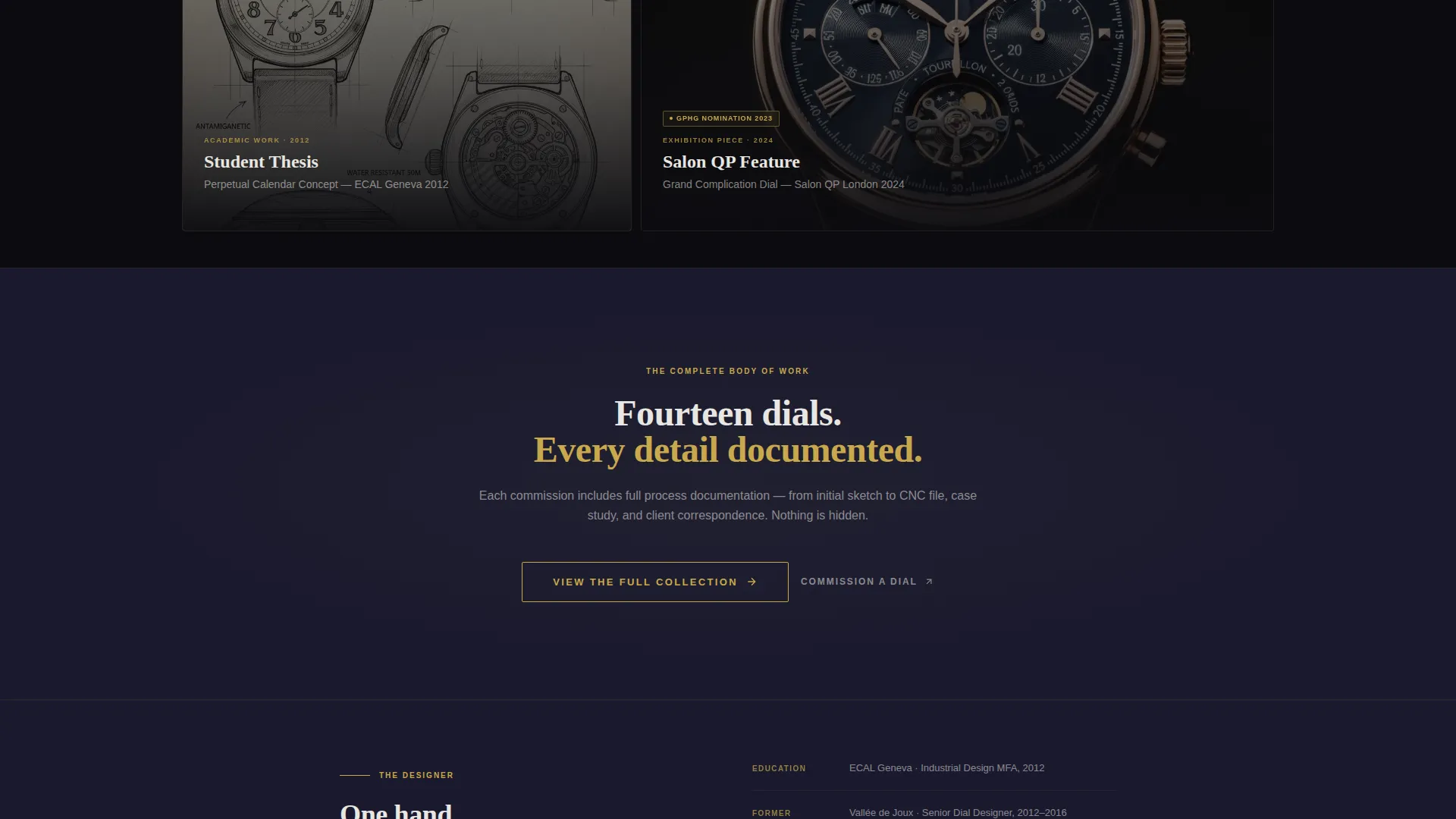
Click-Through Call-to-Action System
A gold-outlined primary button reading "View the Full Collection" appears after the third grid row. A secondary persistent button in the top navigation reads "Commission a Dial." There is no form on this page. The click-through earns its action through demonstrated mastery.
Page sections overview
| Section | Purpose |
|---|---|
| Hero Header | Establish identity through typography alone |
| Persistent Navigation | Surface commission inquiry button at all times |
| Bento Grid Row 1 | Introduce early and concept-stage work |
| Interstitial Quote 1 | Add creative director voice after first grid row |
| Bento Grid Row 2 | Present mid-career commissions and patent work |
| Interstitial Quote 2 | Reinforce credibility with second maison quote |
| Bento Grid Row 3 | Showcase flagship and most recognized commissions |
| Primary call to action Block | Gold-outlined button to full collection view |
| Bento Grid Row 4 | Close with the Baselworld debut and pinnacle work |
Design & branding system
The visual identity follows a Lens & Frame theme built entirely on an Obsidian & Gold color system. The palette is deliberately dark so that every project image and gold accent carries maximum visual weight.
- True obsidian black (#0B0B0F) as the dominant background, with a watchmaker's loupe dark (#1A1A2E) for layered depth
- Brushed gold (#C9A84C) reserved for accent elements and hover states only, the way a watchmaker uses gold on hands and crowns rather than entire cases
- Dial white (#E8E6E1) for all body typography, reading like applied indices on a matte dial face
Mobile & speed optimization
The bento grid layout is structured to reflow gracefully on smaller screens. The visual hierarchy that governs the desktop experience carries through to mobile without losing the sense of scale.
- Large hero typography scales down while preserving wide tracking and the single gold accent word
- Grid cells stack in a logical prestige order so the escalation narrative remains intact on mobile
- Hover detail crops adapt to tap interactions so mobile visitors still encounter the guilloché and mechanism reveals
How this template helps you convert
The page is engineered as a click-through, not a form capture. Conversion happens when a visitor is convinced enough to take a deliberate next step.
- The award badge density across project cards builds rapid credibility, so by the time the primary "View the Full Collection" button appears, the visitor has already seen the body of evidence.
- The persistent "Commission a Dial" button in the navigation remains available throughout the scroll, catching visitors who are ready to hire before they reach the bottom of the page.
Other information about this template
This template sits within the Portfolio & Agency category, specifically under the 3D & Product Design Portfolio subcategory. It is purpose-built for the watch designer portfolio niche and reflects a very high intersection match between its template style, creative direction, and target audience.
- The Bento Grid template style was chosen to mirror the way a watch designer lays out a collection tray: each piece given its own space, some pieces commanding more room than others
- The Award & Recognition creative direction aligns with how luxury clients in the horology world evaluate talent, through peer-recognized credentials rather than self-reported claims
- This template is a strong fit for designers preparing for a collection launch, a new commission pitch, or a public debut at a trade event
Theme
Lens & Frame
Creative direction
Award & Recognition
Color system
Obsidian & Gold
Style
Bento Grid
Direction
Click-Through
Page Sections
Typographic Hero Header
Asymmetric Bento Grid Layout
Award Badge Project Cards
Prestige-escalating Scroll Order
Interstitial Quote Panels
Click-through Call-to-action System
Related questions
Can I use this template without finished product photography?
Is there a contact form included in this template?
How does the prestige escalation structure work?
Can the Obsidian and Gold color system be changed to match a different brand?
What type of clients is this portfolio template designed to attract?



