Hospital & Clinic Construction Privacy Policy & Terms Website Template
A modular card-grid landing page built for hospital and clinic fire protection contractors. The template guides facility directors, compliance officers, and construction managers through a clear, phase-by-phase project process, from deficiency report to final inspection, using a warm, technical visual identity that signals competence before a single word is read.
by Rocket studio
Quick summary
This landing page template is designed for fire protection contractors who work inside occupied hospitals and surgical centers. It presents a transparent, step-by-step project process using modular cards, a technical line-art header, and a restrained warm-stone color system. The goal is simple: earn the trust of facility directors before asking for a meeting.
Who this template is for
This template is built for contractors who specialize in healthcare fire protection work, specifically those who need to demonstrate competence to a technically demanding, risk-aware audience. It speaks directly to the people responsible for keeping a medical campus compliant and operational.
- Facility directors managing aging hospital campuses with active code deficiencies
- Compliance officers reviewing National Fire Protection Association (NFPA) 99 reports and coordinating with authorities having jurisdiction (AHJ)
- Construction managers scheduling tenant improvement work inside live surgical centers and occupied patient wings
What problem this template solves
Most fire protection contractor websites look like every other trade contractor site, a logo, a phone number, and a list of services. That approach fails in healthcare. Facility directors are not generalists. They need evidence that a contractor understands occupied-space constraints, infection control protocols, and phased construction sequencing before they will take a meeting.
- There is no clear proof of process, leaving buyers unable to evaluate contractor competence before reaching out
- Generic layouts do not reflect the technical and regulatory complexity of hospital fire protection work
- Visitors who are not yet ready to call have no lower-commitment path to stay engaged with the contractor
What you get with this template
This template delivers a complete, single-page click-through layout structured around a transparent project methodology. Every visual and structural decision reflects the hospital environment it serves.
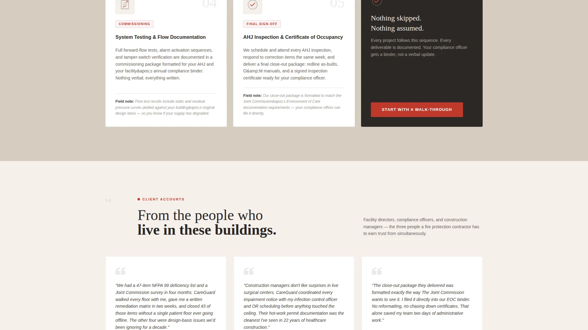
- A full modular card-grid section that walks visitors through each project phase, from survey and code analysis through AHJ final sign-off
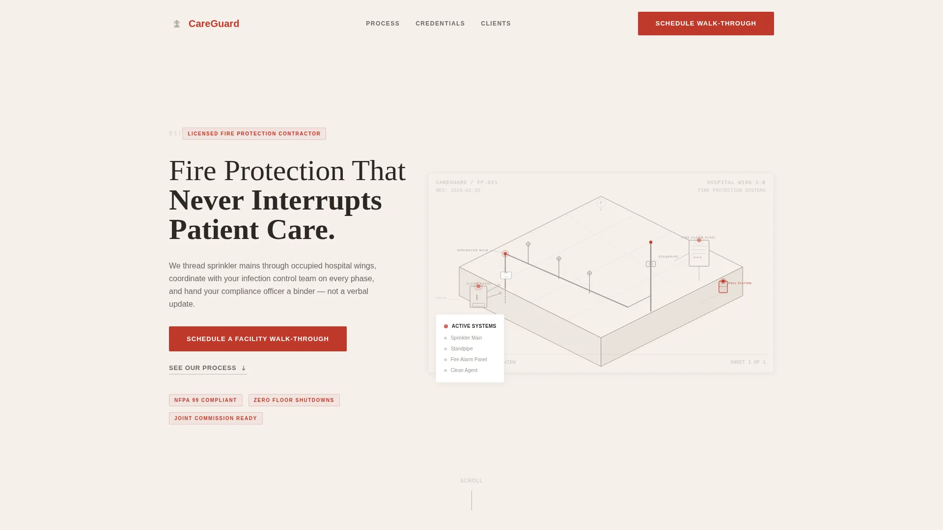
- A line-art isometric header illustration showing sprinkler risers, standpipes, fire alarm panels, and clean agent cabinets with animated red activation nodes
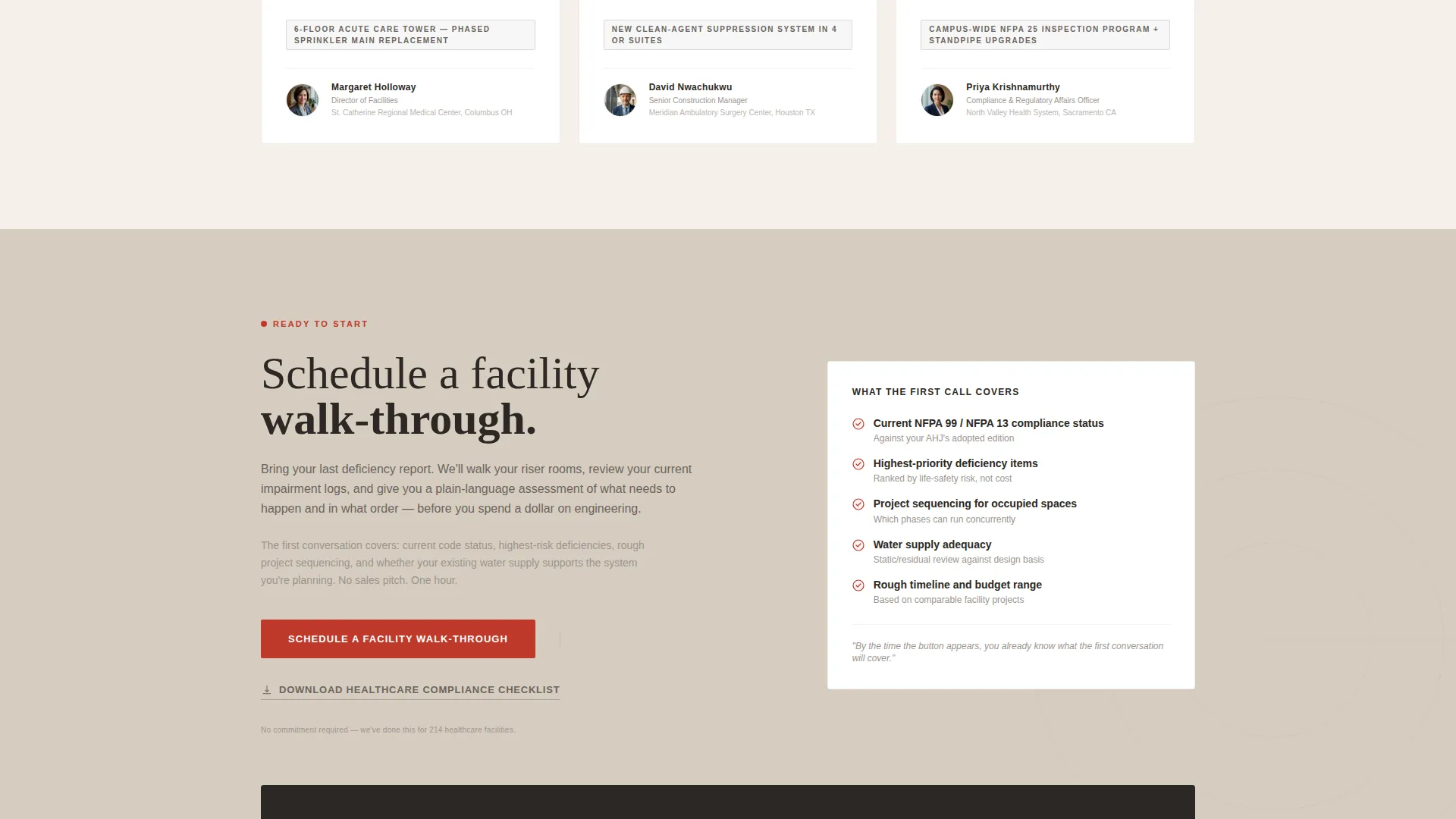
- A primary call-to-action (call to action) in suppression-red and a secondary lead-capture text link for visitors who want a compliance resource before scheduling a consultation
Feature list
This section covers the core design and structural capabilities built into this template.
Phase-by-Phase Process Card Grid
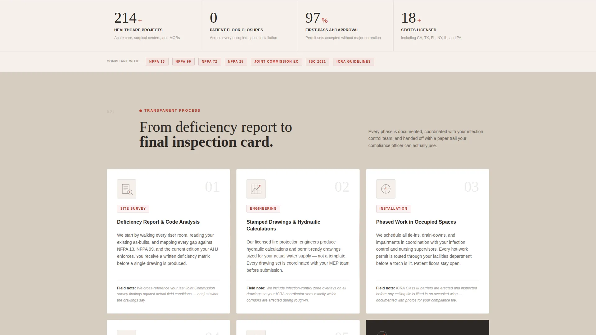
Each modular card represents one stage of a fire protection project. Cards cover survey and code analysis, engineered drawings, phased installation around occupied spaces, system commissioning, and AHJ final sign-off. Every card includes a line-art icon, a two-sentence plain-language explanation, and a real operational detail, such as Infection Control Risk Assessment (ICRA) barrier coordination during sprinkler rough-in or hot-work permit handling with infection control teams.
Isometric Line-Art Header
The header features a technical cutaway illustration of a hospital floor drawn in thin mortar-gray strokes on limestone white. Sprinkler risers, standpipes, fire alarm panels, and clean agent cabinets are all visible. Each system carries a single pulsing red node at its activation point, giving the illustration immediate visual authority with both engineers and administrators.
Warm Stone Color System
The palette uses limestone white, mortar gray, corridor beige, and suppression-red in a disciplined hierarchy. Background rows alternate between limestone white and corridor beige to visually separate card sections. Suppression-red appears only on calls to action and critical callouts, ensuring it carries full visual weight every time it appears.
Click-Through call to action Architecture
The primary call to action, "Schedule a Facility Walk-Through", appears in suppression-red after the process cards. It is positioned deliberately, after the visitor has seen the full methodology. A secondary text link, "Download Our Healthcare Compliance Checklist," offers a lower-commitment option for visitors not yet ready to book a consultation.
Fade-In Headline Overlay
A headline fades in over the isometric header illustration: "Fire Protection That Never Interrupts Patient Care." The animation is subtle and purposeful, reinforcing the contractor's core value proposition at the moment a visitor first lands on the page.
Service Utility Visual Theme
The overall design theme reflects a well-maintained hospital corridor, warm fluorescents on terrazzo, nothing decorative, everything functional. Mortar gray carries body text and icon strokes. The layout is clean, legible, and structured to communicate reliability through visual order rather than marketing flair.
Page sections overview
| Section | Purpose |
|---|---|
| Isometric Header | Establishes technical credibility with a line-art hospital cutaway and fade-in headline |
| Process Card Grid | Walks visitors through each project phase with icons, plain-language copy, and operational details |
| Primary call to action Block | Prompts facility directors to schedule a project consultation after reviewing the methodology |
| Secondary Lead Capture | Offers a compliance checklist download for visitors not yet ready to book a meeting |
Design & branding system
The visual identity is built around a Service Utility theme. It communicates competence through restraint, the way a well-organized mechanical room communicates competence without needing a sign.
- Color system uses limestone white (#F5F0EB), mortar gray (#9B958F), corridor beige (#D6CCBF), and suppression-red (#C0392B) in a strict hierarchy
- Backgrounds alternate between limestone white and corridor beige to separate card rows without harsh contrast; mortar gray carries all body text and icon strokes
- Suppression-red is reserved exclusively for calls to action and critical callouts, appearing sparingly the way a pull station appears on a hospital wall
Mobile & speed optimization
The modular card-grid layout is structured to adapt naturally across screen sizes. Each card is self-contained, which means the grid can reflow from multi-column to single-column without losing the sequential, phase-by-phase logic of the design.
- Card modules are independent units, so the process flow reads clearly on both desktop and mobile viewports
- The line-art illustration and thin-stroke icons are lightweight by design, keeping the visual system from adding unnecessary load to the header section
- call to action placement is retained on smaller screens, ensuring the "Schedule a Facility Walk-Through" button remains reachable after the process cards
How this template helps you convert
This template is built as a click-through page. Every structural decision is oriented toward one outcome: moving a qualified facility director from skeptical visitor to booked consultation.
- The transparent process card grid builds methodological trust before any ask is made, so the visitor arrives at the call to action already understanding how a project would run
- The suppression-red call to action appears only after the full process has been presented, making the ask feel earned rather than premature
- The secondary "Download Our Healthcare Compliance Checklist" text link retains visitors who are not yet ready to schedule, giving the contractor a second path to engagement without disrupting the primary conversion flow
Other information about this template
This template is purpose-built for the hospital and clinic fire protection contractor niche within the broader construction and home services category. It is not a general-purpose contractor template adapted for healthcare, every design and copy decision reflects the specific demands of working in occupied medical facilities.
- The template is categorized under Hospital and Clinic Construction, making it relevant for contractors who handle both new compliance work and tenant improvement projects in live clinical environments
- The card-grid structure supports the Transparent Process creative direction, which is particularly effective for regulated industries where buyers need to evaluate vendor methodology before committing
- The Warm Stone color system and Service Utility theme make this template visually distinct from standard blue-and-gray contractor layouts, helping a healthcare fire protection contractor stand out in a space where most competitors rely on generic trade-contractor aesthetics
Theme
Service Utility
Creative direction
Transparent Process
Color system
Warm Stone
Style
Card Grid (Modular)
Direction
Click-Through
Page Sections
Phase-by-phase Process Card Grid
Isometric Line-art Header Illustration
Warm Stone Disciplined Color System
Click-through Call to Action Architecture
Fade-in Headline Overlay
Service Utility Visual Theme
Related questions
Who is this landing page template designed for?
Can I adapt the process card content to match my specific project phases?
What is the purpose of the two call-to-action options on this page?
Is this template suitable for contractors handling retrofit projects in active hospitals?
How is suppression-red used in this template's color system?



