Veterinary & Animal Hospital Booking Website Template
Housecall is a split-screen landing page built for mobile veterinary practices. It pairs a credential-heavy badge display with warm candid photography, then walks visitors through a real home visit using scroll-linked panel reveals. The goal is simple: replace clinic anxiety with calm confidence, and turn that confidence into a booked appointment.
by Rocket studio
Quick summary
Housecall is a single-page, click-through landing page for mobile veterinary practices. It uses a 50/50 split-screen layout throughout, pairing professional trust signals with honest, human storytelling. Visitors scroll through a real home visit, see what equipment arrives at the door, read client testimonials, and land on a booking prompt, all without filling out a single form.
Who this template is for
This template is built for veterinarians who practice outside clinic walls. It speaks directly to a specific kind of client and a specific kind of care.
- Mobile vet practices looking to book more home visits through a calm, trust-first page
- Veterinarians serving elderly pet owners, rescue fosters, or households with anxious or handling-resistant animals
- Solo practitioners or small mobile practices that want a polished, credential-forward online presence without a complex multi-page site
What problem this template solves
Pet owners who need mobile veterinary care often have one quiet fear: can real medicine actually happen outside a building? They worry about whether a home visit is a lesser option. This template answers that fear directly, before the visitor ever has to ask.
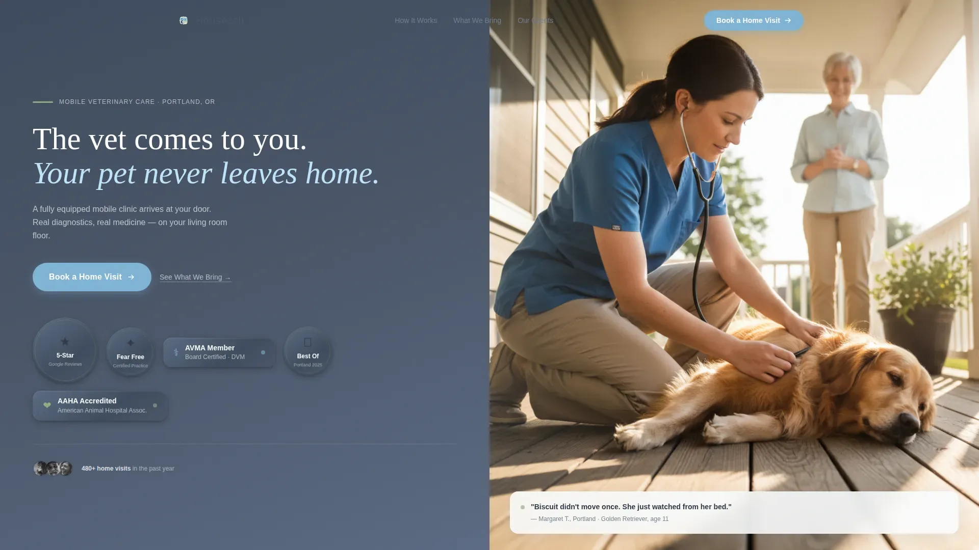
- It removes the "is this legitimate?" doubt by leading with board certifications and a Fear Free Certified Practice emblem
- It replaces clinic-visit assumptions with a transparent, step-by-step home visit walkthrough
- It lowers booking friction by sending one click straight to a scheduling tool, skipping form fields entirely
What you get with this template
You get a complete, ready-to-customize landing page built around a single conversion goal: getting a visitor to book a home vet visit. Every section has a job, and every design choice supports it.
- A split-screen hero with an award badge cluster on one side and a candid vet photo on the other, plus a sticky "Book a Home Visit" call to action
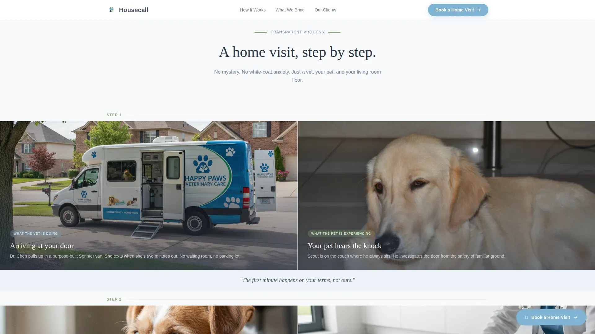
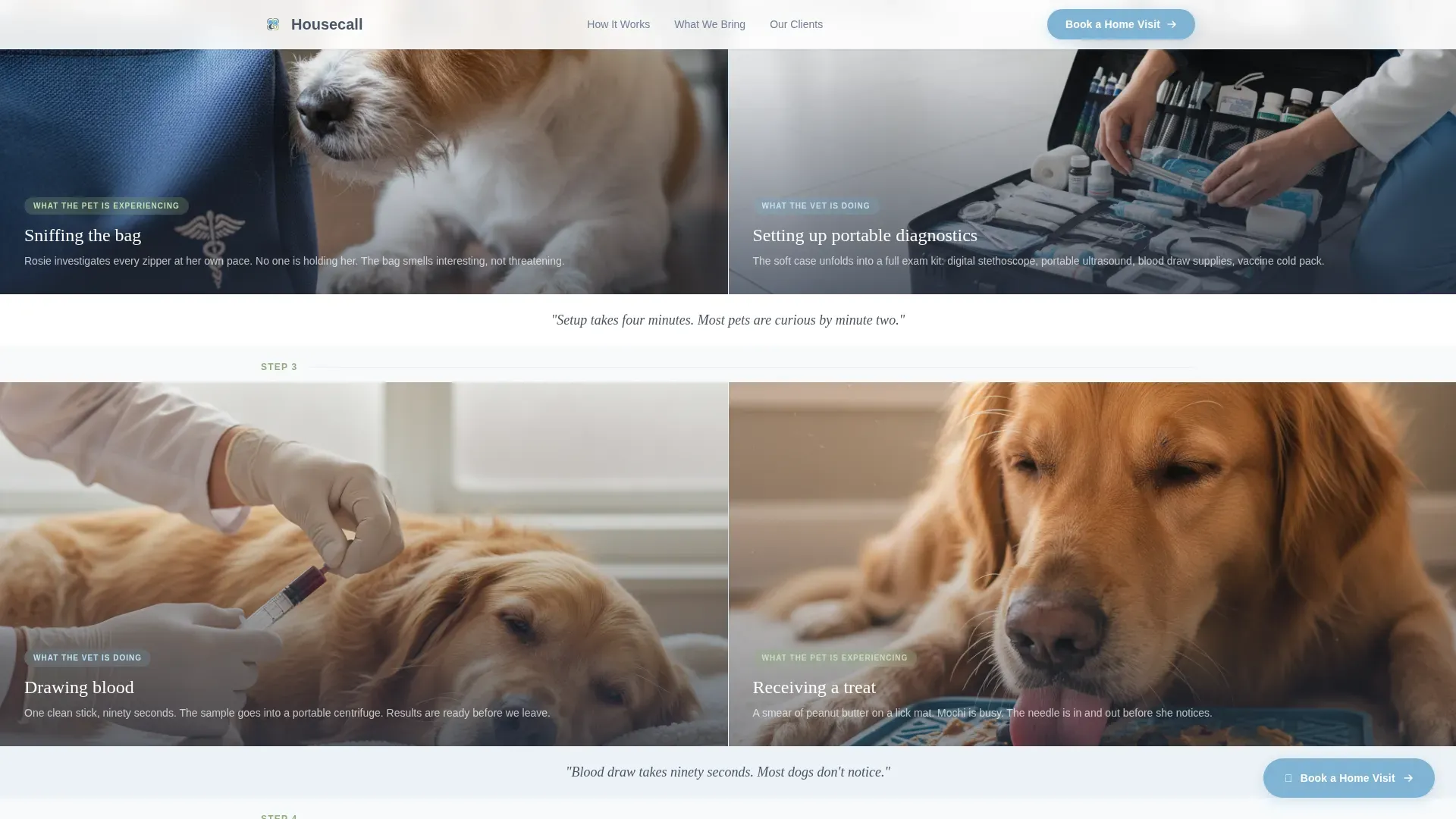
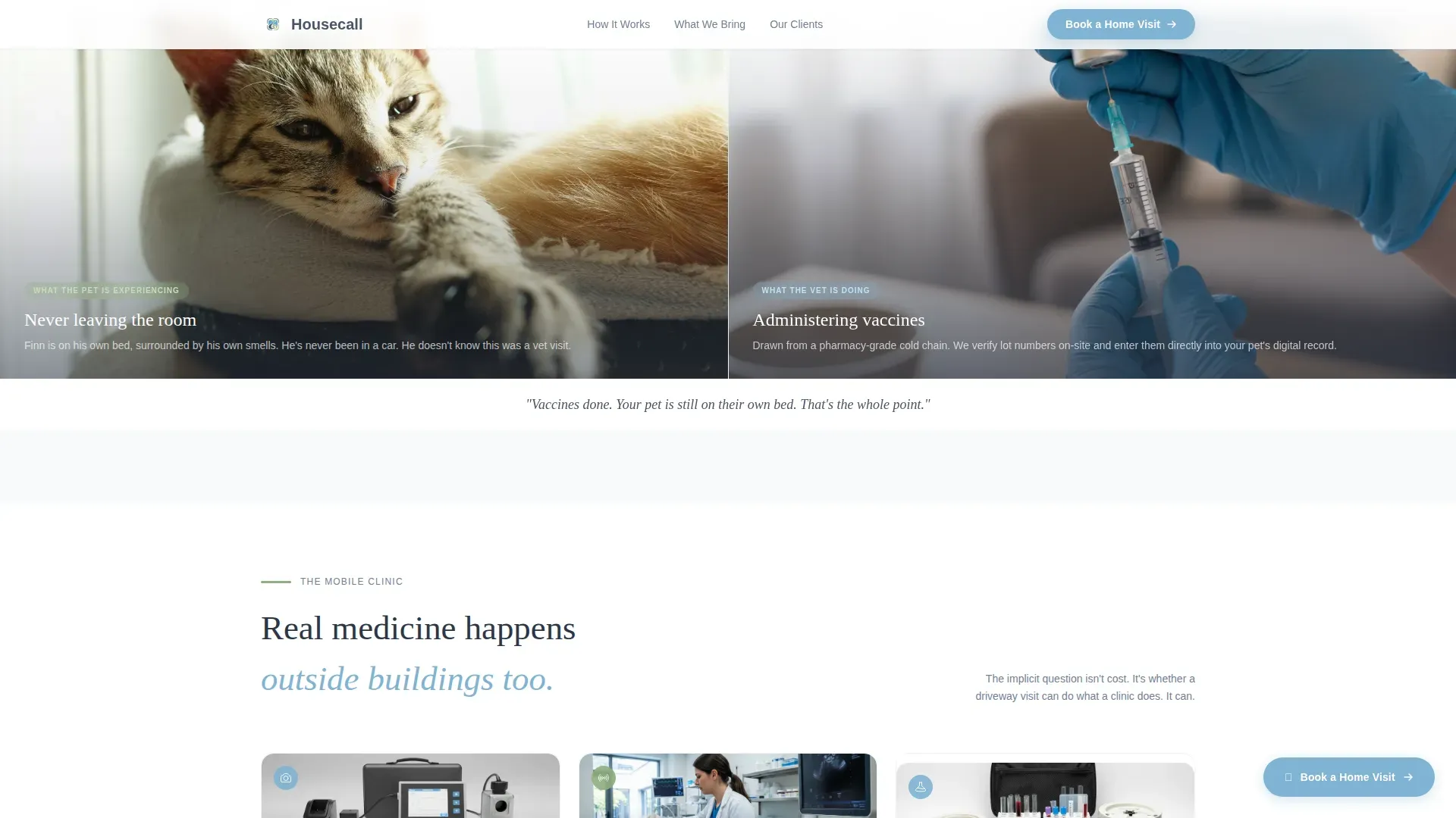
- A scroll-linked process reveal section showing each stage of a home visit in sequential left-right panel pairs
- An equipment lightbox, client testimonials, and a zip-code-aware closing call-to-action section
Feature list
A brief note: every feature below is drawn directly from the template brief. Nothing here is speculative.
Split-Screen Hero with Award Badge Cluster
The hero divides into two equal halves. The left panel displays veterinary board certifications, local recognition seals, a Fear Free Certified Practice emblem, and a five-star aggregate badge. Each badge is rendered as a tactile, lightly shadowed medallion on a slate background. The right panel holds one candid photograph of a vet with a patient, grounding the credentials in human reality.
Scroll-Linked Process Reveal Panels
As visitors scroll, sequential split panels reveal each stage of a home visit side by side. The left side shows what the vet is doing: arriving, setting up portable diagnostics, drawing blood, administering vaccines. The right side shows what the pet is experiencing: staying on their own bed, sniffing the bag, receiving a treat. Each pair carries a single honest caption.
Equipment Lightbox Inventory
A secondary text link labeled "See What We Bring" opens a lightbox modal listing the mobile clinic's equipment. Items include a portable X-ray unit, ultrasound, and a pharmacy drawer. This section directly addresses the implicit objection that real medicine cannot happen outside a traditional building.
Sticky Booking Call to Action
A "Book a Home Visit" button appears anchored in the hero and repeats as a sticky button that follows the visitor on scroll. One click routes to a scheduling tool pre-filtered by zip code. There is no contact form on this page.
Client Testimonial Vignettes
Three testimonial blocks include real client names, pet names, and specific outcomes. This level of specificity builds credibility faster than generic five-star reviews. The social proof sits between the process reveal and the final call-to-action section.
Zip-Code-Aware Booking Prompt
The closing section presents a warm, localized booking prompt. Visitors are directed to a scheduling tool that filters availability by zip code, reducing the gap between interest and confirmed appointment.
Page sections overview
| Section | Purpose |
|---|---|
| Hero Split Screen | Introduce credentials and warmth side by side |
| Process Reveal Panels | Walk through each home visit stage honestly |
| Equipment Lightbox Trigger | Overcome the "real medicine?" objection visually |
| Client Testimonials | Reinforce trust with specific, named outcomes |
| Final Booking Prompt | Close with a localized, low-friction booking step |
| Minimal Footer | Provide navigation and contact without distraction |
Design & branding system
The visual identity uses an Organic Flow theme. Every color, typeface, and spacing decision reinforces a single feeling: unhurried, competent, and genuinely warm. There are no clinical whites or hard edges.
- Color palette: weathered slate (#4A5568) for primary text and grounding elements, open-sky blue (#7FB3D3) for interactive highlights and section transitions, soft cloud white (#F7FAFC) for backgrounds, and warm lichen green (#8FAE7E) for trust markers and icons
- Typography: DM Sans handles body copy with clean readability, while Fraunces serif display headlines add warmth and character to key moments
- Visual texture: lightly shadowed badge medallions, scroll-linked panel animations at medium intensity, and hover states on interactive elements give the page a tactile, handcrafted feel
Mobile & speed optimization
The template is designed desktop-first, with a deliberate and well-considered mobile fallback built in. No feature is lost on smaller screens; the layout simply adapts.
- Split-screen panels stack vertically on mobile so each side remains fully readable without side-scrolling
- The sticky booking button remains fixed and accessible at all scroll positions on both desktop and mobile viewports
- Static sections use Server Components for efficient rendering, while the lightbox modal and sticky button behavior use Client Components to keep interactivity responsive
How this template helps you convert
Every structural decision on this page moves a hesitant visitor toward booking. The conversion path is short and intentional.
- Trust is established immediately: the badge cluster and candid photo in the hero answer "is this practice credible?" before the visitor scrolls at all
- Doubt is resolved through specificity: the process reveal panels replace the mystery of a home visit with a picture-by-picture walkthrough, and the equipment lightbox answers the "can real medicine happen here?" question with concrete inventory
- Booking is one click away: the sticky call-to-action button is always visible, and the scheduling tool is pre-filtered by zip code so the visitor never has to search for availability manually
Other information about this template
This template fits naturally into the mobile veterinary care space, where the online presence often needs to work harder than a clinic's physical location. A few additional details worth knowing:
- The page layout is built as a single-page landing experience, not a multi-page website
- Footer follows a horizontal flow pattern, keeping the closing experience clean and uncluttered
- The template is localized for a United States audience, using English copy and USD pricing context where applicable
- The Pacific Northwest visual tone, cool stone palette, and unhurried pacing make this template especially well suited for practices in that region, though it adapts cleanly to other markets
- The creative direction is called Transparent Process, meaning the design philosophy centers on showing the visitor exactly what will happen, removing uncertainty at every scroll step
Theme
Organic Flow
Creative direction
Transparent Process
Color system
Slate & Sky
Style
Split Screen (50/50)
Direction
Click-Through
Page Sections
Split-screen Hero with Badge Cluster
Scroll-linked Process Reveal
Equipment Lightbox Modal
Sticky Booking Call to Action
Named Client Testimonial Blocks
Zip-code-aware Closing Prompt
Related questions
Does this template include a contact form?
Can I update the credential badges in the hero section?
How does the equipment lightbox work?
Is this template a good fit for a solo mobile vet practice?
What happens when the split-screen layout is viewed on a phone?



