Japanese Architecture Portfolio Website Template
Hozon is a Bold Brutalist landing page template built for Japanese heritage preservation consultants. It combines an iridescent AI color system with an immersive overlap layout to turn forensic material expertise into trust. Nine-tile photo mosaics, ghosted isometric diagrams, and stackable case study cards guide institutional clients toward a consultation request.
by Rocket studio
Quick summary
Hozon is a single-page Click-Through landing page template for a Japanese preservation consultancy. It uses an Overlap/Layered structure where panels slide over one another like pages in a conservation dossier. Sumi ink backgrounds, iridescent accent bleeds, and brutally large bilingual typography create a visual identity that feels ancient and forensic at once.
Who this template is for
This template was designed for heritage professionals who need to demonstrate deep material expertise before a client ever fills in a form. The audience is institutional and discerning. They respond to evidence, not decoration.
- Temple abbots and shrine custodians dealing with post-typhoon structural damage
- Municipal heritage officers preparing Agency for Cultural Affairs applications
- Private collectors managing flaking Edo-period lacquerware and folding screens
What problem this template solves
Most consultancy pages list services in bullet points and ask for a callback. That approach fails in the heritage preservation field, where clients must trust your diagnostic eye before they hand over a centuries-old structure. This template closes that trust gap visually.
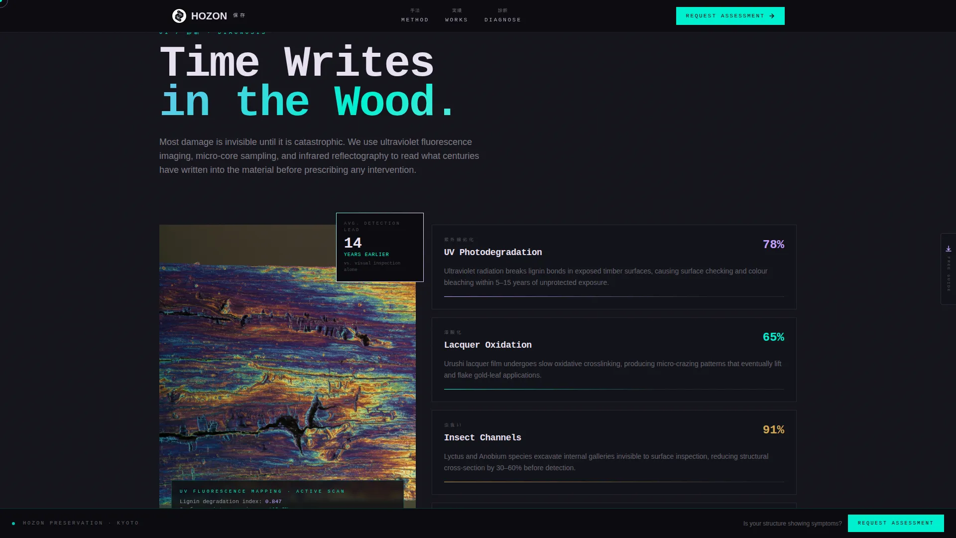
- Neglect feels abstract until you show the slow chemistry of decay in iridescent false-color detail
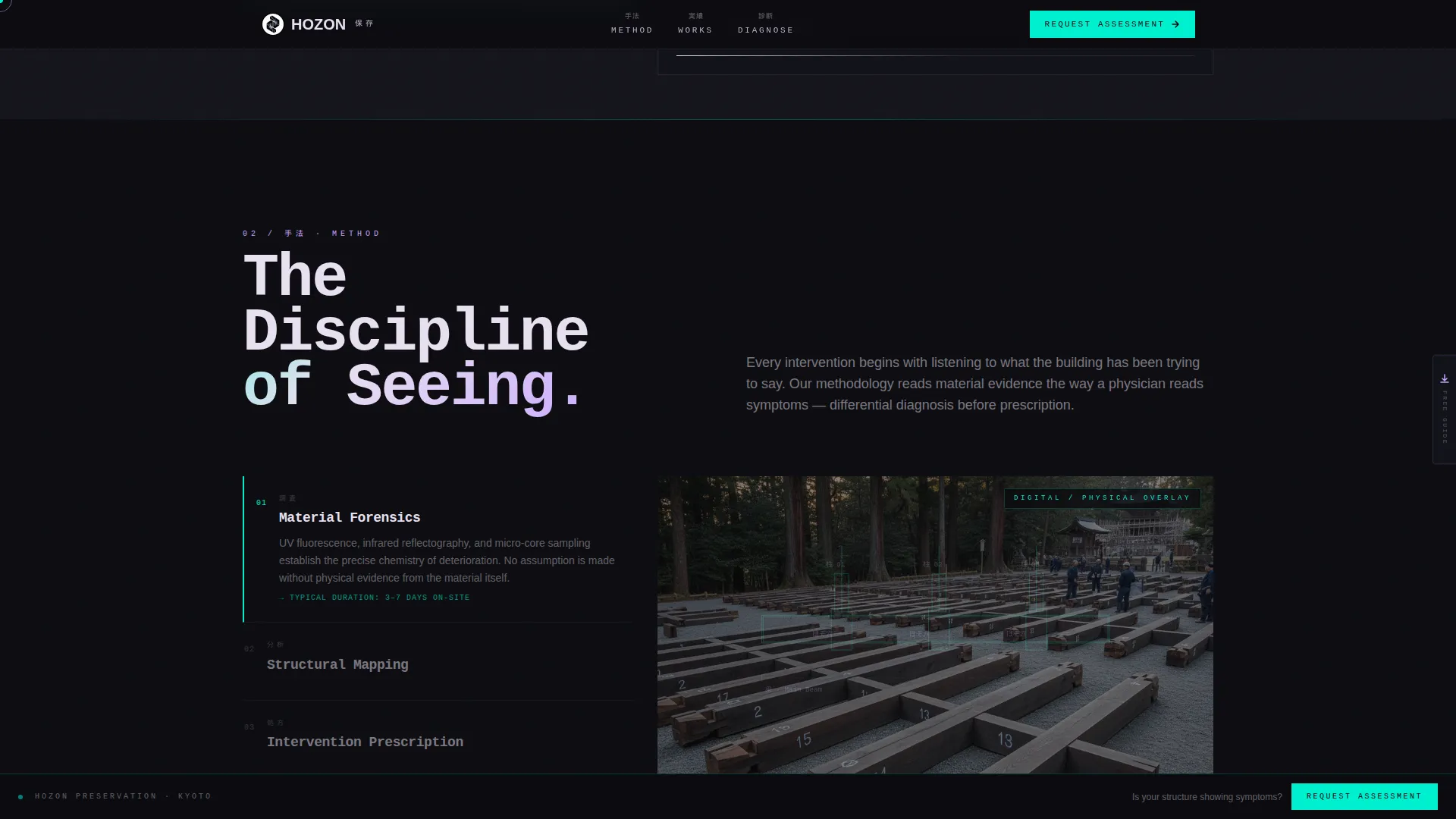
- Methodology stays invisible until isometric joinery diagrams ghost over actual photographs of the joints
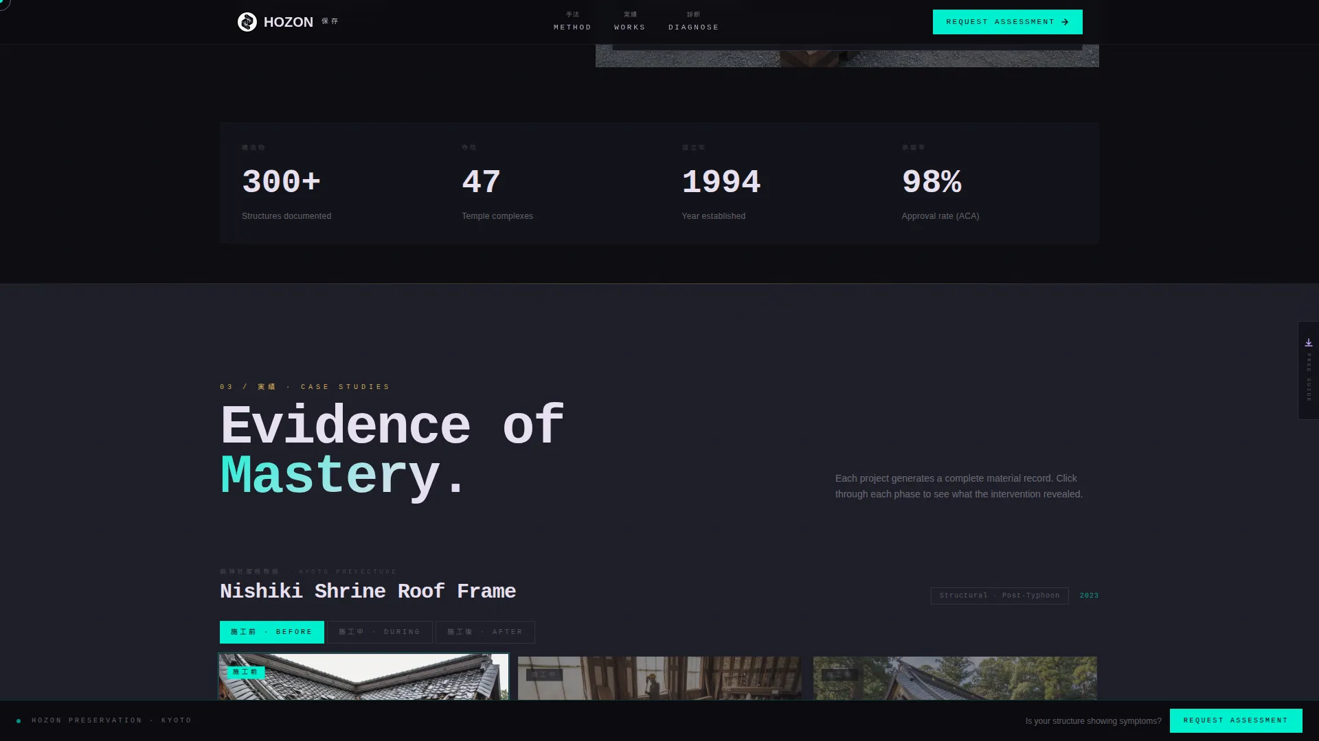
- Credibility is implied rather than proven until before, during, and after case studies are stacked in one place
What you get with this template
You receive a fully structured, desktop-first landing page with high-animation interactivity and a clear Click-Through flow. Every section is built to accumulate proof before the primary call to action appears.
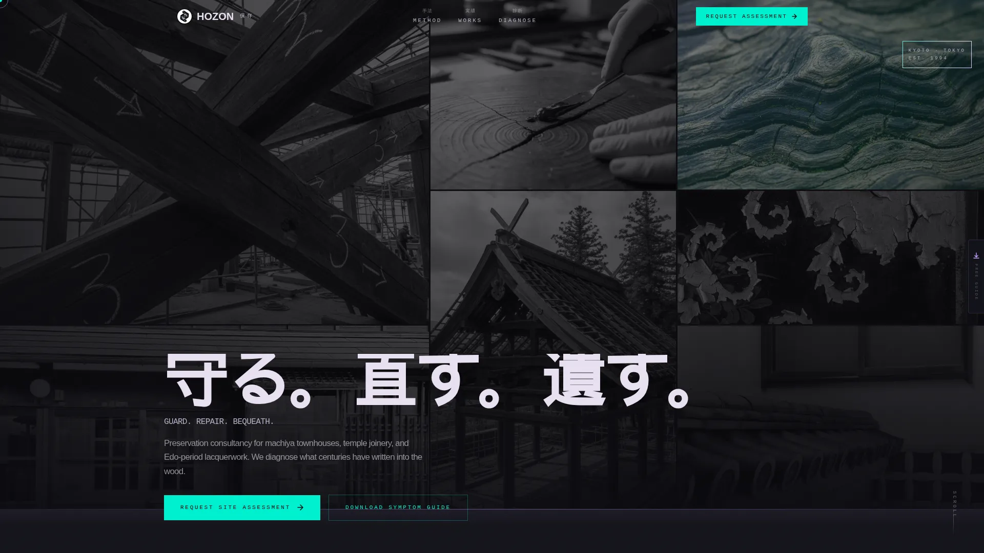
- A nine-tile brutalist photo mosaic header with a scroll-triggered Japanese typographic crash
- Five thematically sequenced content sections that overlap by thirty percent as the user scrolls
- A fixed spectral teal call-to-action bar, a full-width brutalist conversion block, and a slide-out email capture panel
Feature list
This section describes the key built-in components and design capabilities included in the Hozon template.
Nine-Tile Brutalist Photo Mosaic Header
Nine unevenly cropped images are arranged in overlapping blocks that intentionally break the grid. Eight tiles are desaturated; one glows with iridescent color grading to pull the eye. A scroll-triggered typographic crash reveals the bilingual headline 守る。直す。遺す。 in heavy monospaced type.
Overlap/Layered Panel Scroll Structure
Each content section slides over the previous one by thirty percent, mimicking pages being laid across a conservation lightbox. Parallax micro-shifts on images and iridescent border cycling reward slow, attentive reading at every scroll position.
Isometric Joinery Diagram Overlay
The methodology section layers digital isometric drawings of joinery disassembly directly over photographs of the physical wood. The diagram ghosts atop the image, making the diagnostic process transparent and visually compelling.
Stackable Before/During/After Case Study Cards
Case studies appear as triptych cards showing each intervention phase on its own overlapping panel. Visitors can click to stack or expand cards, keeping the layout asymmetric and evidence-driven without overwhelming the page.
Fixed Call-to-Action Bar and Slide-Out Email Panel
After the second section, a fixed bottom bar in spectral teal on sumi black carries the primary call to action. A secondary email capture panel slides out from the page edge without any navigation change, gating a downloadable PDF guide.
Bilingual Japanese and English Display Typography
Key phrases appear in Japanese kanji alongside English, rendered in JetBrains Mono and Manrope at brutally large sizes with tight tracking. The typographic system reinforces institutional authority and cultural specificity simultaneously.
Page sections overview
| Section | Purpose |
|---|---|
| Hero Photo Mosaic | Establish material intimacy with nine overlapping image tiles and a scroll-triggered bilingual headline |
| The Problem | Visualize decay through iridescent false-color degradation mapping and material diagnostic context |
| Methodology Diagrams | Ghost isometric joinery drawings over real photographs to make the diagnostic process visible |
| Case Study Triptychs | Present before, during, and after cards in a stackable asymmetric layout as proof of intervention quality |
| Consultation Call to Action | Full-width brutalist block and fixed spectral teal bar driving clicks to the consultation request form |
| Footer Arc Split | Logo and tagline on the left, navigation links on the right, anchoring the page with quiet authority |
Design & branding system
The visual identity is built on the tension between raw archival darkness and alien iridescent light. Sumi ink dominates every background in heavy, unbroken slabs. Iridescent accents then bleed across overlapping panel edges, cursor trails, and scroll-triggered highlights like digital patina forming over centuries.
- Color palette: sumi ink (#0B0B0F) as dominant background, holographic lilac (#C4A1FF), spectral teal (#00F0D0), and interference pearl (#E8E0F0) for accents and text
- Typography: JetBrains Mono and Manrope at large sizes with tight tracking, refusing all decorative ornamentation
- Animation layer: cursor trail effects, iridescent border cycling, parallax micro-shifts on images, and scroll-triggered type crashes using GPU-accelerated transforms
Mobile & speed optimization
The template is built desktop-first to serve institutional clients reviewing heritage documentation at a workstation. The animation and interactivity layer is designed with performance constraints in mind.
- All animations use GPU-accelerated transforms to reduce layout recalculation during scroll
- Section reveals are driven by Intersection Observer, so off-screen content does not load animation until needed
- Heavy visual sections are structured so content hierarchy remains clear even before animations fully render
How this template helps you convert
The page converts by making material neglect feel urgent and expert intervention feel reverent. No form fields appear on the landing page itself. The click-through earns its click by stacking proof before the ask.
- The fixed spectral teal call-to-action bar appears after the second section and stays visible through every remaining scroll position, keeping the primary action persistent without being intrusive.
- The slide-out email panel offers a downloadable PDF guide gated behind a single email field, creating a low-friction secondary conversion path that does not disrupt the main scroll journey.
- The full-width brutalist call-to-action block before the footer delivers the final, high-confidence ask after case study evidence has already been absorbed.
Other information about this template
Hozon sits at the intersection of the Architecture and Design category and the Japanese Architecture subcategory. It is specifically scoped for the Japanese preservation consultant niche, where institutional trust and material credibility determine whether a potential client makes contact.
- The template style is Overlap/Layered, which is distinct from standard stacked or card-grid layouts
- The creative direction is Immersive Visual, meaning every section is built to reward lingering rather than fast scanning
- The color system is classified as AI Iridescent, using gradient hover states and interference-pattern accents that shift across panel edges
- The header concept is a Photo Grid Mosaic with intentional brutalist asymmetry, not a standard full-bleed hero image
- The landing page direction is Click-Through, routing visitors to a separate consultation request form rather than collecting data on-page
Theme
Bold Brutalist
Creative direction
Immersive Visual
Color system
AI Iridescent
Style
Overlap/Layered
Direction
Click-Through
Page Sections
Nine-tile Brutalist Photo Mosaic
Overlap/layered Panel Scroll
Isometric Joinery Diagram Overlay
Stackable Case Study Triptych Cards
Fixed Call-to-action Bar and Slide-out Panel
Bilingual Display Typography System
Related questions
Who is the Hozon template designed for?
Does this template include a contact form?
What makes the visual design distinctive?
Can I adapt the case study section for my own projects?
Is this template suitable for a bilingual Japanese and English audience?



