Specialist Baby & Kids E-Commerce Professional Website Template
Huddle is a baby and kids group buying landing page template built for platforms where parents and caregivers pool their purchasing power to unlock wholesale prices. It features overlapping device mockups, animated before-and-after price reveals, a progressive sign-up form, and dual conversion paths for group organizers and joiners, all wrapped in a warm sunset gradient visual system.
by Rocket studio
Quick summary
Huddle is a single-page landing page template for a baby and kids group buying platform. Parents, daycare directors, and parenting group admins can see exactly how bulk orders slash prices, from organic pouches to big-ticket gear. The design is soft, layered, and built to move visitors toward starting or joining a group buy.
Who this template is for
This template was designed for people who already believe in group buying but need a polished, trustworthy front door for their platform. It speaks directly to the people coordinating purchases and the parents ready to join them.
- New parents and caregivers looking to stretch their budget on everyday baby essentials
- Daycare directors and parenting community admins who regularly organize bulk orders
- Founders and product teams launching a baby and kids group buying platform
What problem this template solves
Organizing group purchases for baby products is genuinely valuable, but most platforms look like spreadsheets dressed up with a logo. That mismatch kills trust before a single parent enters their email. This template solves that disconnect by making the savings feel real and the process feel simple.
- Visitors struggle to believe the discount until they see the math unfold section by section
- Organizers need two distinct conversion paths that do not compete with each other
- The sign-up process often feels like a commitment too early, driving drop-offs before any action
What you get with this template
You get a fully designed, section-led landing page that guides two types of visitors, organizers and joiners, toward the action that fits them. Every visual choice reinforces the core promise: buy together, pay less.
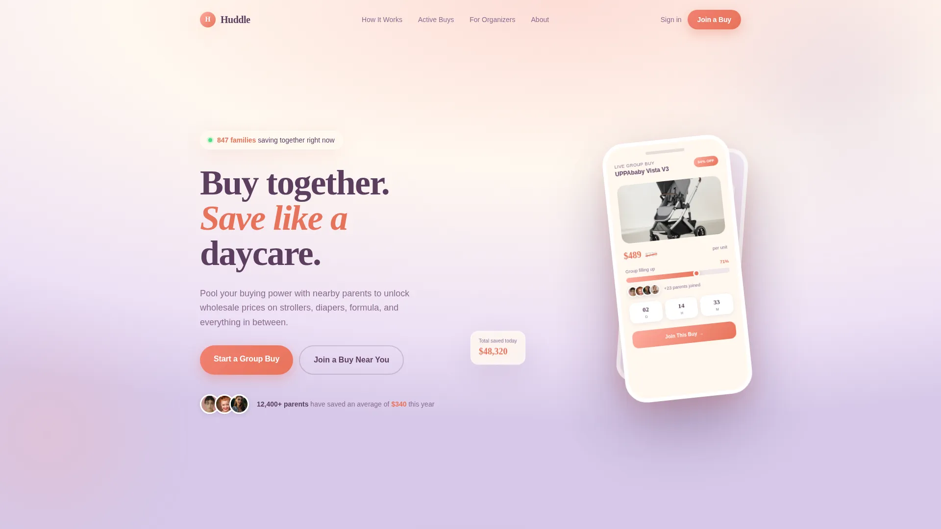
- An overlapping device mockup header with a live group buy preview, progress bar, and countdown timer
- A scrollable before-and-after price reveal sequence that escalates from small savings to big-ticket gear
- A progressive disclosure sign-up form with category selection, group size estimate, and email capture
Feature list
This section covers the core built-in components that make Huddle work as a conversion-focused landing page.
Layered Device Mockup Header
The header shows a floating phone screen angled slightly left, displaying a live group buy with a progress bar, joined-parent avatars, and a countdown timer. A second screen peeks behind it showing a product grid. The layered composition creates a sense of depth and immediately demonstrates the platform in action.
Before-and-After Price Reveal Sections
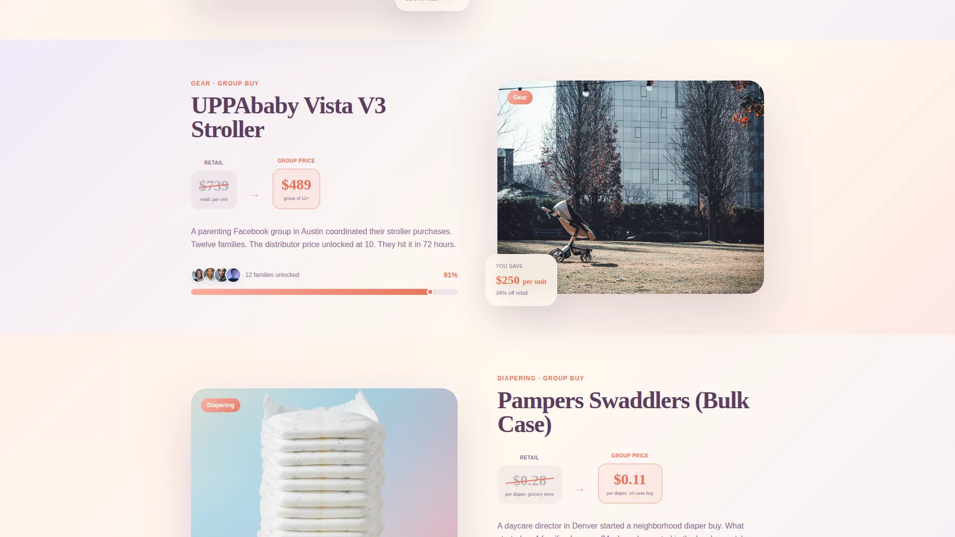
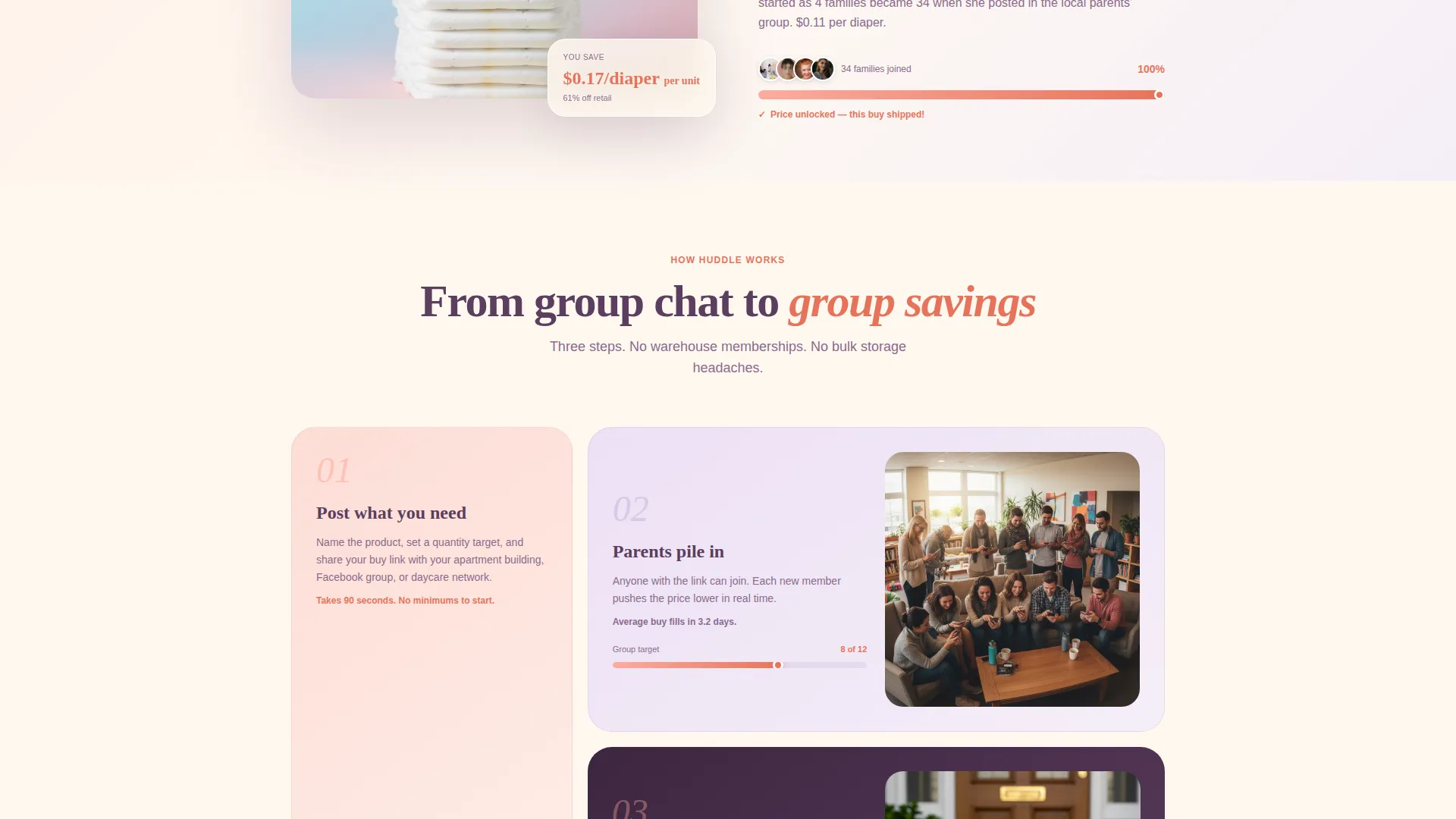
Each scroll section splits a product's retail price against the group buy outcome. An illustrated progress bar fills as parent avatars join one by one. The sequence escalates from small everyday items to high-value baby gear, making the savings math undeniable by the time a visitor reaches the call to action.
Dual Conversion Call-to-Action System
A primary "Start a Group Buy" button is placed after the second product reveal and also pinned as a floating button throughout the scroll. A secondary path reads "Join a Buy Near You" with a zip code field that surfaces active local groups. Both paths coexist without competing.
Progressive Disclosure Sign-Up Form
The form asks for product category first, then group size estimate, then email address. This three-step sequence feels like browsing rather than committing. It lowers the perceived barrier and keeps drop-off low across both organizer and joiner audiences.
Live Group Buy Ticker
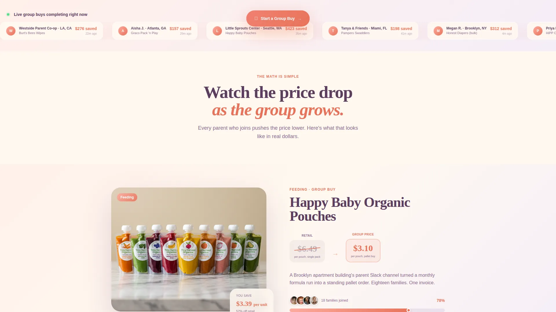
A live-style ticker displays recently completed group buys with real dollar amounts saved. This element builds immediate social proof and keeps the page feeling active, even for first-time visitors who have not yet joined a buy.
Soft Gradient Card Grid Layout
Cards and section dividers use a warm gradient wash across their backgrounds. Layered elements cast subtle shadows that create depth without visual clutter. The modular card grid layout makes the page easy to scan and adapts cleanly to different product categories.
Page sections overview
| Section | Purpose |
|---|---|
| Header with Mockups | Introduces the platform with layered phone screens, a live group buy preview, progress bar, and countdown |
| Headline and Hook | Delivers the core value statement: "Buy together. Save like a daycare." |
| First Price Reveal | Shows retail versus group price on a small everyday item like organic pouches |
| Progress Bar Visual | Animates parent avatars joining and the price dropping as the group grows |
| Second Price Reveal | Escalates to a higher-value product, reinforcing the savings pattern |
| Primary call to action Block | Places the "Start a Group Buy" button prominently after the second reveal |
| Join a Buy Section | Offers the secondary path with a zip code field to find active local groups |
| Progressive Sign-Up Form | Collects category preference, group size, and email through a three-step flow |
| Live Savings Ticker | Shows recent completed group buys with dollar amounts saved |
| Footer | Closes the page with supporting navigation and trust elements |
Design & branding system
The visual identity uses a Soft Gradient theme built around a Sunset Gradient color system. Every color choice is intentional, warm without being loud, soft without feeling unfinished. The overall effect feels like the sky outside a nursery window at golden hour.
- Core palette: warm peach (#FDAB9E) melting into soft lavender (#C3AED6), with creamy cloud white (#FFF8F0) as the page background
- Accent and action color: gentle coral (#E8735A) used consistently for buttons and progress indicators
- Gradients wash across card backgrounds and section dividers; layered elements use barely-there shadows for depth without visual weight
Mobile & speed optimization
The template is built with a single-page, section-led structure that keeps the layout manageable at any screen size. The layered device mockup and card grid both adapt to narrower viewports without losing their core visual logic.
- Floating call-to-action button remains accessible on scroll across mobile screen sizes
- Progressive form disclosure reduces the visual load on smaller screens by revealing one step at a time
- Card grid layout reflows cleanly so product reveals and savings comparisons remain readable on phones and tablets
How this template helps you convert
Every design decision in Huddle is oriented around one outcome: moving a hesitant parent toward taking action. The template earns trust visually before it asks for anything.
- The before-and-after price reveal sequence does the persuasion work section by section, so visitors arrive at the call-to-action already convinced rather than still skeptical.
- The dual-path conversion system means organizers and joiners each see a relevant next step, reducing friction and keeping both audiences moving toward sign-up.
- The live savings ticker and filled progress bar create a sense of active community, signaling that real people are already saving, and that waiting means missing out.
Other information about this template
Huddle was designed with the Baby and Kids group buying niche in mind, where trust and warmth are as important as the numbers. A few additional details worth knowing before you build with this template:
- The template style follows a Card Grid (Modular) approach, making it straightforward to swap in different product categories like feeding, gear, clothing, or diapering
- The header concept is classified as a Device Mockup, meaning the phone screens are visual design elements included in the layout, not live app integrations
- The creative direction is Before-and-After Reveal, a proven structure for group buying and collective pricing platforms where showing the contrast is the entire argument
- The landing page direction is Click-Through, guiding visitors toward a clear next action rather than asking for a lengthy commitment upfront
- The Cloud Canvas color system informed the overall palette approach, complementing the Sunset Gradient with soft, airy backgrounds that keep the page feeling light
- This template fits naturally alongside platforms in the baby gear auction and wholesale kids product space, where communities already organize informal group buys on social media or shared documents
Theme
Soft Gradient
Creative direction
Before/After Reveal
Color system
Cloud Canvas
Style
Card Grid (Modular)
Direction
Click-Through
Page Sections
Layered Device Mockup Header
Before-and-after Price Reveal
Dual-path Conversion System
Progressive Disclosure Sign-up Form
Live Savings Ticker
Soft Gradient Card Grid Layout
Related questions
Who are the two main audiences this landing page is built for?
Can I use this template for product categories beyond baby gear?
Does the countdown timer and progress bar show live data?
What makes the sign-up form feel less intimidating?
Is this template suitable for a marketplace with many active group buys?



