Marketing Professionals Community Landing Page Template
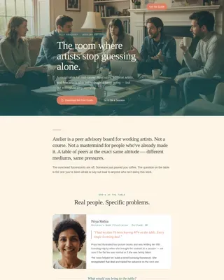
Huddle is a warm, masonry-style landing page template built for a free marketing professionals community on Discord. It uses a botanical color system, testimonial card hero, and Pinterest-style grid to turn casual visitors into active members. The sticky "Pull Up a Chair" call to action and two-field join form make signing up feel effortless and genuinely inviting.
by Rocket studio
Quick summary
Huddle is a single-page, lead-generation landing page template designed for a free marketing professionals Discord community. It pairs a botanical color system with a masonry grid layout to create a warm, neighborhood-feel browsing experience. The sticky call to action, real-member testimonials, and a public channel preview work together to turn curious visitors into engaged community members.
Who this template is for
This template is built for community founders, marketers, and organizers who want to grow a peer-to-peer group for marketing professionals. It works especially well when your audience values authenticity over polish and needs social proof before they commit.
- Freelance copywriters looking for a sounding board between client projects
- In-house marketing managers and agency strategists who want peer support without hierarchy
- Community builders launching a free Discord server for marketing professionals
What problem this template solves
Marketing professionals often feel isolated. They have real questions and no safe place to ask them without looking uninformed in front of a client or a boss. Generic community pages make joining feel like a transaction, not a welcome.
- Visitors leave before joining because the page feels cold or salesy
- Community landing pages often fail to show what daily life inside the group actually looks like
- Most join forms create friction with long fields, vague promises, or implied email sequences
What you get with this template
This template gives you a complete, ready-to-customize landing page that feels lived-in and warm from the first scroll. Every section is designed to build trust before it asks for anything.
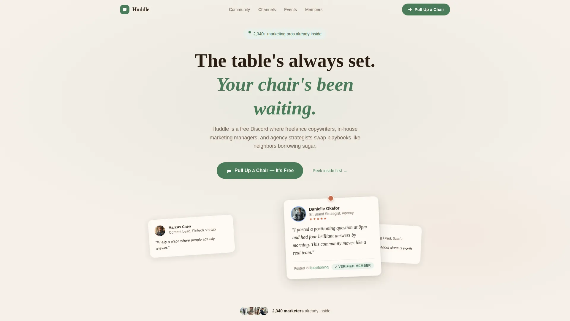
- A hero section with an oversized, slightly tilted testimonial card and peek cards from the edges
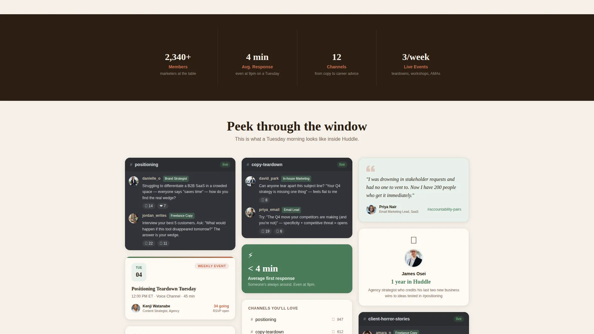
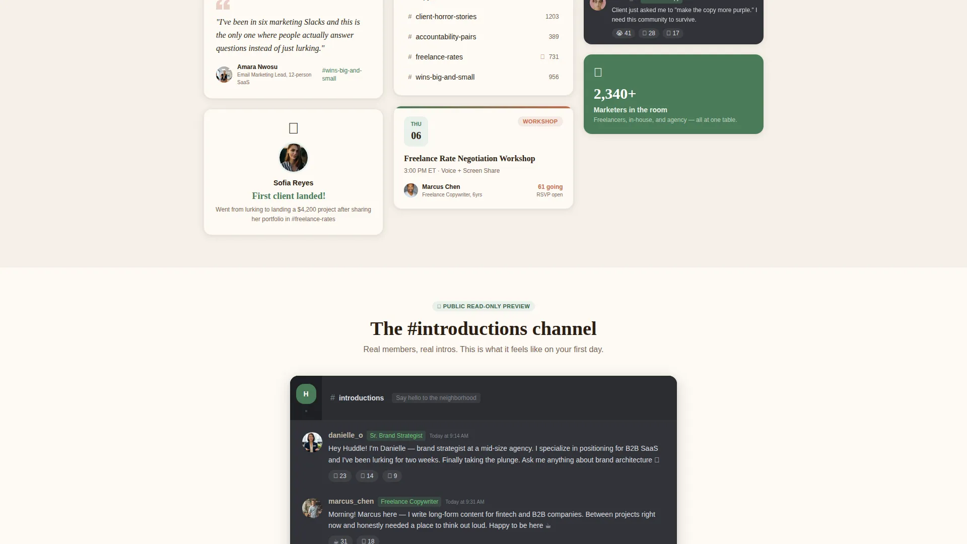
- A Pinterest-style masonry grid filled with Discord thread screenshots, member milestones, and weekly event cards
- A sticky "Pull Up a Chair" call to action button that opens a two-field modal join form
Feature list
This template includes a focused set of purpose-built sections and design decisions. Each one supports the core goal of converting curious visitors into community members.
Testimonial Card Hero
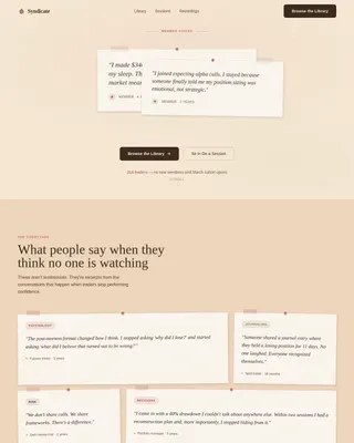
The hero opens with a single large testimonial card pinned slightly askew against a parchment cream background. Real member photos, job titles, and handwritten-feeling quotes anchor the section. Two additional cards peek in from the left and right edges, hinting at a community full of voices.
Masonry Grid Layout
The Pinterest-style masonry grid fills with cards of varying sizes across multiple rows. Cards include blurred Discord thread screenshots, member milestone celebrations, weekly event announcements, and short video clip placeholders. Each row feels more intimate than the one above it, drawing visitors deeper into daily community life.
Public Channel Preview
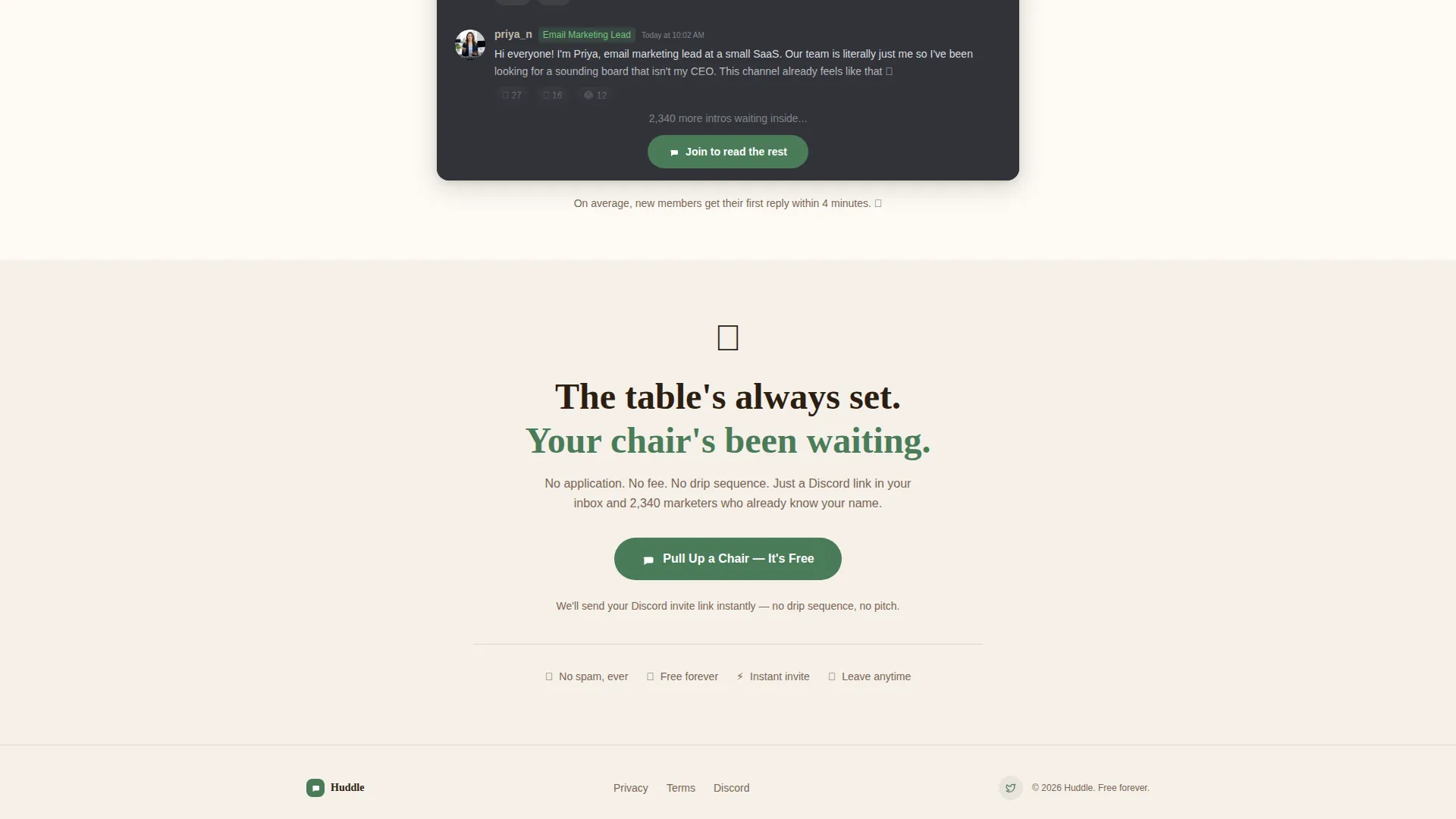
A read-only preview of the #introductions channel lets visitors scroll through real member introductions before committing. This section builds genuine curiosity and a sense of belonging. It makes joining feel inevitable rather than pressured.
Sticky Call to Action Button
A greenhouse green "Pull Up a Chair" button stays fixed as visitors scroll through the page. Clicking it opens a lightweight modal with just two fields: first name and email address. A single reassurance line below the form reads that the Discord invite arrives instantly with no follow-up pitch sequence.
Community Stats Section
A dedicated section displays member count, average response time, and weekly event frequency. These numbers give undecided visitors a clear picture of how active and responsive the community is. Terracotta highlights draw the eye to the most compelling figures.
Botanical Branding System
The color system uses greenhouse green, sun-dried terracotta, soft parchment cream, and deep potting soil. Fraunces handles display headings for warmth and character, while DM Sans keeps body text clean and easy to read. The palette and type pairing reinforce the neighborhood kitchen-table feeling throughout every section.
Page sections overview
| Section | Purpose |
|---|---|
| Testimonial Card Hero | Open with real member voice and social proof |
| Masonry Community Grid | Show daily community life through varied cards |
| Channel Preview | Let visitors browse #introductions before joining |
| Community Stats | Display member count, response time, and events |
| Join Form | Collect first name and email via modal form |
| Minimal Footer | Close the page cleanly without distraction |
Design & branding system
The visual identity follows a Family First theme grounded in a botanical color palette. Every color choice reinforces a sense of warmth, rootedness, and genuine welcome.
- Greenhouse green (#4A7C59) marks active buttons and links; terracotta (#C46D4E) highlights notifications and member counts; parchment cream (#F5F0E8) washes across backgrounds; potting soil (#2C1E12) grounds all body text
- Fraunces is used for display headings and gives the page an earthy, editorial warmth; DM Sans handles body copy with clean, modern readability
- Scroll-triggered card reveals, slight rotation on testimonial cards, and staggered masonry entrance animations bring the page to life without overwhelming the content
Mobile & speed optimization
The template is built with a mobile-first approach, recognizing that community browsers typically scroll on their phones. The design adapts naturally from wide masonry grids to single-column card stacks on smaller screens.
- Images are lazy-loaded so the page feels responsive even with rich visual content
- CSS scroll animations handle motion effects without adding heavy JavaScript overhead
- The sticky call to action button remains accessible and visible on every screen size
How this template helps you convert
Every design and copy decision on this page removes hesitation and replaces it with curiosity. The structure guides visitors from skepticism to belonging in a single scroll.
- The testimonial card hero leads with a real member voice rather than a headline claim, making the first impression feel earned rather than marketed
- The masonry grid and channel preview replace abstract promises with visible, textured evidence of an active, friendly community
- The two-field modal form and the "no drip sequence, no pitch" reassurance line remove the last barrier between a visitor and a Discord invite
Other information about this template
This template is part of the Community and Nonprofit category on the marketplace, designed specifically for the marketing professionals free Discord community niche. It is a single landing page, not a multi-page website.
- The Local and Neighborhood creative direction means the scrolling experience feels like walking down a familiar street, not browsing a corporate product page
- The Masonry and Pinterest layout style is intentional: varied card sizes create visual rhythm and keep visitors exploring longer
- The footer follows a Superhuman Extreme Minimal pattern, keeping the close of the page clean and distraction-free
- This template suits any free peer community in a professional niche where trust and social proof matter more than feature lists
Theme
Family First
Creative direction
Local & Neighborhood
Color system
Botanical
Style
Masonry/Pinterest
Direction
Lead Generation
Page Sections
Testimonial Card Hero with Peek Cards
Pinterest-style Masonry Grid
Sticky Pull Up a Chair Button
Public Channel Preview Section
Community Stats Display
Botanical Color and Typography System
Related questions
Can I customize the colors and fonts in this template?
Does the join form connect to an email service automatically?
Is this template suitable for a paid community, not just a free one?
How does the channel preview section work?
What screen sizes does this template support?