Dynamic Art Supplies Landing Page Template
Pigment is a vibrant art supply landing page template built as a modular card grid. It combines a full-bleed overhead studio photo header, a before/after product card reveal mechanic, and a curated upgrade bundle layout. Designed for art supply retailers, the template guides visitors from casual browsing to confident kit upgrades through visual proof and a personalized quiz flow.
by Rocket studio
Quick summary
Pigment is a single-page art supply landing page template with a modular card grid layout. It opens with a full-bleed overhead studio photo, leads visitors through flipping product cards that reveal before/after transformations, and closes the gap between what a maker owns and what they could own. The template is built to convert browsers into buyers through layered visual storytelling.
Who this template is for
This template is made for art supply retailers and stationery shop owners who sell to serious makers. It suits shops that carry a range of student-grade and artist-grade tools and want to nudge customers toward meaningful upgrades.
- Specialty art supply shops serving lettering artists, watercolorists, and illustrators
- Stationery retailers stocking imported or premium craft tools alongside everyday supplies
- Online shops that want a high-impact single-page layout without a complex multi-page build
What problem this template solves
Most art supply shop pages show products in flat grids with no context. Visitors scroll, skim, and leave without understanding why one tool is better than another. Pigment solves this by making the upgrade argument visual and immediate.
- Product cards passively display tools without showing what those tools can actually produce
- Visitors with mixed skill levels struggle to know which upgrade is right for them
- Generic shop layouts miss the chance to guide a restocking artist toward a higher-value purchase
What you get with this template
The template delivers a complete, ready-to-customize landing page layout built around the art supply upgrade journey. Every section is purposeful and sequenced to build desire before asking for the click.
- A full-bleed overhead header image section with a fade-in headline overlay
- A modular card grid with flip-on-hover before/after reveal mechanics for individual products
- Curated bundle sections that expand on click to show full-width upgrade comparisons
- A sticky bottom bar with a secondary call to action leading to a short personalized quiz
- Grade comparison badges on every product card showing student-grade versus artist-grade status
Feature list
This section covers the core built-in components the template provides, drawn directly from the creative brief.
Full-Bleed Studio Header
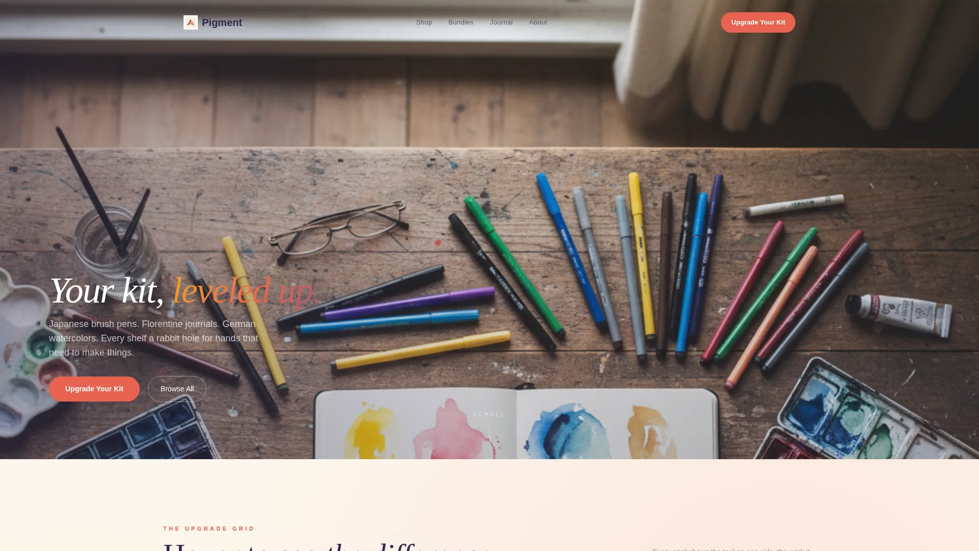
The header fills the viewport with a top-down photograph of a studio table mid-creation. Objects are arranged in deliberate compositional chaos. A single headline fades in over the negative space after the image settles, giving the page a cinematic opening beat.
Before/After Flip Cards
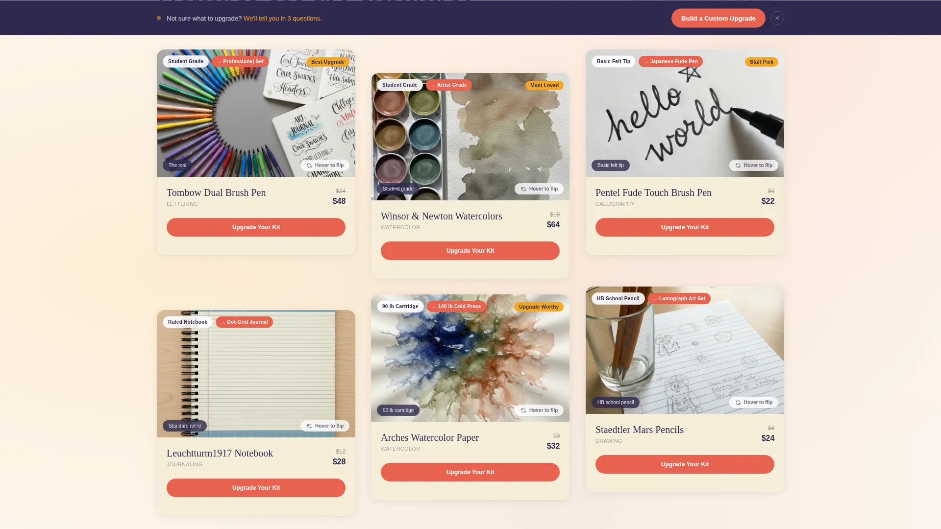
Each product card in the modular grid has two states. The front face shows the tool; the back face reveals the artwork it created. A hover or tap triggers the card flip, making the quality gap between student-grade and artist-grade tools immediately visible without a word of explanation.
Grade Comparison Badges
A small coral badge appears on every card showing the visitor's current grade level and the available upgrade. The badge makes the product gap concrete and personal, turning passive browsing into an active comparison.
Expandable Bundle Sections
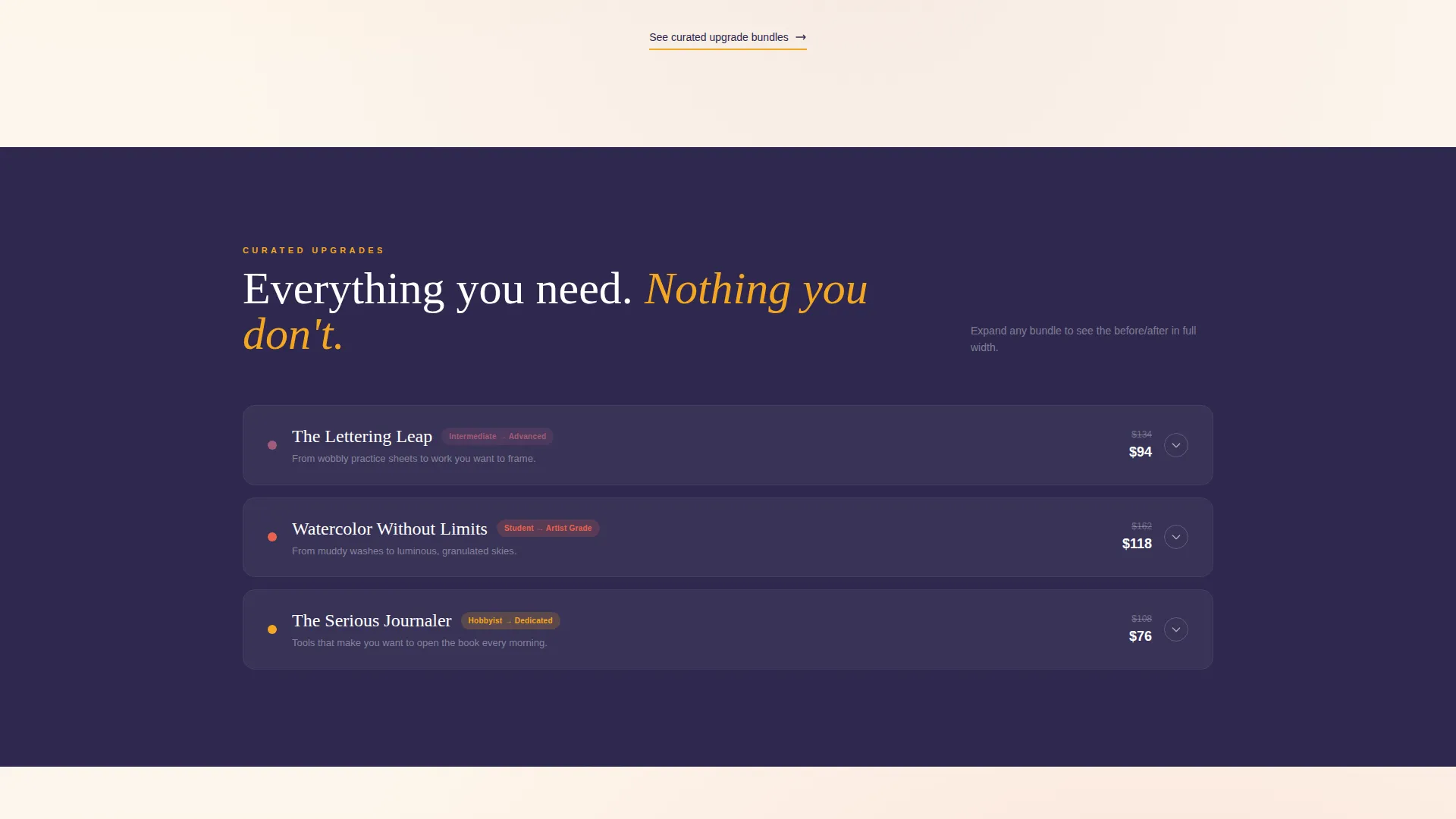
As visitors scroll deeper, individual product cards give way to curated upgrade bundles. Each bundle card expands on click to display the before/after comparison at full width, giving the argument room to breathe and the product proof space to land.
Sticky Upgrade Bar
After the third scroll section, a sticky bottom bar appears with a secondary call to action labeled "Build a Custom Upgrade." The bar stays visible as the visitor continues scrolling, keeping the next step always within reach.
Personalized Quiz Flow
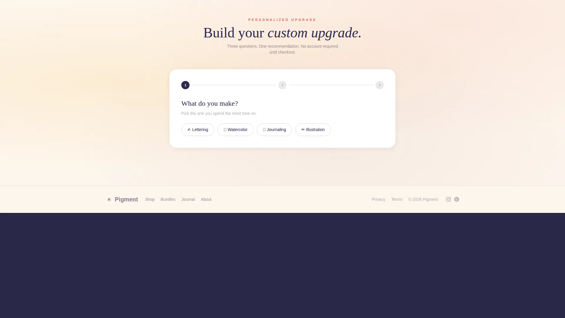
The sticky bar leads to a short three-question quiz: what the visitor makes, how long they have been creating, and what their current go-to tool is. The quiz returns a personalized upgrade recommendation with a one-click add-to-cart path. No account creation is required until checkout.
Page sections overview
| Section | Purpose |
|---|---|
| Full-bleed header | Opens with studio overhead photo and fade-in headline |
| Grade badge row | Signals student-to-artist upgrade framing immediately |
| Individual card grid | Displays tools with flip-card before/after reveal |
| Bundle upgrade sections | Groups tools into curated kits with expandable full-width reveal |
| Sticky bottom bar | Keeps secondary call to action visible throughout scroll |
| Personalized quiz | Returns tailored upgrade recommendation with add-to-cart |
Design & branding system
The visual identity uses a Sunset Gradient palette that feels like a watercolor wash left to dry on a warm windowsill. Warm and cool tones bleed into each other naturally, giving the page depth without clutter.
- Saffron (#F4A623) highlights hover states and upgrade badges; coral (#E8634F) drives all primary call-to-action buttons; dusky mauve (#A25B7B) marks premium tier labels; twilight indigo (#2E294E) grounds navigation and body typography
- Cards sit on a soft parchment base (#FDF6EC) with warm subtle shadows that make each product feel physical, as if resting on a real studio desk
- Typography follows the indigo anchor for legibility, keeping the palette's warmth in decorative elements rather than body text
Mobile & speed optimization
The card grid layout is modular by design, which means it adapts naturally to narrower viewports. Flip interactions convert from hover-triggered to tap-triggered on touch devices, keeping the core reveal mechanic intact on phones and tablets.
- Individual cards restack into a single-column flow on small screens without losing the before/after structure
- The sticky bottom bar remains fixed on mobile, so the quiz call to action is never more than a thumb-tap away
- Bundle expansion sections adjust to full-width single-column display on mobile for comfortable reading
How this template helps you convert
Pigment earns the click by showing proof rather than making claims. Every layout decision is sequenced to reduce hesitation and increase confidence before the visitor reaches the cart.
- The before/after flip card mechanic delivers visual proof of the upgrade value on the first scroll, replacing lengthy product descriptions with instant side-by-side contrast.
- The grade comparison badge on every card keeps the upgrade offer visible throughout browsing, so the call to action never feels sudden or out of context.
- The personalized quiz removes the guesswork from choosing an upgrade by returning a specific recommendation matched to the visitor's medium, experience level, and current tools.
Other information about this template
This template is categorized under Retail and E-Commerce, specifically within the Books and Stationery Store subcategory. It is a single-page layout, not a multi-page site, so all sections exist within one scrollable flow.
- The template style is Card Grid (Modular), meaning individual cards can be reordered or duplicated to accommodate different product catalog sizes
- The primary call to action is "Upgrade Your Kit," used on individual cards and bundle sections; the secondary call to action is "Build a Custom Upgrade" in the sticky bar
- No account creation is required from visitors until the checkout step, reducing friction throughout the browsing and quiz experience
- The template is well-suited for shops stocking specialty tools such as artist-grade watercolor sets, professional brush pens, fine tracing papers, and handcrafted journals
Theme
Luxe Minimal
Creative direction
Flash Deal
Color system
Citrus Burst
Style
Card Grid (Modular)
Direction
Marketplace/Multi
Page Sections
Full-bleed Studio Header with Fade-in Headline
Before/after Flip Card Grid
Grade Comparison Badges
Expandable Bundle Upgrade Sections
Sticky Bottom Bar with Secondary Call to Action
Personalized Upgrade Quiz
Related questions
Can I add more product cards to the grid?
Does the flip-card mechanic work on mobile devices?
Can I customize the quiz questions for my specific shop?
Is this template suitable for a shop that focuses on one art medium?
Do visitors need to create an account before adding items to the cart?



