Color Analyst Booking Website Template
Drape is an editorial landing page template built for color analysts. It guides visitors through three client case studies, comparison tables mapping old palettes against diagnosed seasonal palettes, an accordion FAQ section, and two lead-capture paths. The result is a single-page experience that builds trust steadily and converts both ready-to-book visitors and those still researching.
by Rocket studio
Quick summary
Drape is a single-page color analyst landing page template with a Case Study Narrative structure. It pairs editorial photography with side-by-side palette comparison tables, accordion FAQ blocks, and two distinct lead-generation forms. The design feels like a sunlit lookbook: unhurried, visually precise, and built to turn a curious visitor into a booked client.
Who this template is for
This template is made for professional color analysts who work with adult clients and want a polished online presence that reflects the quality of an in-person draping session. It suits practitioners who have real client stories to share and want those stories to do the selling.
- Color analysts offering one-on-one seasonal palette consultations
- Personal styling professionals expanding into color diagnosis services
- Independent practitioners ready to capture leads directly from their landing page
What problem this template solves
Most color analysts rely on word-of-mouth or generic booking pages that fail to explain what a draping session actually delivers. Visitors arrive curious but leave unconvinced because nothing on the page shows them proof or answers their doubts.
- Visitors don't understand what color analysis involves before they book
- Generic pages can't show the visual before-and-after contrast that makes the service compelling
- No structured path exists for visitors who need more trust before committing to a session
What you get with this template
You get a fully structured, single-page layout designed specifically for color analyst lead generation. Every section has a defined role, from the editorial header through the case studies to the dual capture forms at the end.
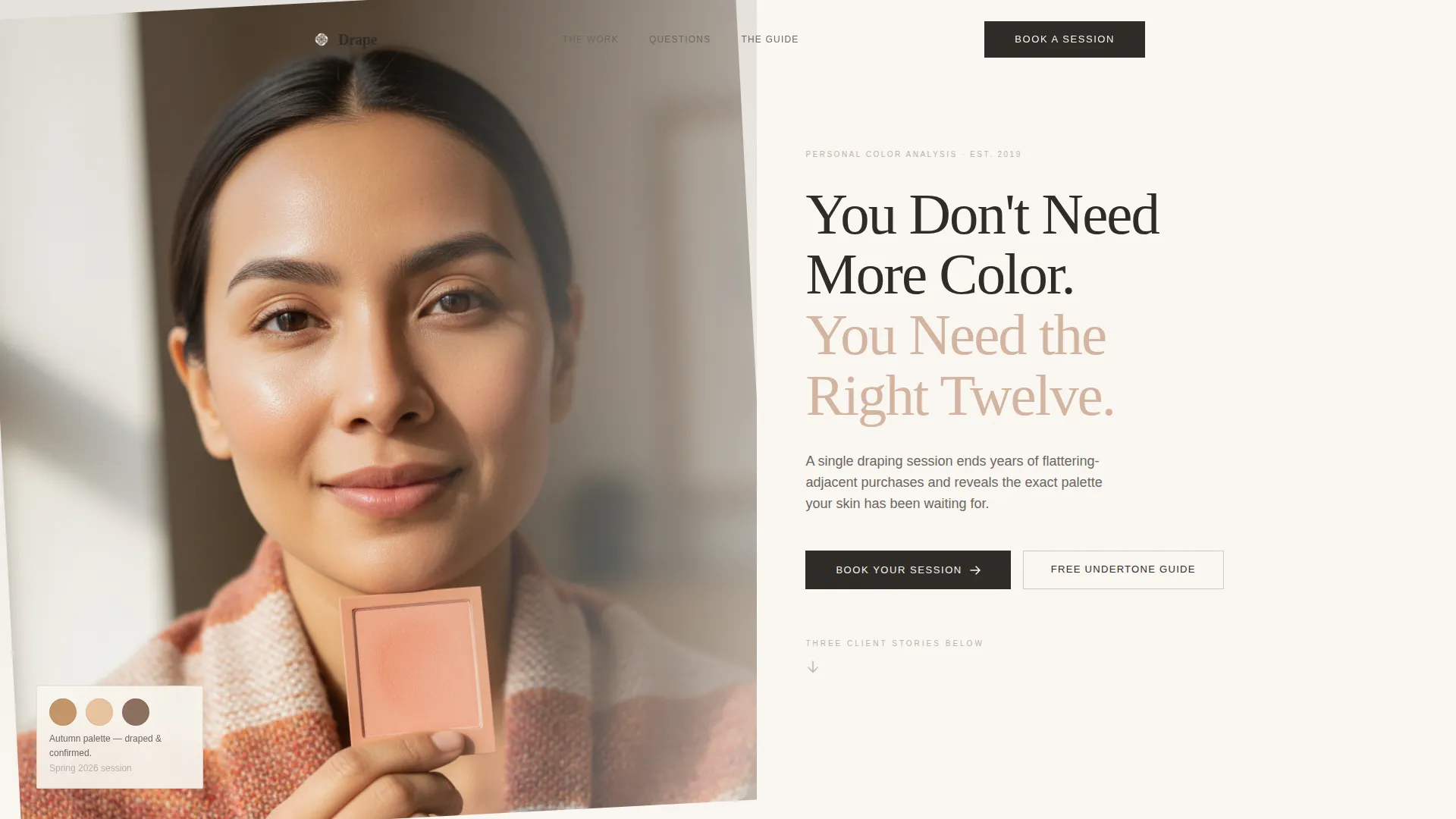
- A half-page editorial header with a serif headline and portrait composition
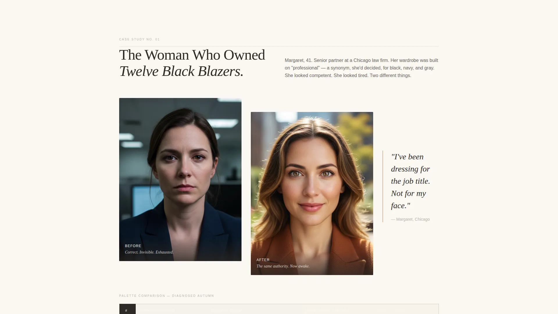
- Three before-and-after case study spreads, each anchored by a palette comparison table
- Two lead-capture forms: a session booking form and a free PDF download gate
Feature list
This template is built around a small number of high-impact components. Each one is designed to serve a specific moment in the visitor's decision journey.
Editorial Half-Page Header
The header splits into two columns. The left side holds a tightly cropped portrait of a woman being draped, with a warm-toned fabric swatch catching window light beneath her chin. The right side carries a large serif headline and a single line of subtext, followed by a quiet downward arrow that invites the scroll.
Palette Comparison Tables
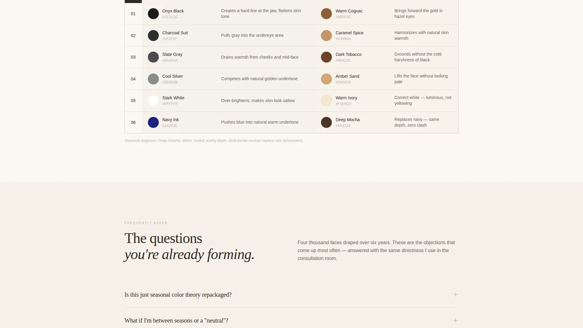
Each case study includes a structured comparison table that maps the client's old default palette against their diagnosed seasonal palette. Hex color swatches appear side by side with short descriptive notes, such as "drains warmth from under-eyes" versus "brings forward the gold in hazel," making the value of a diagnosis immediately visible.
Case Study Narrative Spreads
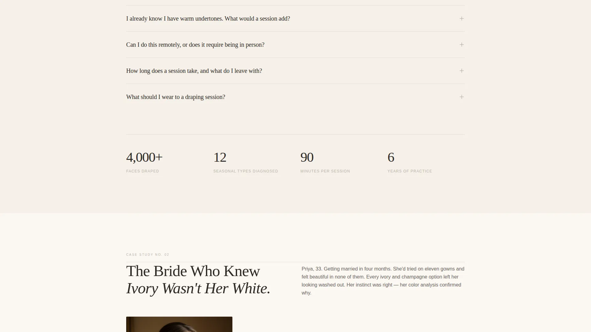
Three before-and-after editorial spreads move the page forward like a lookbook. Each spread tells a real client story, grounding the service in recognizable situations: the professional tired of her own wardrobe, the bride unsure of her white, the new mother whose palette shifted after pregnancy.
Accordion FAQ Blocks
Between case studies, accordion-style FAQ sections unfold to address the objections visitors form while reading. Questions like "Is this just seasonal color theory?" and "What if I am between seasons?" are answered with calm, specific authority, keeping the reader on the page rather than searching elsewhere.
Session Booking Form
The primary lead-capture form appears after the second case study. It collects first name, email address, and one qualifying question: "What color do you always reach for but never feel right in?" This question begins the consultation before the session is confirmed.
PDF Download Gate
A secondary lead-capture path offers a free downloadable PDF titled "The 12 Most Misunderstood Undertones." It is gated behind email capture only, providing a lower-commitment entry point for visitors who are not yet ready to book.
Page sections overview
| Section | Purpose |
|---|---|
| Editorial Header | Establishes authority and visual tone immediately |
| Hero Headline Block | Communicates the core promise in one sentence |
| Case Study One | Opens the narrative with the first client story |
| Comparison Table One | Shows palette contrast for the first client |
| Accordion FAQ Set One | Addresses early objections between case studies |
| Case Study Two | Deepens proof with the second client story |
| Comparison Table Two | Shows palette contrast for the second client |
| Primary call to action Form | Captures session booking leads with a qualifying question |
| Case Study Three | Closes the narrative arc with the third client story |
| Comparison Table Three | Shows palette contrast for the third client |
| Accordion FAQ Set Two | Handles final objections before the secondary offer |
| PDF Download Gate | Captures email leads with a lower-commitment offer |
Design & branding system
The visual identity follows an Editorial Magazine theme built on the Cloud Canvas color system. Every color decision serves the same purpose: keep the palette swatches the most visually dominant element on the page, so the analysis speaks for itself.
- Soft warm white (#FAF7F2) as the base background, evoking unbleached cotton paper
- Muted dove gray (#B8B2A8) and whispered blush (#D4B5A0) for supporting text and accents
- Charcoal (#2E2A26) used exclusively for headlines and table borders, creating a decisive graphite-pencil contrast
Mobile & speed optimization
The template is structured for clear vertical readability on smaller screens. The half-page header, comparison tables, and accordion blocks each adapt to a single-column flow without losing their visual logic.
- The editorial portrait and headline stack cleanly on mobile without cropping the key visual element
- Comparison tables reflow to display hex swatches and notes in a readable single-column format
- Accordion FAQ blocks collapse by default on all screen sizes, keeping the page uncluttered during the initial scroll
How this template helps you convert
The page is designed around a deliberate trust curve. Proof accumulates before a commitment is asked for, and a second, lower-stakes path catches visitors who are not yet ready to book.
- The three case study spreads with comparison tables build specific, visual proof before any form appears, so the visitor arrives at the booking call to action already convinced rather than merely curious.
- The primary booking form is placed after the second case study, when proof has accumulated but the reader still has curiosity remaining, capturing intent at its peak.
- The PDF download gate provides a secondary conversion path for visitors who need one more layer of trust, ensuring that undecided visitors still enter your list before they leave.
Other information about this template
This template belongs to the Professional Services category and is specifically matched to the Color Analyst Online Presence subcategory. It is designed as a single landing page, not a multi-page site, making it straightforward to launch and maintain.
- The template style is Comparison Table, meaning structured side-by-side palette data is a core visual component throughout the page
- The creative direction is Case Study Narrative, so real client stories drive the persuasive structure rather than feature lists or testimonial blocks
- The lead-generation direction means every section is sequenced to move a visitor toward one of two conversion actions: booking a session or downloading the free PDF
- The header concept is Half-Page Photo+Text, which requires a strong editorial portrait to activate the visual tone the template is built around
Theme
Editorial Magazine
Creative direction
Case Study Narrative
Color system
Cloud Canvas
Style
Comparison Table
Direction
Lead Generation
Page Sections
Editorial Half-page Header
Palette Comparison Tables
Case Study Narrative Spreads
Accordion FAQ Blocks
Dual Lead Capture Forms
Related questions
Does this template include the palette comparison table layout?
Can I use this template if I only have one or two client stories right now?
What lead capture options does this template include?
What type of photography does this template require?
Is the accordion FAQ section editable with my own questions?



