Transparent Barge Builder Landing Page Template
Hull is a split-screen landing page template built for barge builders and custom vessel fabricators. It pairs build-phase imagery with live documentation on every scroll section, presents a twelve-point comparison table against industry standards, and drives two clear conversion paths: a build consultation form and a gated transparency report download. The result is a page that earns trust before a single phone call is made.
by Rocket studio
Quick summary
Hull is a single-page template designed for custom barge builders who need to prove quality before a prospect picks up the phone. Every section splits the screen between a build phase and its matching documentation. Visitors see raw plate, framed hull, coated vessel, and classified asset side by side with the paper trail that backs each stage.
Who this template is for
This template is built for fabrication yards and marine contractors who win contracts by demonstrating process rigor, not just vessel photos. It speaks directly to buyers who spec vessels rather than buy off the shelf.
- Fleet operators replacing aging inland waterway tonnage
- Commodity shippers needing custom hopper or deck barge configurations
- Marine logistics companies spec'ing project cargo vessels to tight classification requirements
What problem this template solves
Most shipyard websites show finished vessels and a phone number. That approach leaves serious procurement buyers with unanswered questions about weld quality, material certification, and build transparency. Hull closes that gap before the first conversation.
- Buyers cannot verify quality claims without seeing documentation alongside imagery
- Prospects comparing yards have no standard framework for an apples-to-apples evaluation
- Shipyards lose credibility by offering no self-serve proof of process before a sales call
What you get with this template
You get a fully structured split-screen landing page that moves a visitor from initial trust through detailed comparison to a clear conversion action. Every visual element serves a functional purpose in the buyer journey.
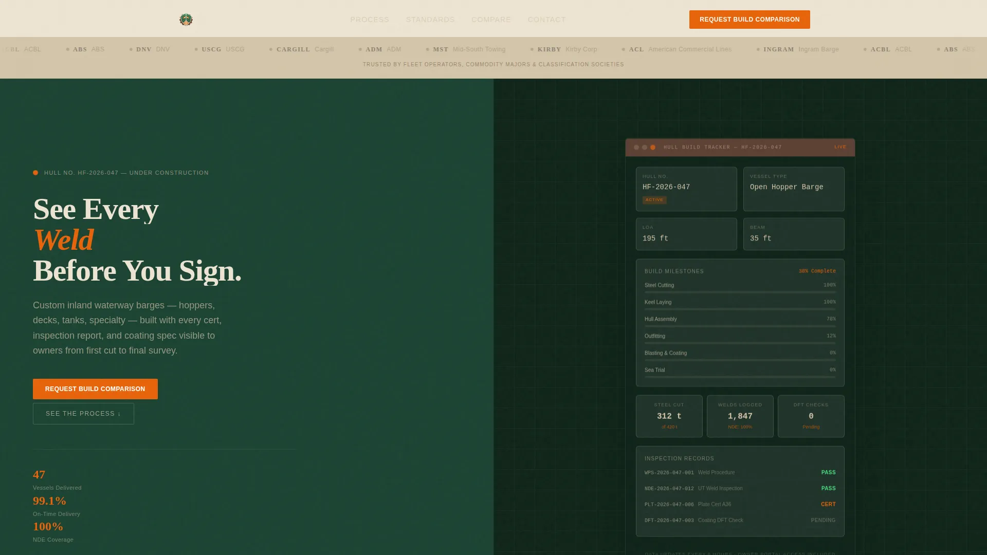
- A logo bar header displaying fleet operator and certification body logos for immediate credibility
- A live-style build dashboard mockup showing milestones, steel tonnage, and coating inspection status
- Four scroll sections pairing build-phase visuals with corresponding documentation panels
- A twelve-point "Our Build versus. Industry Standard" comparison table
- A primary consultation form and a secondary gated report download
Feature list
This section covers the core built-in components that make Hull work as a conversion-focused shipyard landing page.
Split-Screen Section Layout
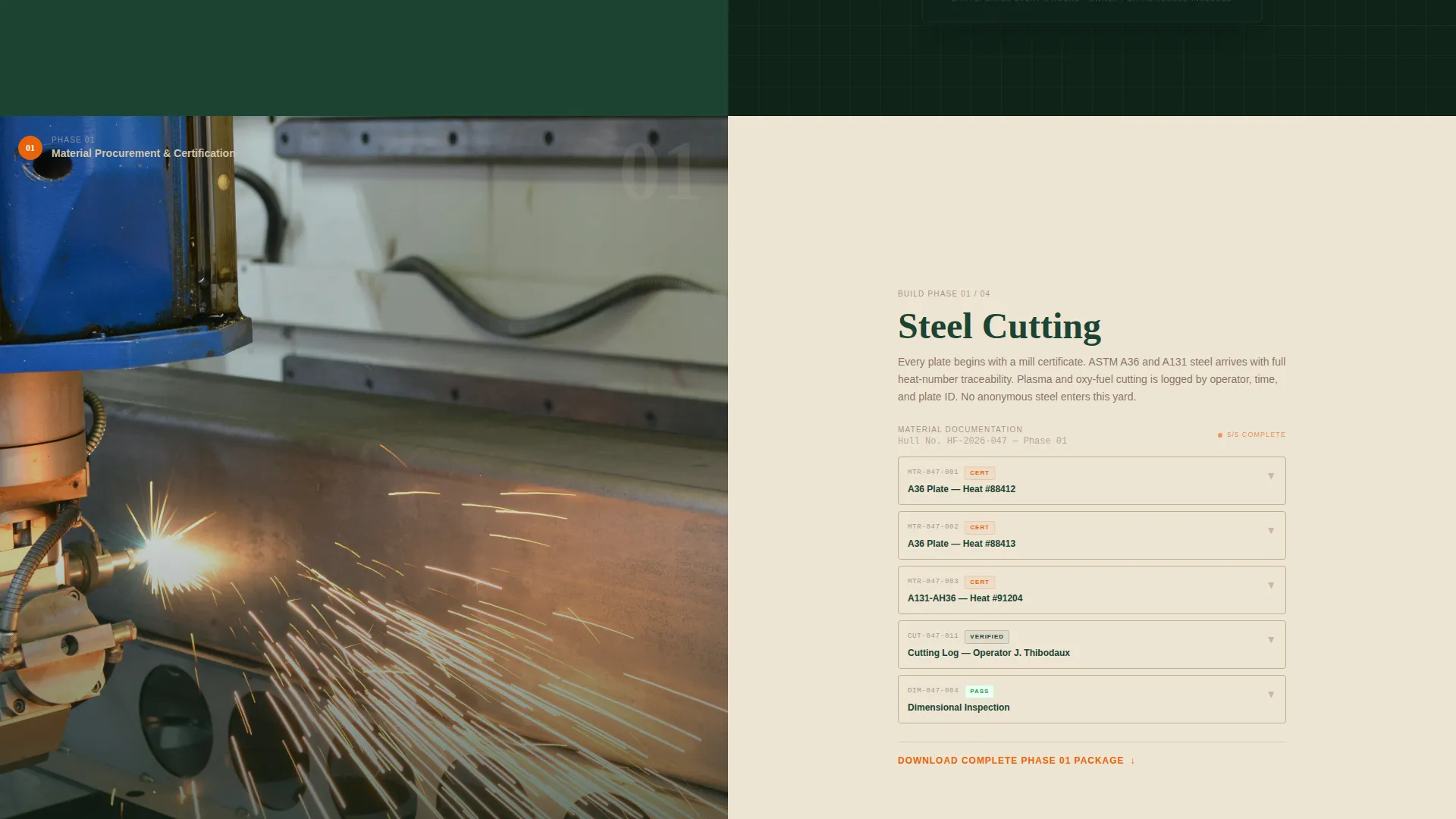
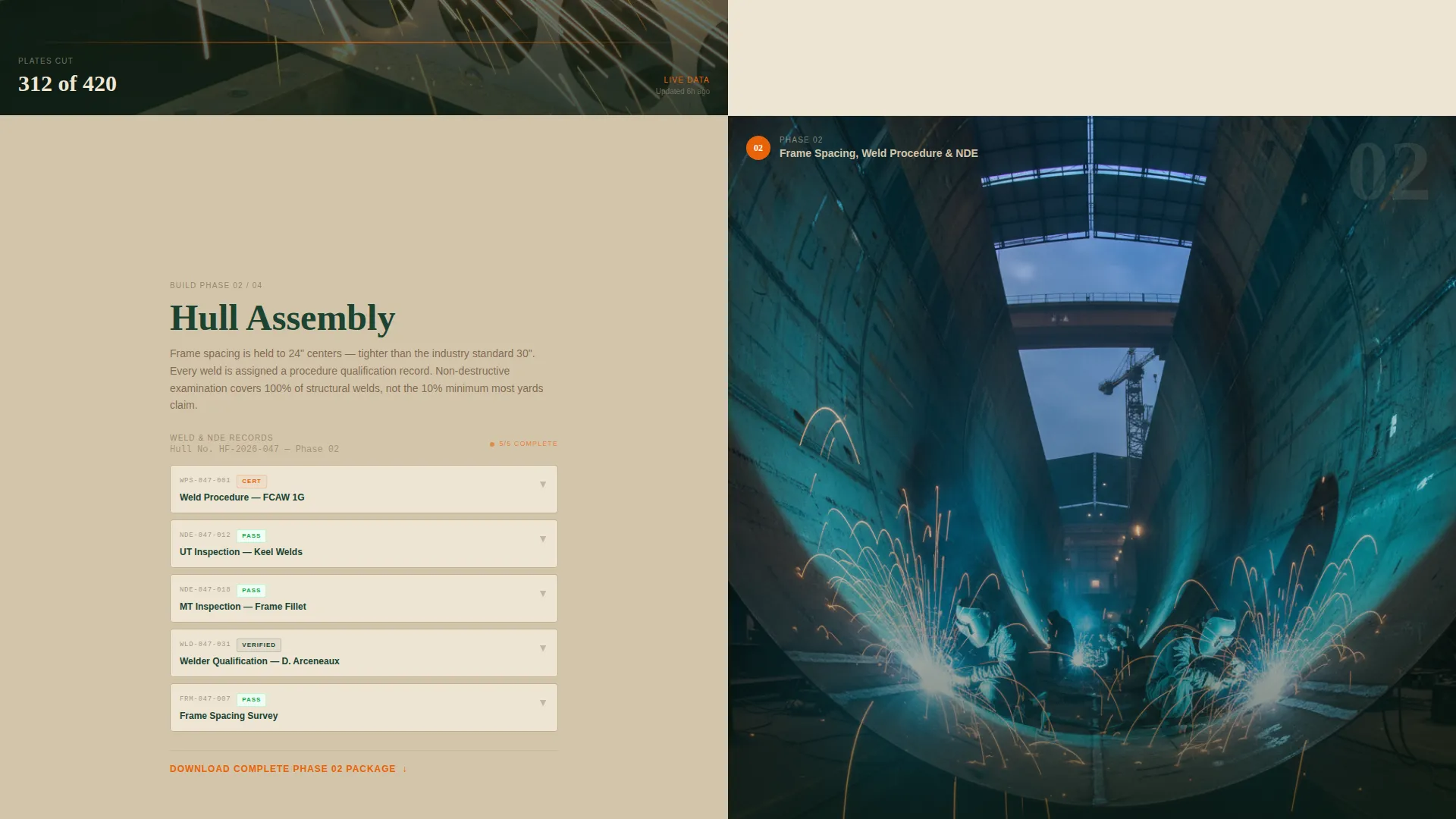
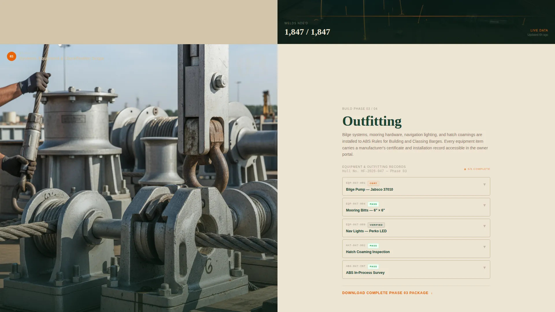
Each of the four main scroll sections divides the viewport 50/50. The left side shows a specific build phase: steel cutting, hull assembly, outfitting, and sea trial. The right side displays the corresponding documentation, including material certificates, weld inspection reports, coating thickness readings, and classification survey results.
Live-Style Build Dashboard Mockup
Below the header, the right half of the viewport holds a dashboard-style mockup. It displays build milestones, steel tonnage consumed, and coating inspection status for a vessel under construction. This component sets the tone of transparency before the visitor scrolls a single pixel.
Twelve-Point Comparison Table
A persistent split-view table appears mid-scroll contrasting "Our Build" against "Industry Standard" across twelve line items. These include frame spacing, plate grade, weld non-destructive examination (NDE) coverage, coating dry film thickness (DFT) minimums, delivery timeline accuracy, warranty terms, classification scope, owner data access, change-order transparency, progress reporting frequency, post-delivery support, and fifteen-year total cost of ownership.
Dual Conversion Path Design
The primary call to action, "Request Your Build Comparison," opens a short form collecting vessel type, fleet size, replacement timeline, and preferred classification society. The secondary path offers "Download Our Transparency Report," gated behind a single email field, giving prospects a sample documentation package before committing to a conversation.
Logo Bar Header
A clean horizontal strip at the top of the page displays logos of fleet operators, commodity majors, and marine certification bodies. Set on a river-silt tan background, the logo bar delivers social proof in the first viewport without requiring any scroll.
Forest Trust Color System
The template uses a four-color palette: deep woodland green for headers and primary backgrounds, weathered bark brown for secondary panels and dividers, river-silt tan for content surfaces, and safety-orange reserved exclusively for calls to action and interactive highlights.
Page sections overview
| Section | Purpose |
|---|---|
| Logo Bar Header | Establishes credibility with fleet operator and certification body logos |
| Hero Split Screen | Bold headline left, live build dashboard mockup right |
| Steel Cutting Section | Build-phase image paired with material certificates panel |
| Hull Assembly Section | Framed hull visual paired with weld inspection reports panel |
| Outfitting Section | Outfitting image paired with coating thickness readings panel |
| Sea Trial Section | Sea trial visual paired with classification survey results panel |
| Comparison Table | Twelve-point "Our Build versus. Industry Standard" split-view table |
| Primary call to action Form | Vessel type, fleet size, timeline, and classification society fields |
| Secondary Download call to action | Email-gated transparency report download |
Design & branding system
The visual identity uses the Forest Trust color system, built around four tones that feel grounded, load-bearing, and industrial without being harsh. Typography follows a heavy industrial sans-serif style that reinforces structural confidence in every heading.
- Deep woodland green (#1B4332) anchors headers and primary background areas
- Weathered bark brown (#5C4033) defines secondary panels and section dividers, while river-silt tan (#D4C5A9) surfaces content areas with warmth
- Safety-orange (#E8630A) appears only on calls to action and interactive highlights, keeping conversion triggers visually distinct at all times
Mobile & speed optimization
The split-screen layout is structured to reflow cleanly on smaller viewports, so the documentation panels remain readable and the comparison table stays functional on a tablet or phone screen.
- Each 50/50 split section is designed to stack vertically on narrow screens without losing the pairing between image and documentation
- The dashboard mockup and comparison table are built as self-contained visual blocks, making them easy to scroll through on a touch device
- The dual conversion forms are compact by design, requiring minimal input fields to reduce drop-off on mobile
How this template helps you convert
Every design decision in Hull is oriented toward moving a serious procurement buyer from skepticism to action. The page does not rely on atmosphere alone. It gives buyers tangible evidence at each stage.
- The logo bar and dashboard mockup establish credibility in the first viewport, before any scrolling begins, so visitors anchor their trust early.
- The four documentation-paired scroll sections build a progressive case for quality, letting buyers self-verify claims section by section rather than taking the yard's word for it.
- The comparison table and dual conversion paths meet buyers at two different levels of readiness, capturing both high-intent prospects and early-stage researchers in one page flow.
Other information about this template
Hull is part of a broader template system built on the Dashboard Pro theme. The Forest Trust color system it uses is one of several named palettes available across the template family, making it straightforward to align Hull with an existing brand identity or to adopt the palette as a starting visual direction.
- The template style is Split Screen (50/50), a layout approach that works particularly well for process-driven industries where proof and imagery need to appear together
- The creative direction is Transparent Process, meaning the page architecture is built around showing documentation alongside build imagery rather than relying on finished-product photography alone
- The header concept, Logo Bar, is a repeatable component that can be updated to reflect the yard's actual client and certification relationships
- The landing page direction is Comparison/Versus, a structure proven effective when buyers are actively evaluating multiple vendors before committing
Theme
Dashboard Pro
Creative direction
Transparent Process
Color system
Forest Trust
Style
Split Screen (50/50)
Direction
Comparison/Versus
Page Sections
Split-screen Build Phase Layout
Live-style Dashboard Mockup
Twelve-point Comparison Table
Dual Conversion Path Structure
Logo Bar Credibility Header
Forest Trust Color System
Related questions
Can I update the logos in the logo bar to match my actual clients?
What vessel types does the consultation form support?
Do I need a developer to edit the twelve-point comparison table?
Can this template work for a yard that builds vessels beyond barges?
Is the transparency report download ready to deliver files automatically?