Sideboard Landing Page Template for Dining Room Storage
Hutch is a single-column landing page template for a hand-finished sideboard, built for the dining room storage market. It uses a warm Agrarian Root visual identity, a full-bleed hero photograph, and a spatial scroll journey that moves visitors through room context, joinery detail, and a clear click-through call to action, all without a form or friction.
by Rocket studio
Quick summary
Hutch is a single-column, click-through landing page template designed to sell a hand-finished sideboard. The page guides visitors through a cinematic scroll, from a full-bleed hero image to close-up joinery detail, building trust before delivering a single confident call to action. It suits dining room storage solutions at every stage of a home renovation project.
Who this template is for
This template is built for makers, retailers, and small furniture brands selling quality dining room storage to real homeowners. The target buyer is someone who cares about craft, proportion, and permanence, not trend cycles.
- Homeowners mid-renovation who have removed an old built-in and need a considered replacement
- Newlyweds furnishing their first proper dining room with pieces meant to last
- Empty-nesters reclaiming a formal dining space and investing in furniture that earns its place
What problem this template solves
Selling hand-finished furniture online is hard. Visitors cannot open a drawer, feel the grain, or test the weight. A generic product page fails to communicate craft. This template solves that gap by turning the scroll into a tactile walkthrough.
- Buyers leave product pages that feel clinical and impersonal, especially for considered purchases
- A single click-through page with no distractions keeps the visitor focused on the piece itself
- The spatial scroll builds emotional connection before any purchase decision is required
What you get with this template
You get a complete, single-column landing page layout that moves visitors from first impression to confident click. Every section has a defined role, and the visual system does the heavy lifting.
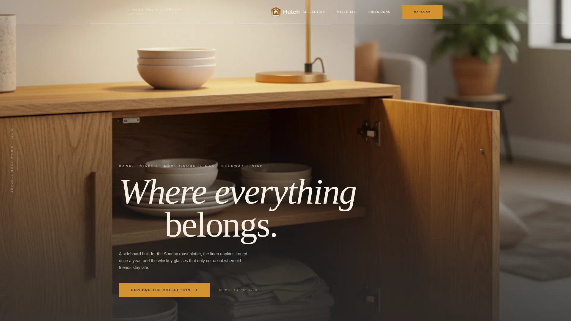
- A full-bleed hero section with a serif headline that rises from the bottom of the composition
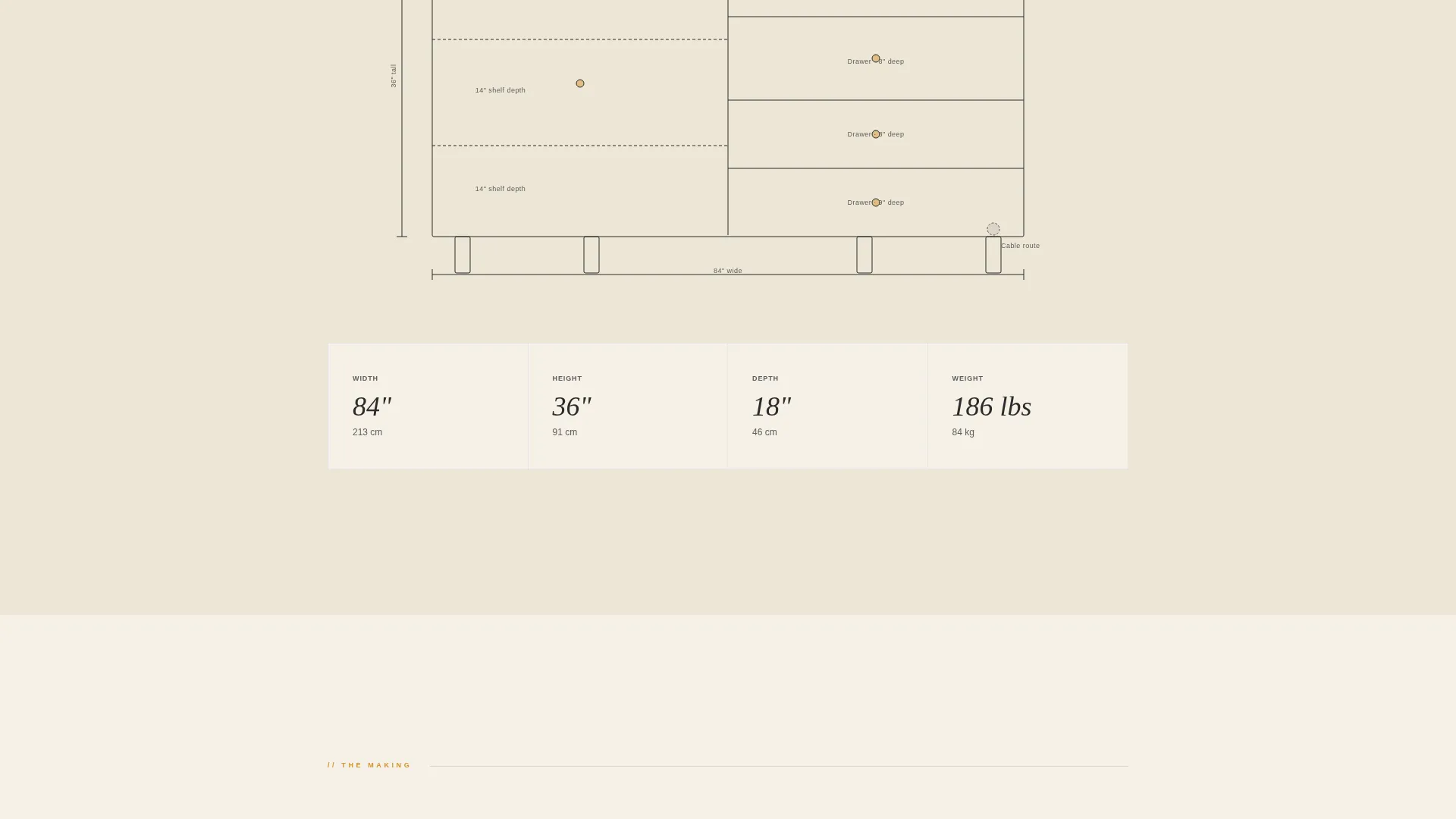
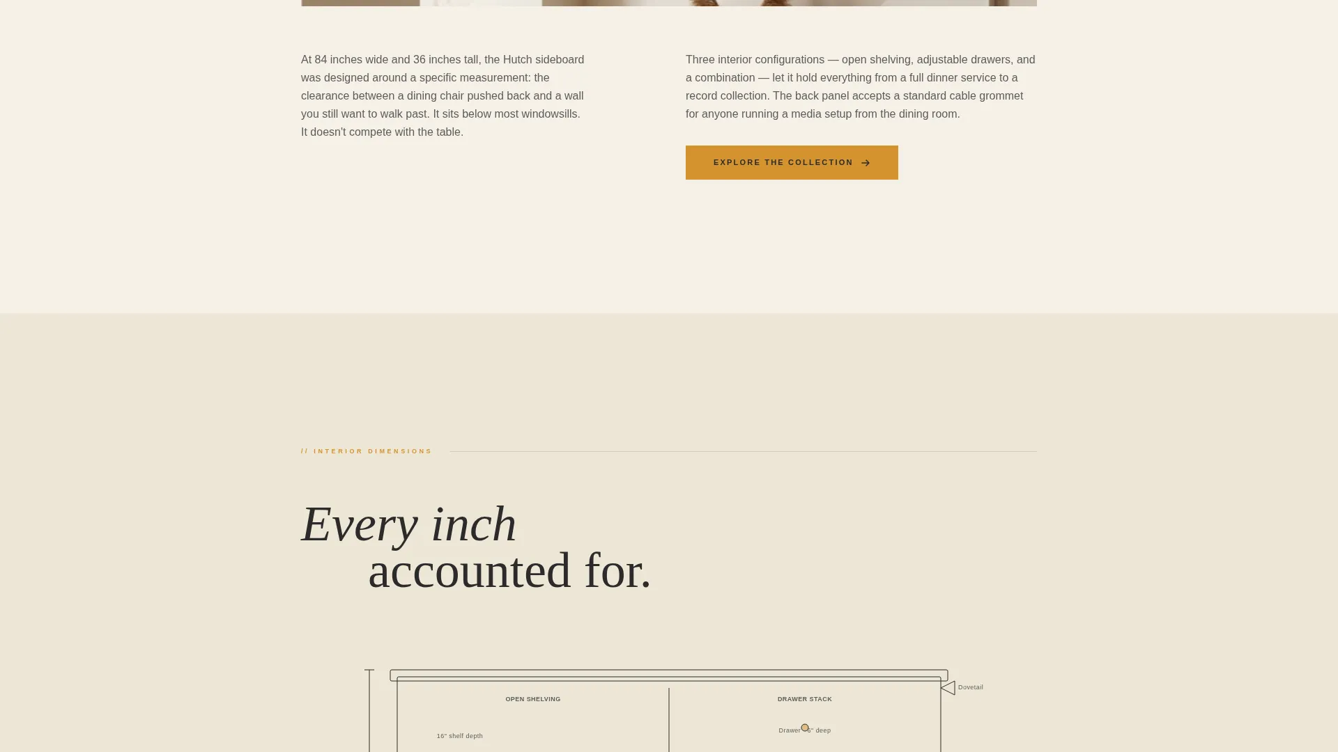
- An interior cross-section diagram section rendered in clean ink-on-cream line art showing shelf depths, drawer dimensions, and cable-routing channels
- Detail crop sections, a dimensions strip, a material sourcing callout, a homeowner social proof row, and a sticky click-through call-to-action bar
Feature list
This section covers the core designed capabilities built into the Hutch template.
Full-Bleed Hero with Serif Headline
The opening section is a straight-on, symmetrical photograph of the sideboard against a plastered wall. Doors sit slightly ajar to reveal stoneware and folded cloth. A serif headline rises from the bottom of the frame after the still-life composition lands, unhurried and painterly.
Spatial Scroll Architecture
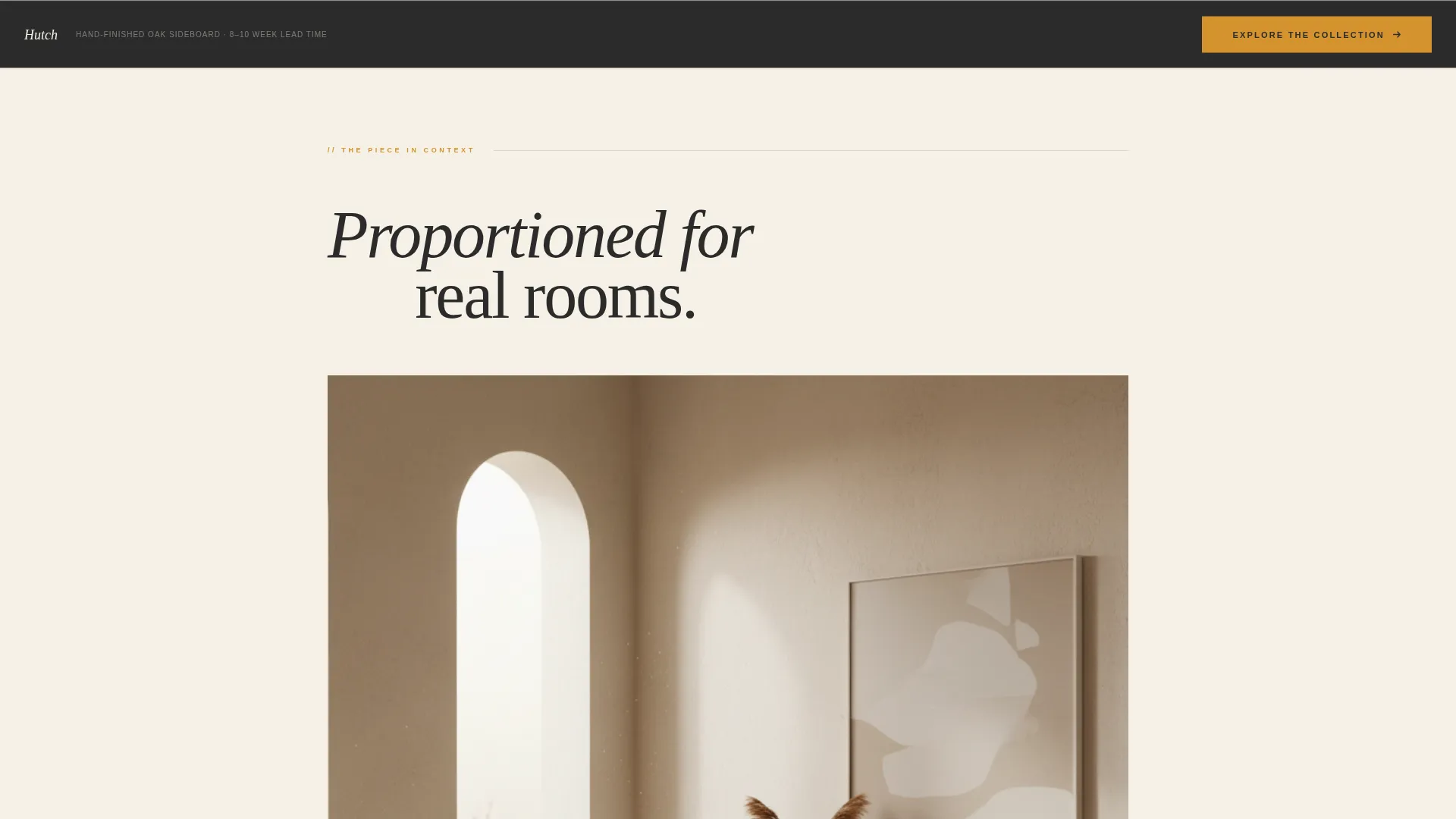
After the hero, the page pulls back to show the piece inside a full room. Visitors see ceiling height, chair clearance, and true proportions. The camera then pushes in to an overhead cross-section diagram drawn in ink-on-cream line art, followed by full-column-width detail crops of dovetail joints, grain, and hardware patina.
Dimensions-at-a-Glance Strip
A compact horizontal strip presents key measurements at a glance. Buyers can quickly confirm the piece fits their space without hunting through a specification sheet buried elsewhere on a product detail page.
Material Sourcing Callout
A dedicated callout names the actual forest region supplying the timber. This single, specific detail does more for trust than a paragraph of general quality claims. It grounds the product in real provenance.
Homeowner Social Proof Row
Three homeowner photographs sit in a quiet row, each paired with a one-line quote. The format is intentionally understated, matching the tone of the page rather than feeling like a review widget bolted on.
Sticky Click-Through Call to Action
The primary call-to-action button, rendered in amber on charcoal, first appears after the room-context section. Once the visitor scrolls past the joinery details, it reappears as a persistent sticky bar at the bottom of the viewport, always available without interrupting the scroll.
Page sections overview
| Section | Purpose |
|---|---|
| Full-Bleed Hero | Opens with a still-life photograph and delayed serif headline |
| Room Context View | Shows the piece at full scale inside a real room |
| Cross-Section Diagram | Reveals interior shelf depths, drawer sizes, and cable channels |
| Detail Crop Gallery | Brings dovetail joints, grain, and hardware into full-column focus |
| Dimensions Strip | Presents key measurements in a scannable horizontal band |
| Material Sourcing Callout | Names the timber origin to establish provenance and trust |
| Homeowner Proof Row | Displays three owner photos with one-line quotes |
| Sticky call to action Bar | Persists at the bottom of the viewport after joinery section scroll |
Design & branding system
The Hutch template uses an Agrarian Root theme built on a Charcoal and Amber color system. The palette evokes a farmhouse table at golden hour, warm light pooling across dark wood, brass hardware catching last sun. Cream dominates the background, charcoal anchors all text, and amber appears only where the eye needs to act.
- Background uses raw linen cream (#F5F0E6) as the dominant canvas, giving the page the feel of an unbleached tablecloth
- All primary typography is set in deep plough-soil charcoal (#2B2B2B), with secondary text and divider lines in smoked iron (#5C5C5C)
- Calls to action and hover states use sun-dried wheat amber (#D4932F) exclusively, drawing attention the way a lit candle draws you to a set table
Mobile & speed optimization
The single-column layout is inherently well-suited to smaller screens. Every section stacks cleanly, and the full-bleed imagery retains its impact at mobile widths. The sticky call-to-action bar remains accessible throughout the scroll on any device.
- The single-column flow requires no complex grid reordering on smaller viewports
- Full-column-width detail crops are as effective on a phone screen as on a desktop display
- The sticky bottom bar keeps the primary action reachable without requiring the visitor to scroll back up
How this template helps you convert
The Hutch template is optimized for a single outcome: moving the visitor to a product detail or checkout page. Every design and content decision supports that goal without adding friction.
- Trust is built in layers before the call to action appears, room context, technical diagrams, material sourcing, and homeowner quotes all arrive first, so the visitor feels informed and confident
- The amber call-to-action button appears at the right moment after the visitor has absorbed the product story, then stays available as a sticky bar so no scroll position is a dead end
- There is no form, no modal, and no secondary path competing for attention, just one clear button that says "Explore the Collection"
Other information about this template
The Hutch template is part of the Construction and Home category, sitting within the Dining Room Renovation subcategory and targeting the dining room storage solution niche. It is designed as a single-column flow page using a click-through landing page direction.
- The template style is Single Column Flow, making it straightforward to adapt for any sideboard, buffet, or credenza product in the same furniture category
- The Agrarian Root theme and Charcoal and Amber color system can be applied consistently across other pages in a broader dining room or home renovation campaign
- Generous whitespace between every section transition is a deliberate design choice, giving the eye the same rest that a well-organized drawer gives the hand
Theme
Agrarian Root
Creative direction
Spatial & Architectural
Color system
Charcoal & Amber
Style
Single Column Flow
Direction
Click-Through
Page Sections
Full-bleed Hero with Serif Headline
Spatial Scroll Architecture
Dimensions-at-a-glance Strip
Material Sourcing Callout
Homeowner Social Proof Row
Sticky Click-through Call to Action
Related questions
Who is this landing page template best suited for?
Can I use this template for products other than a sideboard?
Does this template include a contact form or lead capture?
How does the sticky call-to-action bar work?
Can the color system be adjusted to match a different brand?