Scandinavian Architecture Booking Website Template
Hygge is a full-page Scandinavian interior design landing page built for boutique studios that convert through atmosphere rather than hard selling. The page guides visitors room by room, using cursor-driven parallax geometry, clickable material hotspots, and a conversational multi-step lead form to turn quiet curiosity into a booked consultation.
by Rocket studio
Quick summary
Hygge is a storybook landing page for a Scandinavian interior designer. It pairs Bauhaus-inspired floating geometry with full-bleed project photography and a warm, unhurried scroll rhythm. Each section feels like stepping into a new room. By the final call to action, a visitor knows how the designer thinks and is ready to start a conversation.
Who this template is for
This template suits design professionals whose work speaks through imagery and whose clients need to feel trust before they book. It is built for a specific kind of studio and a specific kind of buyer.
- Scandinavian interior designers running boutique, B2C studios
- Young homeowners renovating a first flat, expat couples furnishing a new apartment, and boutique hotel owners curating guest-room experiences
- Visual-first creative practices that want a portfolio landing page with a built-in lead generation path
What problem this template solves
Most interior design pages present a gallery and a contact form. They ask for commitment before they build trust. Hygge solves this by turning the scroll itself into a consultation experience.
- Visitors absorb a designer's material vocabulary through clickable hotspots before they ever fill out a field
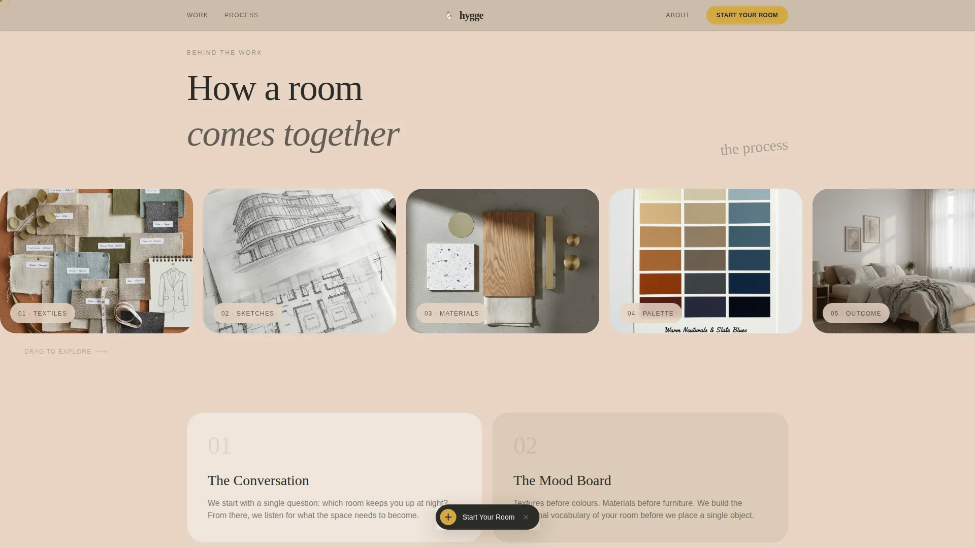
- The moodboard process section warms hesitant visitors before directing them toward the primary call to action
- The conversational multi-step form replaces a cold contact form with a sequence that feels like the first five minutes of a real consultation
What you get with this template
You get a complete, fully structured landing page built around an immersive room-by-room scroll. Every section is purposeful, every interaction is tied to trust-building or lead capture.
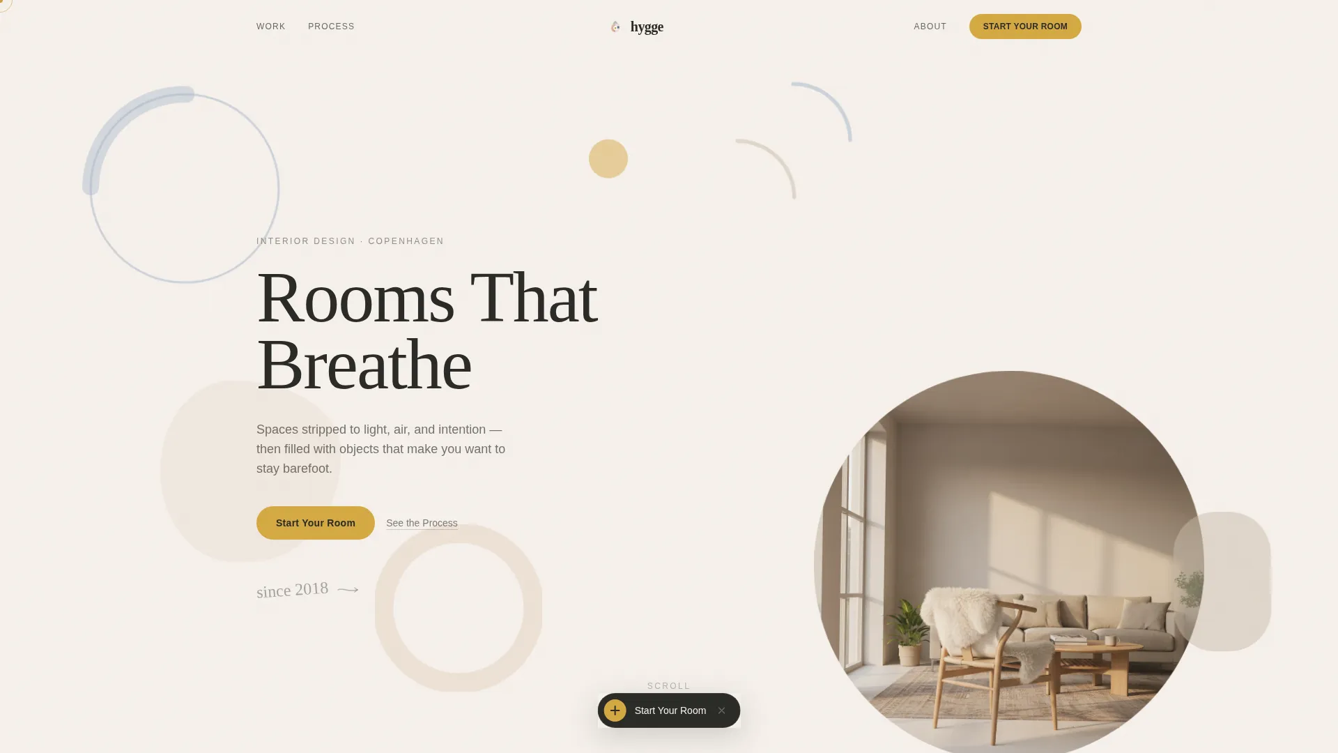
- A hero section with cursor-driven parallax geometry, a typewriter headline, and a nested interior photograph inside an abstract geometric composition
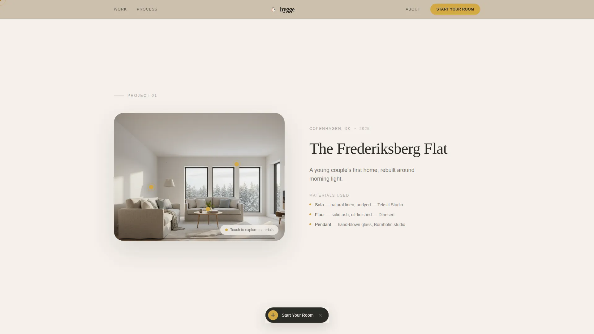
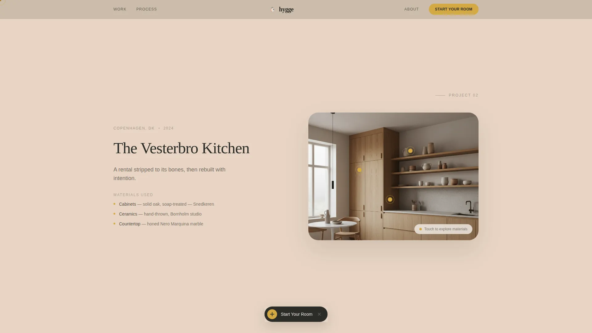
- Full-bleed project photography rooms with clickable material hotspots, alternating with process rooms showing moodboards and sketches
- A floating mustard ochre call-to-action pill, a multi-step conversational lead form, client testimonials with grayscale-to-color hover portraits, and an arc-split footer
Feature list
This template is built with a specific set of interactive and visual features. Each one comes directly from the design brief and supports the studio's lead generation goal.
Cursor Parallax Hero
Overlapping circles, arcs, and soft rectangles float and gently rotate on page load. As the cursor moves, shapes shift at different depths. A finished interior photograph sits nested inside the largest geometric form, revealing itself as the visitor engages with the composition.
Typewriter Headline Animation
The headline "Rooms That Breathe" types itself letter by letter in a thin serif. It settles naturally into the negative space between geometric shapes. The effect creates an immediate sense of calm intention without feeling like a gimmick.
Clickable Material Hotspots
Each project photography section includes interactive hotspot markers on key objects. Clicking a hotspot reveals a material callout, for example "solid ash, oil-finished" or "hand-thrown ceramic, Bornholm studio." Visitors learn the designer's vocabulary by touching the work, not by reading a separate about page.
Scroll-Triggered Palette Swap
Scrolling into the kitchen project section triggers a soft shift to warmer tones. Illustrated geometric shapes rearrange themselves around the project photography. The transition is handled per section so each room has its own atmospheric identity.
Conversational Multi-Step Lead Form
The lead form asks one question at a time. It opens with "Which room keeps you up at night?" followed by square meters, a photo upload field, and an email field. The sequence is designed to feel like the opening of a real consultation rather than a data collection exercise.
Floating Call-to-Action Pill
A mustard ochre "Start Your Room" pill appears after the third scroll section and follows the visitor as they continue down the page. It provides a persistent, low-pressure entry point to the lead form without interrupting the scroll experience.
Page sections overview
| Section | Purpose |
|---|---|
| Hero geometric composition | Introduces the studio with parallax shapes, an interior photograph, and a typewriter headline |
| Project room photography | Showcases finished work with clickable material hotspots for tactile context |
| Process moodboard room | Reveals the designer's thinking through mood imagery and sketches |
| Client testimonials | Builds trust with named project quotes and grayscale-to-color portrait hover |
| Start Your Room form | Captures leads through a conversational, one-question-at-a-time form sequence |
| Arc split footer | Closes the page with a structured, visually grounded footer layout |
Design & branding system
The visual identity follows a Playful Geometric theme built on the Cloud Canvas color palette. Every color has an assigned role, and the typography pairing is chosen for tactile warmth and legibility.
- Colors: soft birch white (#F5F0EB) and muted blush (#E8D5C4) alternate as full-page section backgrounds; washed slate blue (#A3B4C8) anchors typographic moments; warm putty (#C9BBA8) grounds the navigation and footer; mustard ochre (#D4A843) is reserved exclusively for interactive hotspots and call-to-action buttons
- Typography: DM Serif Display for headlines, Manrope for body text, combining a tactile editorial quality with clean readability
- Visual style: Scandinavian minimalism structured around Bauhaus playful geometry, with geometric shapes used as compositional framing devices rather than decorative noise
Mobile & speed optimization
The template is designed desktop-first, because interior photography demands a wide viewport to read properly. Mobile layouts follow with graceful degradation so the core experience remains coherent on smaller screens.
- Static page sections are built as server components to keep initial load fast; all animations and interactive elements run in client components
- Cursor parallax and floating geometry adapt to touch contexts so mobile visitors still experience the visual language without needing a mouse
- Full-page section blocks scale proportionally so photography and typography remain legible across viewport sizes
How this template helps you convert
Every design decision in this template is tied to moving a visitor from passive browsing to active interest. The conversion path is built into the scroll itself.
- The material hotspot system and alternating project-then-process rhythm build familiarity with the designer's voice across five scroll sections, so that by the time the lead form appears, the visitor already feels like they know the studio.
- The secondary "See the Process" path anchors hesitant visitors to the moodboard section rather than letting them leave, warming them toward the primary call to action at the page bottom.
- The floating pill call to action provides a persistent, friction-low entry point after the third section so visitors who are ready early do not have to scroll to the bottom to act.
Other information about this template
This template is part of a broader collection of architecture and design landing pages built for creative professionals in the Scandinavian interior design niche. A few additional context points are worth knowing before you use it.
- The page is structured for an English-language audience with a Copenhagen and broader European context in mind, including DKK and EUR pricing conventions and European date formats
- The footer uses a Pattern 7 Arc Browser Split layout, which divides the footer visually into two arced zones for a distinctive close to the page
- Testimonial portraits use a grayscale-to-color hover effect tied to named client projects, giving social proof a personal and specific quality rather than a generic review feel
- The template style is classified as Storybook/Full-Page, meaning each scroll section is treated as a self-contained room with its own visual atmosphere and narrative role
Theme
Playful Geometric
Creative direction
Interactive Explorer
Color system
Cloud Canvas
Style
Storybook/Full-Page
Direction
Lead Generation
Page Sections
Cursor Parallax Hero Composition
Typewriter Headline Animation
Clickable Material Hotspots
Scroll-triggered Palette Swap
Conversational Multi-step Lead Form
Floating Call-to-action Pill
Related questions
Who is this landing page template built for?
Can I change the colors and typography to match my own studio identity?
How does the multi-step lead form work?
Is this template suitable for a hotel or hospitality client?
Does the template include the photography shown in the preview?



