Nonprofit Marketing & Agency Portfolio Website Template
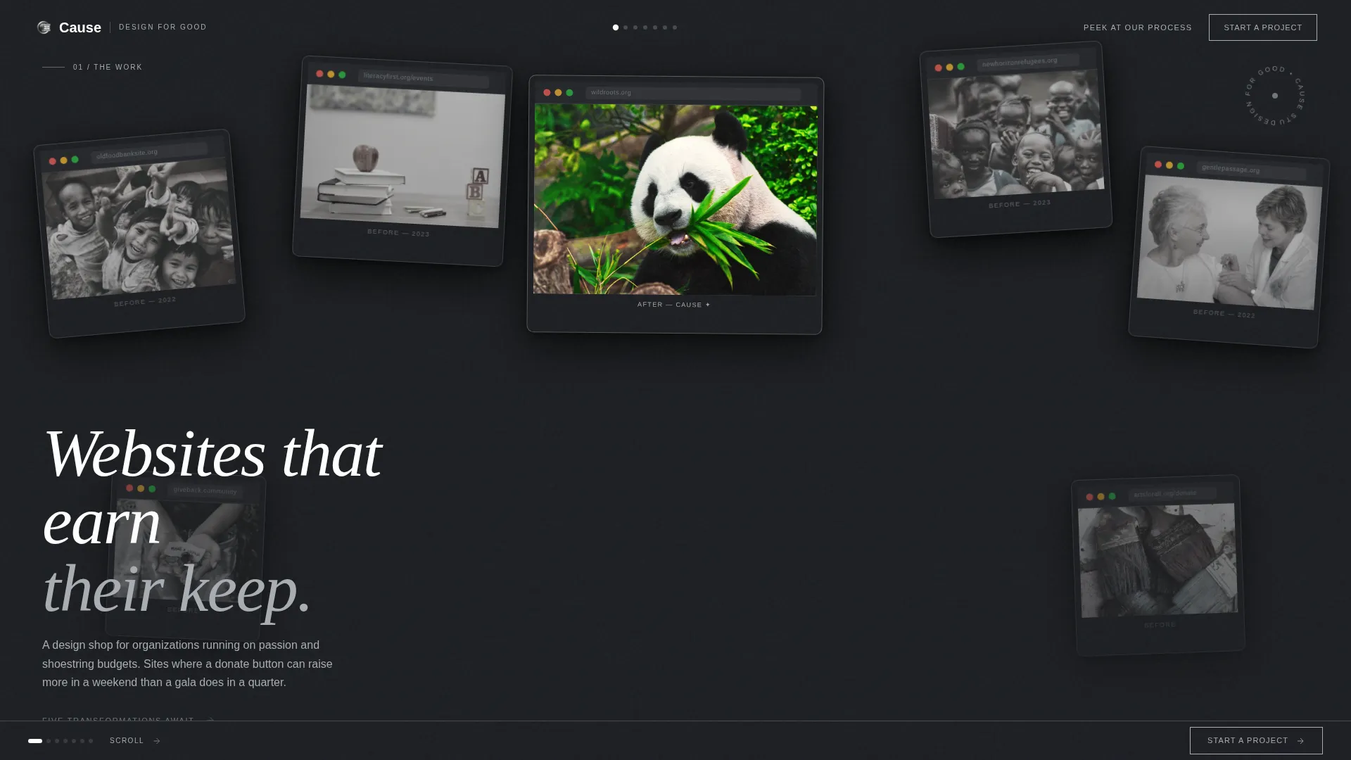
Cause is a horizontal scroll landing page built for nonprofit web design agencies. It combines a Lens & Frame visual identity with a Monochrome Steel color system to present case study transformations like frames on a film strip. The layout guides visitors from evidence to action, earning every click through five real mission-driven project panels before the primary call to action appears.
by Rocket studio
Quick summary
Cause is a single-page horizontal scroll template for agencies that design websites for nonprofit organizations. It opens with a collage header of overlapping browser windows and carries visitors rightward through five mission-driven case study panels. Each panel pairs a before-and-after redesign with hard performance numbers, building trust before the final call to action locks into place.
Who this template is for
This template is built for boutique digital agencies and independent designers who specialize in nonprofit clients. It speaks directly to the people who help resource-constrained organizations raise more, reach more, and look credible doing both.
- Nonprofit web design agencies ready to show transformation evidence, not just portfolio screenshots
- Independent designers pitching executive directors, development officers, and board members on a rebrand
- Small creative studios whose work spans food security, refugee resettlement, literacy, and similar causes
What problem this template solves
Many agency landing pages talk about process without showing proof. Nonprofit clients need more convincing because every dollar spent on a redesign is a dollar pulled from the mission. This template closes that gap by letting the work speak first.
- Visitors often leave before reaching a call to action because the page never earns their trust with evidence
- Nonprofit decision-makers need to see concrete outcomes, not just aesthetic before-and-after comparisons
- A static portfolio grid buries the emotional stakes; a horizontal scroll sequence builds them frame by frame
What you get with this template
You get a fully structured horizontal scroll landing page with a clear visual narrative arc. Every section is mapped to a moment in the buyer journey, from curiosity to conviction to click.
- A collage-style header with overlapping browser window frames showing real nonprofit site contexts
- Five sequential case study panels, each with a grainy before-state screenshot and a crisp redesigned version, paired with metric callouts
- A persistent ghost button call to action rail that solidifies into a full white action button only after all case studies have been seen
Feature list
This section covers the core built-in capabilities delivered by the Cause template.
Horizontal Scroll Case Study Sequence
Each panel fills the full viewport like a gallery room. The visitor moves rightward through five nonprofit project transformations. The motion feels like pulling a film strip through an enlarger, each frame developing into sharper focus and more proof.
Collage Scrapbook Header
The opening section layers overlapping browser windows at different angles and scales, like Polaroids tossed onto a desk. One center frame carries a faint warm tint to mark the redesigned "after" state, pulling the eye in a field of near-monochrome frames.
Before-and-After Panel Design
Each case study panel anchors the old site as a grainy, low-contrast screenshot pinned at an angle. The scroll reveals the redesigned version, crisp and full-bleed, with micro-animations that bring metric callouts into view as the visitor arrives.
Tiered Call to Action System
The primary call to action, "See What We'd Build for You," starts as a persistent ghost button in the bottom rail. It solidifies to a full white button with gunmetal text only on the final panel, after all five transformations have been witnessed. A secondary link, "Peek at Our Process," appears midway for visitors not yet ready to commit.
Metric Callout Animations
Performance figures fade in as each panel comes into view. Examples baked into the layout include a forty-two percent increase in online donations and a three-point-seven-second average session time improvement, giving prospects specific, scannable evidence at every stop.
Monochrome Steel Visual System
The entire page uses a four-value palette: deep gunmetal, brushed aluminum, light silver matte, and signal white. Backgrounds alternate between gunmetal and silver matte. Single-pixel aluminum divider lines reference film sprocket edges, keeping the gallery aesthetic consistent from header to final panel.
Page sections overview
| Section | Purpose |
|---|---|
| Collage Header | Establish agency context with layered nonprofit browser window frames |
| Case Study Panel 1 | Show food security project transformation with before-and-after states |
| Case Study Panel 2 | Present literacy program redesign alongside session time metric callout |
| Case Study Panel 3 | Feature wildlife conservancy panel with donation thermometer evidence |
| Case Study Panel 4 | Elevate refugee resettlement project and raise emotional stakes |
| Case Study Panel 5 | Close with pediatric hospice transformation and solidify final call to action button |
| Midpoint Process Link | Offer secondary path for visitors not ready to inquire yet |
| Persistent call to action Rail | Keep "See What We'd Build for You" ghost button accessible throughout scroll |
Design & branding system
The Lens & Frame theme treats every design decision as if the page itself were hanging in a converted warehouse gallery. Color is stripped back so the client work becomes the loudest thing on screen.
- Four-color Monochrome Steel palette: deep gunmetal (#1C1E22), brushed aluminum (#A8ADB3), light silver matte (#E3E5E8), and signal white (#FFFFFF) reserved for active states and call to action surfaces
- Backgrounds alternate between gunmetal and silver matte panels; type appears in white or aluminum depending on the surface beneath it
- Single-pixel aluminum border lines act as dividers throughout, referencing film sprocket edges and reinforcing the Lens & Frame identity
Mobile & speed optimization
The horizontal scroll layout is designed with intentional pacing in mind. Each panel is scoped to a single viewport, which keeps the visual load contained and the reading experience focused at any screen size.
- Full-viewport panel sizing ensures each case study frame is readable without zooming or horizontal overflow issues
- Micro-animations are tied to scroll position, so they fire only when the relevant panel is in view rather than all at once
- The lightweight four-color palette avoids heavy gradient or image-filter rendering that could slow perceived load on mobile devices
How this template helps you convert
The Cause template is engineered as a click-through landing page. Every scroll action moves the visitor closer to a decision point, and the call to action system is paced to appear only after evidence has been delivered.
- The collage header creates immediate context by showing real nonprofit site types, food banks, literacy programs, and wildlife conservancies, before a single word of copy is read.
- Five sequential before-and-after panels with hard numbers give nonprofit decision-makers the proof of value they need to justify a redesign investment to their boards.
- The solidifying call to action button on the final panel uses visual change as a psychological signal, the button becoming "real" only after the visitor has earned the full picture, making the click feel like a natural next step rather than a sales push.
Other information about this template
This template is part of a broader portfolio and agency template category focused on nonprofit marketing and agency contexts. It is particularly well-suited to design shops that lead with impact storytelling rather than credential lists.
- The template style is Horizontal Scroll, which distinguishes it from standard vertical-scroll portfolio pages and creates a more cinematic browsing experience
- The header concept is Collage/Scrapbook, a deliberate creative choice that communicates range across mission types without requiring a separate case study archive page
- The creative direction is Immersive Visual, meaning the page experience itself is part of the pitch, not just a container for it
- The landing page direction is Click-Through, optimized to move visitors to a dedicated project inquiry form on a separate next page rather than capturing leads inline
- The Lens & Frame theme and Monochrome Steel color system were chosen to let client work, not agency branding, dominate the visual field


Theme
Lens & Frame
Creative direction
Immersive Visual
Color system
Monochrome Steel
Style
Horizontal Scroll
Direction
Click-Through
Page Sections
Horizontal Scroll Case Study Sequence
Collage Scrapbook Header
Before-and-after Panel Layout
Tiered Call to Action System
Scroll-triggered Metric Animations
Monochrome Steel Visual System
Related questions
What kind of agency is this template built for?
Can I replace the case study panels with my own nonprofit projects?
How does the call to action system work?
Does this template link to other pages?
Is the horizontal scroll layout suitable for mobile viewers?



