Advanced Implant Dentist Appointment Booking Website Template
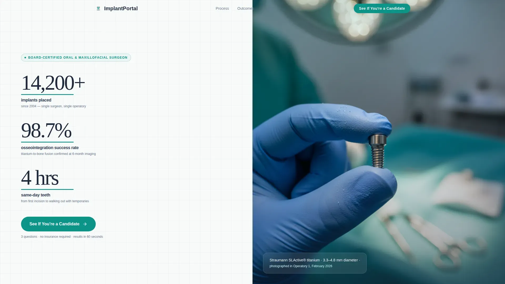
A split-screen landing page built for implant dentistry practices that need to turn serious prospects into scheduled consultations. The template leads with clinical proof stats, walks patients through a four-phase surgical timeline, and routes them into a three-question screening modal that hands off directly to a booking calendar. No insurance fields, no friction.
by Rocket studio
Quick summary
This is a single-page, split-screen landing page designed for a single-surgeon implant dentistry practice. It opens with a stats wall and a clinical macro photograph, then guides visitors through a transparent surgical timeline before triggering a frictionless three-question screening modal that connects qualified candidates to a booking calendar.
Who this template is for
This template is built for implant dentists who want a patient acquisition page that earns trust through transparency rather than persuasion tactics. It suits practices where one surgeon handles the full scope of care, from initial scan to final crown, under one roof.
- Implant dentists offering same-day temporaries, guided placement, or full-arch reconstruction
- Single-surgeon practices that want to pre-qualify patients before the first appointment
- Dental professionals targeting adults aged 45 to 70 who are researching permanent tooth replacement solutions
What problem this template solves
Many dental practice pages either overwhelm visitors with clinical jargon or undersell the procedure with vague reassurances. Qualified implant candidates, especially those who have lived with a failing bridge or loose dentures for years, arrive in research mode. They need specifics, not slogans.
- Visitors leave without booking because the process feels opaque or the next step feels risky
- Generic contact forms create unnecessary friction for patients who just want to know if they qualify
- Practice pages fail to convert desktop-first, high-intent researchers who need data before committing
What you get with this template
The template delivers a fully structured, desktop-first landing page with four primary content areas, a sticky call-to-action bar, and an embedded screening modal. Every section is scoped to move a qualified patient one step closer to a consultation.
- A stats and metrics hero section with a clinical photograph panel and a primary call-to-action button
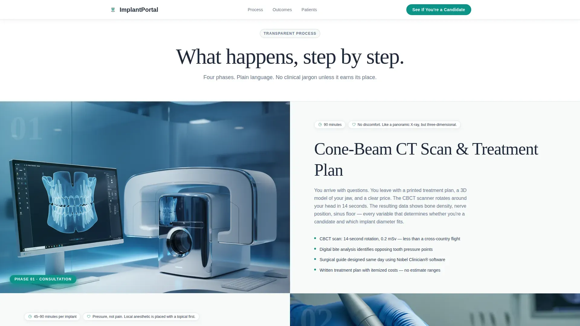
- A four-phase surgical timeline built as sequential split-screen scroll sections with plain-language explanations
- A patient story social proof section, a final full-width candidate screening trigger, and a horizontal-flow footer
Feature list
This template is built around a small set of purposeful, high-impact components. Each one serves the core goal: disclose the process clearly, remove doubt, and make booking feel easy.
Stats and Metrics Hero Wall
The left hero panel displays three oversized proof figures: 14,200 or more implants placed, a 98.7 percent osseointegration success rate, and same-day teeth in four hours. Each number is set at display scale with teal underlines that pulse once on page load. The primary call-to-action button sits directly below the stats. The right panel holds a single clinical macro photograph of a gloved hand holding a titanium implant post.
Four-Phase Surgical Timeline
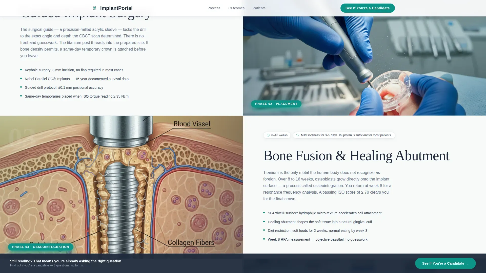
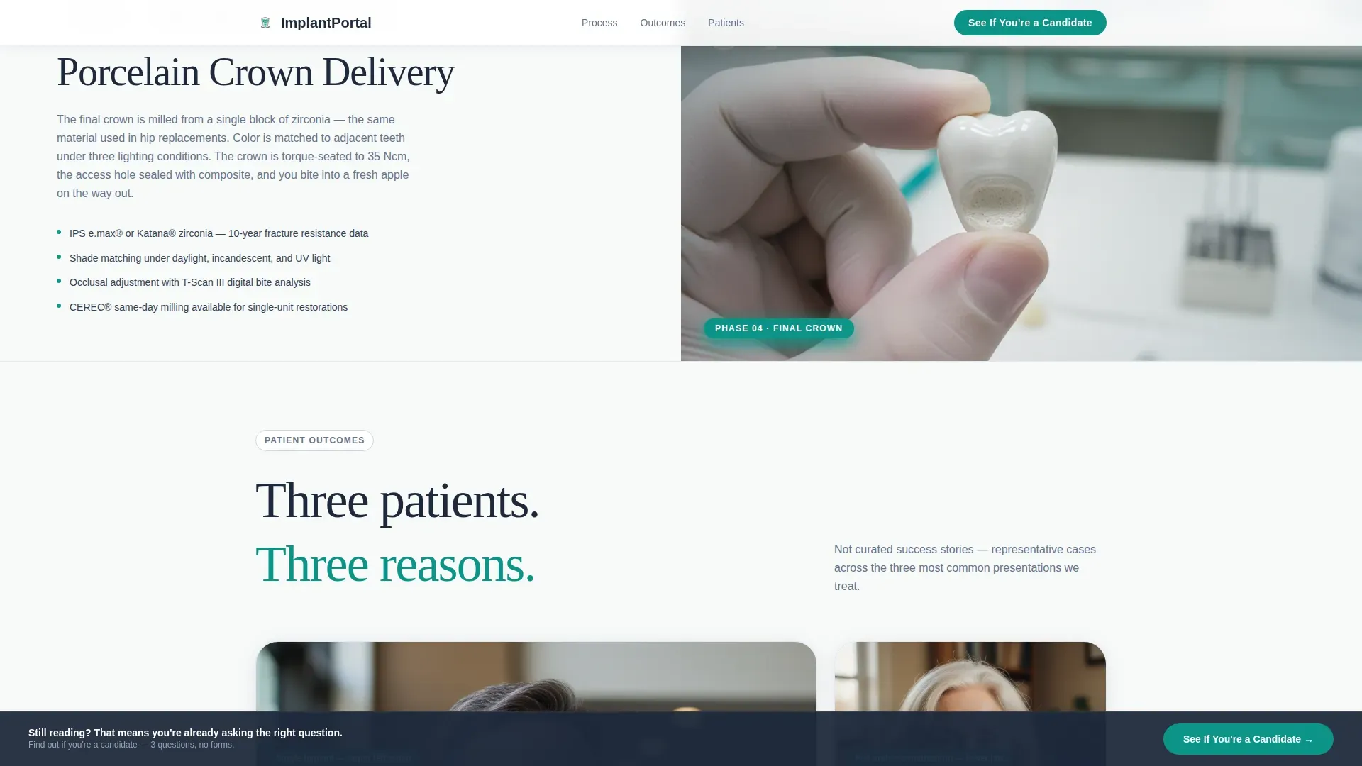
The scroll experience unfolds as a surgical timeline across four sequential split-screen sections. Each phase, consultation with three-dimensional imaging, guided implant placement, healing abutment, and final porcelain crown, pairs a clean illustration or computed tomography scan slice on the left with a plain-language explanation on the right. The explanation covers what happens, how long it takes, and what the patient feels.
Three-Question Screening Modal
Clicking the primary call-to-action opens a modal rather than a traditional contact form. The modal asks three questions: number of missing teeth (single, multiple, or full arch), current solution (nothing, denture, or bridge), and preferred consultation type (in-office three-dimensional scan or virtual). The final screen confirms eligibility and hands off to the booking calendar with no phone number field and no insurance field.
Sticky Candidate Call-to-Action Bar
After the second scroll section, a sticky bar appears at the bottom of the viewport. It carries the same primary call-to-action label and triggers the same screening modal. This ensures the conversion entry point stays accessible throughout the entire scroll without interrupting the timeline narrative.
Patient Story Bento Grid
A social proof section presents named patient testimonials alongside specific outcomes, procedure types, and recovery timelines. The bento grid layout allows multiple stories to coexist at a glance, giving prospective patients relatable reference points before they self-screen.
GSAP Scroll Animation System
The template includes high-intensity animation using GSAP ScrollTrigger. Staggered reveals activate as each timeline section enters the viewport. Parallax split panels create depth between the illustration and text columns. The teal pulse underlines on the stats figures fire once on initial load.
Page sections overview
| Section | Purpose |
|---|---|
| Stats hero wall | Display clinical proof figures and primary call-to-action above the fold |
| Clinical macro photo | Anchor the hero's right panel with authentic surgical imagery |
| Consultation phase | Introduce the three-dimensional scan and patient assessment step |
| Placement phase | Explain guided titanium implant surgery and same-day temporaries |
| Healing abutment phase | Describe the osseointegration and abutment placement period |
| Final crown phase | Show the porcelain crown fitting as the procedure's conclusion |
| Patient story grid | Provide named social proof with outcomes and recovery timelines |
| Candidate screening trigger | Present a full-width final call-to-action before the footer |
| Horizontal flow footer | Close the page with a clean, structured footer pattern |
Design & branding system
The visual identity follows a Medical Clarity theme. Every design choice is functional. Nothing decorative enters the layout unless it serves the communication goal directly.
- Color system uses surgical teal (#0D9488) for interactive elements and calls to action, sterile white (#F8FAFA) for open backgrounds, charcoal instrument gray (#1E293B) for headlines and body text, and soft titanium (#CBD5E1) for dividers, card borders, and secondary surfaces
- Typography pairs Fraunces at display scale for oversized proof numbers and primary headlines with DM Sans for all body text, labels, and explanatory copy
- The visual tone is sterile and precise, referencing the feel of a clinical instrument tray: cool metal surfaces, blue-green antiseptic light, and no decorative noise
Mobile & speed optimization
The template is designed desktop-first, reflecting the research behavior of its primary audience: professionals and adults aged 45 to 70 who browse in a focused, seated context. The layout is structured to perform cleanly at standard desktop viewport widths.
- Server Components handle all static sections including the hero, timeline, and footer to keep initial load lean
- Client-side rendering is scoped only to the modal screening flow and GSAP animation layers, limiting interactive overhead to what requires it
- Split-screen columns, parallax panels, and the bento grid are built to reflow responsibly at smaller breakpoints without breaking the narrative sequence
How this template helps you convert
Every structural decision in this template reduces the distance between a curious visitor and a booked consultation. The page does not try to close skeptical visitors with pressure. It closes prepared ones with clarity.
- The stats wall establishes clinical credibility in the first viewport, so visitors who are already researching implants immediately see evidence that matches their expectations for a high-quality practice.
- The transparent surgical timeline lowers perceived risk by making the procedure feel legible. When patients understand each phase in plain language, the unknown shrinks and the decision to screen feels manageable.
- The three-question modal removes the single biggest friction point in dental lead capture: the long contact form. Three questions, a confirmed eligibility result, and a direct handoff to the calendar makes the commitment feel as low-risk as the procedure claims to be.
Other information about this template
This template is category-matched to the Health and Medical vertical, specifically the implant dentist patient portal niche within the implant dentist website subcategory. It is localized for United States practices with English copy, date formatting in month/day/year order, and pricing in United States dollars where applicable.
- The intersection match score for this template's niche, subcategory, and category alignment is 13, indicating a strong purpose-fit for single-surgeon implant practices
- The template style is Split Screen 50/50, meaning every major content section divides the viewport into equal left and right columns
- The landing page direction is Click-Through, meaning the page's sole conversion goal is to move visitors into the screening modal and then the booking calendar
- The header concept is Stats and Metrics, prioritizing proof data over brand storytelling in the first viewport
- The creative direction is Transparent Process, which means the scroll narrative is structured as honest disclosure rather than persuasive copy
Theme
Medical Clarity
Creative direction
Transparent Process
Color system
Teal Catalyst
Style
Split Screen (50/50)
Direction
Click-Through
Page Sections
Stats and Metrics Hero Wall
Four-phase Surgical Timeline
Three-question Screening Modal
Sticky Candidate Call-to-action Bar
Patient Story Bento Grid
GSAP Scroll Animation System
Related questions
What type of dental practice is this landing page built for?
Does the page include a traditional contact form?
Can the screening modal questions be changed?
What animation technology does this template use?
Is this template suitable for a multi-location dental group?



