Specialist Implant Dentist Appointment Booking Website Template
A split-screen landing page built for implant dentistry practices that need to turn hesitant visitors into booked consultations. It stacks verified patient testimonials alongside bold outcome statistics, then guides prospects through a five-step candidacy assessment. The design uses a clean, clinically warm palette and serif typography to build trust fast and move people toward a first call.
by Rocket studio
Quick summary
This is a single-page landing page designed specifically for implant dentistry practices. It pairs a testimonial-led hero section with a stats-first scrolling rhythm, a moving review marquee, and a five-step guided quiz. Every section is built to reduce hesitation and earn the consultation request from adults who have been putting off tooth replacement for too long.
Who this template is for
This template suits implant dentistry practices that rely on trust, social proof, and clear clinical credentials to convert website visitors. It is especially relevant for practices serving adults who are researching tooth-replacement options for the first time.
- Implant dentists offering single-tooth replacements, full-arch restorations, or same-day temporaries
- Practices that receive referrals from general dentists and need to justify the handoff
- Adult children or caregivers researching implant options on behalf of a parent
What problem this template solves
Most implant dentistry pages ask visitors to "book a consultation" before giving them any reason to trust the practice. The visitor arrives skeptical, scans a few paragraphs, and leaves. This template solves that trust gap by leading with faces, numbers, and verified words from real patients.
- Visitors hesitate because they cannot tell whether a practice is truly experienced or just well-marketed
- Outcome statistics mean little without a human story alongside them to make the number feel real
- A generic contact form does not help a nervous patient understand whether they are even a candidate
What you get with this template
You get a fully structured landing page with five distinct sections, each with a defined visual role. The layout is split-screen throughout, meaning content never competes for attention on a single axis.
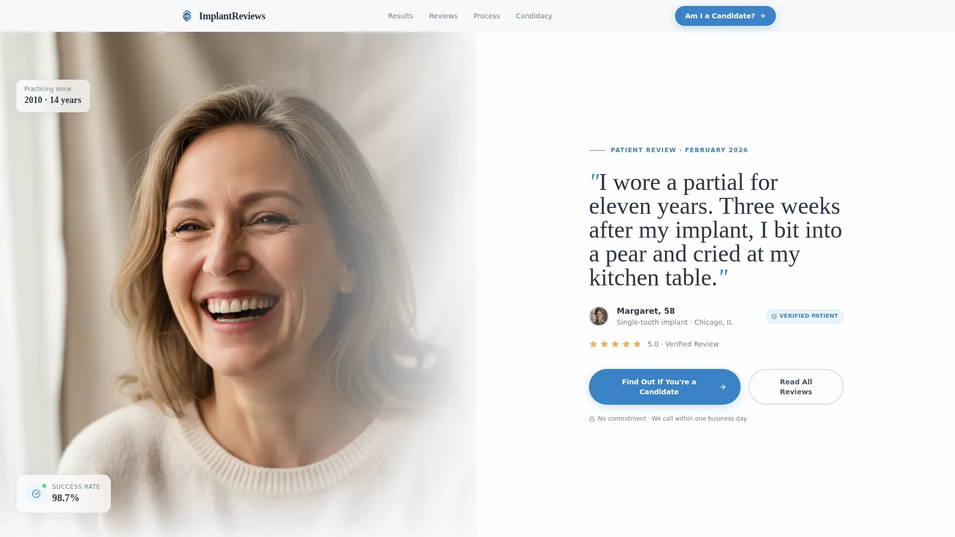
- A hero section with a patient portrait on one half and an oversized pull-quote card on the other
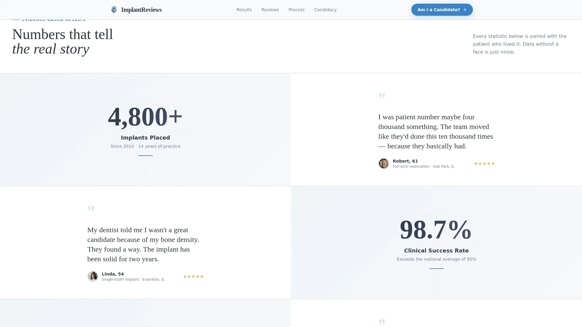
- An alternating stats-and-story scroll sequence featuring four stat-and-micro-testimonial pairs
- A dual-direction testimonial marquee, a five-step candidacy quiz, and a visual process strip
Feature list
This template is built around a small number of high-impact features, each chosen to move a specific kind of visitor closer to booking.
Split-Screen Testimonial Hero
The hero divides the viewport equally. The left half holds a large patient portrait shot in natural light. The right half displays a pull-quote in oversized serif type, the patient's first name and age, a five-star row, and a verified-review badge. The combination of a real face and specific words stops scrolling the way eye contact does.
Stats-First Impact Scroll
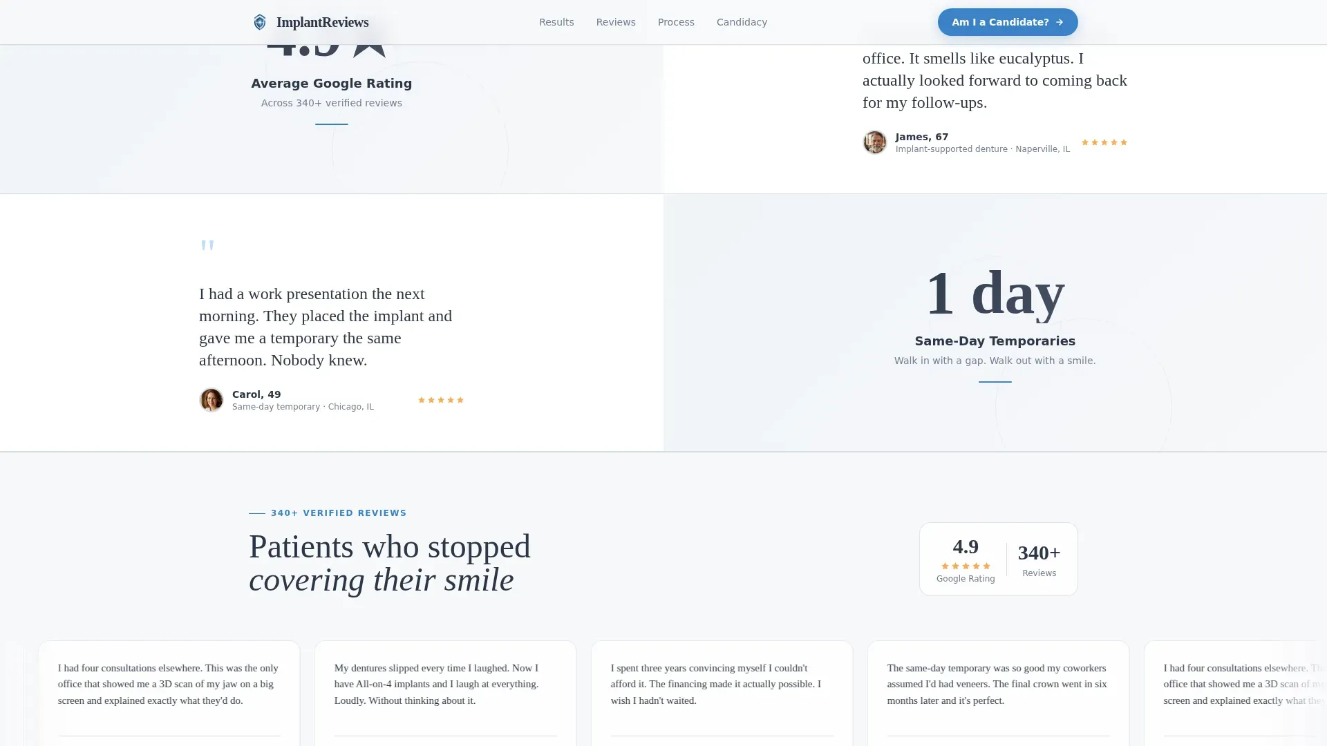
Immediately below the hero, bold numerals appear before any paragraph text: 4,800 or more implants placed, a 98.7 percent success rate, 14 years of practice, and a 4.9 average rating. Each statistic occupies one half of a split frame. The opposite half holds a micro-testimonial that gives the number a human context. The sequence alternates direction as the visitor scrolls, creating a rhythm of accumulating evidence.
Five-Step Candidacy Assessment Quiz
The primary call to action reads "Find Out If You're a Candidate" and opens a guided five-step assessment. Step one asks what is bothering the visitor most. Step two asks how long the issue has persisted. Step three covers medical considerations such as bone loss, smoking, and current medications. Step four offers an optional smile photo upload. Step five collects name, phone number, and preferred contact time. A trust-blue progress bar fills with each completed step.
Testimonial Marquee with Glassmorphic Cards
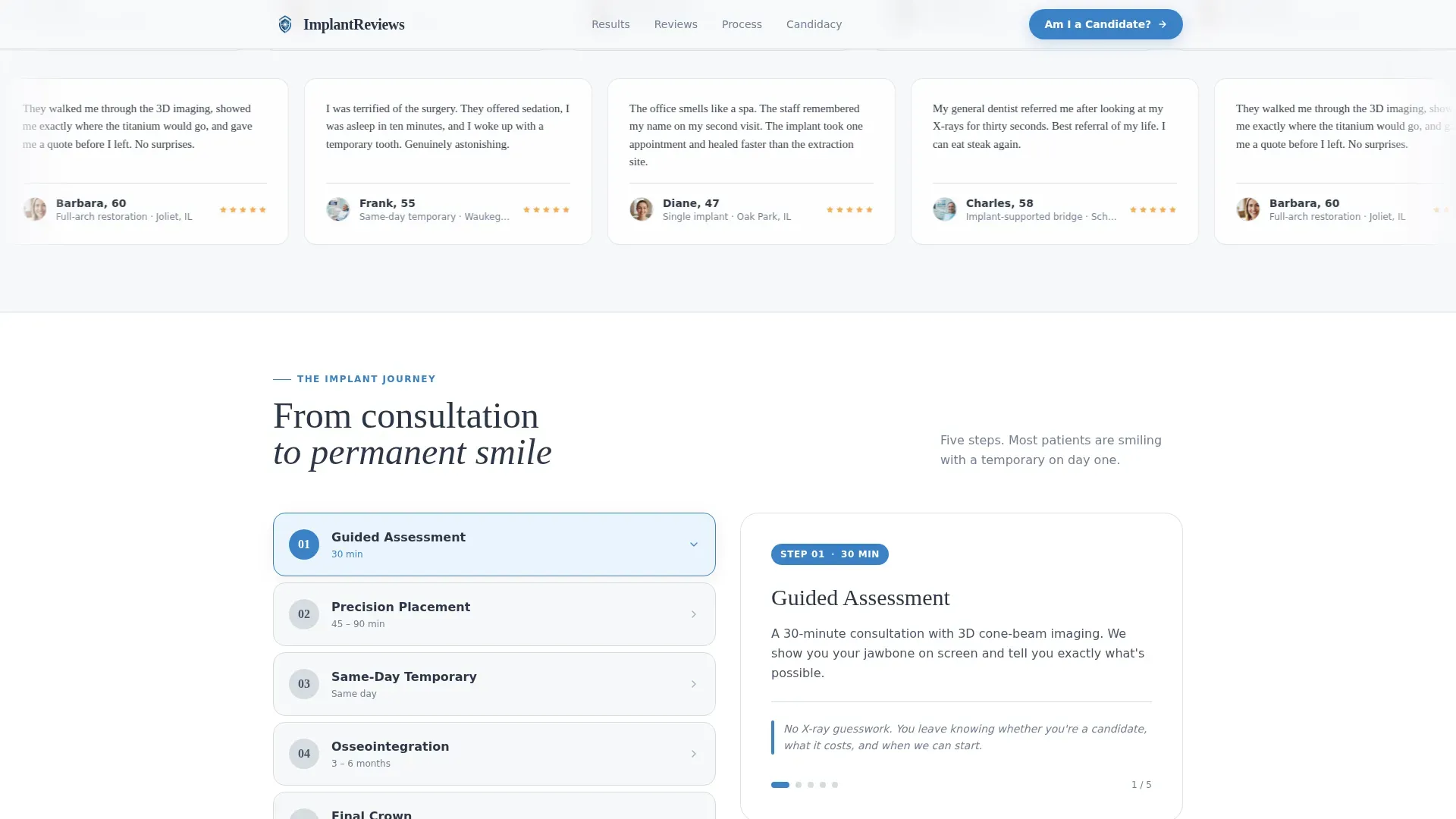
A dual-direction scrolling marquee displays patient review cards in a glassmorphic style. The cards pause when a visitor hovers, allowing them to read at their own pace. The marquee runs continuously in the background, signaling a volume of positive reviews rather than a curated handful.
Visual Process Strip
A dedicated section illustrates the implant journey across three clear stages: consultation, implant placement, and final smile. This section answers the procedural question most first-time visitors carry before they feel ready to ask it directly.
Page sections overview
| Section | Purpose |
|---|---|
| Hero testimonial card | Opens with a split patient portrait and verified pull-quote to establish trust immediately |
| Stats impact pairs | Alternates statistics and patient micro-stories to build layered, scroll-driven credibility |
| Testimonial marquee | Streams glassmorphic review cards in dual directions to signal review volume |
| Candidacy quiz | Guides prospects through a five-step assessment to qualify and capture lead details |
| Implant process strip | Visualizes the treatment journey from consultation to final smile in three stages |
| Footer row | Provides a single linear row with practice contact details and closing navigation |
Design & branding system
The visual identity follows a Medical Clarity approach using a Soft Mist color palette. The result feels like a Scandinavian clinic at morning light: sterile without being cold, and warm without being imprecise.
- Clinical white (#F7F8FA) as the dominant background, breath-fog gray (#D6DCE1) for dividers and secondary panels, and calm slate (#4A5568) for body text
- Trust-blue (#3B82C8) reserved exclusively for interactive elements, the quiz progress bar, and call-to-action buttons so every blue element reads as a prompt to act
- Fraunces serif for display headlines and pull-quotes, paired with DM Sans for body copy and interface labels
Mobile & speed optimization
The template is built desktop-first to match the browsing habits of the primary audience, adults in their fifties who are more likely to research on a larger screen. Full mobile support is included so the page remains functional and readable across all device sizes.
- Static sections are built as server components to keep the initial page load light
- Interactive elements including the quiz and animations are handled as client components to isolate their rendering overhead
- High-motion features such as blur-reveal transitions, staggered card animations, character reveals, and the marquee are scoped to avoid layout shift on smaller screens
How this template helps you convert
Every section is arranged to reduce a specific type of resistance that tooth-replacement candidates typically carry. The page does not ask for commitment until it has already delivered evidence.
- The hero creates immediate emotional identification. A mid-laugh patient portrait paired with a verified quote tells the visitor that someone like them already went through this and came out smiling.
- The stats-and-story scroll builds rational confidence. By the time a visitor reaches the quiz, four pairs of numbers and human accounts have already answered the question "but does it actually work?"
- The five-step quiz earns the lead by making the visitor feel assessed rather than sold to. Collecting a photo and a preferred call time lowers friction and raises the quality of the eventual consultation.
Other information about this template
This template is designed for a single-page landing structure and is not a multi-page website. All sections exist within one scrolling flow, which keeps the visitor on a single path toward the quiz call to action.
- The verified-review badge and star-rating row in the hero are visual components included in the template layout; connecting them to a live review platform requires additional setup outside this template
- The photo upload field in quiz step four is marked optional to reduce friction for visitors who are not yet comfortable sharing an image
- Animation intensity is high throughout, including blur reveals on the hero, staggered card entrances on the marquee, a character-reveal effect on headline text, and a filling progress bar inside the quiz
- The footer follows a linear single-row pattern with practice information presented in a clean horizontal layout
Theme
Medical Clarity
Creative direction
Stats-First Impact
Color system
Soft Mist
Style
Split Screen (50/50)
Direction
Quiz/Assessment
Page Sections
Split-screen Testimonial Hero
Stats-first Impact Scroll
Five-step Candidacy Quiz
Dual-direction Testimonial Marquee
Visual Implant Process Strip
Related questions
Who is the target patient for this landing page template?
Can I customize the statistics shown in the stats section?
How does the five-step quiz capture lead information?
Is this template suitable for a practice focused only on single-tooth implants?
Does the page include a standard contact form in addition to the quiz?



