Complete Implant Dentist Appointment Booking Website Template
A single-page implant dentist virtual consultation landing page built to convert research-fatigued adults into booked 15-minute video calls. It opens with a guided multi-step form, walks visitors through a personalized readiness audit, presents a side-by-side treatment comparison table, and closes with a teal-accented calendar booking flow, all in a calm, clinical Arctic White design.
by Rocket studio
Quick summary
This landing page is designed for implant dentists who want to turn anxious, over-researched patients into booked virtual consultations. A three-step intake form, a personalized readiness audit, and a detailed comparison table do the heavy lifting. The Educational Guide theme keeps the experience calm and credible from the first tap to the final booking confirmation.
Who this template is for
This template is built for implant dental practices that offer virtual consultations as a first point of contact. It is especially useful for practices serving patients who have already visited multiple offices and are still confused about pricing or treatment options.
- Implant dentists and oral surgeons running virtual consultation programs
- Dental marketing teams building a dedicated conversion landing page for implant inquiries
- Practices targeting adults in their 40s through 70s who research on mobile at night
What problem this template solves
Prospective implant patients often arrive with three conflicting price quotes, hours of YouTube research, and deep distrust. They need a structured, unhurried experience that answers their questions before asking for a commitment. This template addresses that gap directly.
- Patients leave other pages confused by jargon, price variance, and unclear next steps
- A generic contact form does not build enough trust for a high-consideration dental purchase
- Mobile visitors need a sticky, persistent call to action that travels with them as they scroll
What you get with this template
You get a complete, section-led single-page layout built around the patient journey from first curiosity to a confirmed video appointment. Every section earns the visitor's trust before asking them to act.
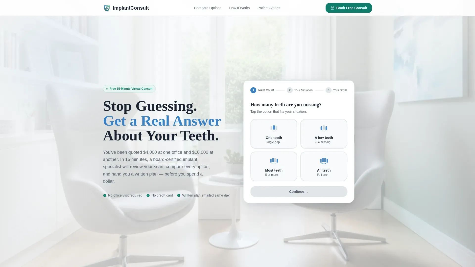
- A three-step header form collecting tooth count, current situation, and an image upload
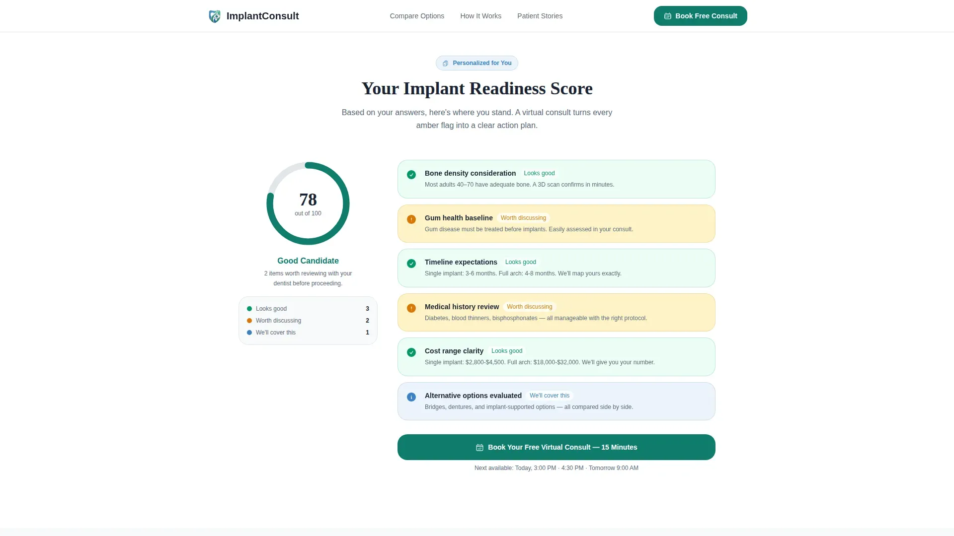
- A dynamic Implant Readiness Score checklist generated from the visitor's own form inputs
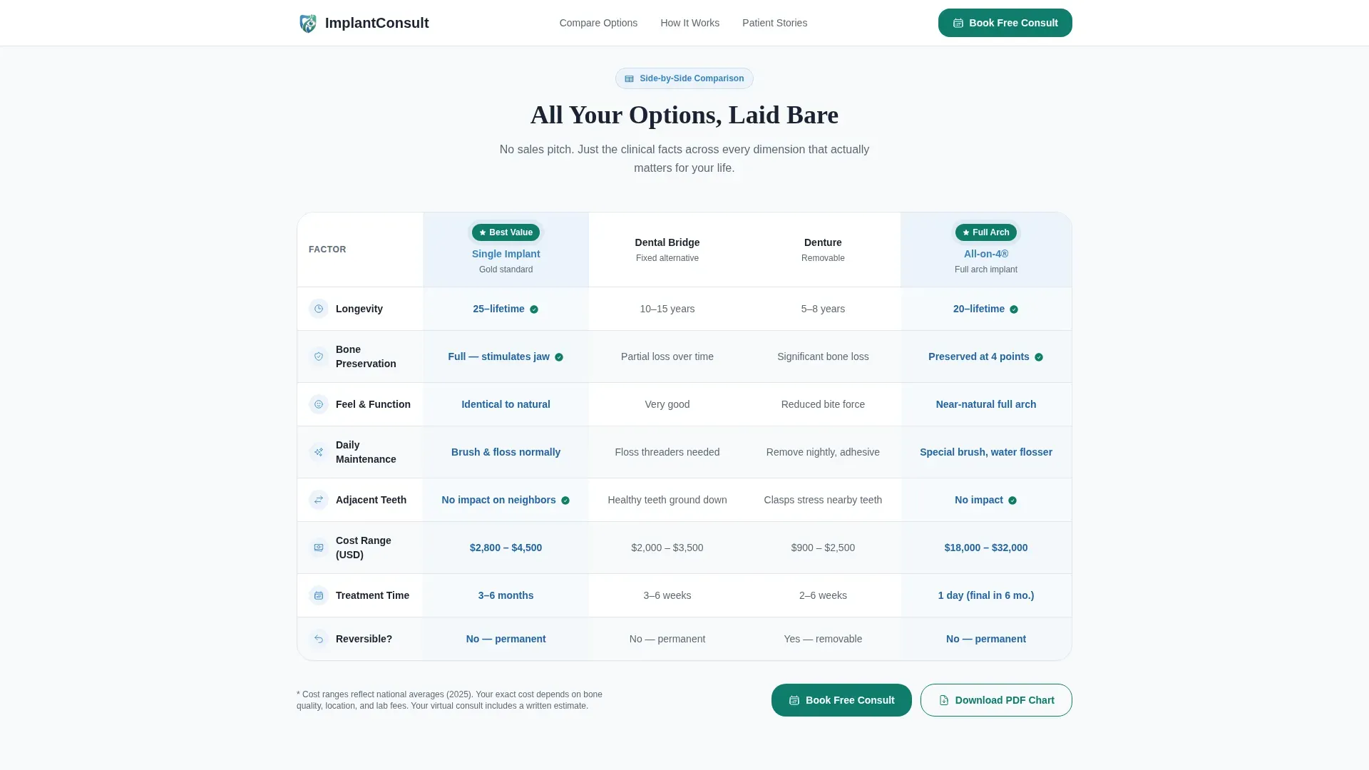
- A side-by-side comparison table covering single implants, bridges, dentures, and All-on-4 across six clinical dimensions
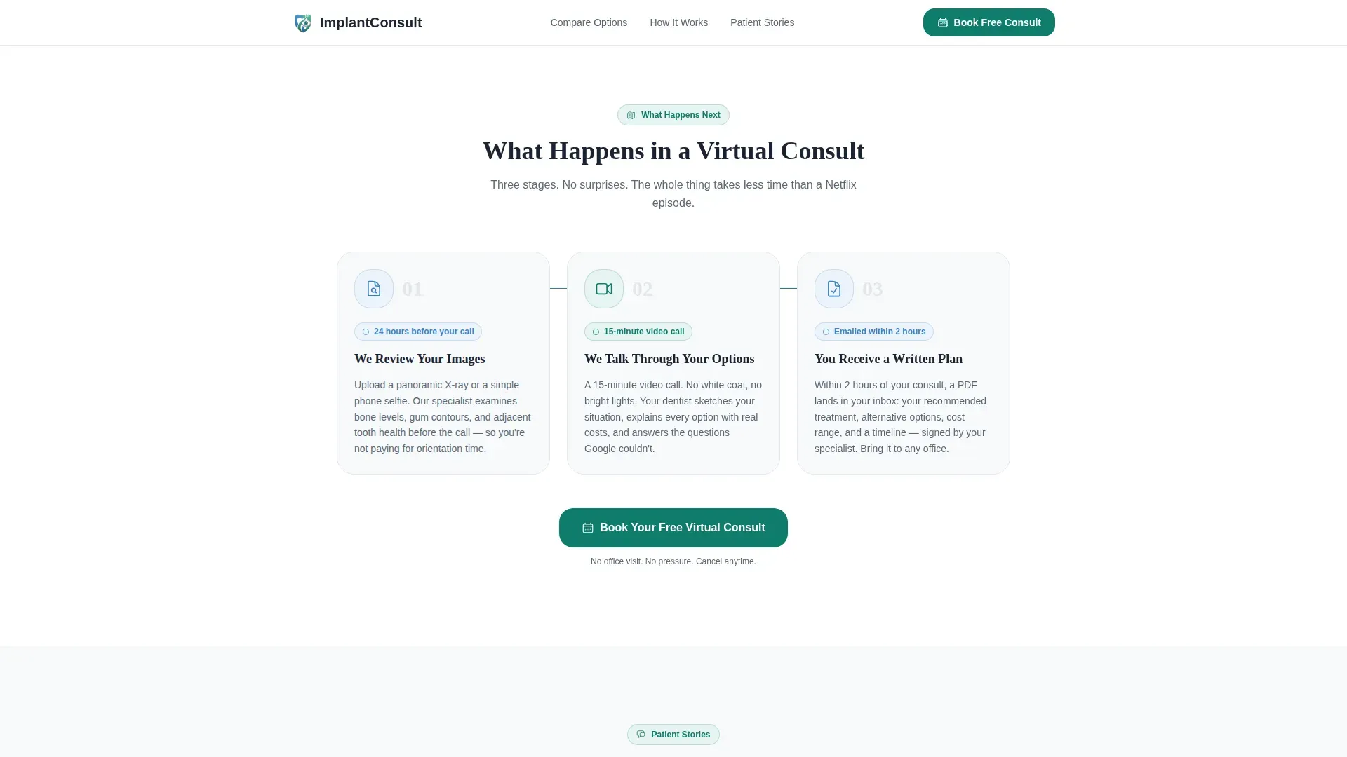
- A three-card walkthrough explaining exactly what happens during a virtual consult
- A patient testimonial slider with specific outcome stats and star ratings
- A sticky mobile call-to-action bar and a secondary email-capture path for visitors not yet ready to book
Feature list
This template is built around a set of purposeful interactive and visual components that work together to educate, reassure, and convert.
Three-Step Guided Intake Form
The header card opens mid-conversation rather than with a blank field. Step one asks how many teeth are missing using illustrated jaw icons. Step two asks about the visitor's current situation. Step three collects a panoramic X-ray upload or smile selfie. A teal progress bar fills across each step so the visitor feels momentum, not paperwork.
Personalized Readiness Audit
Immediately below the header, the visitor sees their own Implant Readiness Score. Line items such as bone density consideration, gum health baseline, and timeline expectations appear checked in green or flagged in amber based on the inputs they just gave. This section turns a generic page into a personal conversation.
Side-by-Side Comparison Table
The core of the page is a structured table comparing single implants, dental bridges, conventional dentures, implant-supported overdentures, and All-on-4 treatment across six clinical dimensions: longevity, bone preservation, maintenance, daily feel, and cost range. Implant columns are highlighted in cerulean, and alternative columns appear in muted gray, so the clinical picture becomes clear without editorializing.
Virtual Consult Walkthrough Cards
Three illustrated white cards explain the consultation process step by step: the dentist reviews your images before the call, you discuss all options together on video, and you receive a written treatment plan afterward. This section removes the fear of the unknown before the visitor commits to booking.
Calendar Booking Embed with Pre-Fill
The primary call to action opens a calendar showing available 15-minute video slots within the next 72 hours. The form pre-fills from the header inputs so the patient never re-enters information already provided. A sticky bottom bar on mobile ensures this booking option is always one tap away.
Secondary Lead Capture Path
A second conversion option labeled "Not Ready Yet? Get the Implant Guide" captures an email address and delivers a downloadable PDF comparison chart. This path nurtures visitors who need more time before committing to a live consultation.
Page sections overview
| Section | Purpose |
|---|---|
| Hero Form Card | Collect teeth count, situation, and image in three guided steps |
| Readiness Audit | Show a personalized implant readiness score from form inputs |
| Comparison Table | Compare treatment options across six clinical dimensions |
| Virtual Consult Steps | Walk through what happens during a 15-minute video call |
| Patient Testimonials | Build trust with photo quotes and specific outcome results |
| Secondary Lead Capture | Capture emails from visitors not yet ready to book |
| Sticky Mobile Bar | Keep the booking call to action visible on every scroll position |
| Footer | Linear single-row footer with minimal navigation |
Design & branding system
The visual identity follows an Educational Guide theme anchored in an Arctic White color system. The palette feels clinical without being cold, and trustworthy without being sterile.
- Background uses clinical white (#F8FAFB) and soft enamel gray (#E2E6EA) for borders and card separators
- Calm cerulean (#3B82C4) highlights implant columns in the comparison table and marks primary interactive elements
- Confident teal (#0E7C6B) is used for all buttons, progress indicators, and the sticky mobile call-to-action bar
- Typography pairs DM Sans for body text with Fraunces as a trustworthy serif for display headlines
Mobile & speed optimization
The template is built mobile-first, recognizing that the target audience most often researches dental options on a phone late at night. Layout decisions prioritize thumb-friendly taps and readable type at small sizes.
- The sticky bottom bar keeps the booking call to action persistent as the visitor scrolls through the full page
- The multi-step form uses large illustrated icons rather than dense text fields, reducing friction on small screens
- Static sections use server components while the interactive multi-step form runs as a client component, keeping the initial load light
How this template helps you convert
Every section of this template is sequenced to reduce anxiety, build credibility, and move the visitor toward a single clear action: booking a free virtual consultation.
- The intake form begins a personal conversation before the visitor reads a single line of body copy, capturing their situation and making the rest of the page feel tailored to them.
- The readiness audit and comparison table answer the two questions every implant patient is actually asking: "Am I a candidate?" and "Is this better than my other options?" Answering both questions on the same page removes the need to leave and research elsewhere.
- Three booking call-to-action placements, after the audit, after the comparison table, and in the persistent mobile bar, ensure the visitor always has a clear next step visible regardless of where they stop reading.
Other information about this template
This template is designed for a specific, high-consideration healthcare niche and reflects the real decision journey of adult implant patients. A few additional details are worth noting for teams evaluating this template.
- The page is localized for English (United States), using USD pricing references and MM/DD/YYYY date formatting throughout
- GSAP scroll-reveal animations and micro-animations on step transitions are included to create a sense of gentle forward progress
- The comparison table row highlighting uses teal on hover for an additional layer of interactivity during desktop browsing
- The patient testimonial slider is built with GSAP and includes photo, quote, and a specific outcome stat per testimonial
- The footer follows a linear single-row layout, keeping the page focused on conversion rather than navigation
Theme
Educational Guide
Creative direction
Checklist & Audit
Color system
Arctic White
Style
Comparison Table
Direction
Booking/Scheduling
Page Sections
Three-step Guided Intake Form
Personalized Implant Readiness Score
Side-by-side Treatment Comparison Table
Virtual Consult Walkthrough Cards
Calendar Booking with Form Pre-fill
Secondary Lead Capture for Undecided Visitors
Related questions
Can I customize the comparison table to match my practice's treatment offerings?
Does the intake form data carry over into the booking calendar?
Is the secondary email capture path included in the template?
What image types can visitors upload in the form's third step?
Can this template work if my practice does not offer 72-hour booking availability?



