Nonprofit Marketing & Agency Portfolio Website Template
Imprint is a single-page landing page template for nonprofit branding agencies. It pairs a hand-drawn SVG animation hero with scroll-linked, torn-paper case study reveals and a three-panel brand brief modal. The editorial Ink and Paper aesthetic, built on cream, ink black, and vermilion, gives creative studios the visual authority to win executive-level nonprofit clients.
by Rocket studio
Quick summary
Imprint is a conversion-focused landing page template built for nonprofit branding agencies. It opens with a live SVG ink-draw animation and guides visitors through layered case study storytelling before inviting them to start a brand brief. The design feels like a letterpress annual report in motion, crafted specifically to earn trust from executive-level nonprofit decision-makers.
Who this template is for
This template is built for branding agencies and creative studios that serve the nonprofit sector. It speaks directly to shops whose work moves beyond generic templates into hand-crafted identity systems for mission-driven organizations.
- Creative directors and brand strategists pitching to foundations and NGOs
- Branding studios positioning for capital campaign and donor-material work
- Independent designers ready to attract executive director clients
What problem this template solves
Most agency landing pages fail to communicate craft. A nonprofit executive director reviewing vendor options needs to feel the quality of the work before a single conversation happens. Generic portfolio grids and stock-photo layouts do not build that trust.
- Volunteer-made visuals and corporate template aesthetics erode nonprofit credibility with major donors
- Creative agencies lack a page that mirrors the editorial quality of the work they actually deliver
- Standard contact forms lose partnership leads who need a guided, consultative intake experience
What you get with this template
You get a fully structured, single-page landing page that brings together animation, editorial storytelling, and a layered modal intake form. Every section is designed to qualify and convert senior nonprofit clients.
- An SVG ink-draw hero animation that sketches a brand lockup into existence in real time
- Three scroll-triggered Creator Spotlight case study sections with torn-paper layered reveals
- A three-panel brand brief modal styled as a folding letter, plus a lead magnet download path
Feature list
Live SVG Ink-Draw Hero Animation
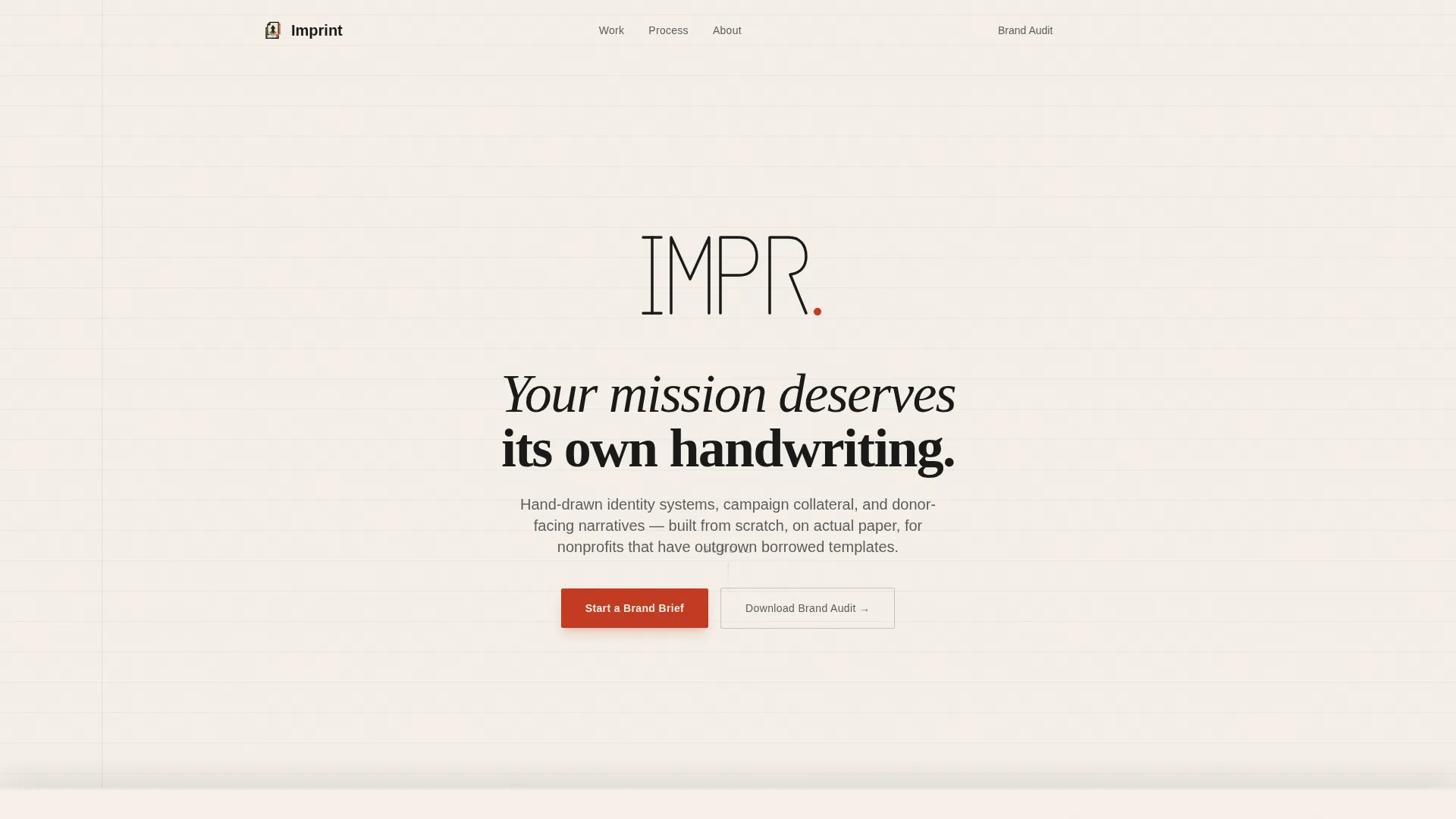
The hero opens with a hand-drawn nonprofit logo sketching itself across a textured paper background. Stroke weight varies to mimic an actual nib on paper. When the drawing completes, it lifts and resolves into a finished brand lockup. The tagline fades in beneath: "Your mission deserves its own handwriting."
Scroll-Linked Creator Spotlight Case Studies
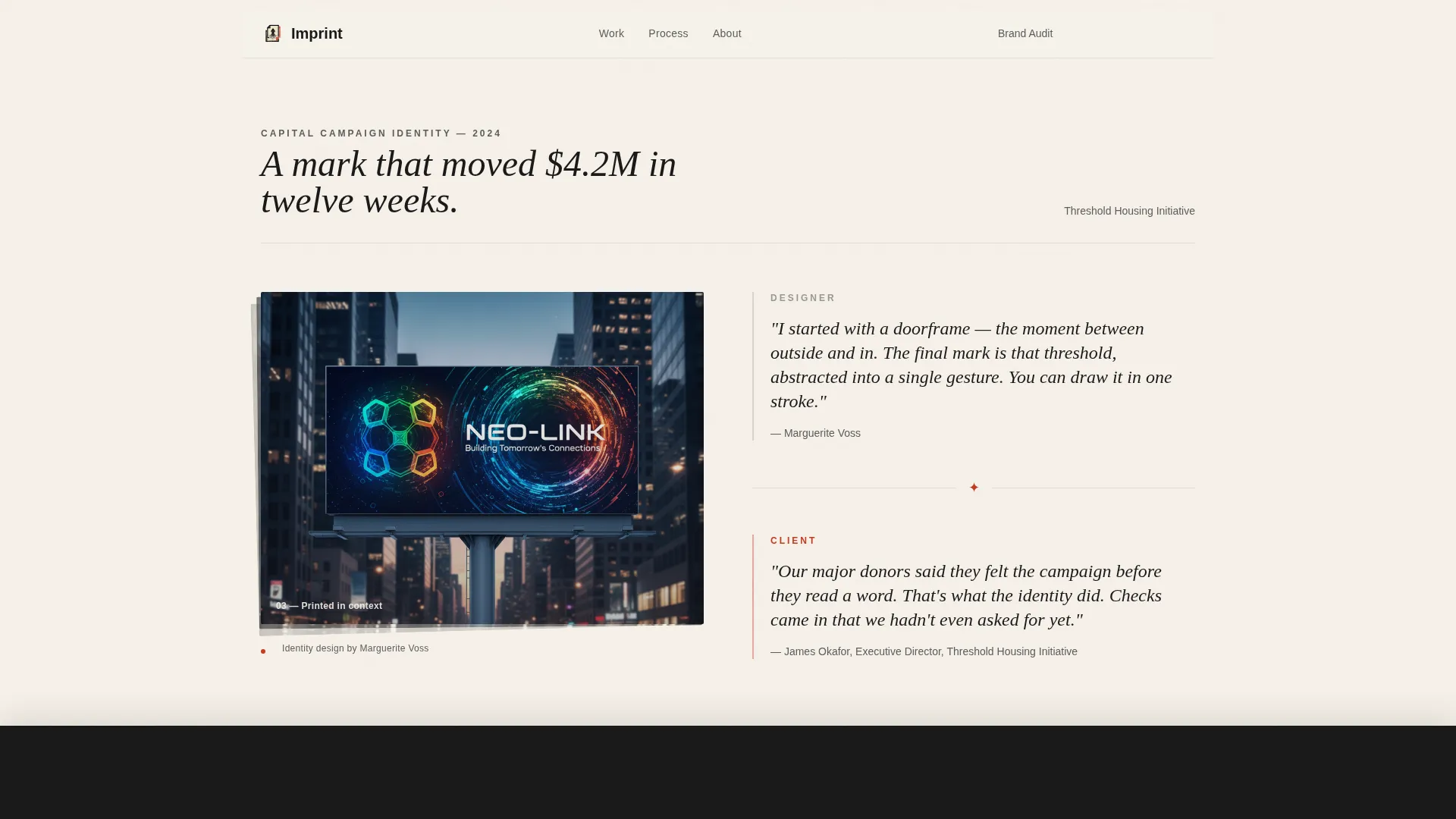
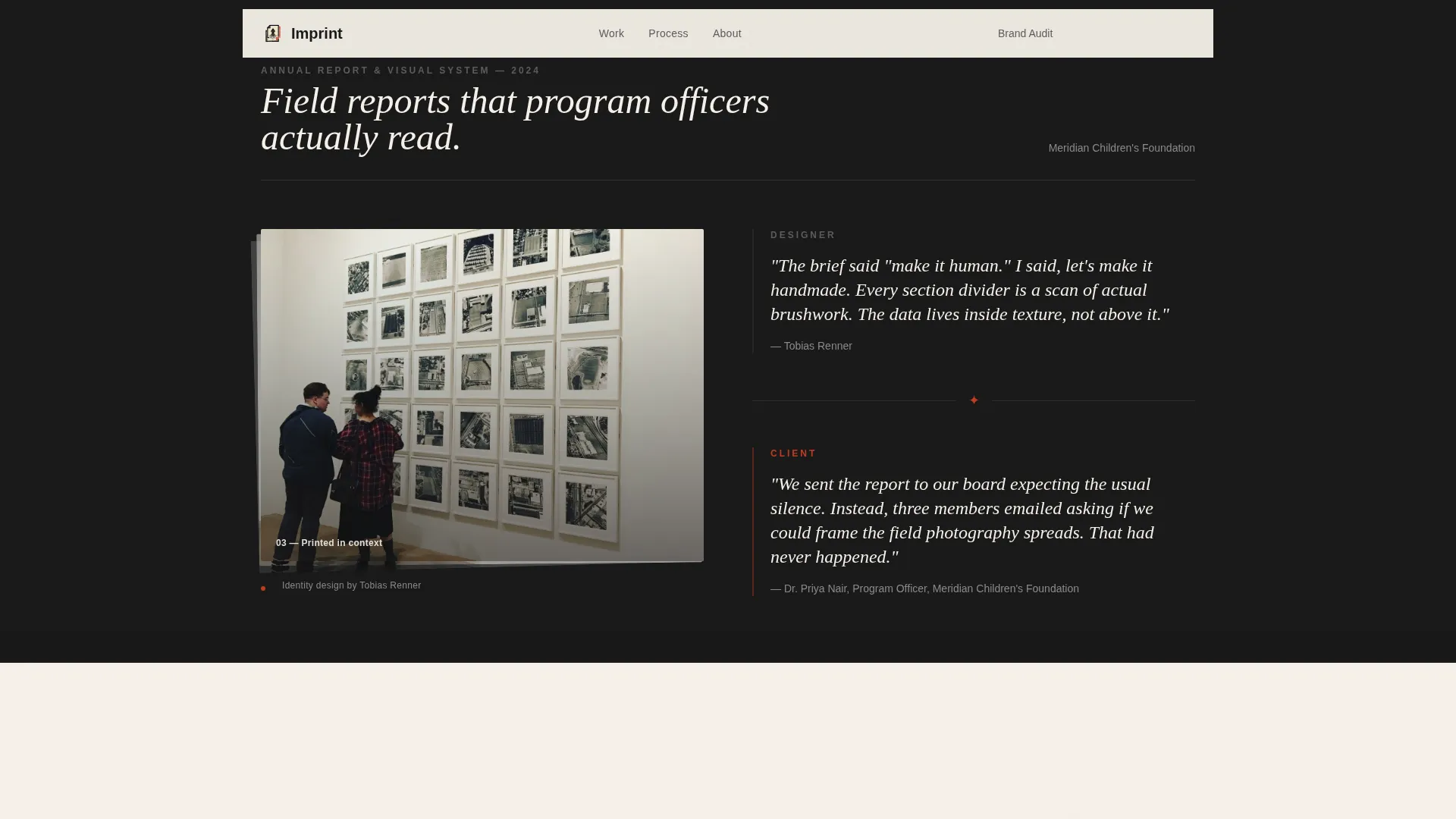
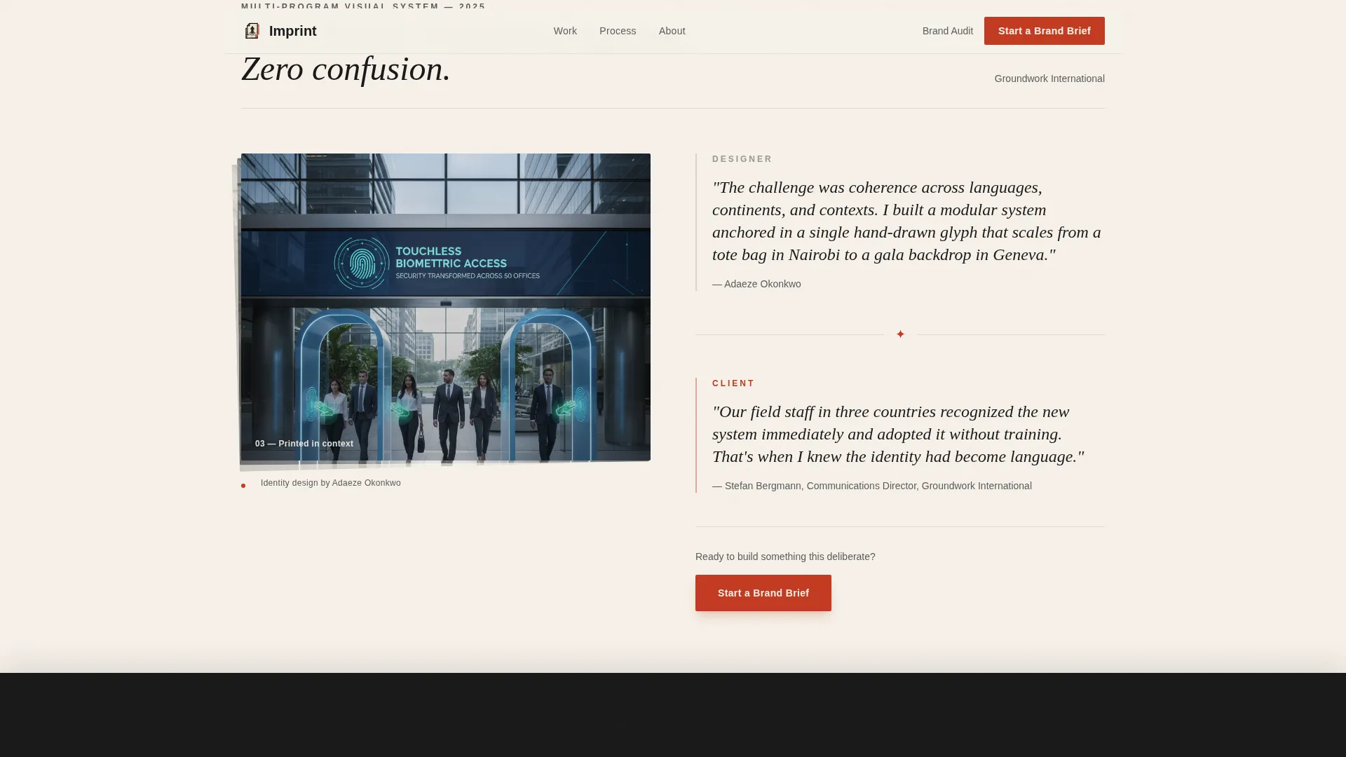
Three case study sections stack as you scroll, each overlapping the previous by forty pixels. A torn-paper edge peels back to reveal a layered composition: pencil sketch underneath, refined vector on top, and the final printed piece photographed in context. Designer pull-quotes and nonprofit director pull-quotes appear side by side in dialogue.
Three-Panel Brand Brief Modal
The primary call to action opens a modal styled as a folded letter unfolding across three panels. Panel one captures organization name and mission statement. Panel two presents brand pain options such as outgrowing a logo or launching a capital campaign. Panel three collects budget range and timeline.
Lead Magnet Download Path
A secondary conversion path offers "Download Our Nonprofit Brand Audit," a twelve-page PDF that scores an organization's existing identity. It requires only name, organization, and email to unlock. This path serves as both a lead magnet and a qualification filter.
Scroll-Stacking Overlap Layout
The Overlap and Layered template structure creates a physical sense of accumulation as visitors scroll. Each section slides over the previous one, reinforcing the visual metaphor of a portfolio building page by page, proof on proof.
Fixed Navigation with Contextual Call to Action
After the midpoint of the page, the primary call to action "Start a Brand Brief" pins itself to the navigation bar. It first appears after the third case study, then becomes a persistent prompt without interrupting the editorial reading experience.
Page sections overview
| Section | Purpose |
|---|---|
| Hero Animation | Ink-draw logo sketch builds brand trust instantly |
| Creator Spotlight One | First case study reveals sketch-to-print project |
| Creator Spotlight Two | Second layered case study with designer dialogue |
| Creator Spotlight Three | Third project triggers primary call to action appearance |
| Process Stack | Overlapping paper sheets show sketch to final print |
| Social Proof | Designer and director pull-quotes in dialogue format |
| call to action and Modal | Brand brief form and lead magnet download path |
| Footer | Linear single-row links and contact information |
Design & branding system
The visual identity follows an Ink and Paper theme. Every color choice references a physical design object, and the palette creates a strong sense of editorial authority without feeling corporate.
- Cotton stock (#F5F0E8) and ink black (#1A1A1A) alternate as section backgrounds to create dramatic tonal contrast as you scroll
- Editing-pencil graphite (#5C5C5C) handles body text and secondary navigation, keeping the reading experience calm and legible
- Stamped vermilion (#C23B22) appears only on active states, pull-quotes, and the primary call to action, making every instance feel as deliberate as a wax seal
Mobile & speed optimization
The template is designed desktop-first, reflecting the reality that executive directors and capital campaign managers typically review vendor materials on a desktop browser. Mobile responsiveness is included to cover secondary device use.
- GSAP ScrollTrigger powers the complex SVG path draw and torn-paper reveal animations
- CSS micro-interactions handle hover states and secondary animations without adding animation overhead
- The scroll-stacking layout and modal unfold are built for smooth performance on modern desktop browsers
How this template helps you convert
Every structural decision on this page points toward one outcome: a qualified prospect submitting a brand brief or downloading the brand audit PDF.
- The three-panel modal guides prospects through a consultative intake flow that mirrors how a real discovery conversation would begin, reducing friction and increasing brief quality.
- The Creator Spotlight storytelling format, with designer and client voices in dialogue, builds credibility across three case studies before the primary call to action ever appears.
Other information about this template
This template works best for agencies that have real project photography and printed piece documentation to place inside the Creator Spotlight sections. The torn-paper reveal effect and layered composition layout are built to showcase tactile, print-focused creative work.
- Typography uses Fraunces for serif display headings and DM Sans for body text, pairing editorial warmth with clean readability
- The footer follows a linear single-row layout, keeping the page's closing moment clean and uncluttered
- The brand brief modal and lead magnet path offer two distinct conversion routes, allowing the page to qualify both ready-to-buy prospects and earlier-stage organizations simultaneously
Theme
Ink & Paper
Creative direction
Creator Spotlight
Color system
Ink & Paper
Style
Overlap/Layered
Direction
Partnership/B2B
Page Sections
Live SVG Ink-draw Hero Animation
Scroll-linked Torn-paper Case Studies
Three-panel Brand Brief Modal
Lead Magnet Qualification Path
Fixed Navigation Call to Action
Overlap and Layered Scroll Layout
Related questions
What type of agency is this landing page template designed for?
How does the brand brief modal work?
What is the lead magnet included in this template?
Is this template suitable for agencies with both nonprofit and for-profit clients?
What animations and interactions are included?



