Certified Hobby & Passion Supplies Professional Website Template
Imprint is a curated card-grid landing page built for a printmaking supply shop. It presents Japanese gouges, linoleum cutters, specialty inks, and hand-rolled papers through tactile, studio-inspired design. Flip-card product previews, a layer-by-layer print animation, and a guided kit-builder flow make every scroll feel like a studio visit, not a catalog browse.
by Rocket studio
Quick summary
Imprint is a single-page card-grid template for a curated block printing supply shop. It organizes tools by feel, shows inks as real printed swatches, and funnels every interaction toward a guided kit-builder. The visual identity pairs a soft lavender-to-white gradient with a marigold accent, creating a page that feels as considered as the craft it serves.
Who this template is for
This template is built for creative-supply sellers who want their storefront to feel as thoughtful as their inventory. It speaks directly to the people who shop there and the people who run the store.
- Independent printmaking supply shops that sell hand-selected tools, inks, and papers
- Art teachers and studio educators stocking supplies at the start of each semester
- Letterpress and block printing hobbyists looking for a guided, low-friction way to build a first kit
What problem this template solves
Most hobby-supply pages feel like warehouse catalogs. They list products by brand or SKU, which means customers who are new to printmaking have no idea where to start. Imprint solves that with editorial curation built directly into the layout.
- Visitors do not know which gouge, ink, or paper to buy first, and a flat product grid does not help
- Returning makers waste time scanning irrelevant products when they already know exactly what they need
- Store owners cannot communicate expertise or taste through a generic theme
What you get with this template
You get a complete, single-page layout designed to sell curated printmaking supplies with confidence. Every section has a defined purpose, and every interaction is aimed at one outcome.
- A modular card grid with hover-flip product previews showing short looping tool-in-use videos
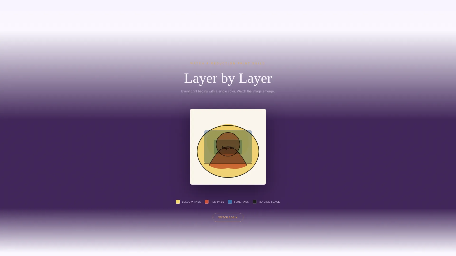
- A full-width animated interstitial that reconstructs a pulled print layer by layer in color sequence
- A dual call-to-action system with a primary "Start Your Kit" marigold button and a secondary "Browse All Supplies" text link
Feature list
This section describes the core built-in capabilities of the Imprint template as designed.
Tactile Product Organization Cards
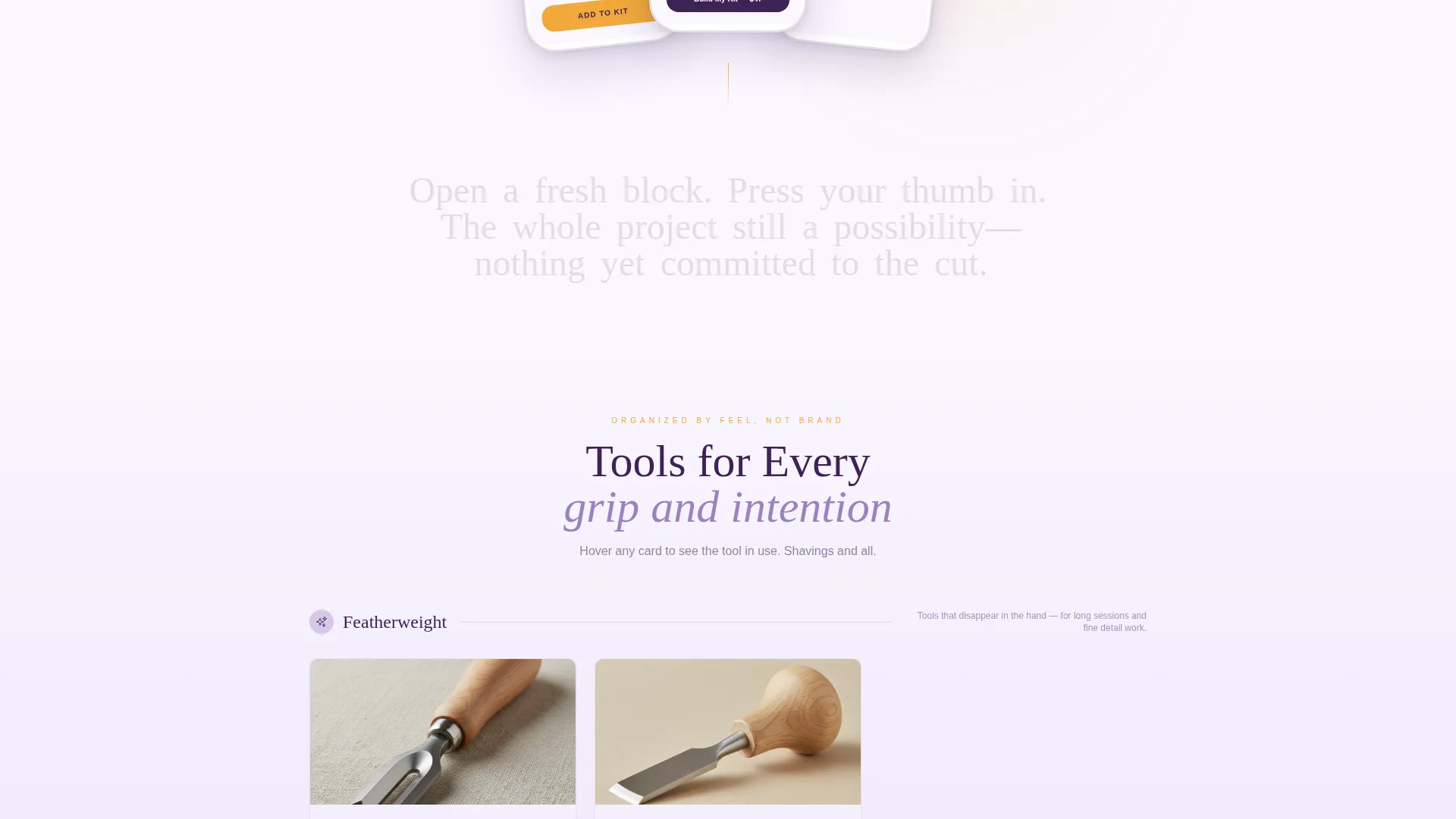
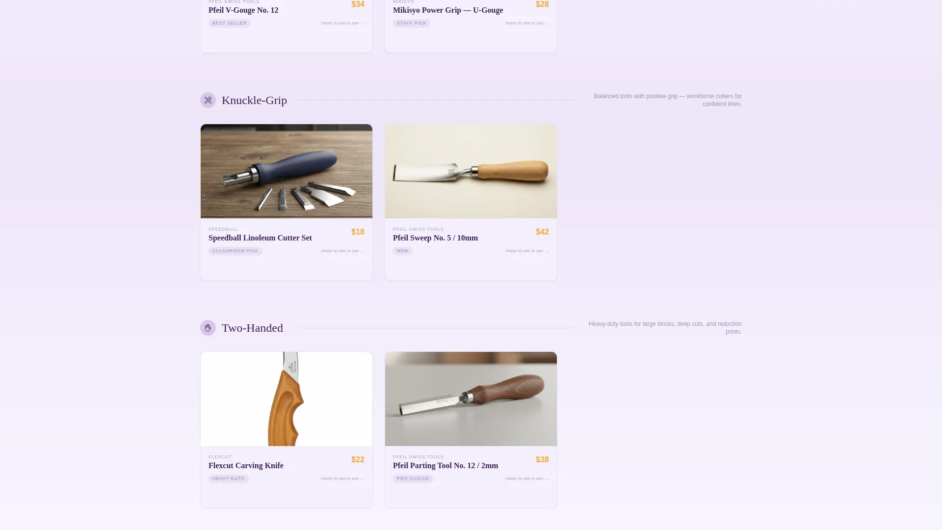
Products are grouped by how they feel in the hand, using labels like "featherweight," "knuckle-grip," and "two-handed" instead of brand or SKU order. This editorial framing helps new printmakers choose confidently without prior product knowledge.
Hover-Flip Video Product Cards
Each product card flips on hover to reveal a fifteen-second looping video of that tool in active use. Shavings curl away from a block, the tool's behavior becomes immediately readable, and the visitor understands what they are buying before they click anything.
Layer-by-Layer Print Animation
A full-width interstitial breaks the card grid mid-scroll. A single pulled print reconstructs itself on screen: yellow appears first, then red, then blue, then keyline black. The sequence rewards curiosity and reinforces the store's deep craft knowledge.
Real-Ink Swatch Cards
Ink products are displayed as scanned pulls of actual printed swatches rather than digital color chips. Each swatch is slightly irregular, confirming these are real studio materials and not stock imagery.
App Store Preview Header
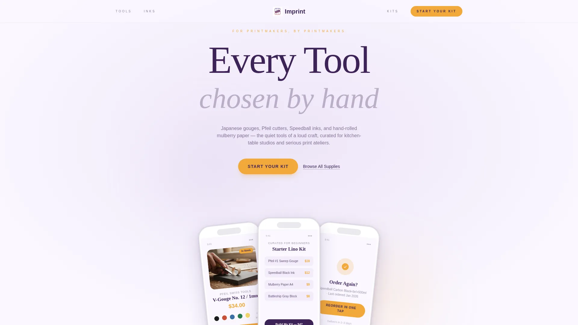
The header frames the store's mobile shopping experience inside a device mockup. Three preview screens fan slightly to show a product detail page, a curated starter kit view, and a one-tap reorder confirmation. Visitors see the store working beautifully before they scroll.
Guided Kit-Builder Flow
The primary call-to-action leads to a four-step kit-builder: block type, gouge set, ink, then paper. The floating marigold pill button reappears after the second card row, keeping the path to the kit-builder visible throughout the scroll.
Page sections overview
| Section | Purpose |
|---|---|
| App Store Header | Frames mobile shopping experience with device previews |
| Feel-Based Tool Grid | Organizes tools by hand feel, not brand |
| Hover-Flip Product Cards | Shows tools in use via flip-reveal videos |
| Print Animation Interstitial | Reconstructs a print layer by layer in full width |
| Real Swatch Ink Grid | Displays inks as scanned printed swatches |
| Floating Kit call to action | Keeps "Start Your Kit" visible during scroll |
| Closing Kit Section | Anchors primary and secondary calls to action |
Design & branding system
The visual identity is built on a Soft Gradient theme using the Lavender Dream color system. Every color decision references the physical experience of printmaking at dusk.
- Pale wisteria (#D5C7E8) washes into warm lilac (#B8A0D2), with deep plum-ink (#3E2357) used for text and navigation
- Marigold (#F2A93B) appears on buttons, hover states, and the floating call-to-action pill as a deliberate single accent color
- Backgrounds shift through barely perceptible lavender-to-white gradients so each card row feels like a new layer in a reduction print
Mobile & speed optimization
The header is staged as an App Store Preview specifically because this store is built to work beautifully on a phone. The mobile shopping experience is the first thing a visitor sees.
- Three fanned device screens in the header show the product detail view, a starter kit, and a reorder confirmation at mobile scale
- The modular card grid adapts naturally to narrower viewports, keeping each card readable and the flip interaction intentional
- The floating "Start Your Kit" pill button is sized and positioned for one-thumb reach on smaller screens
How this template helps you convert
Every design and content decision on this page moves the visitor toward a single low-commitment action: starting a guided kit. The page earns that click by demonstrating editorial taste at every scroll depth.
- The header preview shows the store already working on a phone, removing hesitation before the visitor has read a single word
- Hover-flip videos and real ink swatches prove that the store is run by printmakers, not a generic dropshipper, building the trust that precedes a purchase
- The floating marigold pill keeps the "Start Your Kit" call to action visible throughout the scroll, so the moment a visitor is ready to act, the button is already there
Other information about this template
Imprint is categorized under Retail and E-Commerce, specifically within the Hobby and Passion Supplies subcategory. It is designed as a card-grid modular single-page layout, making it a strong fit for any specialty craft retailer who wants to lead with curation rather than inventory volume.
- The template's creative direction is built around a Curated Collection approach, meaning the layout itself communicates the store's editorial point of view
- The secondary call-to-action path, "Browse All Supplies," is an underlined plum-ink text link designed for returning makers who already know what they need and do not want to go through the kit-builder
- This template suits any passion-driven retail niche where the seller's expertise is itself a product differentiator, from ceramics supplies to natural dye materials
Theme
Neo-Retro
Creative direction
Curated Collection
Color system
Ink & Paper
Style
Card Grid (Modular)
Direction
Quiz/Assessment
Page Sections
Tactile Product Organization Cards
Hover-flip Video Product Cards
Layer-by-layer Print Animation
Real-ink Swatch Display
App Store Preview Header
Guided Kit-builder Call to Action
Related questions
Can I use this template if I sell more than just printmaking tools?
Does the kit-builder come built into this template?
How does the hover-flip video feature work?
Is this template suitable for a first-time shop owner?
Can I change the color palette to match my own brand?



