Hospitality Branding Agency Landing Page Template
Imprint is a bold, overlap-layered landing page template built for hospitality branding agencies. It opens with a typographic takeover, then unrolls a manifesto-style argument across stacked panels, each one proving why distinctive identity beats borrowed aesthetics. A two-step lead generation form closes the page, turning a convinced visitor into a qualified brief.
by Rocket studio
Quick summary
Imprint is a single-page template for hospitality branding agencies that leads with conviction. A massive typographic header commands immediate attention. From there, a manifesto-style scroll builds a case for distinctive identity, panel by panel. The page ends with a focused lead generation form designed to capture qualified clients before a single call is made.
Who this template is for
This template is built for branding agencies that work specifically within the hospitality industry. It speaks directly to studios positioning themselves as the essential creative partner for properties that want to be remembered.
- Boutique branding agencies specializing in hotels, restaurants, bars, and resort groups
- Creative studios rebranding after a leadership or chef change at a client property
- Agency founders who want a landing page that demonstrates their thinking, not just their portfolio
What problem this template solves
Most agency landing pages describe what they do. Imprint argues why it matters. Hospitality brands that borrow visual identity from trends or templates fade quickly. This template addresses that problem head-on, giving the agency a page that models the very conviction it sells to clients.
- Agencies struggle to communicate their point of view before a prospect clicks away
- Generic portfolio layouts fail to differentiate a hospitality specialist from a generalist studio
- Lead intake forms arrive too early, before the visitor has been convinced to share anything real
What you get with this template
You get a fully structured, single-page layout built around a rhetorical scroll that earns its call to action. Every section is a deliberate editorial move, not a filler block.
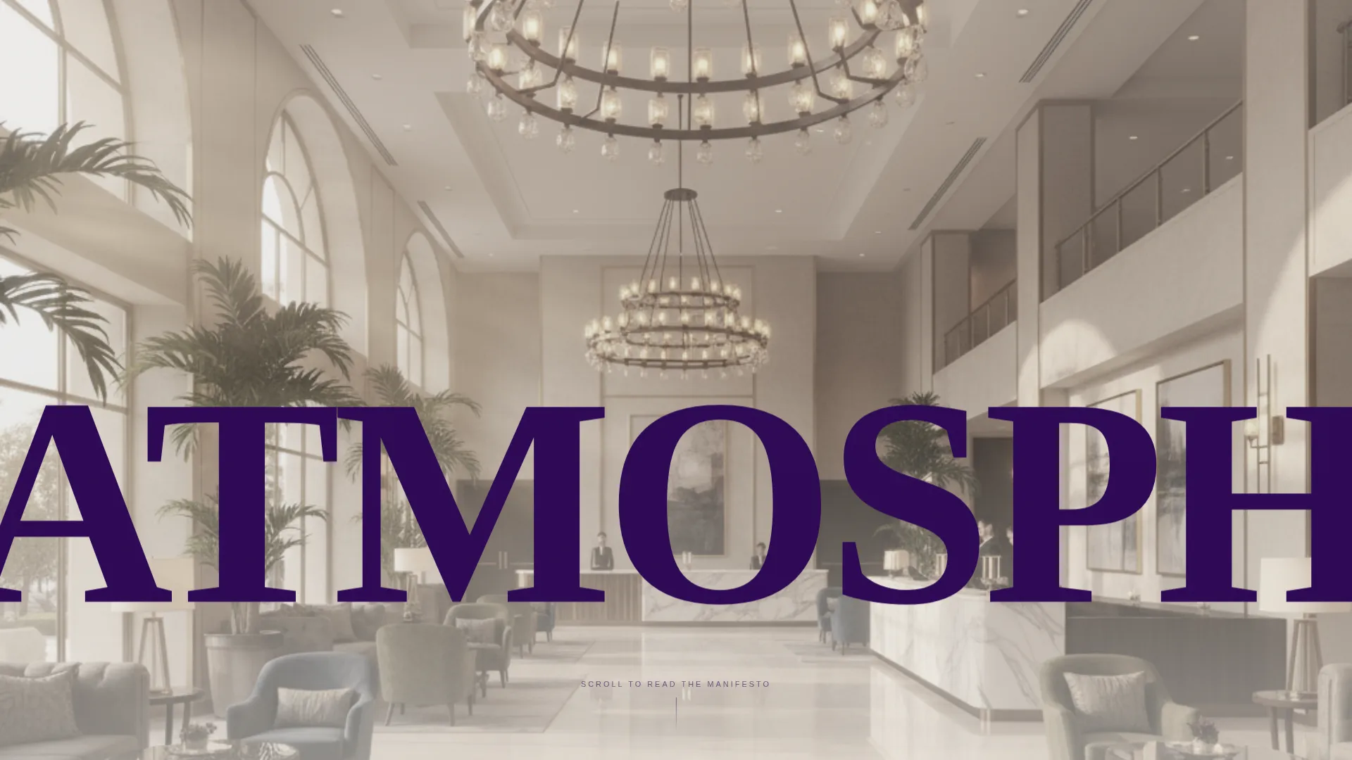
- A letterpress-inspired typographic header that layers oversized type over a desaturated hotel lobby photograph
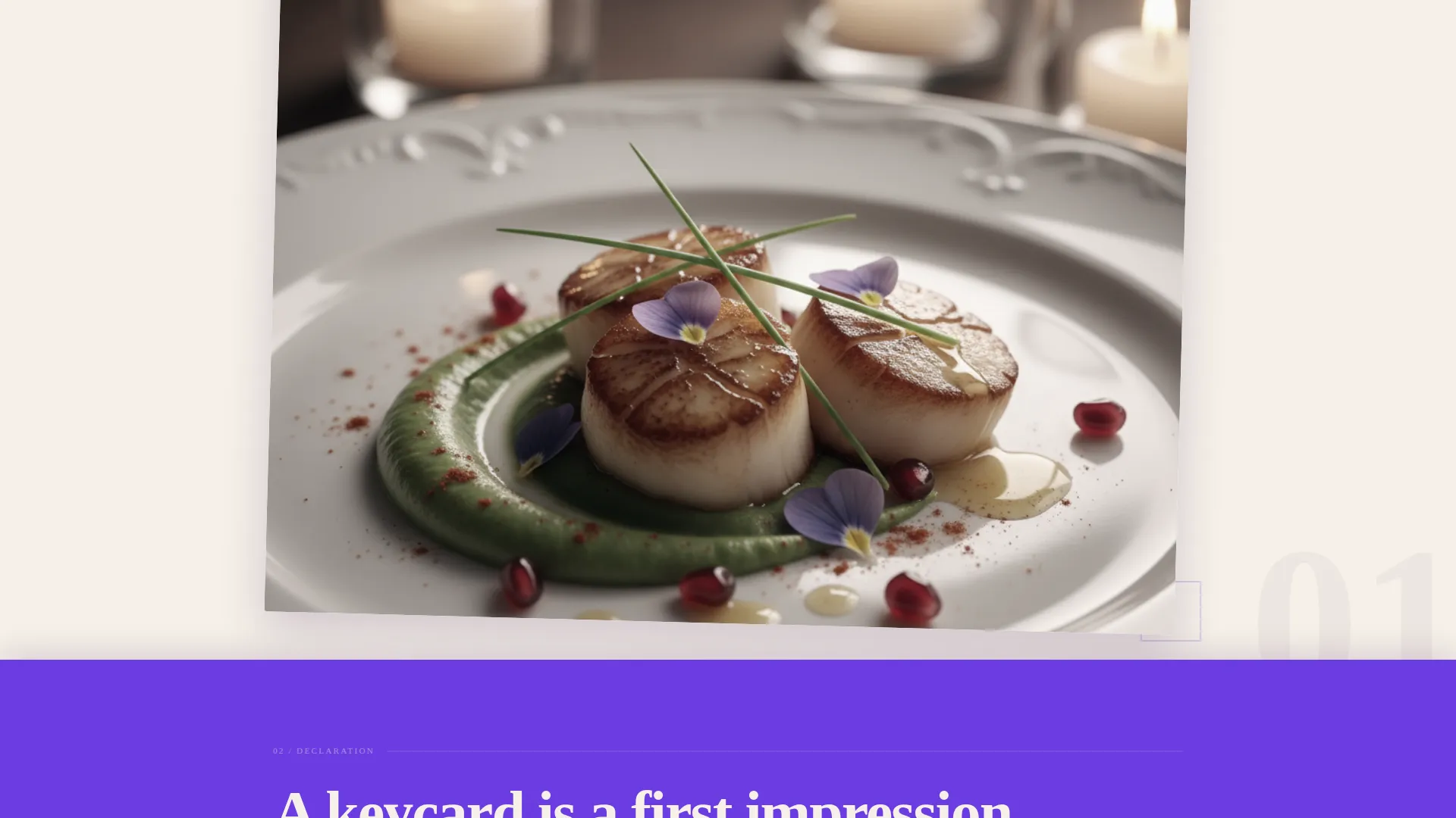
- A manifesto scroll with overlapping stacked panels, each carrying a declarative statement paired with a case-study image peeking beneath the overlapping edge
- A two-step lead generation form that qualifies the visitor by property type and project stage before asking for contact details
Feature list
This template is built from a set of deliberate design and layout decisions that work together as a single argument.
Typographic Header Takeover
The header sets a single word, "ATMOSPHERE", in an enormous ink-heavy serif that bleeds off three viewport edges. A desaturated hotel lobby photograph sits beneath the type, visible only through the open letterforms. No logo and no navigation interrupt the opening tension.
Manifesto Scroll with Stacked Panels
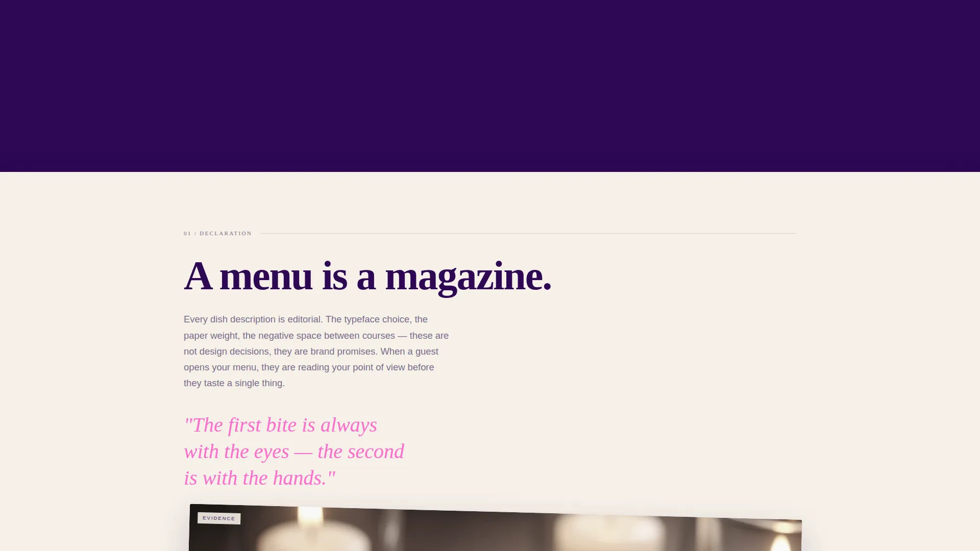
Each scroll section is a declaration: one bold statement, one layered panel, one case-study image sliding out from beneath the overlapping edge. The rhythm alternates thesis and evidence, building rhetorical momentum from the first panel to the last.
Declarative Statement Blocks
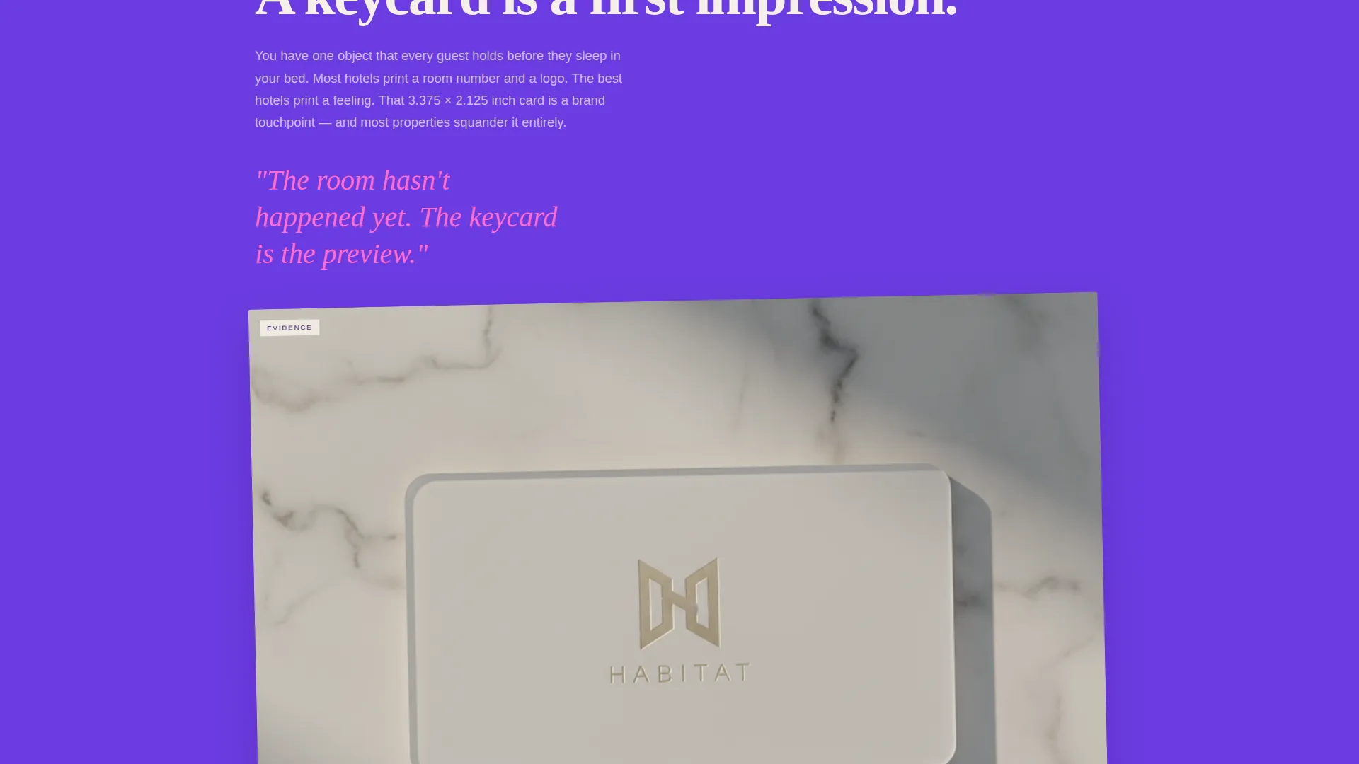
Key brand moments are named and claimed directly. Statements like "A menu is a magazine" and "A keycard is a first impression" land as standalone editorial panels. Each one reframes an ordinary hospitality touchpoint as a branding opportunity.
Two-Step Lead Generation Form
The form opens by asking only for property type and project stage. Once those are selected, it expands to collect name, email, and a single open-ended field asking guests to describe the feeling they want to leave with visitors. This staged approach lowers friction and raises the quality of every submission.
Electric Indigo Color System
Deep writing-desk indigo, charged violet, warm uncoated-stock cream, and a searing white-pink highlight work together as a complete palette. Cream dominates the page ground, indigo commands the typography, violet washes behind layered panels, and the hot pink fires only on hover and pull quotes.
Ink and Paper Visual Theme
The overall aesthetic references freshly printed brand books and letterpress production. Overlapping panels mimic loosely stacked proofs on a designer's table. The result feels analog in soul while remaining sharp and electric in execution.
Page sections overview
| Section | Purpose |
|---|---|
| Typographic Hero Header | Establishes agency tone with a single oversized word over a desaturated hospitality photograph |
| Manifesto Opening Panel | Introduces the core argument: borrowed identity fails, built identity lasts |
| Declaration One | States "A menu is a magazine" and ties editorial thinking to hospitality branding |
| Declaration Two | States "A keycard is a first impression" and frames operational touchpoints as brand moments |
| Declaration Three | States "A Do Not Disturb sign is a brand moment" and closes the rhetorical sequence |
| Case Study Panels | Pairs each declaration with a layered image peeking beneath the overlapping panel edge |
| Lead Generation Form | Two-step intake that qualifies property type and project stage before collecting contact details |
Design & branding system
The palette and typography work as a single, cohesive system. Every visual decision references ink, paper, and the tactile warmth of printed brand materials.
- Color palette: deep indigo (#2E0854) for type, charged violet (#6C3CE1) for panel washes, warm cream (#F5F0E8) as the page ground, and hot pink (#FF6BCD) reserved for hover states and pull quotes
- Typography: ink-heavy serif for display and header elements, scaled to bleed beyond viewport edges for maximum visual weight
- Layering logic: panels overlap like loosely stacked proofs, with case-study images peeking beneath overlapping edges to reward the scroll
Mobile & speed optimization
The overlap-and-layer visual system is structured so that the stacked panel effect translates clearly at smaller screen sizes. No section depends on hover behavior to communicate its core content.
- Declarative statement blocks reflow cleanly into single-column layouts on mobile viewports
- The two-step form collapses into a clear, sequential input flow on smaller screens
- The typographic hero scales proportionally so the key letterforms remain dominant without cropping the photograph entirely
How this template helps you convert
This template is built around a persuasion sequence, not just a layout. By the time a visitor reaches the form, they have already absorbed a full argument for why the agency thinks differently.
- The manifesto scroll builds conviction incrementally, so the visitor arrives at the call to action already aligned with the agency's point of view rather than still deciding whether to engage.
- The two-step form structure reduces drop-off by asking for low-commitment information first, then expanding only after the visitor has self-identified their property type and project stage.
Other information about this template
This template sits within the Portfolio and Agency category, specifically inside the Hospitality Marketing and Agency subcategory. It is designed for studios that operate at the intersection of brand strategy and guest experience design.
- Template style: Overlap and Layered, with panels sliding over each other in a continuous scroll sequence
- Creative direction: Manifesto, meaning the page argues a position rather than simply displaying work
- Header concept: Type Over Image, where typography dominates and the photograph becomes texture beneath the letterforms
- Ideal project types for client intake: new hotel openings, restaurant rebrands after a chef change, bar concept launches, and resort group expansions into new markets
- The "Start Your Brand Brief" call to action is designed to feel like the beginning of a creative conversation, not a sales handoff
Theme
Ink & Paper
Creative direction
Manifesto
Color system
Electric Indigo
Style
Overlap/Layered
Direction
Lead Generation
Page Sections
Typographic Hero Header
Manifesto Scroll with Stacked Panels
Two-step Lead Generation Form
Electric Indigo Color System
Ink and Paper Visual Theme
Declarative Statement Blocks
Related questions
Who is this template designed for?
Can I customize the manifesto statements and panel content?
How does the two-step lead form work?
Is the hot pink color used throughout the template?
What does the 'Start Your Brand Brief' call to action lead to?



