Expert Printmaker Portfolio Landing Page Template
Press is a bold brutalist printmaker case study portfolio landing page template built for hand-press studios targeting gallery directors, editorial art directors, and independent publishers. It leads with a full-viewport before/after slider, escalates through three narrative case studies, and closes with an earned commission form. The Obsidian and Gold color system gives every section the weight of a freshly pulled print.
by Rocket studio
Quick summary
Press is a storybook landing page template designed for artisan printmaking studios. It opens with a draggable before/after slider revealing the journey from raw copper plate to finished print, then walks visitors through three escalating case studies before delivering a lead-generation commission form. The aesthetic is bold, monastic, and unapologetically analog.
Who this template is for
This template suits printmakers and print studios whose portfolio needs to do more than display images. It is built for professionals whose work carries physical and conceptual weight, and who want their website to reflect that.
- Gallery directors and museum curators sourcing limited-edition print runs
- Editorial art directors commissioning illustrated covers with tight production deadlines
- Independent publishers seeking tactile book objects, colophon pages, and chapbook editions
What problem this template solves
Most portfolio websites bury the work behind lengthy bios and navigation menus. Visitors arrive, skim, and leave before they understand what the maker actually does. This template solves that by placing the printmaker's work immediately above the fold, which is a proven strategy for reducing bounce rate and holding attention.
- Visitors lose confidence when a portfolio lacks narrative context for each project
- Generic grid layouts fail to communicate the craft complexity behind hand-pulled editions
- Commission inquiries stall when the site never earns the ask
What you get with this template
You get a fully structured single-page layout that functions more like a monograph than a conventional portfolio website. Every section is built to build trust before the call to action arrives.
- A full-viewport before/after slider hero with a delayed bold headline reveal
- Three complete case study sections, each structured as a narrative arc with beginning, middle, and end
- A commission inquiry form with project-type selection, dimension fields, and a "Describe what you want to feel" textarea
Feature list
This template brings together a set of carefully chosen features that serve both the visual identity and the lead-generation goal. Each feature earns its place on the page.
Full-Viewport Before/After Slider Hero
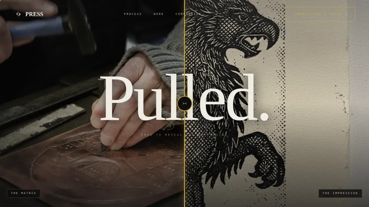
The hero fills the entire screen with a draggable slider. On the left sits a raw copper etching plate scarred with needle marks. On the right, the finished print on dampened cotton rag. A gold-accented handle lets visitors drag across the transformation. A single bold condensed headline, "Pulled," fades in after two seconds, making an immediate visual impact without competing with the imagery.
Escalating Case Study Narrative Structure
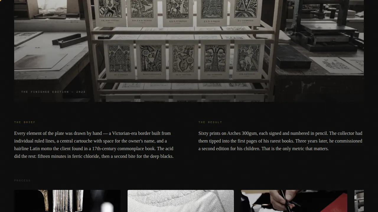
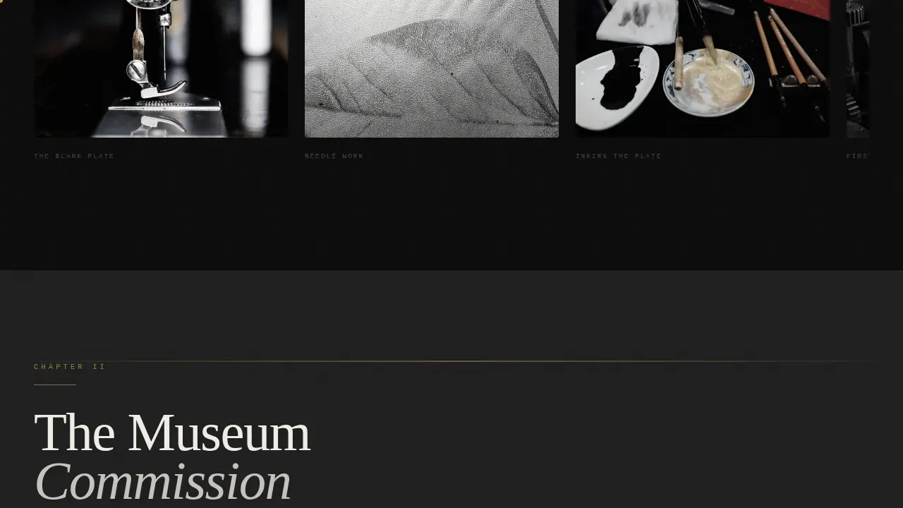
Each case study section tells one project as a complete story. The brief, the blank plate, the carving and inking process, the finished edition, and the gallery or publication outcome are all shown in sequence. Stakes escalate across the three studies, from a bookplate commission to a museum project to a twelve-color reduction woodcut. This structure gives visitors the confidence to commission before they ever reach the form.
Marquee Credentials Strip
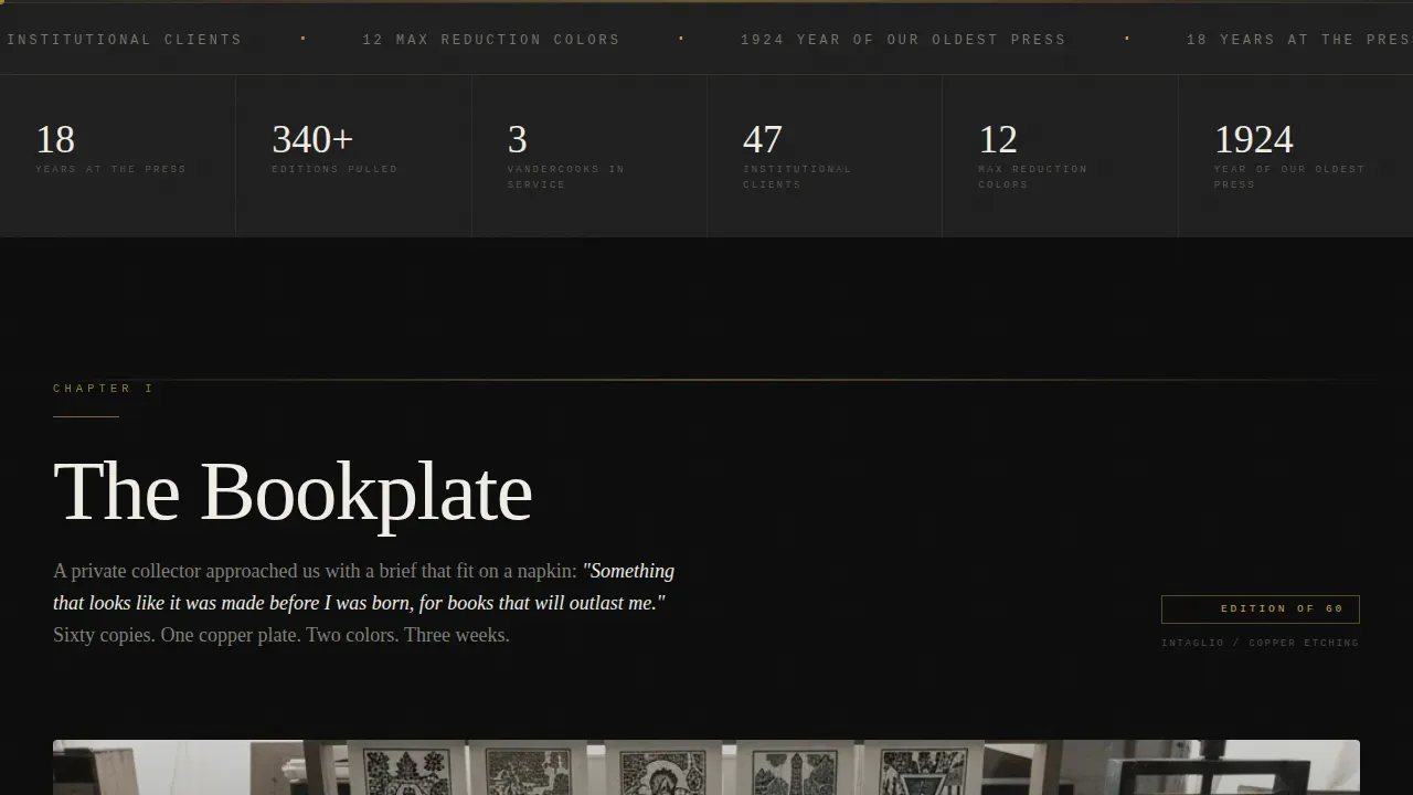
Between the hero and the first case study, a scrolling marquee displays edition numbers, years active, press count, and institutional client references. These raw figures communicate scale and longevity without requiring a dedicated about page. The strip keeps the layout lean while delivering social proof that visitors can read at a glance.
Sticky Secondary Call to Action
After the third case study section loads, a sticky "Commission a Print" button appears on the page and remains accessible while scrolling. This ensures the primary call to action is never more than one tap or click away. The button uses gold on obsidian to stand out against any section background.
Hard-Cut Section Transitions and Staggered Reveals
Every section transition cuts to black before the next gold chapter heading fades in, using GSAP ScrollTrigger animations. This pacing mirrors turning the pages of a printed monograph. Staggered text and image reveals, a cursor follower, and a horizontal scroll gallery within the first case study all contribute to a high-interactivity experience without sacrificing clarity.
Lead-Generation Commission Form
The commission form is the final destination after the emotional weight of the third case study lands. It opens with a project-type selector (edition, editorial, or collaboration), follows with dimension and quantity fields, and closes with a textarea labeled "Describe what you want to feel." This language filters for clients who understand craft. No pricing is shown. The page earns the click through evidence, not promises.
Page sections overview
| Section | Purpose |
|---|---|
| Hero Slider | Reveal plate-to-print transformation, deliver bold headline |
| Credentials Strip | Display edition counts, years active, press references |
| Case Study One | Bookplate commission narrative with horizontal scroll gallery |
| Case Study Two | Museum commission at institutional scale, full-bleed photography |
| Case Study Three | Twelve-color reduction woodcut, emotional climax of the portfolio |
| Commission Form | Capture project inquiries through a craft-filtered lead form |
| Footer | Minimal pattern with contact link styled to the brutalist aesthetic |
Design & branding system
The design draws its rules from brutalism, the architectural and web design philosophy that values structural honesty over decorative polish. Brutalist architecture exposes its materials raw; this template does the same on screen. The color system is Obsidian and Gold: dense slab black (#0B0B0B) dominates every background, press-bed charcoal (#1E1E1E) creates subtle depth in layered sections, burnished gold leaf (#C9A84C) appears only on hover effects, active links, and section dividers, and bone-white paper stock (#F0EDE5) carries all body text.
- Bold typography uses DM Serif Display for headlines, IBM Plex Mono for captions and labels, and Fraunces for body text
- High resolution images of plates, prints, and studio process shots are displayed at full bleed with a hover grayscale-to-color transition
- Gold shapes and geometric rule lines appear as section dividers, used sparingly like metallic ink on a fine-press page
Mobile & speed optimization
The template is designed desktop-first, reflecting the reality that gallery directors and art directors work on large screens. Every interactive element, including the slider, horizontal gallery, and sticky call to action, is built for desktop precision. The layout gracefully degrades on smaller screens without losing the core narrative structure.
- Static sections use server-rendered components for fast initial load, while interactive elements such as the slider and cursor follower run as client components
- The lean, high-contrast aesthetic reduces reliance on heavy decorative assets, supporting faster page rendering across device types
- Smooth animations powered by GSAP ScrollTrigger are implemented with performance in mind, loading only when the relevant section enters the viewport
How this template helps you convert
Every design and layout decision on this page works toward one outcome: a qualified commission inquiry. The page does not ask for the click until it has earned it.
- The before/after slider creates immediate engagement. Visitors interact with the page within seconds, which lowers bounce rate and sets an expectation of craft and precision before a single word is read.
- Three escalating case studies build compounding confidence. Each project raises the stakes, showing that this studio handles everything from intimate bookplates to major institutional commissions. By the third case study, the visitor understands the full range of services available.
- The commission form filters for the right clients. By asking "Describe what you want to feel" rather than "Describe your project," the form language signals taste and attracts clients who value craft over commodity.
Other information about this template
This template is well suited for designers, developers, and agencies who want to deploy a high-craft portfolio website without starting from a blank canvas. No-code tools allow users to build portfolios without extensive technical knowledge, and this template provides a focused starting point that can be adapted with minimal effort. Platforms like Webflow enable users to create complex layouts with unconventional layouts and rich interactivity without writing custom code from scratch.
- The template can be customized to reflect a personal brand or a studio's brand's unique identity, including swapping typography, adjusting the color palette, and replacing placeholder imagery with your own high resolution images
- Many no-code platforms offer integrations with email services and analytics tools such as Google Analytics, making it straightforward to connect the form to a mailing list and track visitor behavior after launch; Google Analytics can also help you monitor which case study sections hold attention longest
- Social media platforms can be linked from the footer using the minimal contact link pattern already built into the site, keeping the unapologetic aesthetic intact without adding visual noise
- The press bold brutalist printmaker case study portfolio landing page template is one of the most distinctive examples of brutalist web design applied to a creative services context, drawing inspiration from brutalist architecture and translating its raw design principles into a fully functional portfolio site
- By 2026, brutalist design has evolved into neo-brutalism, which blends a raw look with modern usability, and this template sits at that intersection: structurally honest but polished enough to serve professional agencies and independent studios equally well
- Developers who want to extend the template can introduce custom code for additional functionality such as a password-protected editions archive or an embedded video of the press in motion
Theme
Bold Brutalist
Creative direction
Case Study Narrative
Color system
Obsidian & Gold
Style
Storybook/Full-Page
Direction
Lead Generation
Page Sections
Before/after Slider Hero
Three Escalating Case Study Sections
Marquee Credentials Strip
Sticky Commission Call to Action
Craft-filtered Lead Generation Form
Gsap-powered Section Transitions
Related questions
Who is this landing page template built for?
Can I use this template without writing code?
Does this template include the commission form?
How do I adapt the case study sections for my own projects?
Is this template suitable for agencies or studios with multiple makers?



