Healthcare Email Marketing Agency Landing Page Template
Inbox is a dark immersive landing page template built for healthcare email marketing agencies. It combines a Photo Grid Mosaic header, a Gallery Walk scroll experience, and an asymmetric 60/40 grid layout to showcase campaign work with clinical precision. A sticky waitlist bar with a live counter and a two-field form turns every scroll into a conversion moment.
by Rocket studio
Quick summary
Inbox is a single-page waitlist landing page for healthcare email marketing agencies. It uses a dark, gallery-style layout to present campaign work, patient reactivation, post-visit surveys, referral sequences, and more, inside illuminated 60/40 frames. The sticky bottom bar collects signups through a minimal two-field form, while scarcity cues drive action.
Who this template is for
This template is designed for agencies and studios that run email programs for health systems, telehealth platforms, and specialty clinics. It speaks directly to the business context of compliance-conscious healthcare marketing.
- Healthcare email marketing agencies pitching hospital marketing directors or CMOs
- Digital health studios launching a waitlist for a new service or client intake program
- Boutique agencies that want a portfolio-style presentation with a built-in signup flow
What problem this template solves
Most agency landing pages feel generic. They list services, show a few client logos, and ask visitors to "get in touch." That approach does not work when your buyer is a marketing director at a regional health system who needs to trust you before a single email goes out.
- Visitors leave without understanding the quality or focus of your work
- There is no clear signal of demand or exclusivity to motivate early commitment
- A generic contact form cannot carry the weight of a high-stakes agency relationship
What you get with this template
You get a fully structured, single-page layout that blends portfolio storytelling with waitlist conversion. Every visual and copy element is designed to reflect the specific world of healthcare email marketing.
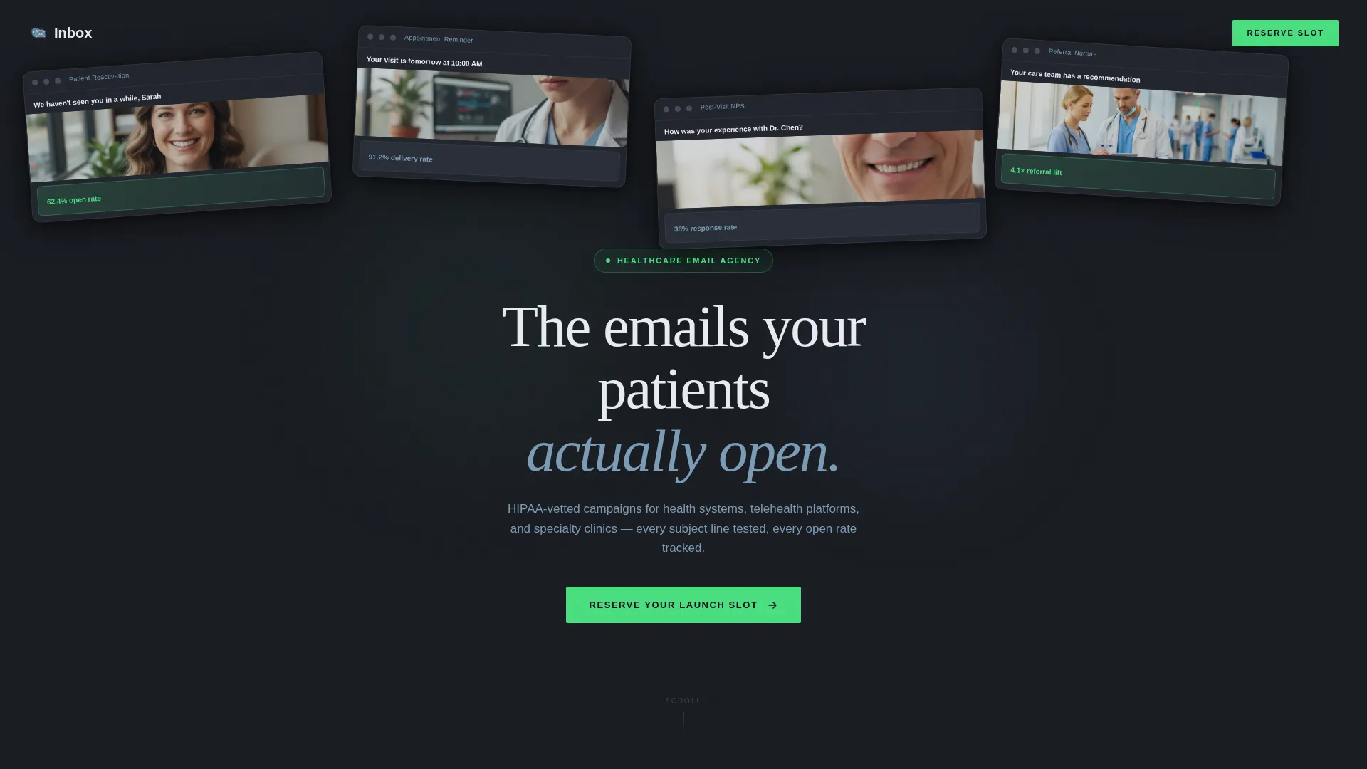
- A Photo Grid Mosaic header with staggered, angled email screenshots glowing against a deep charcoal background
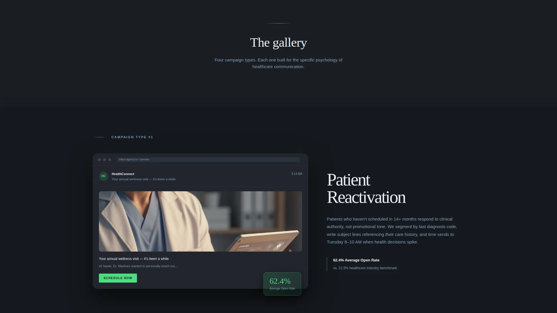
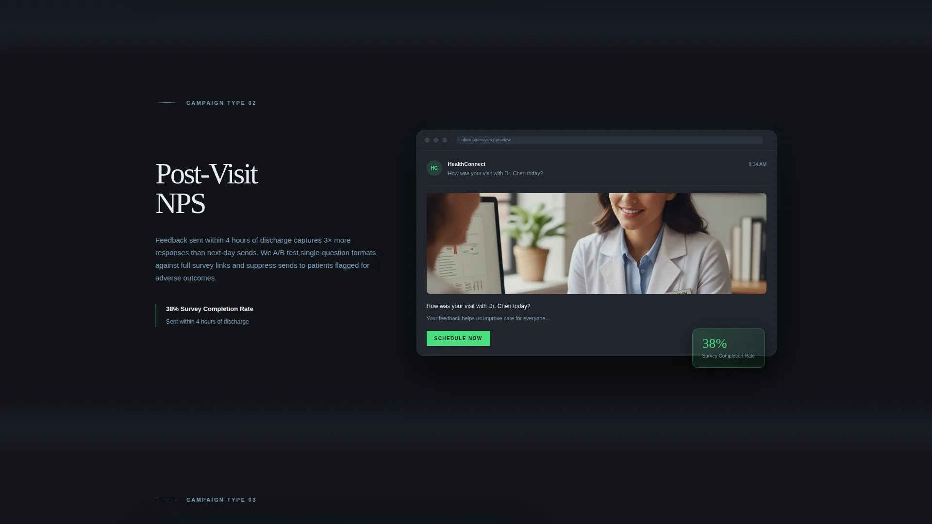
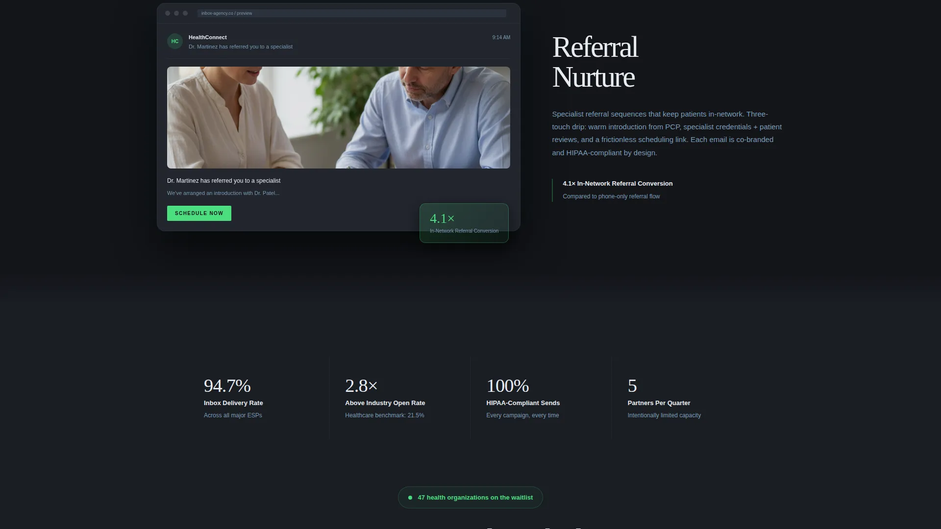
- Four Gallery Walk sections, each spotlighting one campaign type in a 60/40 asymmetric frame with a device mockup and a strategy rationale panel
- A sticky bottom waitlist bar with a two-field form, a live signup counter, and a capacity line
Feature list
This section highlights the core built-in components that define the Inbox template experience.
Photo Grid Mosaic Header
The header arranges email screenshots as luminous, angled cards floating against a charcoal void. Subject lines, clinician imagery, and a 62.4% open rate badge appear across the cards. A thin clinical mist headline reads: "The emails your patients actually open."
Asymmetric 60/40 Gallery Frames
Each campaign section uses a 60/40 split layout. The larger panel holds a dark device mockup displaying the email. The smaller panel presents the strategic rationale and one standout performance metric. The rhythm is calm and deliberate, not crowded.
Gallery Walk Scroll Experience
As the visitor scrolls, each campaign frame fades in against a background that shifts subtly between charcoal and near-black. The effect mimics moving through rooms in a gallery after hours, meditative and immersive, not aggressive.
Sticky Waitlist Bar with Live Counter
A sticky bar anchors to the bottom of the viewport after the visitor passes the second gallery frame. It holds a two-field form (work email and organization name), a live counter showing health systems already on the list, and a vapor blue line: "We onboard five new partners per quarter."
Cloud Canvas Color System
The palette is built around deep charcoal (#1A1D23) as the dominant background, clinical mist (#E8ECF1) for text and card surfaces, soft vapor blue (#7B9CB7) for secondary text and dividers, and pulse green (#4ADE80) reserved exclusively for interactive highlights and call-to-action states.
Campaign Type Spotlights
The template includes four pre-structured campaign sections covering patient reactivation, post-visit Net Promoter Score surveys, referral nurture sequences, and seasonal wellness campaigns. Each section is self-contained and can be edited to match your actual client work.
Page sections overview
| Section | Purpose |
|---|---|
| Photo Grid Mosaic Header | Introduces the agency through a constellation of glowing email screenshots and a central headline |
| Patient Reactivation Frame | Showcases reactivation campaign design in a 60/40 device mockup with strategy rationale |
| Post-Visit NPS Frame | Highlights post-visit survey email work alongside a standout engagement metric |
| Referral Nurture Frame | Presents referral sequence design and the rationale behind the campaign structure |
| Seasonal Wellness Frame | Displays seasonal campaign creative with a supporting performance data point |
| Sticky Waitlist Bar | Collects signups via a two-field form with a live counter and a quarterly onboarding cap line |
Design & branding system
The visual identity follows a Dark Immersive theme that draws from the aesthetic of a monitoring screen in a quiet hospital ward at midnight. Every color choice reinforces focus and trust without clinical coldness.
- Deep charcoal (#1A1D23) fills the background across all sections, with near-black shifts between gallery frames to create a room-to-room transition effect
- Clinical mist (#E8ECF1) is used for headlines, body copy, and card surfaces, keeping text legible against the dark field
- Pulse green (#4ADE80) appears only on interactive elements and call-to-action states, making every clickable moment immediately visible
Mobile & speed optimization
The template is built with a layout that adapts the 60/40 asymmetric grid for smaller viewports. The immersive visual weight is preserved without sacrificing readability on mobile screens.
- Gallery frames reflow to a single-column stack on mobile, keeping device mockups and rationale panels readable in sequence
- The sticky waitlist bar remains anchored at the bottom of the viewport on all screen sizes, so the signup prompt is always accessible
- Soft drop shadows and fade-in transitions are kept lightweight to avoid heavy rendering on mobile devices
How this template helps you convert
The Inbox template is engineered around a single conversion goal: getting the right agency buyer to reserve a slot before the quarter fills. Three structural elements work together to make that happen.
- The gallery proves quality before any claim is made. Visitors see real campaign types rendered with precision, which builds trust faster than a testimonial section ever could.
- The live counter and the quarterly cap line create honest scarcity. When a buyer sees that only five new partners are onboarded per quarter, the decision to act becomes time-sensitive.
- The sticky two-field form removes all friction from the signup. By asking only for a work email and organization name, the template keeps the barrier to entry low while still qualifying the lead by context.
Other information about this template
The Inbox template sits at the intersection of portfolio presentation and waitlist mechanics. It is purpose-built for the healthcare marketing niche, where trust, compliance context, and demonstrated craft matter more than flashy animations or feature overload.
- The template style is Asymmetric Grid (60/40), the theme is Dark Immersive, and the creative direction follows a Gallery Walk scroll pattern
- The header concept is a Photo Grid Mosaic, and the landing page direction is Waitlist/Coming Soon
- The color system is named Cloud Canvas, with four defined roles: charcoal background, mist typography, vapor blue accents, and pulse green interactivity
- This template is categorized under Portfolio & Agency with a subcategory focus on Healthcare Marketing and Agency work
Theme
Dark Immersive
Creative direction
Gallery Walk
Color system
Cloud Canvas
Style
Asymmetric Grid (60/40)
Direction
Waitlist/Coming Soon
Page Sections
Photo Grid Mosaic Header
Asymmetric 60/40 Gallery Frames
Gallery Walk Scroll Experience
Sticky Waitlist Bar with Live Counter
Cloud Canvas Color System
Campaign Type Spotlight Sections
Related questions
Who is this landing page template designed for?
Can I edit the campaign sections to match my own client work?
How does the waitlist conversion mechanic work?
Does the template support a custom color palette?
Is this template suitable for a general marketing agency?



