Ink - Immersive Bio Landing Page Template
Ink is a single-page, horizontal-scroll bio landing page built for people who want one link to say everything. A scroll-jacked name animation opens the experience, then four draggable panels, Work, Words, Signal, and Contact, let visitors explore at their own pace. The dark, ink-on-paper aesthetic makes every interaction feel intentional and personal.
by Rocket studio
Quick summary
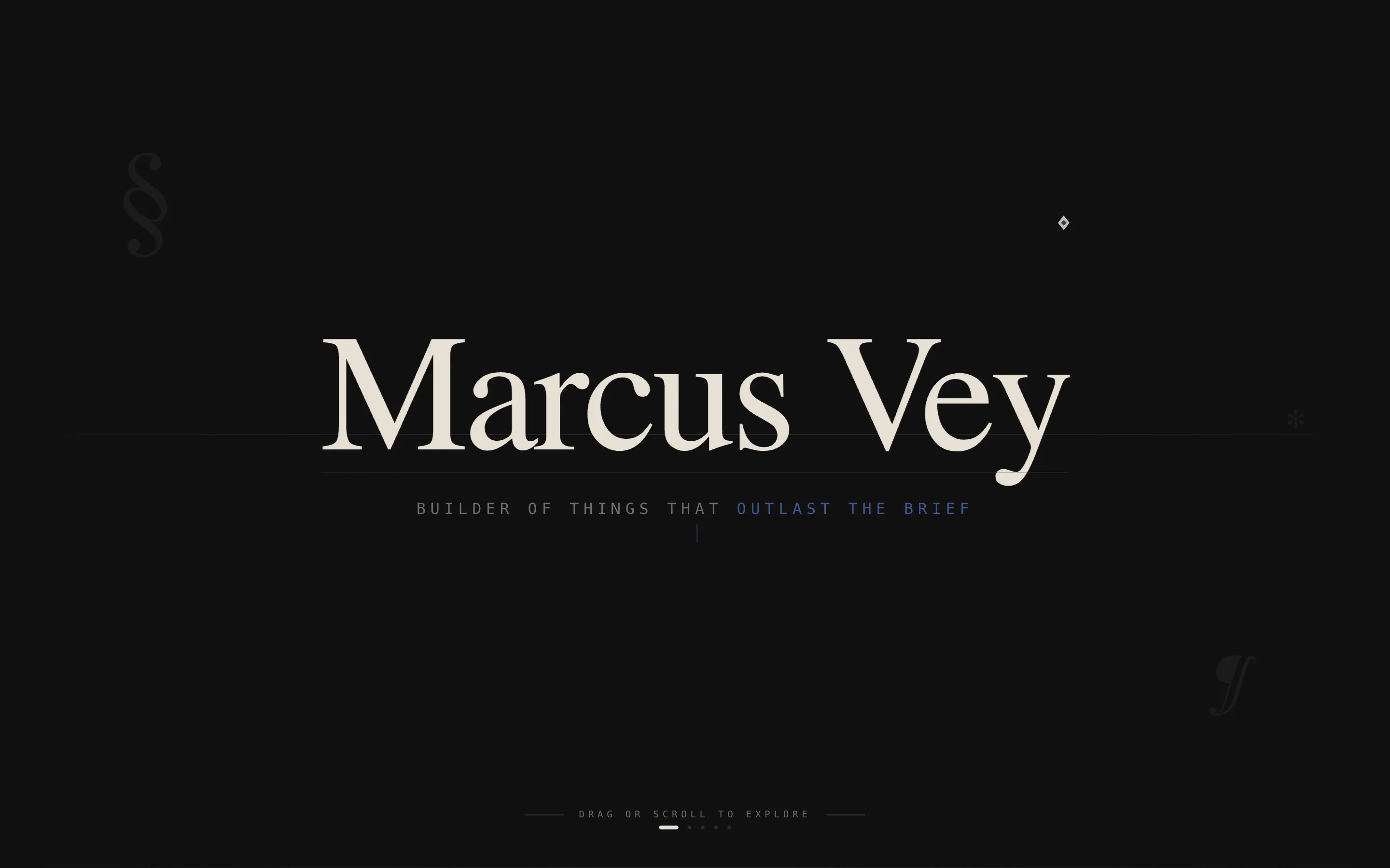
Ink is a minimalist bio landing page that compresses an entire personal presence into one horizontal-scroll experience. A cinematic name animation draws itself across the screen on entry. Four intimate panels guide visitors through your work, writing, social signal, and a friction-free contact form. The design speaks in deep black, aged parchment, and a single blue accent.
Who this template is for
This template is built for individuals who need one strong link to represent everything they do. It suits people who lead with personality and prefer depth over decoration.
- Founders sharing deal flow or investor context through a single, credible link
- Creative directors replacing scattered portfolio links with one cohesive page
- Developers who want a human face attached to their technical work
What problem this template solves
Most personal pages either overwhelm visitors with too much or underwhelm them with too little. A generic bio page loses the reader before the first scroll. Ink solves this by making every interaction earn the next one.
- Visitors lose interest when a page feels like a form filled out, not a person met
- Scattered links and fragmented profiles dilute personal brand credibility
- Standard vertical layouts give no sense of narrative arc or momentum
What you get with this template
You get a complete, ready-to-customize single-page layout with a distinctive visual identity and a sequenced interactive journey. Every section is designed to feel like a deliberate chapter, not a list of facts.
- A scroll-jacked header animation that draws your name and seven-word declaration across the screen
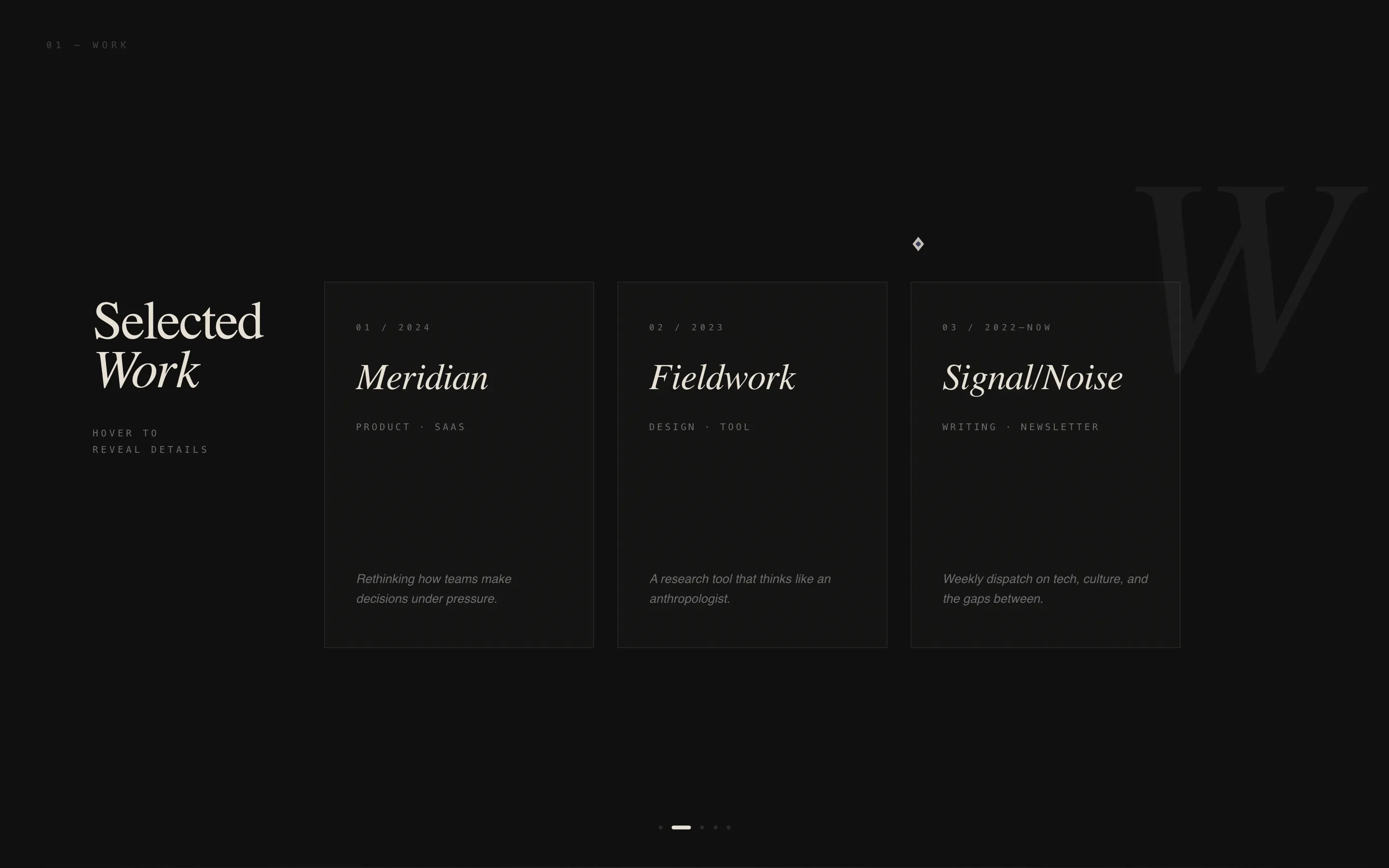
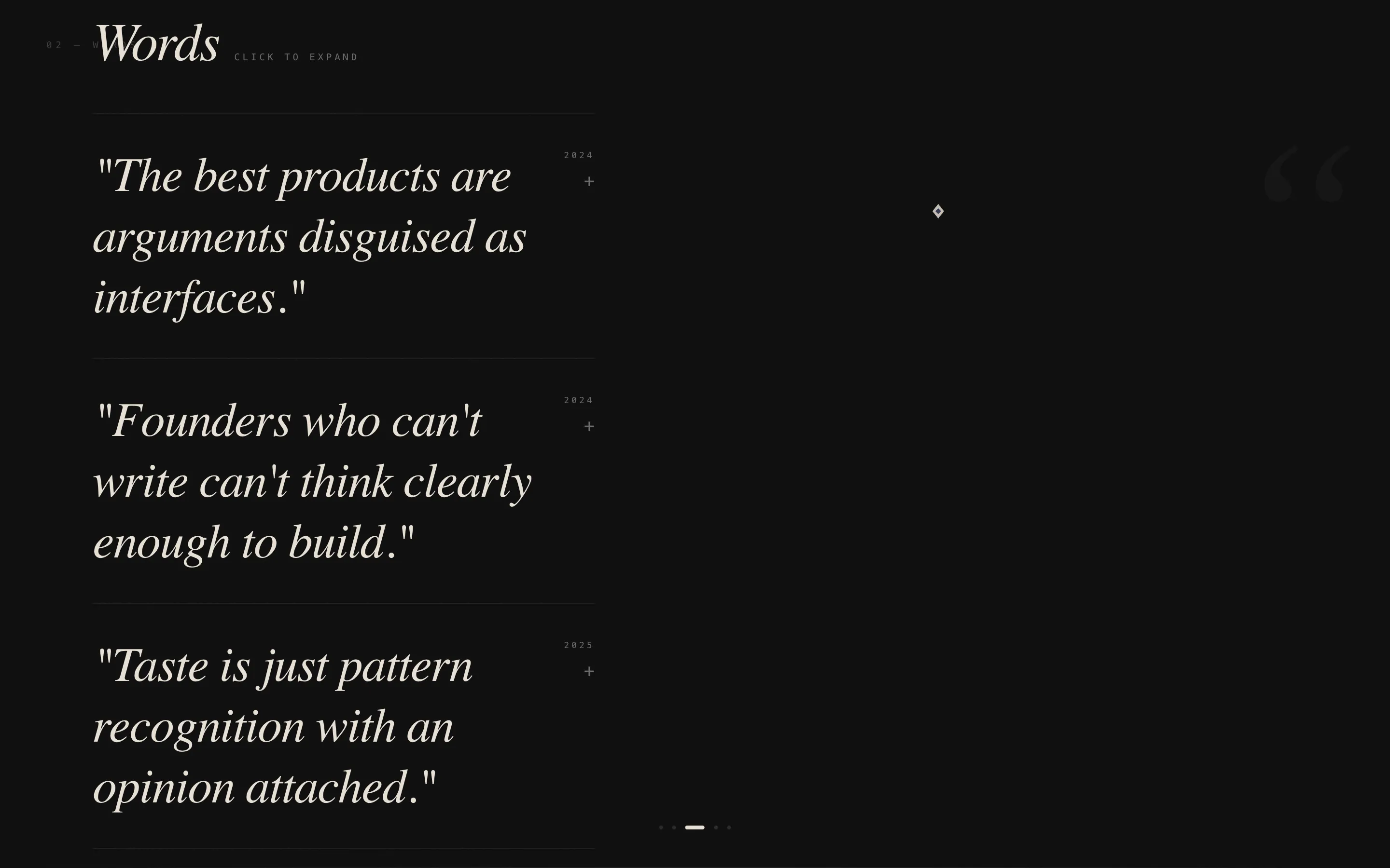
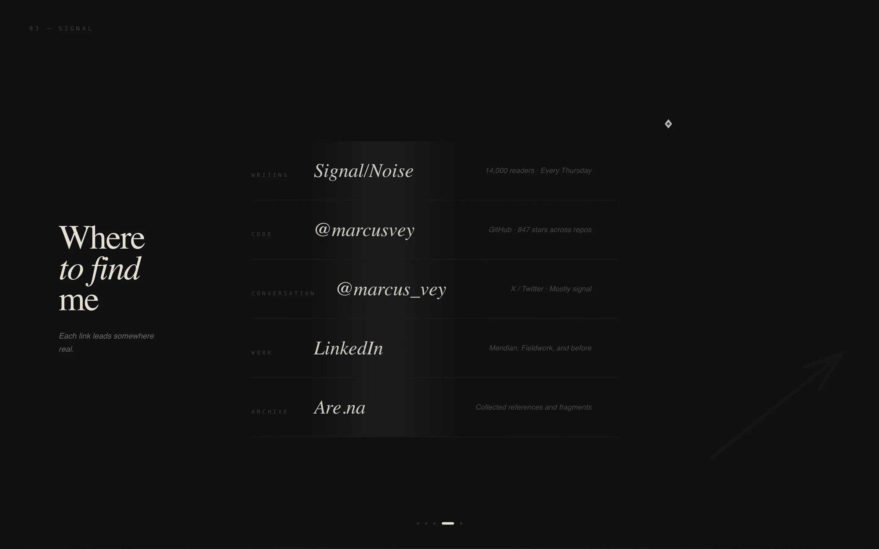
- Four horizontal panels (Work, Words, Signal, Contact) each with cursor-reactive elements
- A minimal contact form with a single message field, email input, and the prompt "Say Something"
Feature list
This template is built around a tight set of purposeful interactive features. Each one is designed to deepen engagement without adding noise.
Scroll-Jacked Name Animation
As the visitor scrolls vertically on entry, the viewport locks and a single line of text draws itself across the screen like ink dragging across paper. It spells out the bio owner's name and a seven-word declaration. The cursor transforms into a writing nib during the sequence, making the visitor feel like a witness rather than a user.
Horizontal Panel Navigation
The page progresses through four chapters, Work, Words, Signal, and Contact, navigated by dragging or scrolling sideways. Each panel is a self-contained section that rewards exploration. The structure creates a sense of forward momentum, like turning pages in a notebook.
Cursor-Reactive Project Cards
Inside the Work panel, project cards tilt on hover to reveal descriptions underneath. The interaction feels like lifting the corner of a page to see what is written below. It rewards curiosity without requiring a click.
Expanding Pull Quotes
In the Words panel, pull quotes respond to the cursor by expanding into full paragraphs. Visitors who want depth get it. Those who skim still leave with a strong impression. The behavior keeps the layout clean at a glance and rich on inspection.
Heartbeat Social Links
Social links in the Signal panel pulse once, like a single heartbeat, when the cursor approaches them. The micro-interaction is subtle but makes the page feel alive. It draws attention to each link without flashing or distracting.
Minimal Contact Form
The final panel stops the horizontal scroll and presents a stripped-down contact prompt. A single text input accepts a message. An email field sits beside it. There are no dropdowns, checkboxes, or extra fields. The line above reads: "If you've scrolled this far, we should talk."
Page sections overview
| Section | Purpose |
|---|---|
| Name Animation Header | Draws visitor in with a cinematic, scroll-locked intro |
| Work Panel | Showcases projects through tilt-on-hover interactive cards |
| Words Panel | Shares writing or ideas via expandable pull quotes |
| Signal Panel | Presents social links with subtle heartbeat hover effects |
| Contact Panel | Captures messages with a single low-friction form |
Design & branding system
The visual identity is built around an Ink and Paper color system. Every color choice is deliberate, and the palette is intentionally small to keep the mood consistent across every panel.
- Deep manuscript black (#0D0D0D) as the base, aged parchment (#E8E0D5) for text, and graphite notation gray (#6B6B6B) for supporting elements
- Fountain pen blue (#2C3E6B) used exclusively for interactive elements and links, keeping the accent meaningful and rare
- A dark immersive theme that feels like a letterpress studio after midnight, with no imagery and no decorative noise
Mobile & speed optimization
The horizontal scroll experience is designed primarily for desktop, where dragging and cursor interactions are most natural. The layout is built to adapt thoughtfully for smaller screens.
- Horizontal panel navigation and cursor-reactive effects are optimized for pointer-based devices
- The minimal structure, with no images and limited color, keeps the page light and fast to render
- Panel content is self-contained, making it straightforward to reflow sections for mobile viewports
How this template helps you convert
Every design and interaction decision in Ink builds toward the final panel contact form. The page does not ask for attention. It earns it, one chapter at a time.
- The scroll-jacked intro creates immediate intrigue and slows the visitor down, giving the page time to make a first impression before any content appears
- The sequential horizontal panels create a sense of narrative investment, so by the time visitors reach the Contact panel, they already feel like they know the person behind the page
- The "Say Something" prompt with zero-friction inputs removes every reason not to reach out, turning an engaged reader into a genuine lead
Other information about this template
Ink is part of a category of personal website templates built for high-signal individuals who value craft over clutter. It sits at the intersection of personal branding and minimalist design thinking.
- The template style is horizontal scroll, a less common format that signals intentionality and sets the page apart from standard vertical bio pages
- The creative direction follows an Interactive Explorer model, where each panel rewards curiosity and cursor movement with layered responses
- This template is well suited for professionals exploring personal website builders or custom-coded single-page setups, and it pairs naturally with tools like Framer or Webflow where scroll-jacking and cursor interactions are natively supported
Theme
Dark Immersive
Creative direction
Interactive Explorer
Color system
Ink & Paper
Style
Horizontal Scroll
Direction
Lead Generation
Page Sections
Scroll-jacked Name Animation
Horizontal Panel Navigation
Tilt-on-hover Project Cards
Expandable Pull Quotes
Heartbeat Social Links
Zero-friction Contact Form
Related questions
Who is the Ink template designed for?
Can I use this template without coding knowledge?
Does the template include a contact form?
How many sections does this template include?
Is Ink suitable as a creative portfolio page?



