Copywriter Portfolio Portfolio Website Template
Ink is a single-page copywriter portfolio landing page built around a cinematic scroll experience. Every section presents a project like evidence, with headlines, context, and measurable results locking into place one by one. The design uses a Tech Glass aesthetic in Monochrome Steel tones, and the page drives visitors toward one clear action: submitting a brief.
by Rocket studio
Quick summary
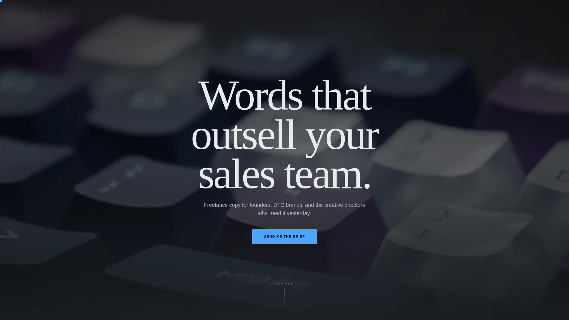
Ink is a persuasive, single-page copywriter portfolio landing page. It opens with a full-bleed keyboard photo and a typewriter-style headline reveal. Each project unfolds like a cinematic scene, with results shown as locked-in subtitles. The entire page builds toward one frosted-glass contact form, designed to turn a visitor into a client inquiry.
Who this template is for
This landing page is built for freelance copywriters who need a portfolio that closes, not just displays. It speaks directly to the kind of writer whose work drives revenue and who wants prospective clients to feel that before they ever make contact.
- Freelance copywriters building a client-facing one-page portfolio
- Independent brand writers who work with startups, creative teams, or direct-to-consumer brands
- Experienced copywriters replacing a generic portfolio site with something that carries weight
What problem this template solves
Most copywriter portfolios look like resumes. They list work without showing what that work actually did. Clients with real budgets and real deadlines need to feel the value before they reach out. Ink closes that gap by framing every piece of work as proof, not decoration.
- Weak portfolios fail to communicate results, so clients move on without reaching out
- Generic layouts make it hard to stand out when creative directors are vetting multiple writers at once
- Scattered multi-page sites lose momentum before the visitor ever reaches a contact form
What you get with this template
You get a fully structured single-page layout where every design choice serves the goal of generating a client inquiry. The page is opinionated in the best way: it tells a story, builds trust, and lands the handshake.
- A full-bleed photo header with a character-by-character animated headline reveal
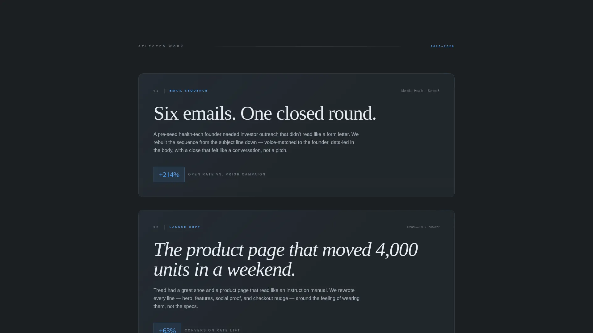
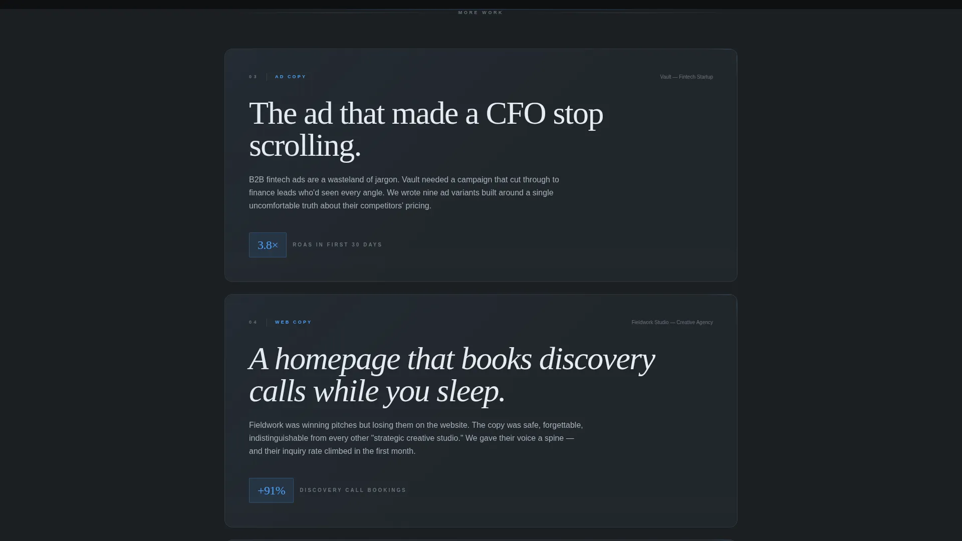
- A cinematic scroll sequence where project cards fade in with headline, context, and measurable result
- A minimal frosted-glass lead generation form anchored at the final viewport
Feature list
This landing page is built around a precise set of visual and structural features. Each one is described below.
Full-Bleed Animated Header
The header opens with a macro photo of hands on a mechanical keyboard, lit with cool overhead light and a shallow depth of field that dissolves into charcoal bokeh. A single word blinks onto the glass overlay first. Then the full headline, "Words that outsell your sales team," renders character by character. No navigation is visible at this stage; the image owns the entire viewport.
Cinematic Project Card Sequence
Each project appears as a full-page card floating on frosted glass. The headline arrives first, then a brief context line slides up beneath it, then a measurable result locks into place like a film subtitle. Examples built into the layout include results like "+214% email open rate" and "Series A closed in nine days." The pacing accelerates as you scroll, building momentum across the full page.
Centered Client Quote Breaks
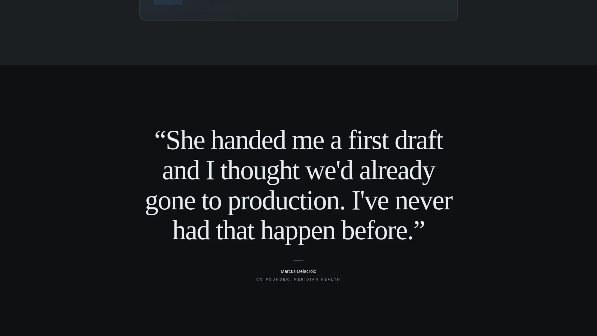
Between project cards, single client quotes appear in oversized white type on a black background. Each quote then dissolves, creating a breathing rhythm between the denser project sections. These quote moments reinforce credibility without interrupting the scroll flow.
Frosted-Glass Lead Generation Form
The final viewport holds a minimal contact form styled in frosted glass. It asks for name, company, a project type selector (ads, web copy, email, long-form, or other), and a single open field labeled "Tell me what's broken." The call to action reads "Send Me the Brief." There is no calendar embed and no pricing listed.
Tech Glass Visual System
The entire layout uses a Monochrome Steel color palette: deep gunmetal, brushed chrome, frosted panel white, and a single electric blue accent reserved for links, cursor trails, and the call-to-action button. The result feels like a matte-black laptop screen glowing in a dark room, every surface carrying a faint reflection.
Page sections overview
| Section | Purpose |
|---|---|
| Full-Bleed Header | Opens the viewport with animated headline reveal |
| Project Card One | Presents first work sample with result |
| Client Quote Break | Delivers a centered credibility moment |
| Project Card Two | Presents second work sample with result |
| Client Quote Break | Delivers a second quote dissolve moment |
| Project Card Three | Presents third work sample with result |
| Final call to action Form | Captures the lead with a minimal frosted-glass form |
Design & branding system
The visual identity follows a Tech Glass theme built on a Monochrome Steel palette. Every color has a specific role, and nothing competes with the content.
- Deep gunmetal (#1B1F23) for backgrounds, brushed chrome (#A8B2BD) for secondary text, and frosted panel white (#E8ECF1) for card surfaces
- A single electric blue accent (#4DA3FF) used exclusively for links, cursor trails, and the call-to-action element
- Frosted glass panel styling applied to project cards and the contact form, creating a layered, backlit depth across the page
Mobile & speed optimization
The storybook scroll format and cinematic pacing are structured to translate cleanly across screen sizes. The single-page format keeps everything contained and easy to navigate on any device.
- Full-bleed sections and frosted card layouts are designed to reflow gracefully on smaller viewports
- The minimal form at the bottom requires only a few fields, keeping the mobile experience frictionless
- Single-page structure means no multi-page navigation, reducing the steps a mobile visitor takes to reach the form
How this template helps you convert
Every design and structural decision in Ink is built around one outcome: getting a qualified prospect to submit a brief. The page earns the contact before asking for it.
- The cinematic scroll sequence builds progressive proof, showing results before the visitor reaches the form, so they arrive with conviction rather than curiosity.
- The "Send Me the Brief" form removes friction by asking for only the essentials, and the "Tell me what's broken" field invites honest, high-intent responses from prospects who are already motivated.
Other information about this template
Ink is a strong fit for copywriters who want a portfolio that reads like a pitch. The storybook, full-page layout format is intentional: it controls the pacing of how a visitor absorbs your work, which is something a standard grid-based portfolio cannot do.
- The template style is classified as Storybook/Full-Page, making it distinct from card-grid or case-study-list formats
- The lead generation direction means the entire layout is oriented toward one conversion action, not passive browsing
- This template is well-suited to writers working across ad copy, web copy, email sequences, long-form content, and brand voice projects
- The header concept uses a Full-Bleed Photo format, which creates immediate visual impact and sets the tone before a single word is read
Theme
Tech Glass
Creative direction
Cinematic Sequence
Color system
Monochrome Steel
Style
Storybook/Full-Page
Direction
Lead Generation
Page Sections
Animated Full-bleed Header
Cinematic Scroll Project Cards
Client Quote Dissolve Breaks
Frosted-glass Lead Form
Monochrome Steel Color System
Related questions
Can I customize the project cards with my own work and results?
Does the form connect to an email inbox or a third-party service?
Is this template suitable if I am just starting out as a copywriter?
Can I change the call-to-action text or the form fields?
Does the page include a navigation menu?



