Copywriter Portfolio Specialist Professional Website Template
Ink is a dark-theme bento grid landing page built for freelance copywriters who work at the sharp end of the brief. It pairs a void-black Tech Glass visual identity with an asymmetric bento layout, a viewport-filling headline, and a brutally minimal lead capture form. Every design choice signals the same thing the copy does: precision over decoration.
by Rocket studio
Quick summary
Ink is a single-page copywriter portfolio landing page built on a bento grid layout with a dark Tech Glass visual identity. It opens with a giant centered headline, walks visitors through project tiles that reveal metrics on hover, and closes every scroll path with a lead generation form. The template is designed to let the writing do the selling.
Who this template is for
This template is built for freelance copywriters who work with high-stakes clients and need a portfolio that earns trust before a single email is sent. It suits professionals whose work drives measurable outcomes and who want a page that feels as considered as their copy.
- Freelance copywriters targeting SaaS founders, creative directors, and startup marketing leads
- Independent writers pitching positioning, rebrands, or conversion-focused landing page projects
- Senior copywriters moving away from generic portfolio sites toward a focused lead generation page
What problem this template solves
Most copywriter portfolios look like resumes with links. They describe the work instead of demonstrating it. Clients who are short on time and burned by past agencies need proof, not biography. This template solves that by making every visible element a writing sample and every interaction a signal of competence.
- Generic portfolio layouts bury the best work behind navigation and labels
- Visitors leave before reaching the contact section because nothing stops the scroll
- A weak first impression costs the brief before any conversation starts
What you get with this template
You get a complete single-page portfolio landing page structured to move a qualified visitor from cold curiosity to a submitted brief. The layout, motion behavior, and copy structure all serve one goal: the lead.
- A viewport-filling header with a glass refraction type effect and ambient light animation
- An asymmetric bento grid of project tiles that flip or expand on hover to reveal performance metrics
- A sticky glass bar with a minimal lead capture form that appears after the third scroll depth
- A secondary conversion path via a single-scroll case study overlay ending in the same call to action
Feature list
A paragraph introducing the core capabilities of this template. Each feature below maps directly to a design or functional decision in the source brief.
Viewport-Filling Giant Headline
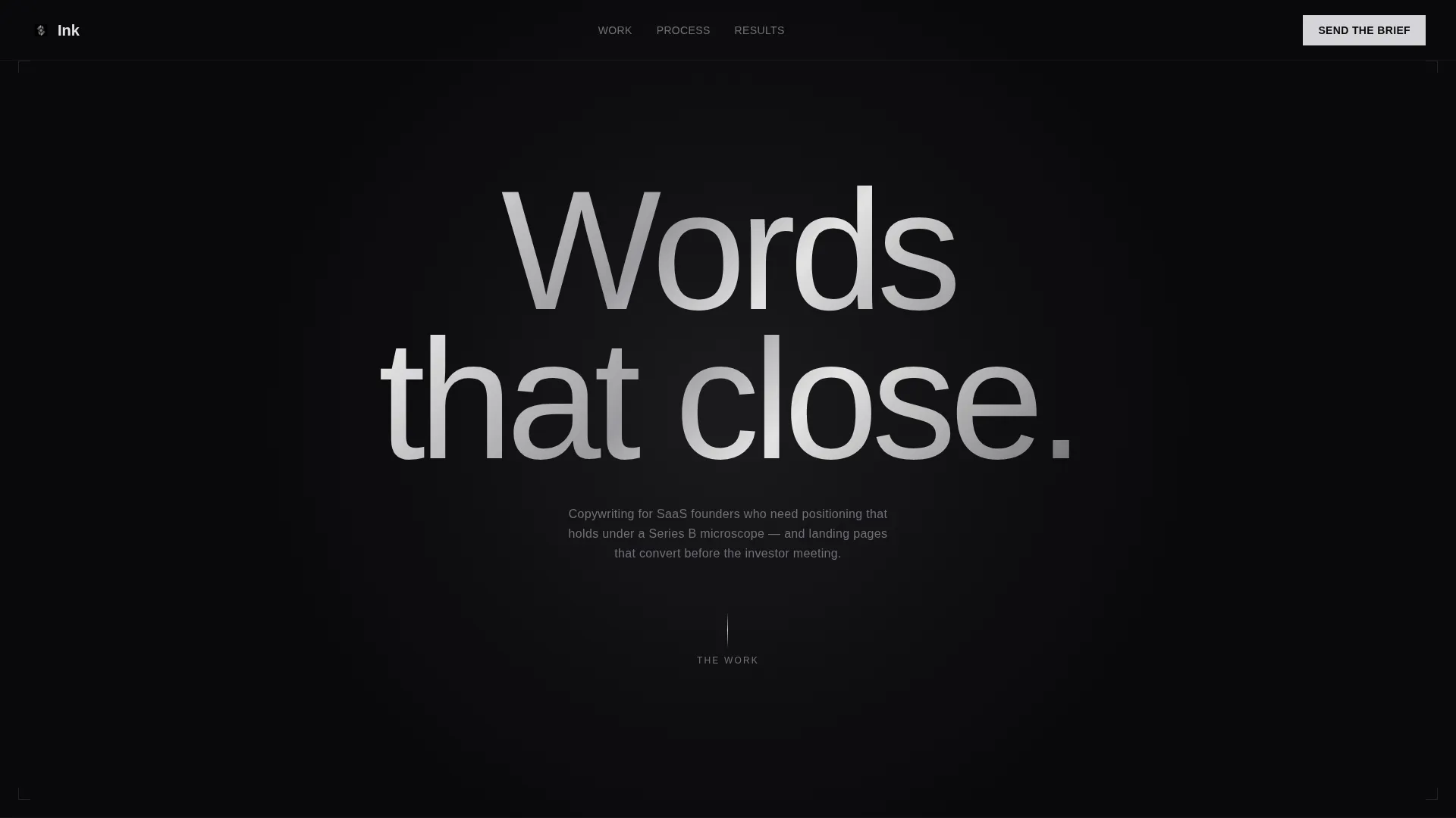
The header renders three or four words in an ultra-light sans-serif typeface scaled to fill the full viewport width. A subtle glass refraction shader makes the letters look etched into a dark pane, while a slow ambient light source drifts behind the type. No subheadline loads on entry. The type itself is the visual.
Asymmetric Bento Grid Layout
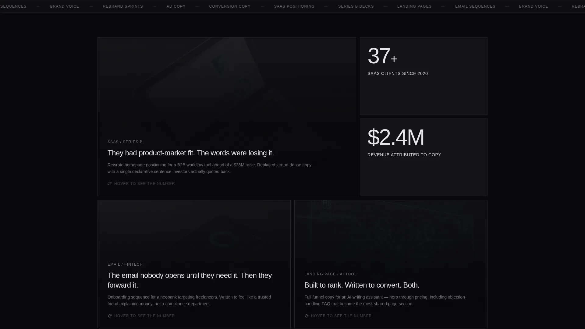
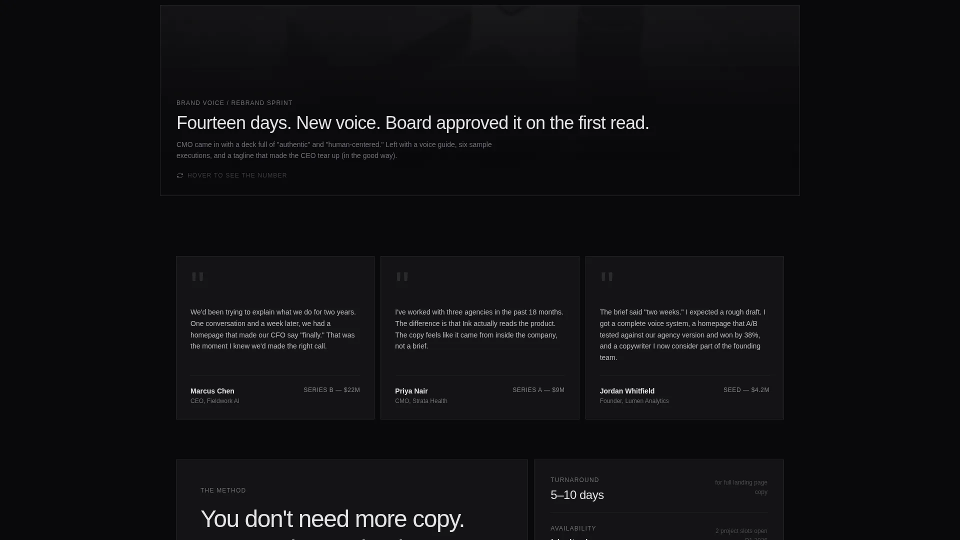
The project grid breathes with intentional imbalance. One massive tile dominates, followed by two narrow ones, then a testimonial strip, then another hero tile. No section headers interrupt the flow. The layout escalates in weight and confidence, ending with a closing tile that simply invites contact.
Hover-Reveal Project Cards
Each bento tile shows headline copy on its glass surface at rest. On hover, the card flips or expands to surface the metric it drove, such as a conversion lift, a revenue number, or an open rate. The interaction rewards attention and keeps the visitor moving through the grid.
Sticky Lead Capture Bar
A glass-panel sticky bar appears after the visitor reaches the third scroll depth. The form inside is minimal: name, company, a one-line project description, and a budget range selector with clear tiers. Nothing is decorative. Every field earns its place.
Single-Scroll Case Study Overlay
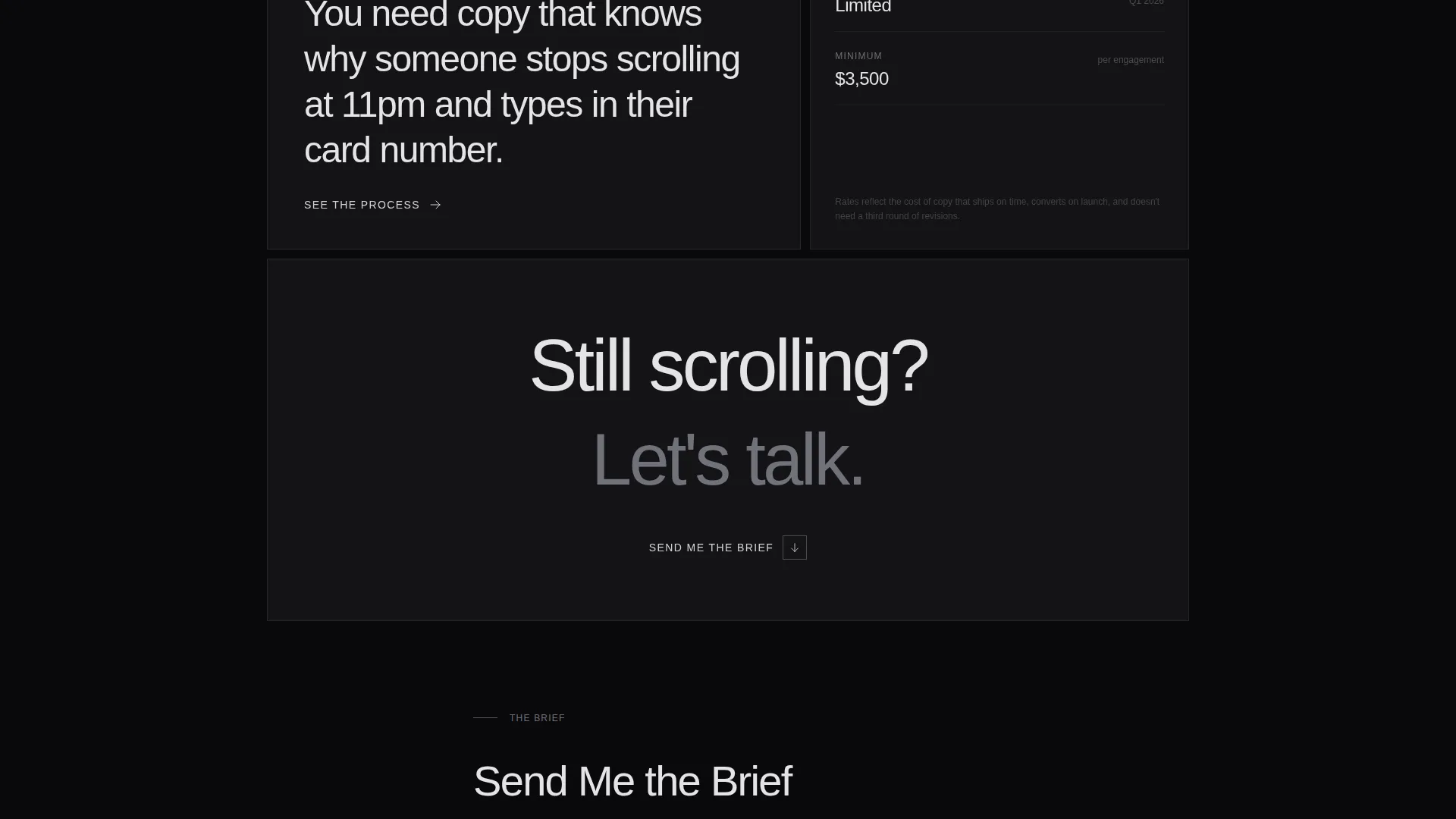
A secondary conversion path labeled "See the Process" opens a focused overlay. The overlay is a single continuous scroll through one project, ending with the same "Send Me the Brief" call to action. It gives detail-oriented clients a deeper look without breaking the main page flow.
Tech Glass Dark Visual System
The frosted glass card borders, backdrop-blur panels, and void-black backgrounds work together as a coherent visual language. The electric accent color appears only on hover states and the cursor trail, never as static decoration. Every visual decision reinforces the tone of the copy.
Page sections overview
| Section | Purpose |
|---|---|
| Giant Headline Header | Fills the viewport with the core value statement using refraction-styled type |
| Dominant Project Tile | Opens the bento grid with the strongest, largest work sample |
| Narrow Project Pair | Follows the hero tile with two compact project cards for contrast |
| Testimonial Strip | Delivers a client voice in a horizontal band between grid clusters |
| Secondary Hero Tile | Re-escalates visual weight before the closing section |
| Closing Contact Tile | Ends the scroll with a direct, low-friction invitation to start a conversation |
| Sticky Lead Bar | Anchors the primary call to action after the third scroll depth |
| Case Study Overlay | Opens a deep-dive single-scroll project view with an inline call to action |
Design & branding system
The visual identity is built on a Monochrome Steel color system. Every palette decision leans cold and precise. The result feels like a premium tool, not a personal website.
- Core palette: void black (#09090B) for backgrounds, brushed gunmetal (#1C1C1E) for card surfaces, frosted glass (#FFFFFF12 with backdrop-blur) for panels, and electric zinc (#D4D4D8) reserved strictly for hover and cursor interaction
- Typography: ultra-light sans-serif scaled to full-viewport width for the header; light zinc body text set against dark surfaces throughout
- Motion and interaction: glass refraction shader on header type, ambient drifting light source behind the headline, card flip and expand on hover, cursor trail accent that fires only on user action
Mobile & speed optimization
The bento grid layout and interaction behaviors are designed with intentional restraint. The accent color never loads as static decoration, which keeps the visual weight low and the hierarchy clean across screen sizes.
- Bento grid tiles reflow to maintain readability and visual priority on smaller viewports
- The sticky lead capture bar remains accessible on scroll across device sizes
- The case study overlay is built as a single continuous scroll, avoiding nested navigation that breaks on touch devices
How this template helps you convert
The page does not ask for trust before it earns it. Every section is sequenced to move a skeptical, time-short client from the headline to the form.
- The giant headline creates an immediate impression that the copywriter thinks in the same register as the client, setting up credibility before a single project tile appears.
- The hover-reveal metric system converts portfolio browsing into a proof-driven experience, letting the numbers speak directly to SaaS founders and startup marketing leads who need results, not descriptions.
- The sticky lead bar and minimal form reduce the commitment required to make contact, lowering friction at the exact moment the visitor is most convinced.
Other information about this template
This template sits at the intersection of portfolio presentation and direct response lead generation. It is a focused tool for a specific kind of professional.
- The template is categorized under Portfolio and Agency, with a Copywriter Portfolio subcategory and a Copywriter Dark Theme Portfolio niche focus
- The bento grid template style, Tech Glass theme, Immersive Visual creative direction, Giant Headline Centered header concept, Lead Generation landing page direction, and Monochrome Steel color system are all matched intersection context fields built into this design
- The page is structured as a single-page landing page, not a multi-page website, making it fast to publish and easy to maintain
- The "Send Me the Brief" primary call to action and the "See the Process" secondary path are both built into the template structure as described in the source brief
Theme
Tech Glass
Creative direction
Immersive Visual
Color system
Monochrome Steel
Style
Bento Grid
Direction
Lead Generation
Page Sections
Viewport-filling Giant Headline
Asymmetric Bento Grid Layout
Hover-reveal Project Metrics
Sticky Minimal Lead Capture Bar
Single-scroll Case Study Overlay
Tech Glass Dark Visual System
Related questions
Can I replace the sample copy with my own projects?
How does the sticky lead capture form work?
Is this template best suited for experienced copywriters?
Can I change the color palette to something warmer?
What type of clients is this landing page designed to attract?



