Copywriter Portfolio Specialist Portfolio Website Template
Inkwell is a full-width immersive landing page template built for freelance copywriters who win clients through proof, not promises. It walks visitors through three escalating case studies, from brief to shipped copy to hard results, using a dark editorial design that feels as considered as the writing it showcases. The primary call to action is simple: send your brief.
by Rocket studio
Quick summary
Inkwell is a single-page copywriter portfolio template built around long-form case studies. It guides visitors through three real-world projects in escalating complexity, pairing raw client briefs with strategic rewrites and measurable outcomes. The dark editorial aesthetic, parchment gold accents, and a bold headline-first header make the template feel as sharp as the work it presents.
Who this template is for
This template is designed for freelance copywriters who close projects through demonstrated thinking, not just sample clips. It suits professionals whose ideal clients expect evidence of strategic depth alongside creative range.
- Freelance copywriters targeting CMOs at mid-market software-as-a-service companies
- Independent brand writers pitching startup founders after a positioning pivot
- Experienced creative writers building trust with agency creative directors who need someone to own a brand voice fast
What problem this template solves
Most copywriter portfolio pages show writing samples with little context. Visitors read a headline, nod politely, and leave. They cannot tell whether the writer understood the brief, challenged it, or just executed it. That missing context is where deals fall apart.
- Prospects cannot connect copy samples to business outcomes without a clear before-and-after narrative
- Generic portfolio layouts do not signal the strategic thinking that senior buyers actually pay for
- A weak or friction-heavy contact form turns warm visitors into leads who disappear without reaching out
What you get with this template
Inkwell gives you a structured, single-page portfolio that moves a visitor from skeptical to convinced across one uninterrupted scroll. Every section is arranged to build credibility in sequence.
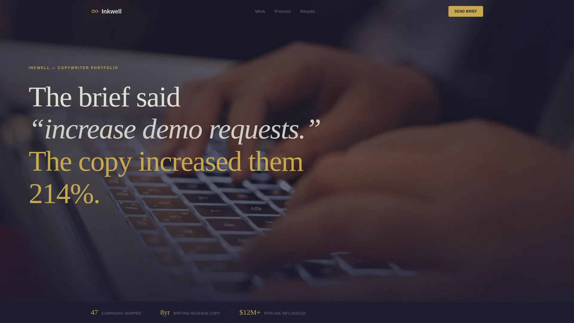
- A cinematic header section with a grain-heavy editorial photograph and a staggered, clause-by-clause headline animation
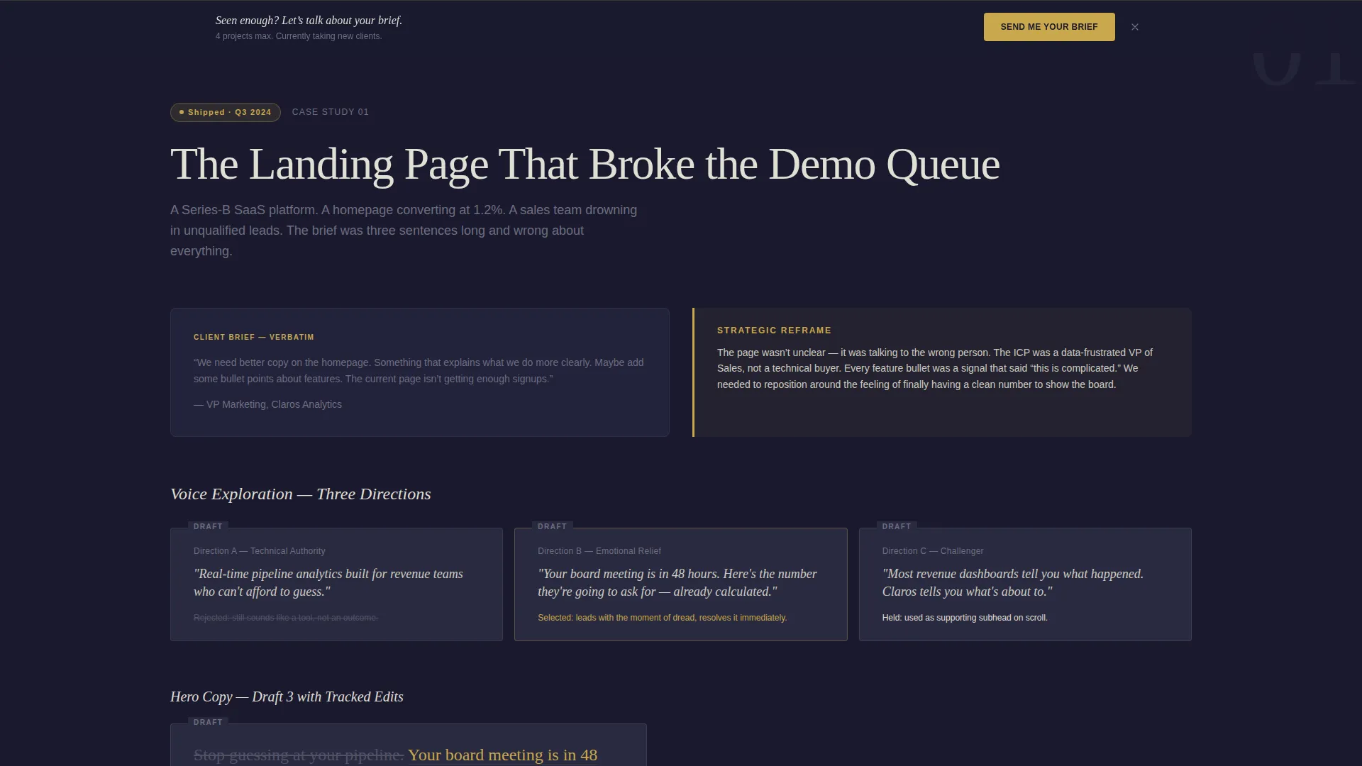
- Three full case study sections, each moving from raw client brief through strategic reframe, draft fragments with visible edits, and final shipped copy with results
- A dual conversion system combining a fixed bottom call-to-action bar with a full-width closing contact form, plus a secondary PDF download capture
Feature list
This template is built around a clear set of capabilities drawn directly from the design brief.
Clause-by-Clause Headline Animation
The header headline fades in one clause at a time over a moody, grain-textured photograph. The effect slows the visitor down and makes the opening line land with the weight of a printed magazine spread.
Three-Stage Case Study Flow
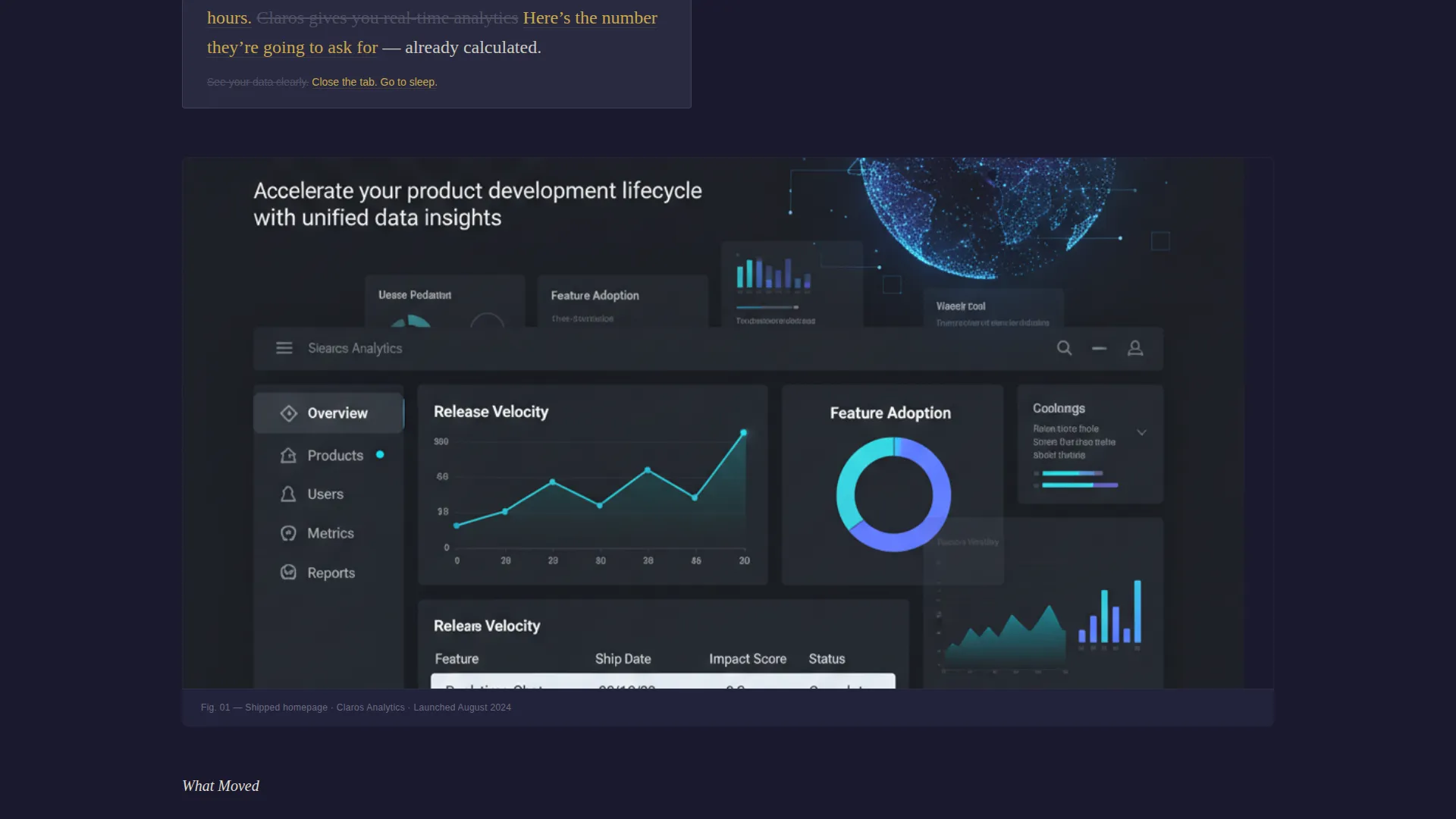
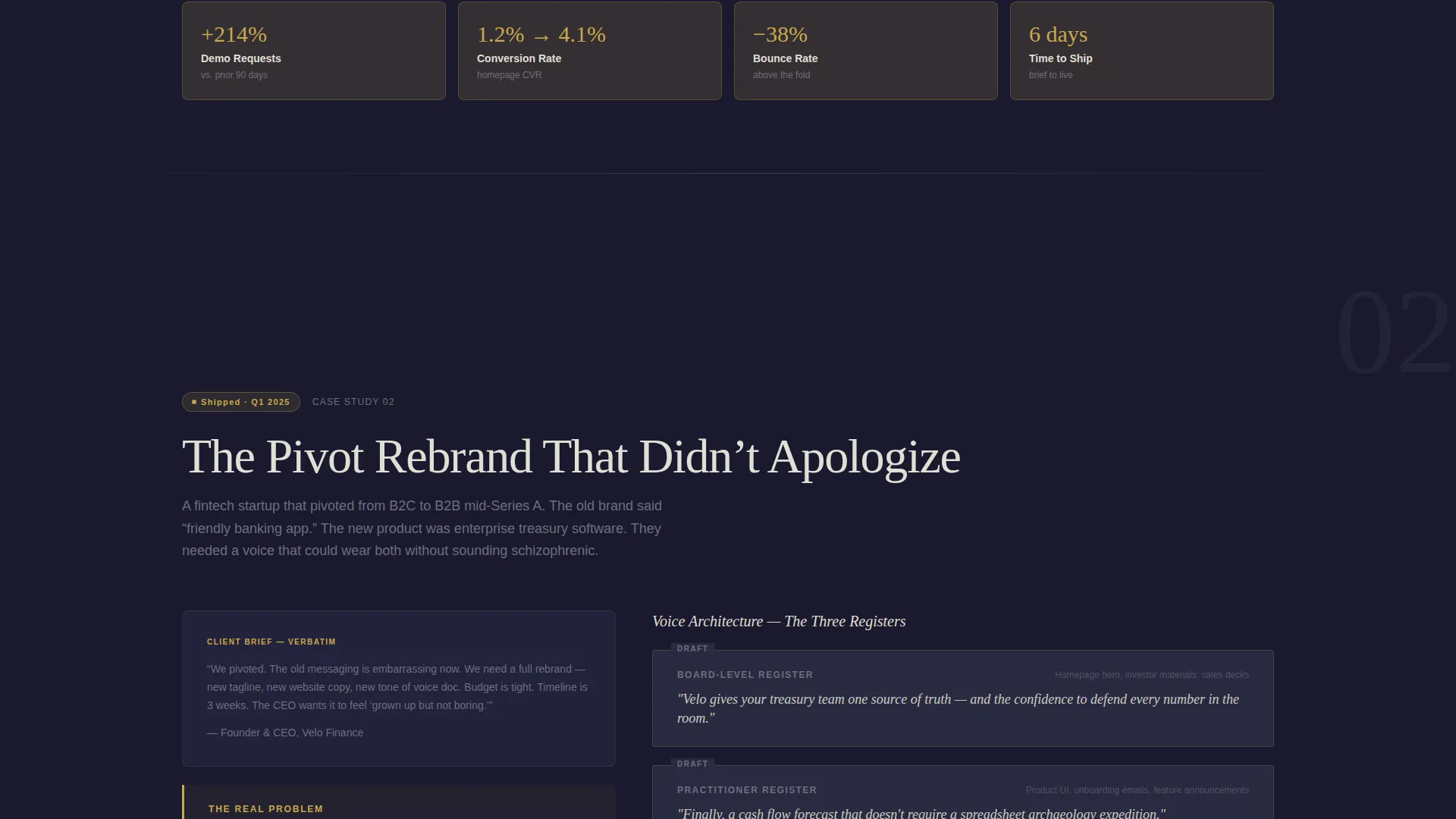
Each case study section opens with the client's original brief, then reveals the strategic reframe, draft fragments with tracked edits visible, and finally the shipped copy alongside measurable results. The rhythm alternates between analytical paragraphs and full-bleed screenshots.
Fixed Bottom Call-to-Action Bar
After the second case study, a parchment gold "Send Me Your Brief" bar locks to the bottom of the viewport. It stays visible as the visitor continues scrolling, keeping the primary conversion path in reach without interrupting reading momentum.
Full-Width Closing Contact Form
The page closes with a dedicated contact section containing fields for name, company, project type (landing page, brand voice, email sequence, full campaign, or other), and a single free-text prompt asking for the problem in one sentence. No budget field keeps friction low.
Secondary PDF Gated Capture
A secondary conversion path offers a downloadable full case study PDF in exchange for an email address. This catches visitors who want more depth but are not yet ready to send a brief, extending the relationship beyond a single visit.
Dark Editorial Visual Identity
The Cloud Canvas color system uses deep graphite, soft fog, pencil-lead silver, and aged parchment gold as the sole accent color. Typography is set in a large editorial serif, giving the page a considered, desk-at-midnight atmosphere.
Page sections overview
| Section | Purpose |
|---|---|
| Type Over Image Header | Opens with an editorial photograph and an animated, clause-by-clause headline that states a hard result upfront |
| Case Study One | Walks through a landing page project from raw brief to shipped copy with visible draft edits and outcome data |
| Case Study Two | Escalates to a full brand rebrand, pairing analytical copy sections with full-bleed in-the-wild screenshots |
| Case Study Three | Closes the triptych with a product launch sequence, the most complex project, proving range and deepening trust |
| Fixed call to action Bar | Appears after case study two as a persistent bottom bar with the primary brief-submission call to action |
| Closing Contact Form | Full-width section with a low-friction form capturing project type and a one-sentence problem description |
| PDF Download Gate | Secondary capture section offering the full case study PDF behind an email address field |
Design & branding system
The visual identity is built on the Cloud Canvas color system, a palette that evokes a writer's desk late at night. Every color choice is intentional: dark backgrounds push the copy forward, and warm gold makes every interactive element feel earned.
- Core palette: deep graphite (#1A1A2E) for backgrounds, soft fog (#E0DFD5) for body text, pencil-lead silver (#6E6E80) for secondary labels and dividers, and aged parchment gold (#C9A84C) reserved for links, pull quotes, and hover states
- Typography is set in a large editorial serif for headlines and display text, creating a confident, publication-grade reading experience
- Grain texture on the header photograph and a deliberate use of shadow outside the focal cone reinforce the immersive, after-hours atmosphere throughout the page
Mobile & speed optimization
The full-width immersive layout is structured to adapt cleanly across screen sizes. The staggered headline animation and full-bleed image sections are built with a vertical scroll rhythm that feels intentional on a phone, not just shrunk from desktop.
- Full-bleed case study screenshots reflow to single-column stacks on smaller screens, preserving the analytical-to-visual rhythm without horizontal overflow
- The fixed bottom call-to-action bar is sized and positioned to remain usable on mobile viewports without obscuring key reading content
- The closing contact form uses a straightforward vertical field layout that works naturally on touch devices
How this template helps you convert
Inkwell is not a brochure. It is a guided argument that ends with a request for action. Every structural decision is made to move a reader closer to sending a brief or sharing their email.
- The escalating case study sequence builds trust progressively. Each project is harder than the last, so by the time the visitor reaches the closing form, they have watched the writer handle a landing page, a full rebrand, and a product launch sequence. That range reduces hiring hesitation.
- The dual call-to-action system removes the all-or-nothing problem. The fixed bottom bar catches visitors who are ready now. The PDF download gate captures visitors who need more time. Both paths lead to a follow-up conversation.
Other information about this template
Inkwell sits within the Portfolio and Agency category, specifically designed for the copywriter case study portfolio niche. A few additional details worth knowing before you customize it.
- The template style is Full-Width Immersive, meaning all major sections extend edge to edge with no constrained sidebar columns
- The creative direction follows a Creator Spotlight approach, positioning the copywriter as a practitioner whose thinking is the product, not just the deliverables
- The header concept is Type Over Image, a technique where large typographic headlines are layered directly over a cinematic photograph
- The theme is Dark Immersive, chosen to signal depth and seriousness rather than the bright minimalism common in generic portfolio templates
- The landing page direction is Lead Generation, with every structural decision subordinated to producing either a brief submission or an email capture
Theme
Dark Immersive
Creative direction
Creator Spotlight
Color system
Cloud Canvas
Style
Full-Width Immersive
Direction
Lead Generation
Page Sections
Clause-by-clause Headline Animation
Three-stage Case Study Sections
Fixed Bottom Call to Action Bar
Low-friction Contact Form
Secondary PDF Gated Download
Dark Editorial Visual System
Related questions
Can I replace the placeholder case studies with my own projects?
Do I need to show exactly three case studies?
What does the secondary PDF download path do?
What project types does the contact form cover?
Who is this landing page template best suited for?



