Game Designer Dark Theme Portfolio Landing Page
Inkwell is a dark-theme game designer portfolio landing page built for systems thinkers who need to show their work. The overlap-and-layered layout uses a case study narrative structure to peel back design decisions like a project folder. It is designed to attract creative directors, indie leads, and recruiters who want process, not polish.
by Rocket studio
Quick summary
Inkwell is a single-page dark-theme portfolio landing page for game designers. It uses a layered, overlapping card layout to present case studies like physical documents on a desk. The design is built around an Ink and Paper color system, a Type Over Image header, and a waitlist capture flow that withholds full breakdowns to drive sign-ups.
Who this template is for
This template is built for game designers who lead with process. It is ideal for systems designers, economy balancers, and level pacing specialists who want their thinking visible before a recruiter ever forwards a résumé.
- Game designers building a portfolio that demonstrates design decisions, not just shipped titles
- Freelancers and contractors targeting creative directors or indie studio leads who evaluate systems thinking
- Designers using a waitlist or coming-soon page to control when and to whom they reveal full case studies
What problem this template solves
Most portfolio pages show outcomes. This template shows thinking. The brief specifically addresses the gap between polished outcome portfolios and the process-first evidence that hiring decision-makers actually need.
- Hiring managers scan dozens of portfolios quickly and skip anything that looks like a marketing page
- Designers with deep process work have no standard format that makes playtest scars, iteration logs, and flowcharts feel intentional
- A standard portfolio layout cannot convey the quiet obsession behind systems design the way a layered, document-like structure can
What you get with this template
You get a fully designed single-page layout with every section, visual detail, and interactive behavior described in the source brief. The template is ready to customize with your own case study content, screenshots, and email capture details.
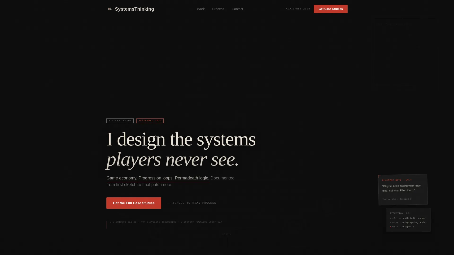
- A Type Over Image header with an oversized serif headline, dimmed game screenshot, and a pulsing red underline beneath the subtitle
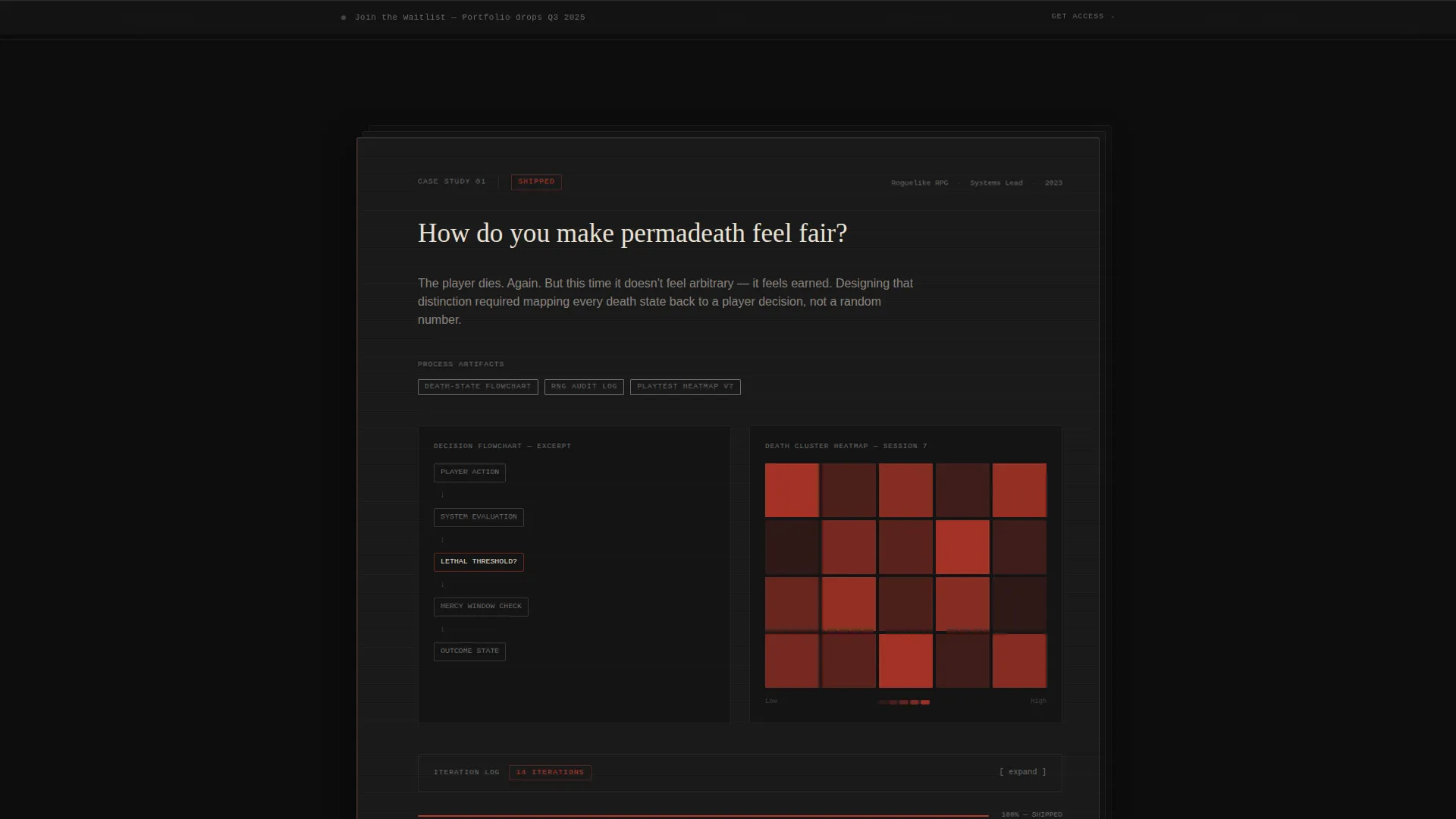
- Scrolling overlap and layered card sections that simulate rifling through a project folder, each card revealing a deeper stage of the design process
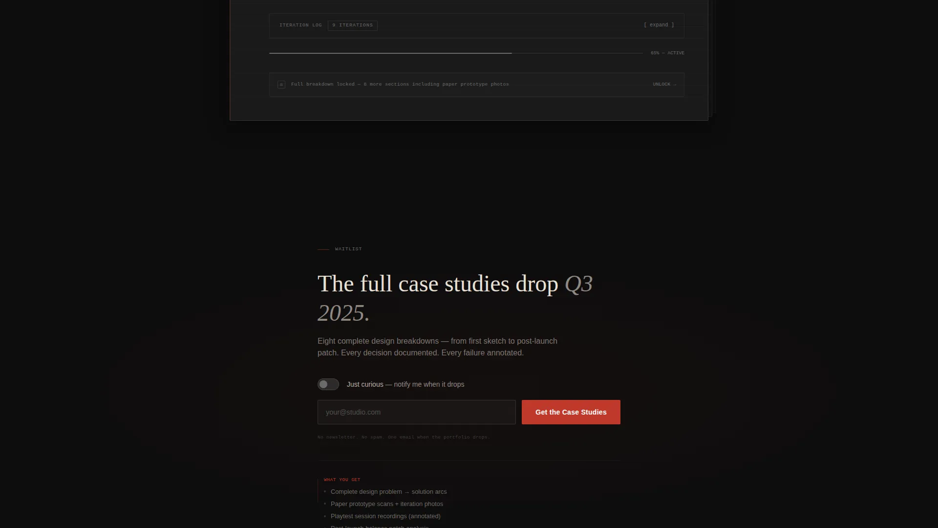
- A waitlist capture block with a single email field, an audience toggle, and a sticky bottom bar that turns revision red on hover
Feature list
This template ships with a focused set of purposefully designed components. Each one is drawn directly from the source brief and serves the case study narrative structure.
Type Over Image Header
A bold oversized serif headline sits in cream over a dimmed, desaturated game screenshot. The type physically overlaps the image edge with a subtle drop shadow. A thin red underline pulses once beneath the subtitle, then stills.
Overlap and Layered Card Scroll
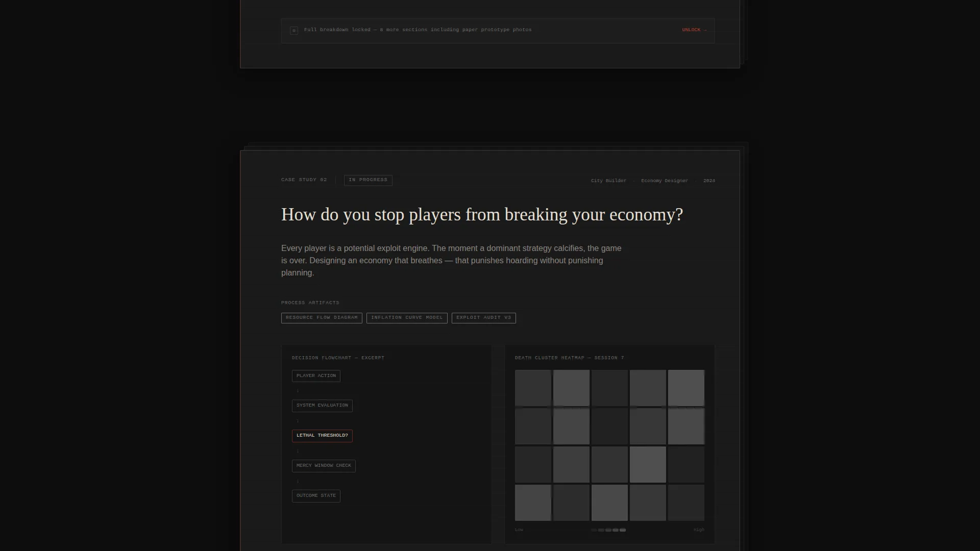
Case study sections are built as stacked, overlapping cards that slide from under one another as the visitor scrolls. The scroll behavior mimics rifling through a physical project folder, building credibility through visible thinking.
Case Study Narrative Structure
Each case study opens with a single provocative design question. Process artifacts such as flowcharts, paper prototype photos, playtest heatmaps, and iteration logs are revealed beneath it, moving from problem to shipped solution.
Waitlist Capture Block
Placed after the second case study teaser, the capture block uses a single email field and a toggle for "I'm hiring" versus "Just curious." The deliberate placement rewards visitor curiosity before the full breakdowns are shown.
Sticky Waitlist Bottom Bar
A graphite sticky bar appears on scroll and reads "Join the Waitlist" with a portfolio drop quarter indicator. On hover, it turns revision red, reinforcing the accent color system and creating a persistent but unobtrusive call to action.
Ink and Paper Dark Color System
The entire layout uses deep inkwell black, warm parchment off-white, graphite notation gray, and a single revision red accent. The palette evokes a Moleskine notebook under a desk lamp, analog in feeling but precise in execution.
Page sections overview
| Section | Purpose |
|---|---|
| Type Over Image Header | Sets the designer's thesis and visual identity above a dimmed game screenshot |
| Subtitle and Pulse Line | Draws the eye with a one-time animated red underline beneath the header subtitle |
| First Case Study Teaser | Opens with a provocative design question and reveals the first layer of process artifacts |
| Second Case Study Teaser | Deepens the narrative and builds enough credibility to trigger the waitlist capture |
| Waitlist Capture Block | Collects email and audience intent after two case study teasers have earned visitor trust |
| Sticky Bottom Bar | Persists a waitlist call to action on scroll with a hover state that activates revision red |
Design & branding system
The visual identity follows a Lens and Frame theme using an Ink and Paper color system. Every design choice references the physical act of annotating a design document late at night, intimate and deliberately lo-fi against the digital craft it documents.
- Color palette: deep inkwell black (#0D0D0D) as the base, warm parchment off-white (#E8E0D5) for primary text, graphite notation gray (#6B6B6B) for secondary labels, and revision red (#C0392B) reserved for interactive highlights, hover states, and annotation callouts
- Typography: bold oversized serif for the headline in cream, paired with a mechanical pencil sketch aesthetic throughout the layout that keeps the page feeling like a design document rather than a marketing site
- Layered depth: sections physically overlap one another, casting subtle shadows and creating the impression of stacked paper documents on a dark desk surface
Mobile & speed optimization
The overlap and layered structure is designed with scroll behavior in mind. The template's visual depth comes from intentional layering rather than heavy asset loads, keeping the page lean for visitors checking portfolios between sprint reviews.
- The sticky bottom bar and waitlist capture block are designed to remain accessible and readable at all viewport sizes
- Oversized typography and high-contrast cream-on-black text maintain legibility across screen sizes without requiring complex responsive rewrites
How this template helps you convert
The conversion strategy is built into the layout sequence. Visitors are not asked to sign up immediately. They are walked through enough visible thinking to feel they are missing something before the capture block appears.
- The header immediately signals a systems designer's mindset, filtering for the right audience before they read a single word of body copy
- Two case study teasers withhold the full breakdowns deliberately, creating a knowledge gap that makes the waitlist feel like access rather than a form
- The sticky bottom bar provides a persistent, low-pressure reminder that activates visually on hover, keeping the call to action present without interrupting the reading flow
Other information about this template
This template is built specifically for the game designer dark theme portfolio niche. It is part of the Portfolio and Agency category and sits within the Game Designer Portfolio subcategory. The Overlap and Layered template style and the Waitlist and Coming Soon landing page direction make it a strong fit for designers preparing a controlled portfolio launch rather than a permanent evergreen page.
- The template style is classified as Overlap and Layered, which is a deliberate structural choice, not a decorative one
- The Lens and Frame theme and Ink and Paper color system are core to the visual identity and should be preserved when customizing
- This template suits designers targeting mid-size studios and indie leads who evaluate candidates on process depth before requesting a full portfolio
Theme
Lens & Frame
Creative direction
Case Study Narrative
Color system
Ink & Paper
Style
Overlap/Layered
Direction
Waitlist/Coming Soon
Page Sections
Type Over Image Header
Overlap and Layered Card Scroll
Case Study Narrative Structure
Waitlist Capture Block
Sticky Revision Red Bottom Bar
Ink and Paper Color System
Related questions
Who is this landing page template designed for?
Can I use this template as a permanent portfolio or only as a coming-soon page?
What makes the scroll behavior feel different from a standard portfolio page?
Does the template include the actual case study content?
How does the waitlist capture block work within the page flow?



