Real Estate Agency Specialist Reviews Website Template
Inquire is a bold brutalist real estate frequently asked question landing page template built for property brokerages that want to answer every buyer, seller, and landlord question before the phone even rings. It pairs a striking split-screen interactive header with a scroll-driven feature matrix, oversized testimonial block, tier comparison grid, and a fixed app download call-to-action bar, all wrapped in a raw, high-contrast Acid Digital visual system.
by Rocket studio
Quick summary
Inquire is a single-page PropTech landing page template designed for real estate agencies that lead with answers, not appointments. The design follows a Bold Brutalist theme: void black, raw concrete off-white, electric chartreuse, and warning magenta work together to deliver a site that feels immediate, honest, and impossible to ignore. Every section earns the visitor's trust before asking for anything.
Who this template is for
This template is built for real estate businesses and agencies that serve buyers, renters, and landlords who need clear answers fast. It suits teams launching a property frequently asked question app or a direct-answer landing page where friction is the enemy.
- First-time buyers who are terrified of hidden costs and need plain-language guidance before they sign anything
- Relocating families searching school districts and lease details late at night on a mobile device
- Landlords trying to understand tenancy regulations and compliance deadlines without paying solicitor fees
What problem this template solves
Most property websites bury answers inside lengthy PDFs, gated forms, or phone queues. Visitors arrive with urgent questions and leave without answers, pushing the bounce rate up and trust down. This landing page template fixes that by putting every key question on screen from the very first scroll.
- Agents spend hours on repeat callback questions that a well-structured frequently asked question landing page can resolve instantly
- Buyers and renters abandon sites when they cannot quickly access the details they need
- Landlords risk missing regulatory deadlines because plain-language guidance is locked behind paywalls or professional fees
What you get with this template
You get a complete, production-ready landing page built around one goal: deliver property answers instantly and drive app downloads. Every section is purposeful, and none of it requires coding knowledge to customize and launch.
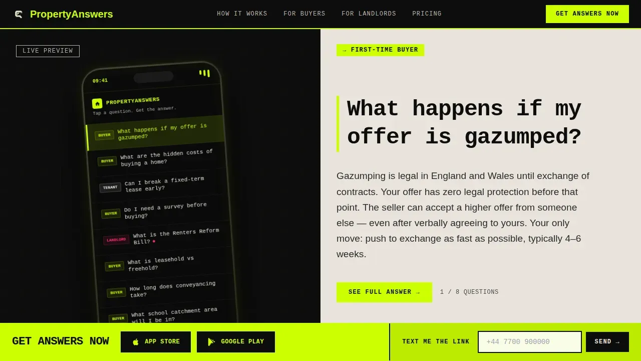
- A live interactive split-screen header where visitors can watch real frequently asked question questions and dynamic answers update in real time
- A scroll-driven feature matrix that stacks evidence in bold rows, a full-width brutalist testimonial block, and a tier comparison grid
- A fixed bottom call-to-action bar with app store badges and a low-friction "Text Me the Link" form for mobile visitors
Feature list
This template's key features are built directly from the project brief. Each one contributes to a landing page that is as functional as it is visually striking.
Interactive Split-Screen frequently asked question Header
The header divides the page into two equal halves. The left side displays a brutalist phone mockup with a live, scrollable list of real property questions rendered in acid chartreuse on void black. The right side shows the selected answer in oversized slab type on raw concrete white, updating dynamically as visitors tap different questions. The phone screen glows faintly, the only soft motion on the page.
Scroll-Driven Feature Matrix
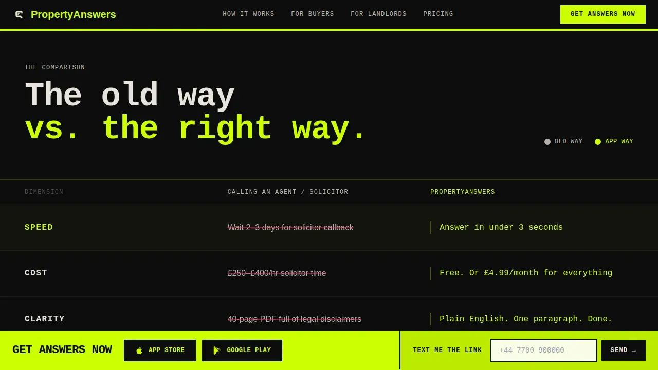
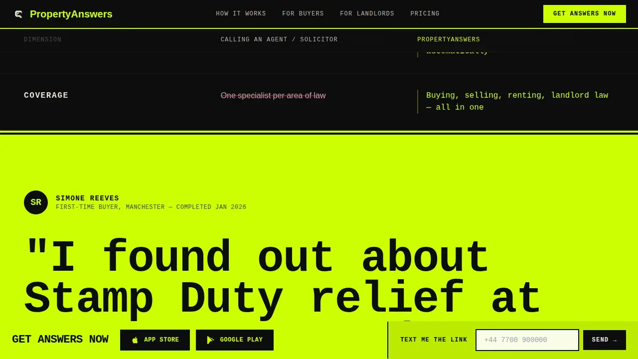
The feature matrix organises every capability into a visible comparison grid. The left column shows the old way: calling agents, reading 40-page PDFs, waiting for solicitor callbacks. The right column shows the app way: instant answers, plain-language breakdowns, push notifications on regulation changes. Each row hits harder as users scroll, stacking evidence like concrete slabs. Midway, the matrix breaks for the full-width testimonial block, then resumes with a tier comparison grid.
Full-Width Brutalist Testimonial Block
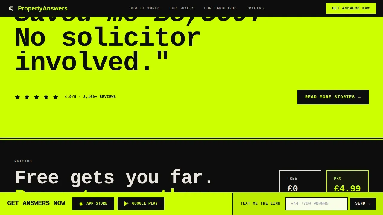
A single sentence rendered at 120 pixels on a full-width chartreuse background. No carousel, no stars, no decorative noise. The statement lands with architectural weight and anchors the page's credibility at a critical moment in the scroll journey.
Fixed App Download Call-to-Action Bar
After the first matrix row, a fixed bottom bar locks into view. It carries the primary "Get Answers Now" call-to-action alongside paired App Store and Google Play badges on a chartreuse strip. A secondary path offers "Text Me the Link" with a single phone-number field, reducing friction for mobile visitors already browsing on their phones.
Acid Digital Color and Typography System
Bold typography is set in JetBrains Mono for headings and monospaced display elements, with DM Sans for body text. The raw design uses void black (#0D0D0D), raw concrete off-white (#E8E3DC), electric chartreuse (#CCFF00) for hover states and active elements, and warning magenta (#FF2D6B) for urgent regulatory callouts. Backgrounds alternate between void black and off-white in hard, unpadded blocks.
Brutalist Footer with Horizontal Flow
The footer follows a horizontal flow layout consistent with the raw design language of the rest of the page. It is clean, direct, and requires no decorative elements to perform its role. Visitors can find links and connect with the brand without visual clutter.
Page sections overview
| Section | Purpose |
|---|---|
| Interactive Split-Screen Header | Let visitors watch live frequently asked question answers before any call to action appears |
| Feature Matrix (Round 1) | Compare old property process versus. app-powered instant answers |
| Full-Width Testimonial | Deliver a single bold social proof statement at maximum visual impact |
| Tier Comparison Matrix | Display Free versus. Pro feature differences in a clear grid |
| Fixed App Download Bar | Drive app store conversions with a persistent, high-contrast action strip |
| Brutalist Footer | Provide information, links, and brand details in a clean horizontal layout |
Design & branding system
The design language is rooted in brutalist web design, an approach inspired by the mid-20th century architectural movement that valued raw concrete and functional honesty over decoration. It strips away unnecessary ornamentation to expose the raw, functional core of the site. The result is a brand's unique identity that makes a bold statement and stands apart from every polished competitor in the market.
- Four-color Acid Digital palette: void black, raw concrete off-white, electric chartreuse, and warning magenta, no gradients, no shadows, no rounded corners
- Bold typography set in JetBrains Mono and DM Sans creates immediate visual hierarchy with oversized geometric forms and high-contrast text
- Custom background blocks alternate between void black and off-white in hard cuts, while chartreuse floods hover states, active toggles, and progress indicators with electric energy
Mobile & speed optimization
The entire landing page is built mobile-first. The boxy, grid-based design scales perfectly for thumb-navigation, which matters when the target audience is browsing at midnight on a phone. Smooth animations are used where they add clarity: tab switching, scroll-triggered matrix rows, the fixed call-to-action bar reveal, and the phone mockup glow. The page does not rely on heavy decorative scripts, which helps keep load times fast.
- The split-screen layout adapts cleanly to smaller device sizes, keeping the interactive frequently asked question preview usable on any screen
- Chartreuse hover states and immediate interaction feedback work well on touch devices without requiring mouse-over behaviour
- The "Text Me the Link" secondary path is specifically designed for mobile users who want to send the app link to themselves in a single step
How this template helps you convert
The landing page is structured to earn the conversion before it asks for one. Visitors interact with real content first, which builds genuine trust and reduces the risk of drop-off before the call-to-action appears.
- Visitors engage with the live frequently asked question preview in the header, effectively using the product before any download prompt appears, which means the fixed call to action bar arrives after they already understand the value
- The feature matrix stacks rows of comparative evidence, speed, cost, clarity, availability, so that by the time the tier comparison grid appears, the decision to act feels structural rather than persuaded
- The low-friction "Text Me the Link" form and paired app store badges provide two distinct paths to conversion, capturing both decisive visitors and those who want to learn more before they sign up
Other information about this template
This template is part of a broader library of brutalist website templates designed to help creative agencies, PropTech projects, and digital studios build with confidence and edge. It is fully customizable without requiring custom code, and teams can adjust visuals, text, and layout details to match the brand's unique identity and showcase their individuality.
- The unapologetic aesthetic makes it well-suited for agencies that want to stand out from generic property portals and deliver a raw design statement that visitors remember
- Teams can customize the landing page by selecting a layout type, setting a custom background, updating text blocks, and clicking Save to make the URL live, following a straightforward step-by-step process
- You can host a custom background image on an external image platform and link it directly to the page, or upload visuals using a blog posting tool as an alternative to third-party image hosting
- The template supports video embeds, so agencies can add property video walkthroughs or explainer videos directly to the landing page to enhance credibility and keep users engaged
- Social media platforms including Facebook can be linked through the footer and connected to the brand's marketing channels, making it straightforward to build an audience across platforms
- Portfolios, past projects, and case studies can be referenced or linked from relevant sections, giving agencies a way to add credibility beyond the frequently asked question content itself
- The history and story of a brokerage can be woven into the testimonial and matrix sections without disrupting the raw design rhythm of the page
- This template is built with the unapologetic aesthetic of brutalist design, which is polarizing by nature, it is best suited for businesses that value authenticity and creative expression over conventional polish
- Brutalist templates are well-suited for no-code development workflows, where the minimalist approach keeps builds fast and adjustments straightforward without specialist skills required
Theme
Bold Brutalist
Creative direction
Feature Matrix
Color system
Acid Digital
Style
Split Screen (50/50)
Direction
App Download
Page Sections
Interactive Split-screen Frequently Asked Question Header
Scroll-driven Feature Matrix
Fixed App Download Call-to-action Bar
Acid Digital Color and Typography System
Full-width Brutalist Testimonial Block
Brutalist Footer with Horizontal Flow
Related questions
Can I customize the colors and typography in this template?
Is this landing page template suitable for mobile users?
What sections are included in this template?
Do I need coding skills to use or edit this template?
Can I add video content to this landing page?



