Lawyer Profile Careers Website Template
Barrister is a full-width immersive landing page template built for a legal career blog. It combines a glassmorphism Tech Glass aesthetic with an animated cityscape hero, creator spotlight sections, featured guide cards, and a newsletter call-to-action banner. The result is a page that feels like a high-rise corner office, authoritative, visually compelling, and built to earn the reader's trust before asking for the click.
by Rocket studio
Quick summary
Barrister is the barrister immersive legal career blog landing page template designed for publishers who decode the path from law school to the corner office. It pairs a Cloud Canvas color system with animated glassmorphism visuals to create a page that stops the scroll and builds real credibility. Every section earns reader trust before guiding visitors toward the flagship guide or newsletter signup.
Who this template is for
This template is built for legal career content creators who want a page that commands the same authority as the profession it covers. If you run a blog, publication, or resource platform in the legal space, Barrister gives you the visual and structural foundation to compete.
- Law career bloggers, legal content publishers, and solo practitioners building a readership from scratch
- Legal professionals and educators sharing career intelligence with students, associates, or lateral candidates
- Aspiring barristers, 2L and 3L students, mid-level associates, and lateral hires who want to understand what their audience sees when they land on the page
What problem this template solves
Most legal career blogs look like they were styled during a courthouse renovation in 2009. They bury their best content under cluttered navigation, fail to establish the writer's credibility, and give potential clients and readers no reason to stay. Barrister solves that.
- Readers arrive from a Google search, a social share, or a law firm Slack channel, and they immediately need a reason to trust the source
- The page must communicate depth and expertise before asking for any action, yet keep its layout distraction free so visitors actually convert
- A scattered blog home page with no clear narrative fails to hold the reader who arrived with a specific career anxiety in mind
What you get with this template
Barrister delivers a fully structured, single-page immersive layout with every section pre-designed and purpose-built. You get a complete visual system, a clear content flow, and interactive elements that make the page feel alive without overwhelming the reader.
- A full-viewport animated hero section with an SVG glass cityscape, smooth building-assembly animation, and a tagline reveal
- Three creator spotlight sections, two featured guide cards, a frosted-glass newsletter call-to-action banner, and a single-row linear footer
- The complete Cloud Canvas color system applied across every element, with glassmorphism cards, hover-glow topic tags, and a floating call-to-action pill button
Feature list
This section covers the core capabilities built into the Barrister template, all drawn directly from the design and structure brief.
Animated SVG Glass Cityscape Hero
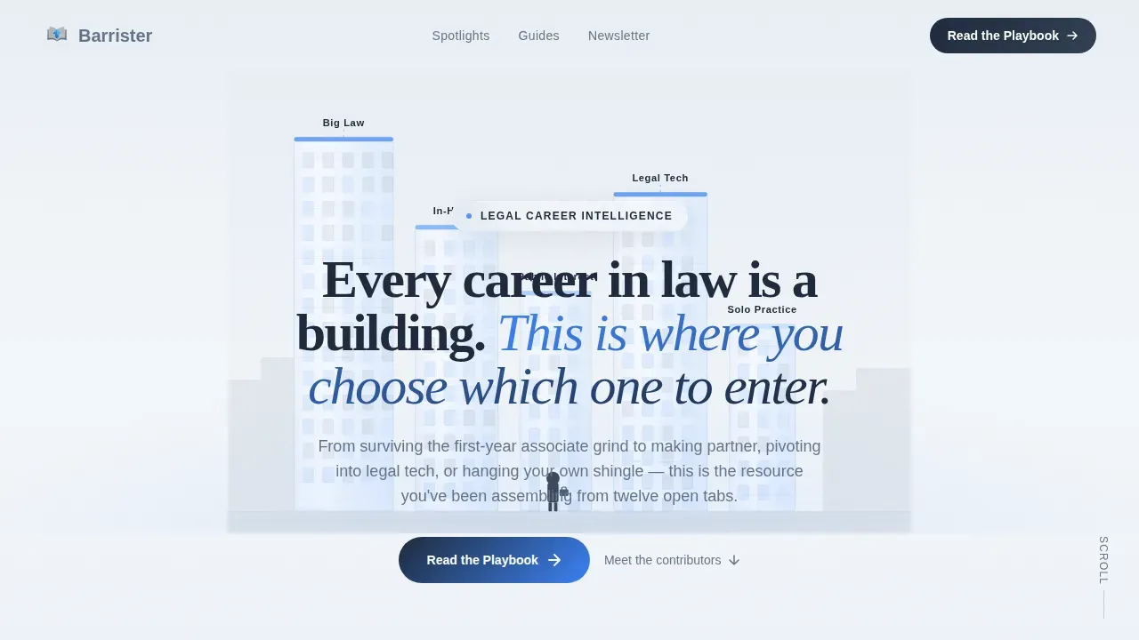
The hero section fills the full viewport with a stylized glass cityscape that assembles itself piece by piece on load. Each building represents a distinct legal career path, Big Law, In-House, Public Interest, Legal Tech, and Solo Practice, labeled in clean sans-serif type. A single illustrated figure stands at a crossroads plaza below, briefcase in hand. The tagline fades in over the skyline with smooth GSAP word animation, placing the key messages directly above the fold where visitors see them without scrolling.
Creator Spotlight Scroll Sections
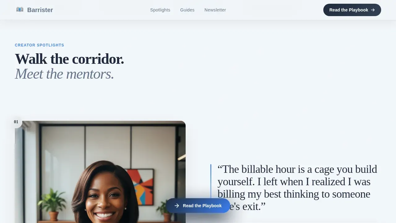
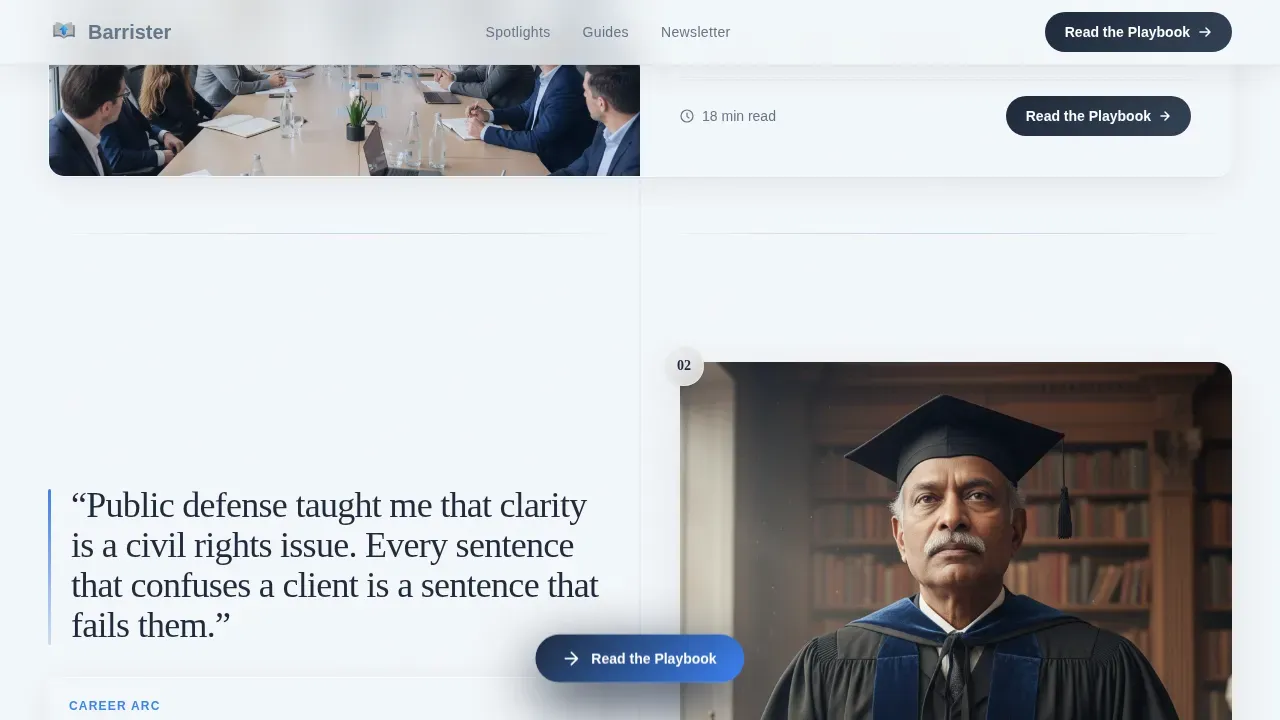
Three dedicated creator spotlight sections are wired into the page flow like a curated corridor of mentors. Each spotlight features a large portrait illustration in the same glass-refraction style, a pull quote in oversized navy type, and a two-sentence career arc summary. The scroll experience is designed so that every spotlight answers the career question the previous one raised, building momentum through recognition rather than urgency. This layout gives the blog a personal touch that static author bios cannot replicate.
Featured Guide Cards with Reading-Time Counters
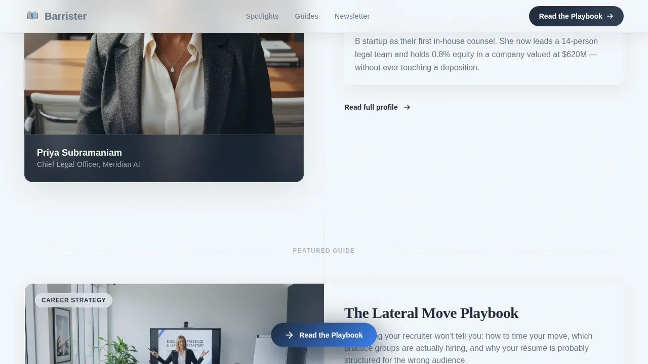
Between creator spotlights, two full-width interstitial guide cards surface the blog's flagship long-form content. Each card displays an animated reading-time counter and topic tags that glow on hover. The cards are pre-labeled for "The Lateral Move Playbook" and "Billable Hours versus. Equity: The Real Math," giving visitors immediate access to valuable information without a gate or form. The primary call-to-action, "Read the Playbook," is anchored to the bottom of each card as a floating pill button.
Frosted-Glass Newsletter Banner
Near the footer, a slim frosted-glass banner delivers the newsletter call-to-action: "Get the Weekly Brief." The banner includes a single email input field and the subline "One career-changing read every Tuesday." This design keeps the subscription form short, requesting only essential information, which reduces friction and supports higher submission rates. The lead magnet approach encourages sign-ups without requiring a hard-sell moment.
Tech Glass Glassmorphism Card System
Every card, spotlight panel, and interstitial block uses the glassmorphism treatment defined by the Cloud Canvas system. Cards float with frosted transparency, backgrounds layer with subtle blurs, and generous whitespace lets each element breathe. The visual appeal comes from layered depth rather than bold colors or heavy decoration, keeping the page sleek and professional while maintaining strong visual hierarchy.
Floating Call-to-Action Pill Button
The primary call-to-action appears first as a floating pill button after the second creator spotlight, then repeats anchored at the bottom of each guide card. No form, no gate, the click lands the visitor directly on the blog's flagship long-form guide. This distraction free approach keeps the page focused on a single conversion goal, which directly supports stronger conversion rates.
Page sections overview
| Section | Purpose |
|---|---|
| Animated hero viewport | Introduces the blog with SVG cityscape and tagline reveal |
| Creator Spotlight One | Features former Big Law associate career arc and pull quote |
| Guide Card One | Surfaces "The Lateral Move Playbook" with reading-time counter |
| Creator Spotlight Two | Features public defender turned legal writing professor |
| Guide Card Two | Surfaces "Billable Hours versus. Equity" guide with hover tags |
| Creator Spotlight Three | Features Chief Legal Officer who never litigated |
| Newsletter call to action banner | Frosted-glass email signup with single field |
| Linear single-row footer | Contact details and essential navigation links |
Design & branding system
The entire page is built on the Cloud Canvas color system, which reads like a rain-streaked high-rise window at dusk. The palette is cool, reflective, and quietly authoritative. Every color choice reinforces the blog's legal prowess and professional credibility without feeling corporate or stiff.
- Color scheme: vapor white (#F4F7FA) for backgrounds, translucent slate (#64748B) for body text, deep briefcase navy (#1E293B) for headlines and navigation, and electric deposition blue (#3B82F6) for hover states, links, and interactive accents
- Typography: Fraunces serif display for headlines and pull quotes, DM Sans for body text and user interface elements, creating a sharp contrast between editorial authority and clean legibility
- Visual style: glassmorphism blurs on card backgrounds, frosted transparency on panel overlays, smooth scroll-reveal stagger animations powered by GSAP, and hover-glow topic tags that signal interactivity without demanding immediate action
Mobile & speed optimization
Barrister is designed desktop-first to serve the reader who is deep in late-night research at a desk, but the layout adapts responsibly for mobile devices. Responsive design ensures the page functions smoothly across screen sizes, which matters because a large share of visitors will encounter the page through a shared link on a phone or tablet.
- The glassmorphism card system and scroll-reveal animations are built with Client Components for interactivity, while static sections use Server Components for faster initial rendering and a shorter load time
- The animated SVG hero is optimized to assemble without blocking the rest of the page, keeping the experience fluid on both desktop and mobile devices
- High quality images and illustration assets use the same glass-refraction visual style throughout, ensuring visual consistency without introducing unnecessary file weight
How this template helps you convert
The Barrister landing page is structured around a single conversion goal: get the visitor to click through to the flagship guide or sign up for the weekly newsletter. Every design decision supports that goal without relying on pressure tactics or walls of persuasion copy.
- The page earns trust through depth first. Three creator spotlights and two guide previews demonstrate expertise and real-world legal intelligence before any call-to-action appears, so visitors arrive at the conversion moment already convinced of the blog's value.
- The floating pill button and frosted-glass newsletter banner both offer clear, immediate action options without competing for attention. The primary call-to-action stays visible and contextually placed, while the newsletter banner near the footer captures readers who scroll all the way through, a pattern consistent with well-targeted law firm landing pages that outperform the industry average conversion rate of 5.81%.
Other information about this template
Barrister fits naturally into a broader content ecosystem for legal career publishers. The page can support a range of adjacent use cases and content strategies when paired with the right tools and publishing habits. Here are additional details that matter to buyers evaluating this template for their specific situation.
- The template's user friendly interface and user friendly navigation make it straightforward to update copy, swap contributor portraits, and refresh guide card titles without rebuilding the layout
- Regularly update the guide cards and creator spotlights with fresh content to keep the page performing; landing pages that are updated consistently convert more reliably over time
- The newsletter banner functions as a practical lead magnet, and the single-field form design follows best practices for reducing friction on legal services content pages
- Lawyers and legal educators who want to draw inspiration from practitioner voices will find the creator spotlight format adaptable to attorney bios, case studies, and success stories from real career paths
- The page's color scheme, sleek design, and exceptional design quality make it a strong foundation for a lawyer website that covers practice areas ranging from family law and real estate law to legal tech and public interest work
- For publishers who also manage Google Ads campaigns or use search engines to drive traffic, the page's scannable layout and above-the-fold headline placement align with landing page best practices for paid and organic traffic alike
- The template supports built in seo tools integration for publishers who want to target specific keywords and improve discoverability without restructuring the page layout
- Social proof elements, such as client testimonials and contributor endorsements, can be added to spotlight sections; short quotes from readers who have benefited from the blog's content reinforce legal prowess and build authority with prospective clients and readers alike
- Trust badges such as legal association logos or media mention marks can be placed near the footer to reinforce the firm's professionalism and the firm's expertise in the legal career space
- For law firm landing page use cases adjacent to this template, platforms like Wix offer a user friendly drag-and-drop interface with a vast selection of customizable templates, while Squarespace provides sleek designs and extensive color scheme and typography customization suitable for showcasing various legal services
- SITE123 is another user friendly website builder ideal for legal professionals who want to go online quickly, offering multilingual support for law firms serving diverse client bases
- Publishers adapting Barrister for a broader lawyer landing page context may want to include contact details, consultation requests, and direct communication options such as phone calls or a free consultation booking link in the footer area
- For law firm contexts, attorney bios, detailed descriptions of practice areas, and clear navigation to services pages help potential clients find legal assistance efficiently
- The exceptional design and sleek design of the page help communicate a law firm's expertise to both prospective clients and general visitors, reinforcing the professional standard that the best lawyer websites set for legal services presentation
Theme
Tech Glass
Creative direction
Creator Spotlight
Color system
Cloud Canvas
Style
Full-Width Immersive
Direction
Click-Through
Page Sections
Animated SVG Glass Cityscape Hero
Creator Spotlight Scroll Sections
Featured Guide Cards with Hover Tags
Frosted-glass Newsletter Banner
Floating Pill Call-to-action Button
Cloud Canvas Glassmorphism Card System
Related questions
Who is this template designed for?
Can I adapt the creator spotlight sections for my own contributors?
Does the page include a newsletter signup form?
Is this template suitable for a law firm landing page context?
How does the animated hero section work?



