Research & Analytics Firm FAQ Website Template
Insight is a single-page landing page template built for user experience research agencies that serve VP-level product leaders at growth-stage and enterprise companies. It uses FAQ-anchored comparison tables, scroll-triggered row reveals, and a stark slate-and-sky visual system to systematically dismantle every alternative before presenting a sample research report as the natural next step.
by Rocket studio
Quick summary
Insight is a conversion-focused landing page template designed for a user experience research agency. It structures the entire page as a series of real objections product leaders raise, each answered by a comparison table that builds a cumulative case for the agency's methodology. The design is cool, authoritative, and built to earn a click rather than demand one.
Who this template is for
This template is built for user experience research agencies and consultancies that sell high-stakes research engagements to sophisticated buyers. If your clients are product leaders who have already shipped and are watching real users struggle, this page speaks their language from the first line.
- user experience research agencies pitching to VP-level product and design leaders at Series B and beyond
- Research consultancies competing against self-serve testing platforms and in-house generalist researchers
- Teams who need a page that builds credibility through substance rather than testimonials or photography
What problem this template solves
Most agency landing pages try to explain what they do. This template skips that entirely. The problem it solves is that sophisticated buyers arrive with formed objections, not open minds. They are already comparing you to tools they know and methods they have tried.
- Visitors compare the agency against DIY analytics tools, platform-based testing services, and in-house researchers before they ever contact you
- A pitch-style page loses those visitors because it never meets their specific objections head-on
- There is no obvious, low-commitment next step that feels earned rather than pushed
What you get with this template
You get a fully structured, single-page layout that replaces a traditional pitch with a progressive case-building experience. Every section is purpose-built for a buyer who is skeptical, time-pressed, and already knows what bad research looks like.
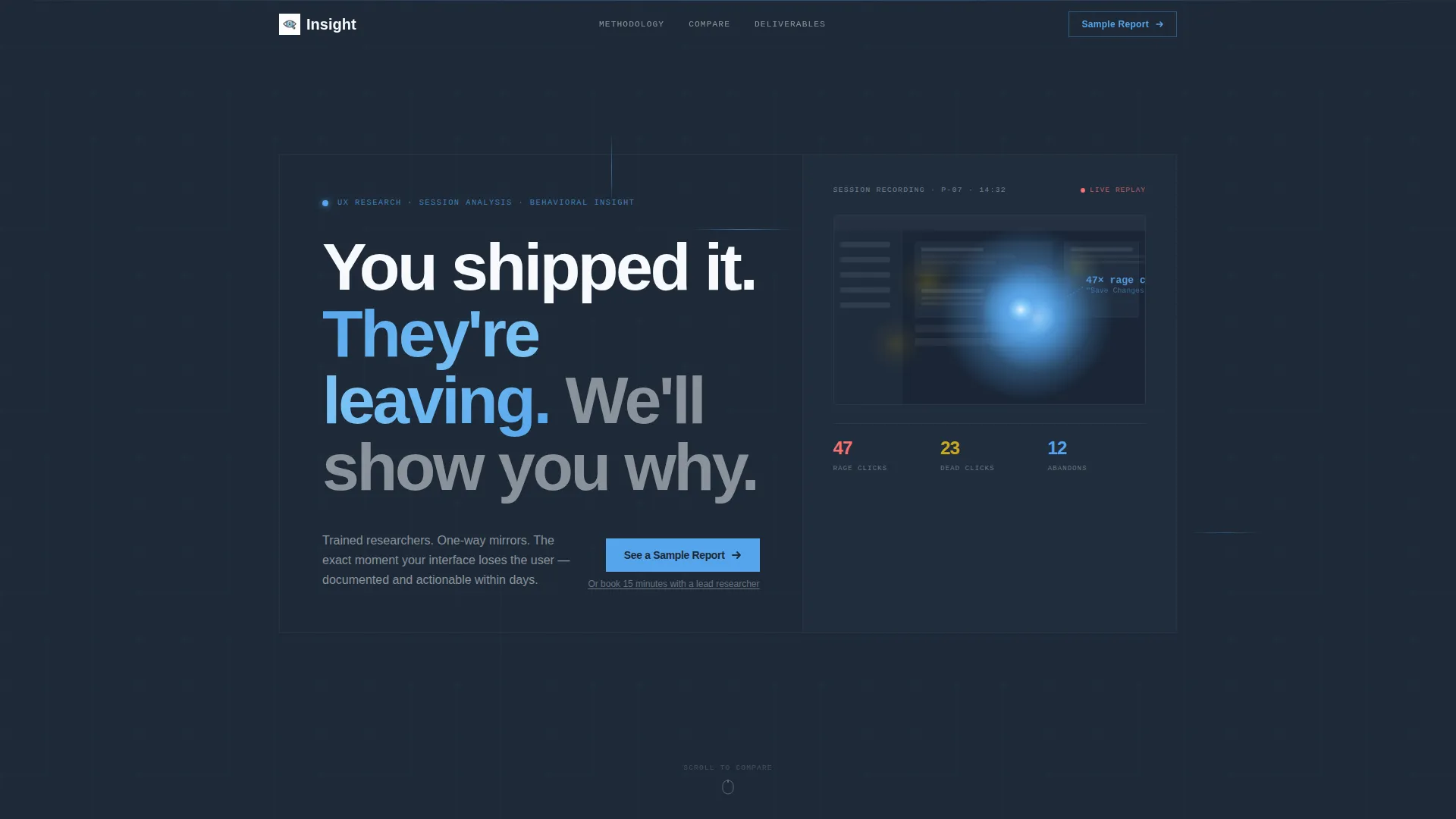
- A giant headline section with a stark session heatmap visualization in place of photography, establishing authority in the first viewport
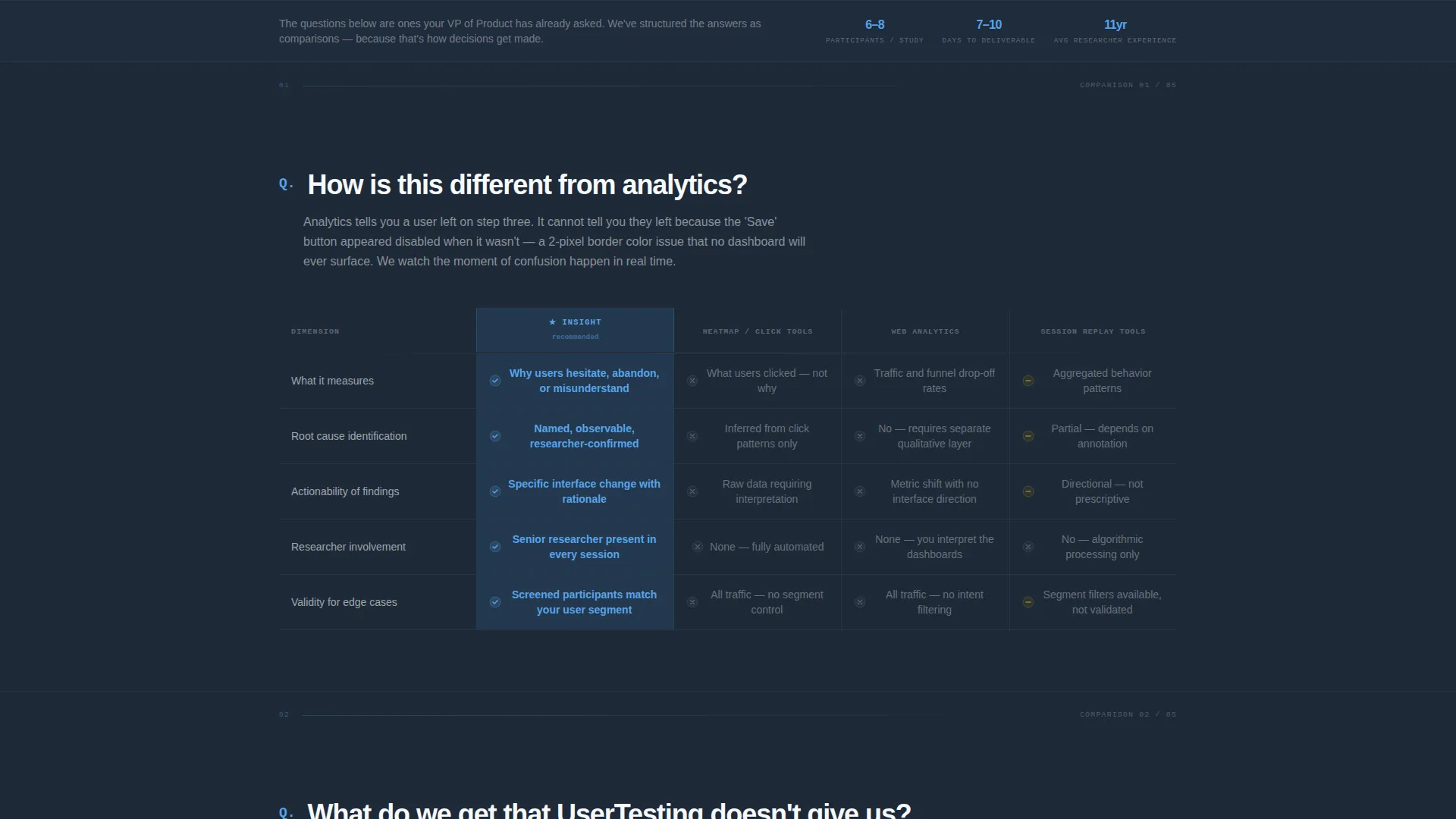
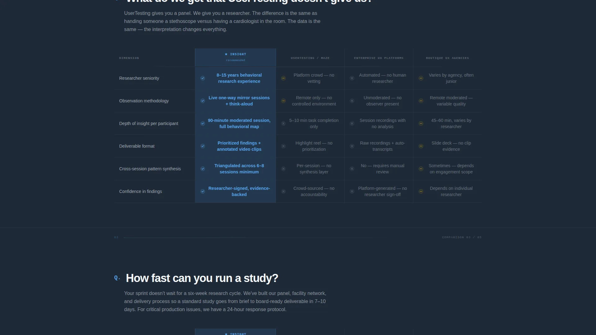
- Five FAQ-anchored comparison table sections that each resolve a specific objection, with the agency column highlighted in sky blue throughout
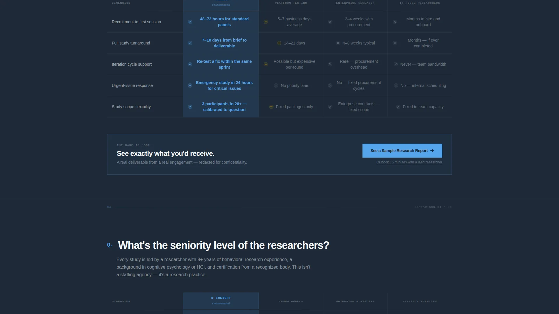
- A primary call-to-action placed after the third comparison table and a persistent bottom bar after the fifth, plus a secondary booking link for visitors already past consideration
Feature list
A crisp paragraph introduces what this template delivers as a functional whole. Each feature below reflects a specific design or structural decision documented in the brief.
Giant Headline Hero Section
The header opens with enormous, tightly tracked type in a heavy grotesque face reading "You shipped it. They're leaving. We'll show you why." It occupies roughly 60 percent of the viewport width. The remaining right column holds a single session heatmap showing rage clicks rendered in sky blue gradients against graphite, with no photography or illustration anywhere in view.
FAQ-Driven Scroll Structure
The page is organized as a sequence of questions product leaders actually ask, such as "How is this different from analytics?" and "How fast can you run a study?" Each question anchors a full comparison table section, turning the scroll into an objection-resolution sequence rather than a passive pitch read.
Scroll-Triggered Comparison Tables
Each comparison table places the agency's methodology against DIY tools, platform-based testing, and in-house generalist researchers. Rows reveal on scroll with the agency column persistently highlighted in sky blue, building a visual and logical argument that compounds as the visitor moves down the page.
Tiered Call-to-Action Placement
The primary call-to-action, "See a Sample Research Report," appears after the third comparison table and again as a persistent bottom bar after the fifth. There is no form on the page. A secondary text link, "Or book 15 minutes with a lead researcher," sits beneath the primary button for visitors already in a decision-ready state.
Corporate Precision Visual System
The entire layout uses a Slate and Sky color system: deep charcoal slate for primary backgrounds, mid-tone graphite for secondary surfaces, open sky blue as the action accent, and clinical white for table cells and breathing room. The palette is intentionally cool and data-like, reinforcing the agency's analytical credibility at every scroll position.
No-Form Click-Through Architecture
The page is engineered for a single click, not a form submission. The sample report call to action clicks through to a gated but generous deliverable page, making the first conversion feel like access rather than commitment. This reduces friction for high-value buyers who resist lead-capture forms on initial contact.
Page sections overview
| Section | Purpose |
|---|---|
| Giant Headline Hero | Establish authority and frame the core problem in one viewport |
| Session Heatmap Visual | Replace photography with data; signal research credibility immediately |
| FAQ Anchor 1 | Address "How is this different from analytics?" with comparison table |
| FAQ Anchor 2 | Address "What do we get that platform testing doesn't give us?" |
| FAQ Anchor 3 | Address "How fast can you run a study?" with comparison table |
| Primary call to action Block | Present "See a Sample Research Report" after three resolved objections |
| FAQ Anchor 4 | Continue objection resolution with fourth comparison table |
| FAQ Anchor 5 | Final comparison table; complete the cumulative case |
| Persistent call to action Bar | Sticky bottom bar with primary call to action and secondary booking link |
Design & branding system
The visual identity follows a Corporate Precision theme. Every design decision reinforces the feeling of a well-organized research repository viewed early in the morning on a high-resolution display. The palette is cool, structured, and deliberately free of warmth or decoration.
- Deep charcoal slate (#1E2A38) for primary backgrounds, mid-tone graphite (#4A5568) for secondary surfaces, open sky blue (#56A5EC) as the action accent, and clinical white (#F7F9FC) for table cells and open space
- Heavy grotesque typography with tight tracking used at large scale in the hero; no photography or illustration anywhere on the page
- Sky blue column highlighting in every comparison table serves as both a visual anchor and a persistent brand signal throughout the scroll
Mobile & speed optimization
The layout is built with a single-column scroll structure that adapts naturally to narrower viewports. Comparison tables are the most complex layout element, and the template accounts for their readability at smaller screen sizes.
- Comparison tables reflow gracefully so the agency column remains readable and highlighted on mobile viewports
- The persistent bottom call-to-action bar is designed to remain accessible as a fixed element across device sizes
- The hero section scales the large typographic headline so it remains impactful without overflowing on smaller screens
How this template helps you convert
This template converts by removing friction at every stage of a skeptical buyer's decision process. It does not ask for trust upfront; it earns trust incrementally through structured evidence.
- Each FAQ-anchored comparison table resolves a specific objection before the visitor has to voice it, so by the time the call-to-action appears, the case is already built and the sample report feels like a logical conclusion rather than a marketing ask.
- The two-tier call-to-action system captures both consideration-stage visitors who want to see the deliverable first and decision-stage visitors who are ready to speak with a researcher directly, without splitting the page into competing paths.
Other information about this template
This template is part of a broader category of professional services landing pages designed for research and analytics firms operating in competitive intelligence and adjacent niches. It is well-suited for agencies that need to differentiate on methodology depth rather than price or brand recognition.
- The Sidebar Companion template style means the hero layout divides the viewport into a dominant text column and a supporting data visualization column, a layout pattern suited to agencies that lead with findings rather than narrative
- The FAQ-Driven creative direction is particularly effective for competitive intelligence and research niches where buyers arrive with pre-formed comparisons in mind
- The Legal Shield theme influence is visible in the page's tone: measured, evidence-first, and structured to let facts carry the persuasion rather than emotional appeals
- This template is a strong fit for agencies positioning against self-serve research platforms or in-house research programs at product-led growth companies
Theme
Legal Shield
Creative direction
FAQ-Driven
Color system
Slate & Sky
Style
Sidebar Companion
Direction
Click-Through
Page Sections
Faq-anchored Comparison Tables
Giant Headline Hero with Heatmap
Tiered Click-through Call to Action System
Corporate Precision Color System
Scroll-triggered Row Reveals
No-form Conversion Architecture
Related questions
Can I edit the comparison table content to match my agency's methodology?
Does this template include a lead capture form?
How many comparison tables does the template include?
Can I change the hero headline and heatmap visualization?
Is this template suitable for a solo user experience researcher or freelancer?



