Fitness Studio Booking Website Template
Pulse is a data-driven fitness studio landing page template built for studios that lead with numbers, not atmosphere. It features a live comparison estimator, a modular flip-card grid, and a contextual floating call-to-action button. The Void and Violet color system keeps the interface sharp and clinical, designed to convert skeptical, research-minded visitors into booked walkthroughs.
by Rocket studio
Quick summary
Pulse is a single-page fitness studio contact template designed around hard data and direct comparison. It opens with an interactive estimator, moves through a modular card grid where every tile reveals a competitive metric, and closes with a focused contact form. The visual system is dark, precise, and built to feel like a performance monitor.
Who this template is for
This template is built for fitness studios that compete on measurable outcomes rather than mood or aesthetics. It suits operators who expect their contact page to do real persuasion work before a visitor picks up the phone.
- Fitness studio owners targeting shift workers, former athletes, and corporate wellness buyers
- Studio managers who need a contact page that handles skeptical, comparison-driven visitors
- Teams pitching bulk corporate memberships who want a shareable, data-backed leave-behind
What problem this template solves
Most fitness studio contact pages ask visitors to trust a feeling. Pulse replaces that with verifiable numbers. Visitors who arrive with a spreadsheet mindset leave with the evidence they need to act.
- Visitors can't easily compare your studio's coached hours or cost-per-minute against alternatives
- Corporate buyers need a documented case to forward internally, not just a phone number
- Shift workers and data-focused athletes abandon contact pages that don't address their specific priorities
What you get with this template
You get a complete, single-page layout that walks a skeptical visitor through a structured decision journey. Every section is built to reduce friction and answer objections before they form.
- A live calculator header that compares your studio against a big-box gym and solo training across four measurable metrics
- A modular flip-card grid where each card reveals a specific competitive argument on tap
- A three-field contact form, a contextual floating call-to-action button, and a gated PDF download path for corporate leads
Feature list
This template packs several distinct interactive systems into one focused landing page. Each feature is grounded in a specific visitor need identified in the brief.
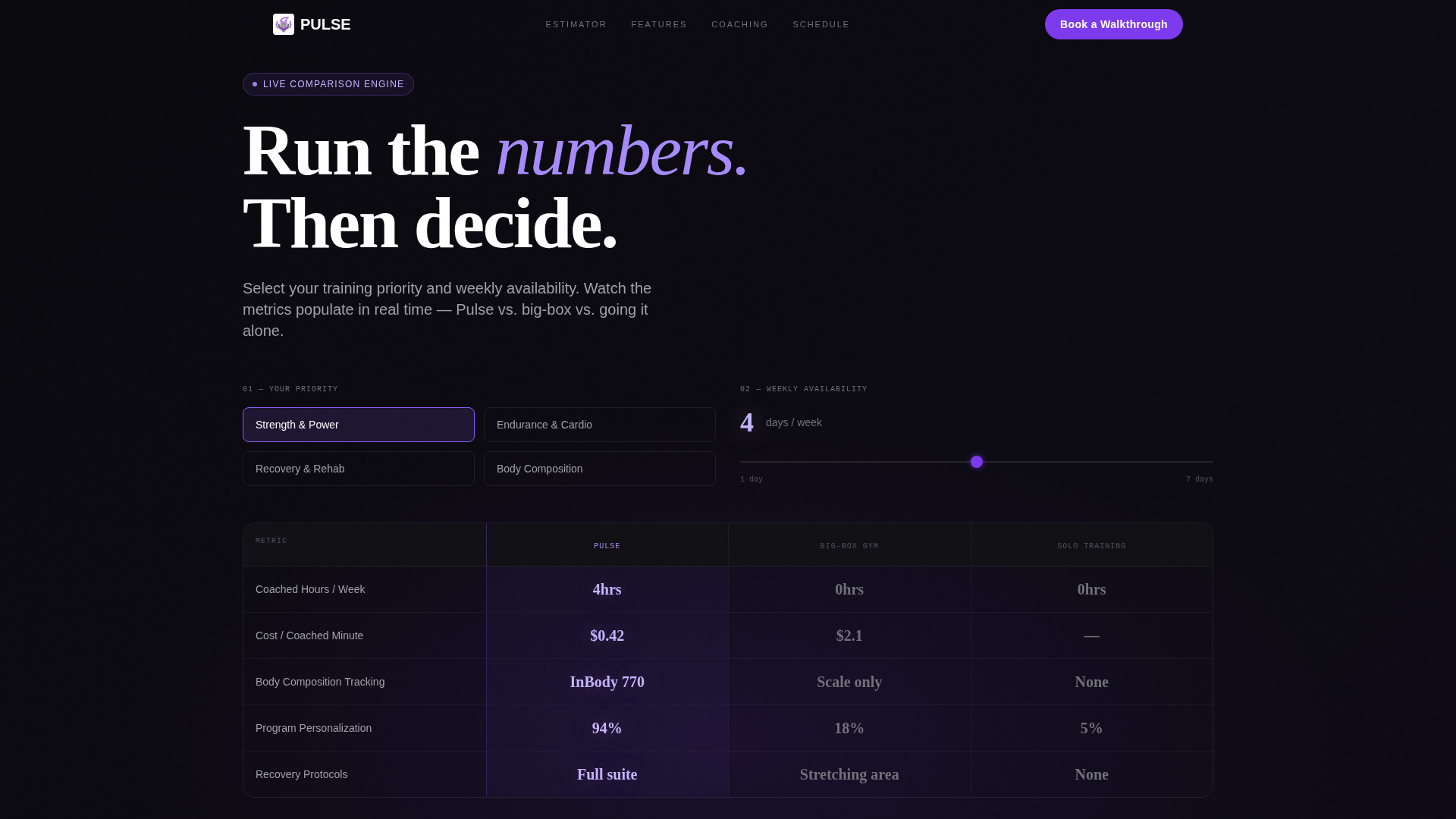
Live Comparison Estimator Header
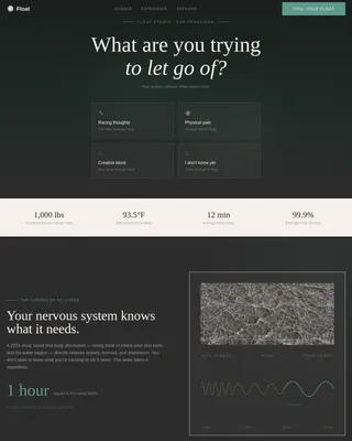
Visitors select their priority (strength, endurance, recovery, or weight loss) and enter their weekly availability. The tool instantly renders a side-by-side breakdown across three training options: this studio, a typical big-box gym, and solo training. Metrics include coached hours per week, cost per coached minute, body-composition tracking access, and a program personalization score. Counter animations in violet populate each metric against the void background in real time.
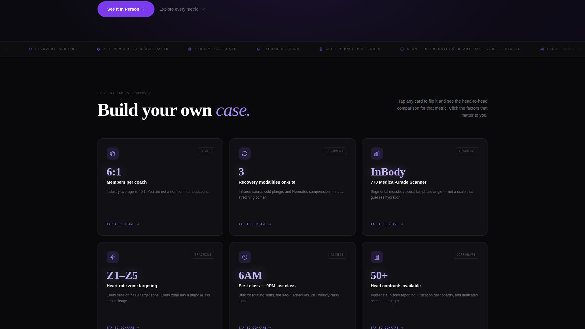
Modular Flip-Card Grid
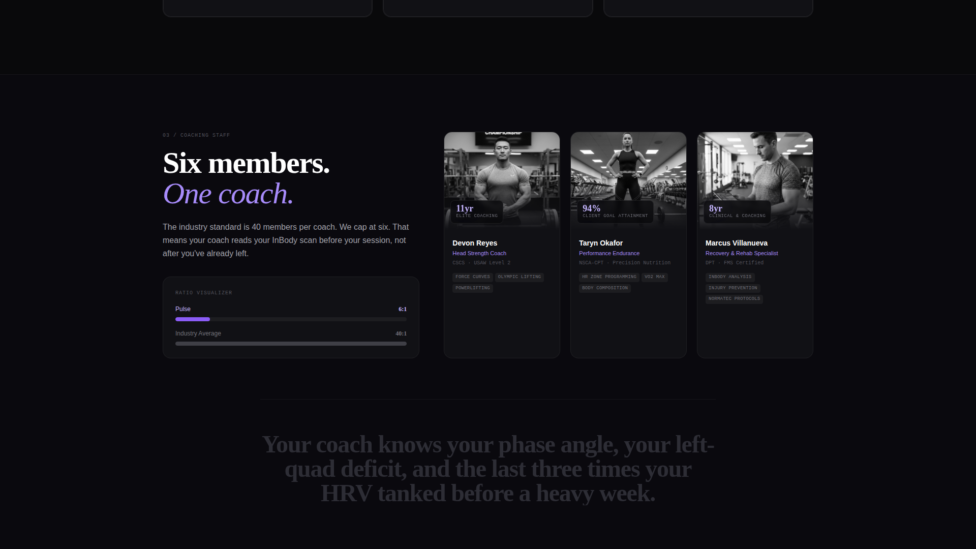
The page body is a card grid where every tile is an interactive comparison module. Tapping a card flips it to reveal detailed specs stacked against competitor equivalents. Examples include a 6-to-1 member-to-coach ratio card shown next to the industry average of 40-to-1, and a recovery technology card listing infrared sauna, cold-plunge protocols, and compression equipment against a competitor's generic stretching area. Visitors build their own case by exploring cards in any order.
Contextual Floating Call-to-Action Button
A violet "Book a Walkthrough" button stays pinned as visitors scroll. Its label shifts based on scroll depth: it reads "See It In Person" after the estimator section, "Meet Your Coach" after the coaching card, and returns to "Book a Walkthrough" at the page bottom. This keeps the primary conversion action relevant to what the visitor just read.
Focused Three-Field Contact Form
The contact form asks only three things: name, preferred contact method (text, email, or call), and a single dropdown reading "What matters most to you?" The dropdown options mirror the card grid categories, connecting form intent directly to the content the visitor just explored.
Gated PDF Comparison Download
A secondary conversion path offers a full comparison document behind an email gate. This captures the corporate wellness manager who is not ready to visit but needs a file to forward to a decision-maker. It is a deliberate second lane for the spreadsheet-minded buyer.
Page sections overview
| Section | Purpose |
|---|---|
| Estimator Header | Live side-by-side comparison tool with animated metric counters |
| Flip-Card Grid | Modular competitive argument cards, each revealing detailed specs on tap |
| Contact Form | Three-field intake capturing name, contact preference, and priority |
| PDF Download Gate | Email-gated secondary path for corporate and document-first buyers |
| Floating call to action Button | Scroll-tracked button with contextual label changes throughout the page |
Design & branding system
The visual identity follows a Data Command theme built around a Void and Violet color system. The palette is designed to feel like a heart-rate monitor glowing in a darkened studio: every surface recedes so the numbers stand out.
- Core colors: absolute void black (#09090B) as the base, deep ultraviolet (#7C3AED) for primary accents, dim console gray (#1E1E24) for card surfaces, and electric lilac (#C4B5FD) for hover states and active data points
- Counter animations render in violet against the void background, mimicking a sports broadcast stat overlay
- The overall aesthetic is clinical and immediate, reinforcing the data-first positioning of the studio
Mobile & speed optimization
The card grid layout is built modular, which means it adapts cleanly to narrower viewports without losing the flip interaction or the metric readability. The floating button remains accessible at every scroll position on mobile.
- Each card in the grid operates as a self-contained module, keeping layout reflow predictable on smaller screens
- The estimator inputs and metric counters are sized for touch interaction, not just mouse clicks
- The three-field contact form and the PDF download gate are both compact enough to complete without horizontal scrolling
How this template helps you convert
Pulse is engineered around the specific resistance patterns of its target visitors. Every layout decision points toward one of two conversion goals: booking a walkthrough or capturing a corporate lead.
- The estimator turns passive curiosity into active engagement. Once a visitor has entered their own numbers and seen a personalized comparison, the gap between browsing and booking narrows significantly.
- The flip-card grid lets skeptical visitors self-select the arguments that matter to them. A shift worker clicks scheduling flexibility; a former athlete clicks coaching ratio; a corporate buyer clicks cost per coached minute. Each path ends at the same form.
- The gated PDF download gives the corporate wellness buyer a concrete next step. They leave with a document they can share, and you capture their email in the process.
Other information about this template
This template is categorized under fitness studio website templates and is specifically designed for the fitness studio contact page niche. It sits at the intersection of technology-forward design and performance-studio marketing.
- The template style is a card grid (modular) layout, making it straightforward to add, remove, or reorder cards as your studio's service offering evolves
- The Data Command theme and Void and Violet color system are pre-configured, so branding setup requires minimal adjustment beyond swapping in studio-specific copy and metrics
- The creative direction is Interactive Explorer, meaning visitor engagement is driven by self-directed exploration rather than a forced linear scroll
- The landing page direction is Comparison and Versus, positioning your studio against alternatives rather than simply describing it in isolation
- This template is well-suited for studios using an InBody body-composition scanner or similar tracking equipment, since the estimator and card grid are designed to surface that kind of metric naturally
Theme
Data Command
Creative direction
Interactive Explorer
Color system
Void & Violet
Style
Card Grid (Modular)
Direction
Comparison/Versus
Page Sections
Live Comparison Estimator
Modular Flip-card Grid
Contextual Floating Call to Action Button
Focused Three-field Contact Form
Gated PDF Comparison Download
Related questions
Can I change the metrics shown in the estimator?
Does the flip-card grid work on mobile devices?
How does the gated PDF download work?
Can I add or remove cards from the grid?
Is this template suitable for a studio that does not yet have all the featured services?