Home Inspector Landing Page Template
Inspect is a split-screen landing page template built for home inspectors who want to earn trust before asking for anything. It pairs an editorial magazine aesthetic with a content-first booking flow, guiding first-time buyers, real estate agents, and relocating families toward a free pre-inspection checklist download through authoritative copy, documentary photography, and a deep-plum color system that feels institutional and serious.
by Rocket studio
Quick summary
Inspect is a single-page, split-screen landing page template designed for professional home inspectors. It uses an Editorial Magazine theme anchored in a Plum Executive color palette to project authority and thoroughness. The page leads with a bold manifesto, moves through credibility signals and inspection content, and closes with a checklist download form that feels like a natural conclusion rather than a sales pitch.
Who this template is for
This template is built for home inspectors who want their online presence to match the seriousness of their work. It suits independent inspectors and small inspection firms that serve buyers, agents, and families navigating high-stakes property decisions.
- Home inspectors targeting first-time homebuyers and relocating families
- Inspection professionals seeking to attract real estate agent referrals
- Independent inspectors who want a credibility-forward booking page without a full website build
What problem this template solves
Most home inspector pages look like service directories. They list phone numbers and certifications without ever explaining what a thorough inspection actually means to a nervous buyer. This template solves the trust gap by giving away expertise first and asking for contact details only after the visitor already feels informed.
- Visitors arrive uncertain; the page educates them before requesting anything
- Credibility signals like certification marks and brokerage logos are placed immediately below the fold
- The primary call to action feels like a resource offer, not a lead capture
What you get with this template
You get a fully structured, section-led landing page that guides visitors from conviction to conversion. Every layout choice reinforces the inspection professional's authority through editorial design and documentary-style visual direction.
- A 50/50 split-screen layout with a manifesto header, alternating editorial spreads, and a two-stage call-to-action flow
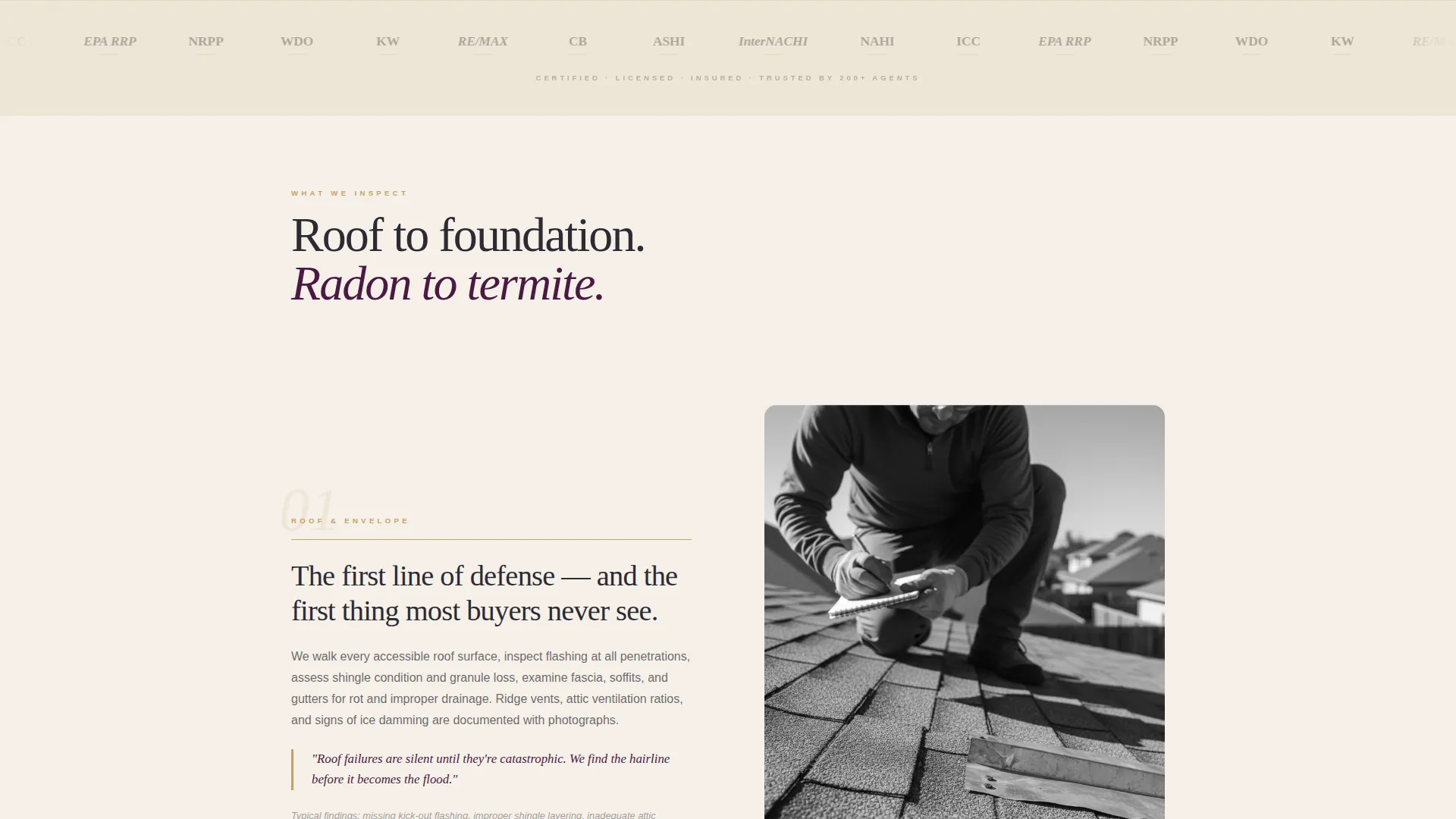
- A logo wall band for certification marks, association seals, and brokerage logos displayed in desaturated monotone
- A content midpoint form and a closing form, both asking only for first name and email address
Feature list
This template is built around a clear set of purposeful design and content components that work together as a unified editorial experience.
Split-Screen Manifesto Header
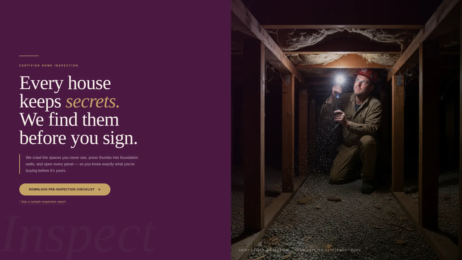
The header divides the viewport into two equal halves. The left side displays an oversized serif manifesto in deep plum. The right side holds a tight editorial photograph. No logo and no navigation appear here, keeping the opening statement the sole focus.
Alternating Editorial Content Spreads
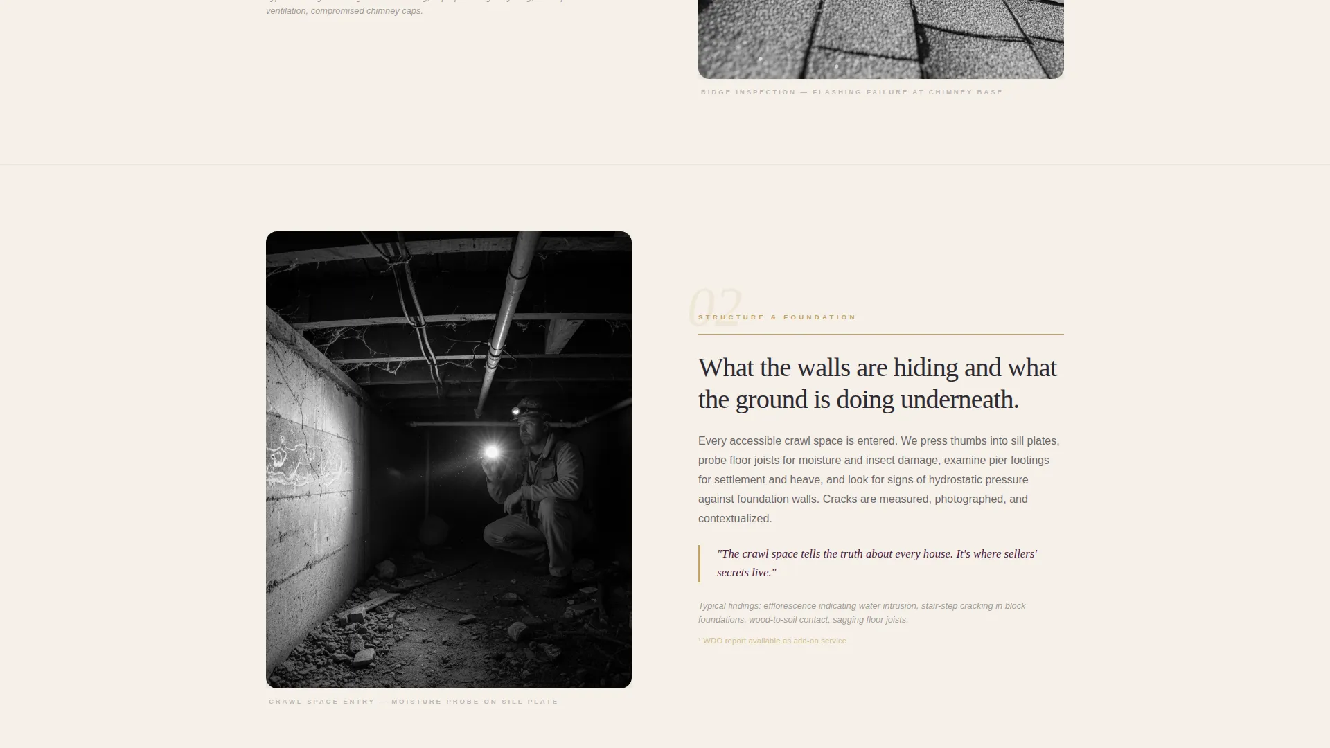
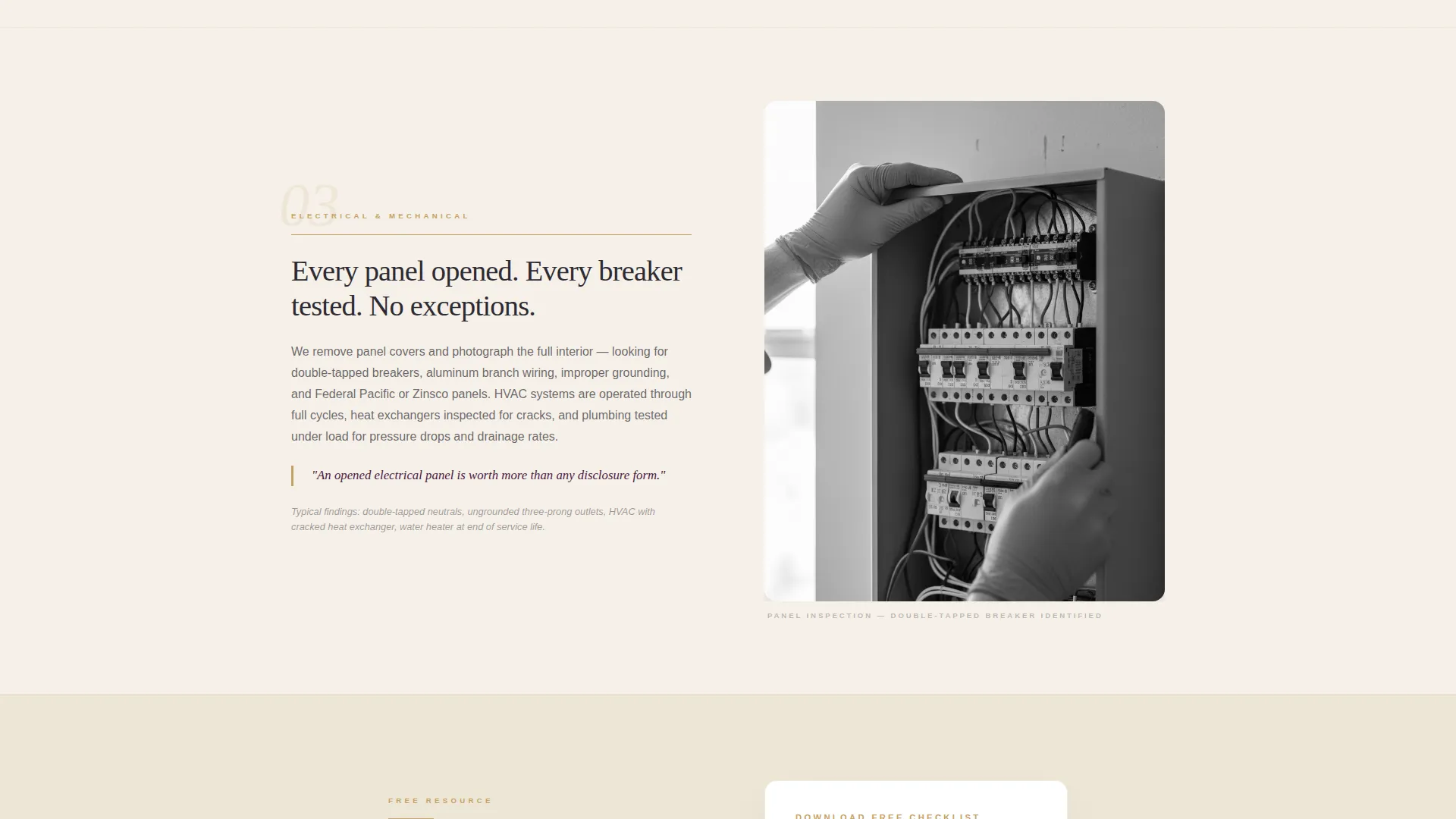
Each scroll section alternates a left-column text panel detailing what gets inspected against a right-column documentary photograph of the inspector at work. The rhythm mirrors turning magazine pages, with each spread functioning as a self-contained story.
Logo Wall Authority Band
Immediately below the fold, a full-width horizontal band tiles certification marks, association seals, and real estate brokerage logos. All marks render in desaturated monotone, creating a credibility signal that feels institutional rather than decorative.
Dual Call-to-Action Placement
The primary call to action, "Download Our Pre-Inspection Checklist," appears at the editorial midpoint and repeats at the page close. A secondary inline text link, "See a Sample Report," is styled as a magazine footnote and requires no form interaction.
Plum Executive Color System
Deep plum anchors headers and section dividers. Warm parchment covers backgrounds. Charcoal ink handles body text. Muted gold appears sparingly on pull-quotes, rule lines, and hover states, creating a palette that communicates institutional weight without self-promotion.
Editorial Typography Treatment
Oversized serif type drives headlines and pull-quotes throughout the page. Body text uses editorial density in charcoal ink. The typographic system reinforces the feeling of a well-produced inspection report rather than a standard service page.
Page sections overview
| Section | Purpose |
|---|---|
| Manifesto Header | Opens with conviction using oversized serif type and a documentary photograph |
| Logo Wall Band | Delivers immediate credibility through certification marks and brokerage logos |
| Inspection Content Spreads | Covers roof to foundation in alternating editorial text and photography pairs |
| Checklist Download Form | Captures first name and email at the editorial midpoint with a resource offer |
| Sample Report Link | Offers inline access to a report preview without requiring form completion |
| Closing Form Repeat | Repeats the checklist call to action at page close for returning scrollers |
Design & branding system
The visual identity follows an Editorial Magazine theme using the Plum Executive color system. Every color decision carries deliberate meaning and is applied with restraint, creating a palette that feels like a leather portfolio opened on a mahogany desk.
- Deep plum (#4A1942) anchors headers and section dividers; warm parchment (#F5F0E8) breathes across all backgrounds; charcoal ink (#2D2A32) sets body text with editorial density
- Muted gold (#C4A265) appears only on pull-quotes, rule lines, and hover states, functioning like a notary seal rather than a decorative accent
- Oversized serif type drives all headline and manifesto elements, reinforcing the weight of a cloth-bound inspection report
Mobile & speed optimization
The split-screen layout is designed with responsive behavior in mind. Each 50/50 panel stacks cleanly on smaller screens so the editorial rhythm reads as well on a phone as on a wide desktop monitor.
- The manifesto header stacks vertically on mobile, keeping the photograph and type both fully visible
- Logo wall tiles reflow into a scrollable row or condensed grid at smaller breakpoints
- Alternating editorial spreads collapse to single-column blocks, preserving the documentary photography and text pairing
How this template helps you convert
The page earns trust incrementally before asking for anything. By the time a visitor reaches either form, they have already received substantive inspection knowledge, making the checklist feel like a logical next step rather than an exchange.
- The manifesto header sets immediate authority, so visitors decide within seconds that this inspector is serious and thorough
- The alternating content spreads deliver inspection expertise section by section, building confidence with every scroll before the first form appears
Other information about this template
This template is categorized under Professional Services with a specific focus on home inspector online presence. It is designed as a content and resource landing page, meaning its primary goal is lead capture through value delivery rather than direct service booking.
- The template style is Split Screen (50/50) and the theme is Editorial Magazine, making it well suited for inspectors who want a distinctive, non-generic presence
- The creative direction follows a Logo Wall Authority approach, which is particularly effective for inspection professionals who hold multiple certifications or work with multiple brokerage partners
- The header concept is a Quote and Manifesto format, which works for inspectors who want to open with a positioning statement rather than a service menu
Theme
Editorial Magazine
Creative direction
Logo Wall Authority
Color system
Plum Executive
Style
Split Screen (50/50)
Direction
Content/Resource
Page Sections
Split-screen Manifesto Header
Alternating Editorial Content Spreads
Logo Wall Authority Band
Dual Call-to-action Placement
Plum Executive Color System
Editorial Typography Treatment
Related questions
Can I replace the manifesto text with my own tagline?
What kind of photography works best in the editorial spreads?
Does the checklist form connect to any email platform?
Can I use this template if I only offer general home inspections?
Is this template suitable for a small inspection firm or only solo inspectors?



