Advanced Condo & Apartment Real Estate Appointment Booking Website Template
Inspect is a condo and apartment inspection landing page template built for property inspection services. It leads with a compelling address input, walks visitors through real case study cards showing what other buyers almost missed, and closes with a transparent three-step booking form. The calm Pastoral Calm visual system builds the trust that anxious buyers need before they sign.
by Rocket studio
Quick summary
Inspect is a modular card-grid landing page template for condo and apartment inspection professionals. It opens with an address input over a soft morning-light photograph, moves into a narrative case study grid of real inspection findings, and ends with a transparent inline booking form. The design is warm, unhurried, and built to turn worried buyers into confident clients.
Who this template is for
This template is built for property inspection professionals who serve buyers in multi-unit residential buildings. It fits inspection businesses that want to sell directly online without a separate quoting step.
- First-time condo buyers who need reassurance before closing day
- Relocating professionals who are purchasing a unit sight-unseen from another city
- Real estate attorneys who require documented deficiency reports from a disinterested third party
What problem this template solves
Condo buyers feel anxious because listing photos hide real problems. Most inspection service websites do nothing to address that anxiety before asking for a booking.
- Visitors have no context for why an inspection matters until it is too late
- Generic service pages bury pricing and force buyers to wait for a quote
- There is no narrative proof that the inspector actually catches what matters
What you get with this template
You get a complete single-page layout ready to represent a condo and apartment inspection service. Every section has a clear job, and the visual flow guides visitors from curiosity to commitment.
- A centered address input header with a headline and a sage call-to-action button
- A modular case study card grid that escalates from cosmetic finds to structural revelations
- A three-step inline booking form with dynamic pricing, a square footage slider, and a calendar date picker
Feature list
This template includes a focused set of purpose-built components, each designed to move a cautious buyer closer to booking.
Address-Led Header Section
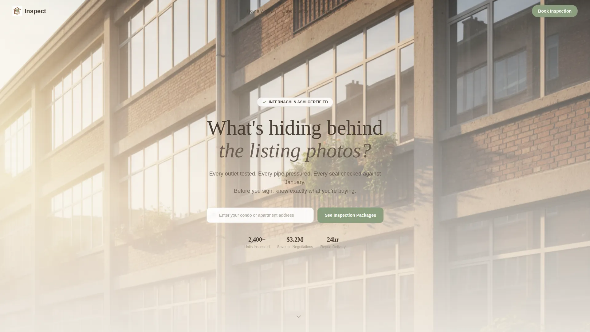
The header centers an address input field over a soft-focus photograph of apartment windows in morning light. The headline "What's hiding behind the listing photos?" sets the tone immediately. A sage-colored button labeled "See Inspection Packages" invites the next step without pressure.
Modular Case Study Card Grid
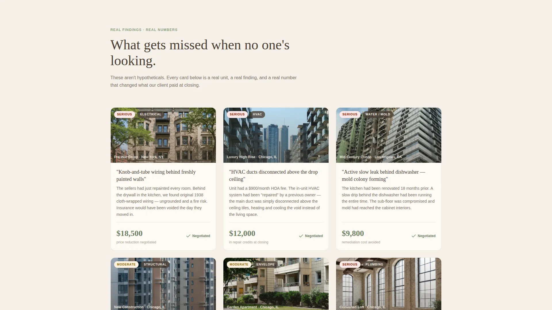
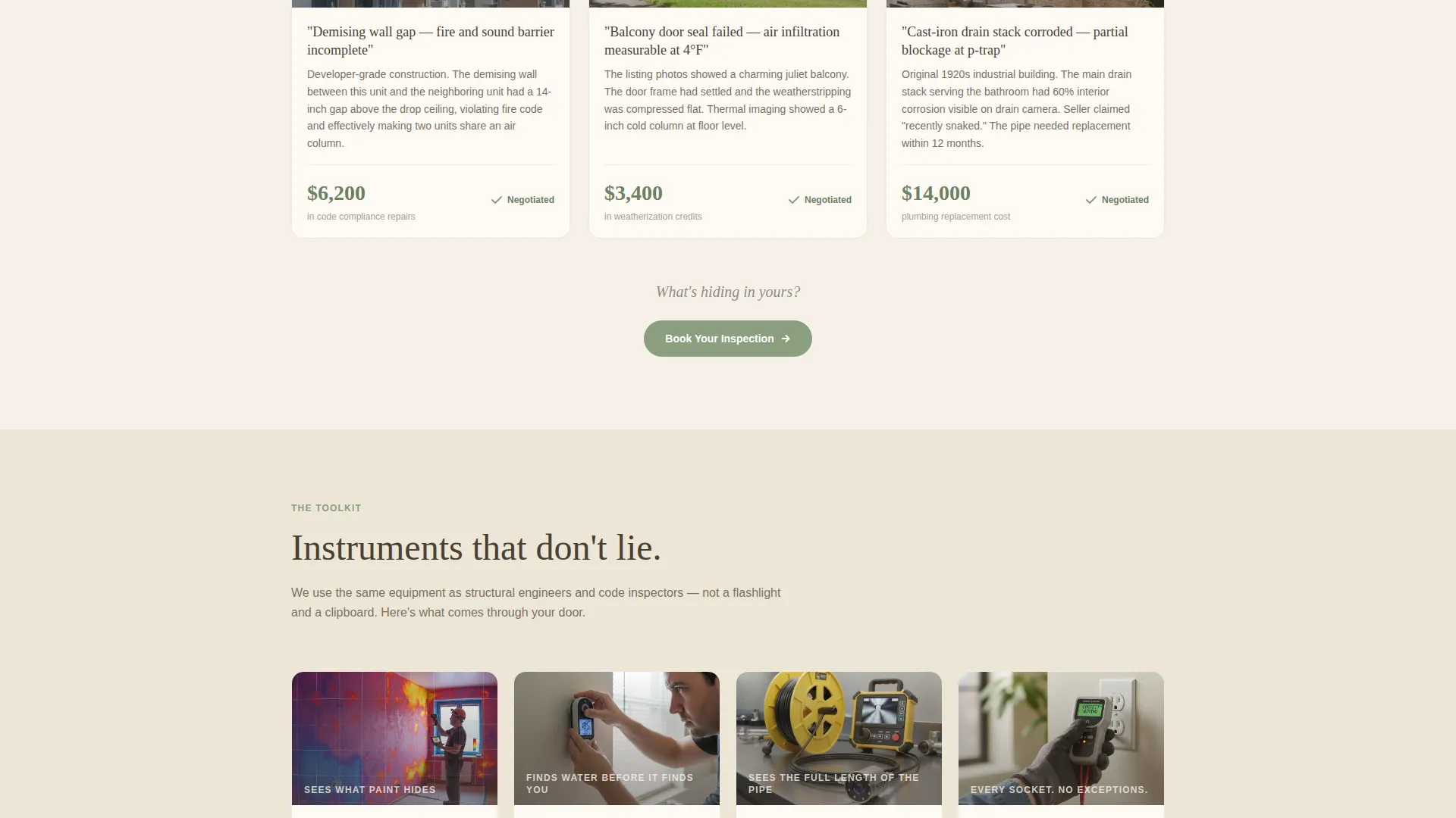
Each card opens with a building exterior photo, a one-line inspection finding, and the dollar amount the buyer saved or negotiated. Cards escalate from cosmetic catches to structural discoveries. The sequence builds a quiet, evidence-based case for never closing without an inspection.
Inspection Process Cards
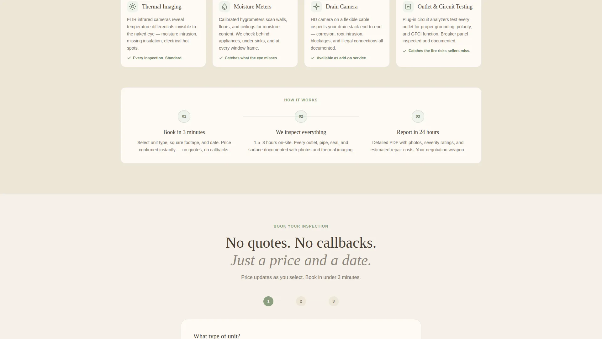
After the case study section, the grid shifts to cards showing the inspection tools and methods used: thermal imaging, moisture meters, outlet testers, and drain cameras. These cards reassure visitors that the findings are backed by professional equipment, not guesswork.
Inline Three-Step Booking Form
The booking flow is embedded directly on the page. Visitors select unit type, adjust a square footage range slider, and pick a preferred inspection date using a calendar picker. Pricing updates dynamically as each option is selected, removing any need to wait for a quote.
Email Capture for Checklist Download
A secondary conversion path offers a downloadable "Condo Buyer's Inspection Checklist" in exchange for an email address. This path targets visitors who are still early in their search and not yet ready to book.
Persistent Mobile Booking Bar
On mobile, a fixed bottom bar keeps the primary "Book Your Inspection" call to action visible at all times. This ensures the booking entry point is never more than one tap away, regardless of scroll position.
Page sections overview
| Section | Purpose |
|---|---|
| Address Input Header | Invites visitors to start with their unit address and sets the page tone |
| Case Study Card Grid | Builds proof through real inspection findings and buyer savings |
| Inspection Tools Cards | Shows the professional equipment and methods behind each finding |
| Inline Booking Form | Captures bookings with unit type, square footage, date, and live pricing |
| Email Checklist Capture | Converts early-stage visitors with a downloadable buyer checklist |
| Mobile Booking Bar | Keeps the primary call to action persistent on smaller screens |
Design & branding system
The template uses a Pastoral Calm theme built around a Warm Stone color system. Every color choice is chosen for emotional effect: warmth, solidity, and quiet authority.
- Limestone cream (#F5F0E8) dominates backgrounds, river-washed fieldstone (#A89F91) carries body text and card borders, and deep hearthstone (#4A3F35) anchors headlines and navigation
- Muted sage (#8B9E7E) appears only on interactive elements such as buttons, checkmarks, and progress indicators, giving every confirmation a quiet "verified" signal
- Typography pairs a hearthstone serif for headlines with clean body copy, creating a tone that feels professional without being cold
Mobile & speed optimization
The layout is designed to work as naturally on a phone as it does on a wide desktop screen. The card grid reflows cleanly at every breakpoint.
- The modular card grid adapts to single-column stacking on smaller screens without losing the narrative escalation between cards
- The persistent bottom booking bar replaces the mid-page call-to-action on mobile, keeping conversion accessible at every scroll depth
- The inline booking form keeps all three steps visible and easy to tap, removing friction from the booking process on touch devices
How this template helps you convert
Every section of this template is designed to move a hesitant visitor toward a decision. The narrative structure does the persuasion so your copy does not have to oversell.
- The case study card grid accumulates real-world proof before the booking form appears, so visitors arrive at the call to action already persuaded rather than skeptical.
- The dynamic pricing display in the inline booking form eliminates the most common reason buyers delay: not knowing what the service will cost before committing.
Other information about this template
This template is built for direct sales, meaning the primary conversion goal is a completed booking rather than a contact form submission. It also supports a secondary lead generation path through the checklist email capture, making it useful at two different stages of the buyer journey.
- The template is designed for single-page deployment with a card-grid modular layout
- It is suited to inspection professionals serving condo and apartment buyers in competitive urban markets
- The downloadable checklist component provides a low-commitment entry point for visitors who are still comparing services
Theme
Dark Immersive
Creative direction
Before/After Reveal
Color system
Sunset Mesa
Style
Asymmetric Grid (60/40)
Direction
Lead Generation
Page Sections
Address-led Header with Call to Action
Modular Case Study Card Grid
Inspection Tools and Methods Cards
Inline Three-step Booking Form
Email Capture for Checklist Download
Persistent Mobile Bottom Booking Bar
Related questions
Can I use this template for both condo and apartment inspection services?
Does the booking form show pricing automatically?
Can I customize the case study cards with my own inspection stories?
What is the checklist email capture for?
Is this template suitable for solo inspectors as well as larger inspection firms?



