Building Inspector Reviews & Testimonials Landing Page
Inspect is a single-page landing page template built for building inspectors who need social proof to do the selling. It stacks testimonials, inspection-scene photography, and a logo wall into a scroll-driven case file that ends in one clear action: Book Your Inspection. No forms, no clutter, just evidence that this inspector misses nothing.
by Rocket studio
Quick summary
Inspect is a split-screen landing page template designed specifically for building inspectors. It presents client testimonials, real estate agency logos, and inspection photographs as a compelling, scroll-driven case file. The visual identity is clean and clinical, and every section builds toward one primary call to action: booking an inspection.
Who this template is for
This template is built for independent building inspectors and inspection firms who want their reputation to speak before a phone call is ever made. If you work with agents, buyers, or developers and rely on referrals and reviews to win new clients, this page is designed for your workflow.
- Building inspectors serving pre-purchase and handover clients
- Inspection businesses targeting real estate agents and property developers
- Solo inspectors who want a credible, professional online presence without building from scratch
What problem this template solves
Most inspectors rely on word of mouth, but when a prospective client lands on their website, there is often nothing compelling enough to convert that visit into a booking. The page either looks generic or buries the social proof where no one scrolls to find it.
- Visitors cannot quickly assess whether the inspector is trustworthy or experienced
- Testimonials exist but are scattered, unformatted, and visually unconvincing
- There is no clear, repeated call to action guiding the visitor toward booking
What you get with this template
You get a fully structured, single-page layout that works like a curated evidence file. Every section is pre-built and ready for your content, from the oversized hero testimonial card to the full-width booking banner that repeats after every third review.
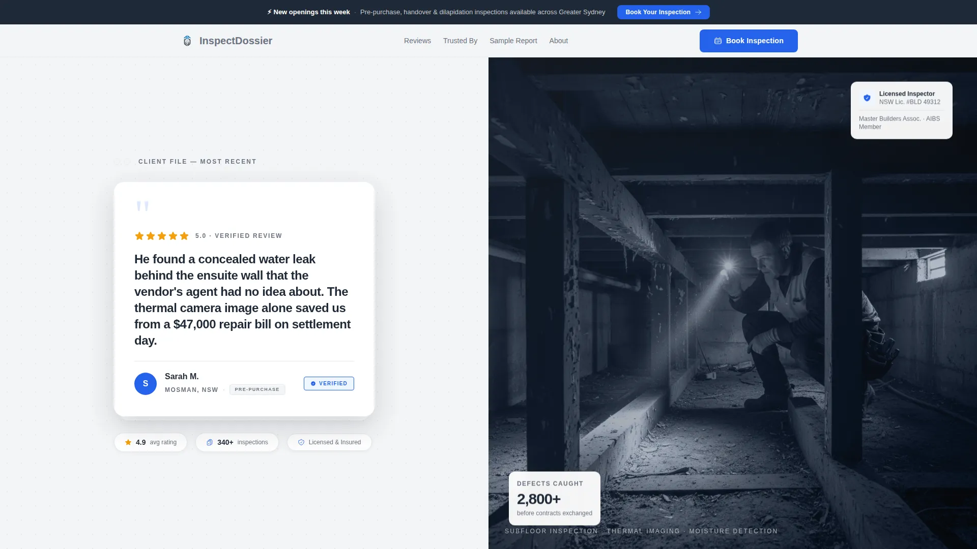
- A split-screen hero section with a testimonial card on the left and an inspector photograph on the right
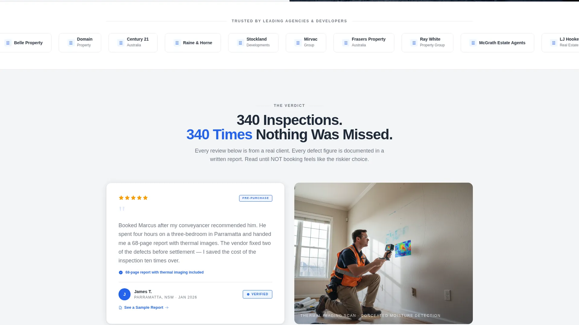
- A logo wall band for real estate agency and developer brand recognition
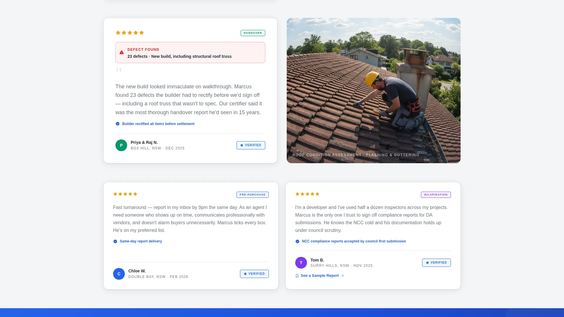
- Alternating left-right testimonial cards paired with inspection-scene photography
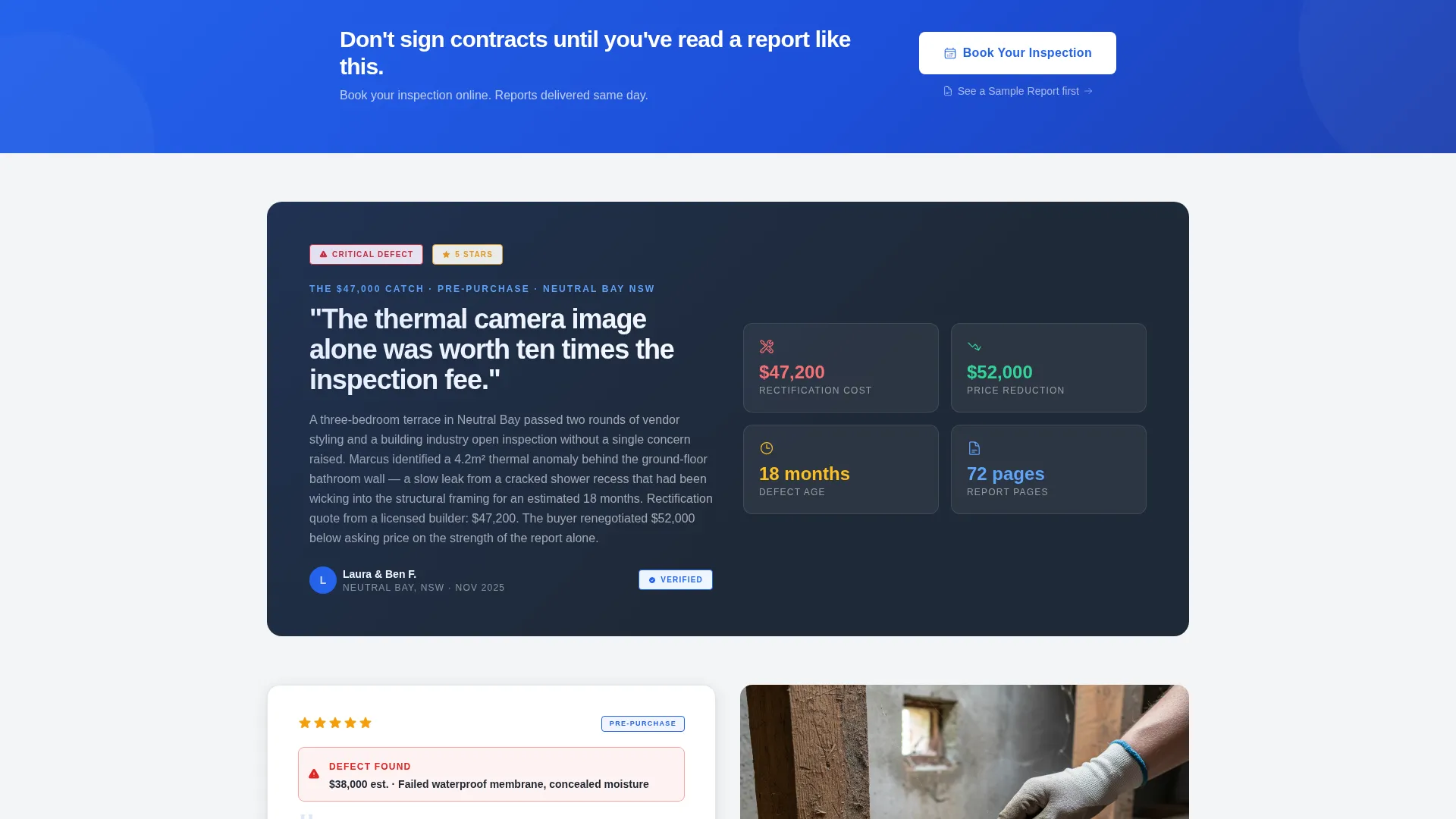
- Persistent top-bar and repeated full-width "Book Your Inspection" call-to-action buttons
- A secondary "See a Sample Report" text link beneath select testimonials
Feature list
This template is built around a focused set of components that work together to establish credibility and drive bookings.
Split-Screen Testimonial Hero
The header splits the screen 50/50. The left side displays a single oversized five-star review as a physical card with a drop shadow. The right side holds a straight-on photograph of the inspector at work. The reviewer's first name, suburb, and inspection type appear in small caps beneath the quote.
Escalating Testimonial Card Sequence
Below the hero, testimonial cards alternate left and right down the page. Each card is slightly larger or more detailed than the last, building from a simple star rating up to a paragraph-length account of a significant defect caught before contracts exchanged. The rhythm is deliberate and persuasive.
Logo Wall Authority Band
Immediately below the header, a horizontal band displays real estate agency logos and developer brand marks. This section establishes existing professional relationships at a glance, giving first-time visitors an immediate reason to trust the inspector.
Persistent and Repeated Booking call to action
The primary call to action, "Book Your Inspection," appears as a persistent button in the top bar and repeats as a full-width banner after every third testimonial card. The click routes to a separate scheduling page. No form is embedded on this page.
Sample Report Secondary Link
A secondary text link, "See a Sample Report," sits beneath select testimonials. This gives hesitant visitors a way to preview the inspection deliverable before committing to a booking, reducing friction for first-home buyers and cautious buyers.
Corporate Precision Color System
The page uses a tightly controlled four-color palette. Background areas use soft overcast white, body text uses surveyor-clipboard gray, headlines use charcoal ink, and a single compliance-blue accent applies to stars, quote marks, and interactive elements. The result is clean, clinical, and immediately trustworthy.
Page sections overview
| Section | Purpose |
|---|---|
| Persistent Top Bar | Keeps the booking button visible at all times while scrolling |
| Split-Screen Hero | Opens with a featured review card and an inspector photograph |
| Logo Wall Band | Displays agency and developer logos to establish professional trust |
| Testimonial Card One | First left-right review paired with an inspection-scene photo |
| Full-Width call to action Banner | Repeats the booking call to action after every third testimonial |
| Testimonial Card Two | Continues the escalating social proof sequence |
| Testimonial Card Three | Deepens the case with a more detailed defect-discovery story |
| Sample Report Link | Secondary link beneath select cards for preview access |
| Final call to action Banner | Closes the page with a strong, repeated booking prompt |
Design & branding system
The visual identity follows a Corporate Precision theme. Every design decision reinforces the feeling of a freshly printed inspection report on bright-white bond paper. The layout is documentary rather than decorative, so credibility is immediate and impossible to argue with.
- Cloud Canvas color system: soft overcast white (#F4F5F7) for backgrounds, surveyor-clipboard gray (#6B7280) for body text, charcoal ink (#1F2937) for headlines, and compliance-blue (#2563EB) for stars, quote marks, and buttons
- Inspection-scene photography style: straight-on, documentary compositions showing the inspector mid-assessment with clipboard, high-vis vest, and torch beam in subfloor settings
- Small caps used for reviewer attribution details such as first name, suburb, and inspection type beneath each testimonial card
Mobile & speed optimization
The split-screen layout is designed to reflow cleanly on smaller screens. Each section is structured so that content stacks in a logical reading order, keeping the testimonial card and photograph readable on mobile without losing the documentary feel.
- Split-screen columns stack vertically on mobile so the testimonial card leads and the photograph follows
- The persistent top-bar booking button remains accessible on all screen sizes
- Logo wall logos reflow into a scrollable or wrapped row to maintain recognition without crowding
How this template helps you convert
This template is engineered so that not booking feels like the riskier option. The page stacks social proof progressively, so by the time a visitor reaches the second or third full-width call to action banner, they have already read multiple credible reviews and seen the inspector's methodology up close.
- The escalating testimonial sequence builds trust incrementally, each card adding more detail and stakes than the last, so the visitor's confidence grows with every scroll
- The repeated "Book Your Inspection" call to action appears at the exact moments when trust peaks, immediately after a compelling review, making the decision easy and the next step obvious
- The "See a Sample Report" link reduces the hesitation of first-time buyers by showing the deliverable before any commitment is required, removing a common barrier to booking
Other information about this template
This template is categorized under Professional Services, specifically the Building Inspector Online Presence subcategory. It is an ideal starting point for inspectors who want a polished reviews and testimonials page without custom development.
- The page direction is Click-Through, meaning all conversion actions route visitors away to a scheduling page rather than collecting form submissions on the page itself
- The header concept is a Testimonial Card, which is an intentional choice that places social proof at the very first point of contact rather than after a promotional pitch
- The creative direction is Logo Wall Authority, a layout strategy that leads with recognizable brand associations to establish credibility before the visitor reads a single testimonial
- This template suits inspection types including pre-purchase inspections, handover inspections, and dilapidation reports, as reflected in the attribution labels beneath each testimonial card
- The template style is Split Screen (50/50), giving equal visual weight to the written testimonial and the photographic evidence of the inspector at work
Theme
Corporate Precision
Creative direction
Logo Wall Authority
Color system
Cloud Canvas
Style
Split Screen (50/50)
Direction
Click-Through
Page Sections
Split-screen Testimonial Hero
Escalating Review Card Sequence
Logo Wall Authority Band
Persistent and Repeated Booking Call to Action
Sample Report Preview Link
Corporate Precision Color System
Related questions
Can I use this template without a large portfolio of reviews?
Does this page collect bookings directly?
Can I update the inspection type labels beneath each testimonial?
What kind of photography works best with this template?
Is this template suitable for inspectors covering multiple suburbs?



