Complete High Net Worth Individual Insurance Professional Website Template
Insured is a single-column landing page template built for high net worth renters insurance providers. It leads with typographic authority and data-driven storytelling to surface the gap between landlord coverage and personal collection value. A three-step progressive estimate form moves visitors from curiosity to coverage inquiry with no credit card required.
by Rocket studio
Quick summary
Insured is a landing page template for luxury renters insurance providers targeting high net worth individuals. It uses a Stats-First Impact structure to reveal coverage gaps through escalating figures, then routes visitors into a three-step estimate form. The design follows an Executive Suite aesthetic: navy, ivory, platinum, and brushed gold.
Who this template is for
This template is built for insurance providers, boutique brokers, and financial services firms that serve affluent renters with significant personal property. It speaks directly to policyholders whose collections far exceed what any standard rental agreement protects.
- Renters insurance brands serving hedge fund partners, tech founders, and diplomats in leased luxury properties
- Family office advisors and wealth managers researching coverage options on behalf of high net worth clients
- Boutique insurance providers who need a conversion-focused landing page that matches their private banking positioning
What problem this template solves
Standard renters insurance products were not designed for a climate-controlled wine cellar or a signed work of fine art. Most landlord policies cover the building, not the Steinway inside it. This template gives providers a way to surface that gap immediately and credibly, before a visitor has time to assume they are already covered.
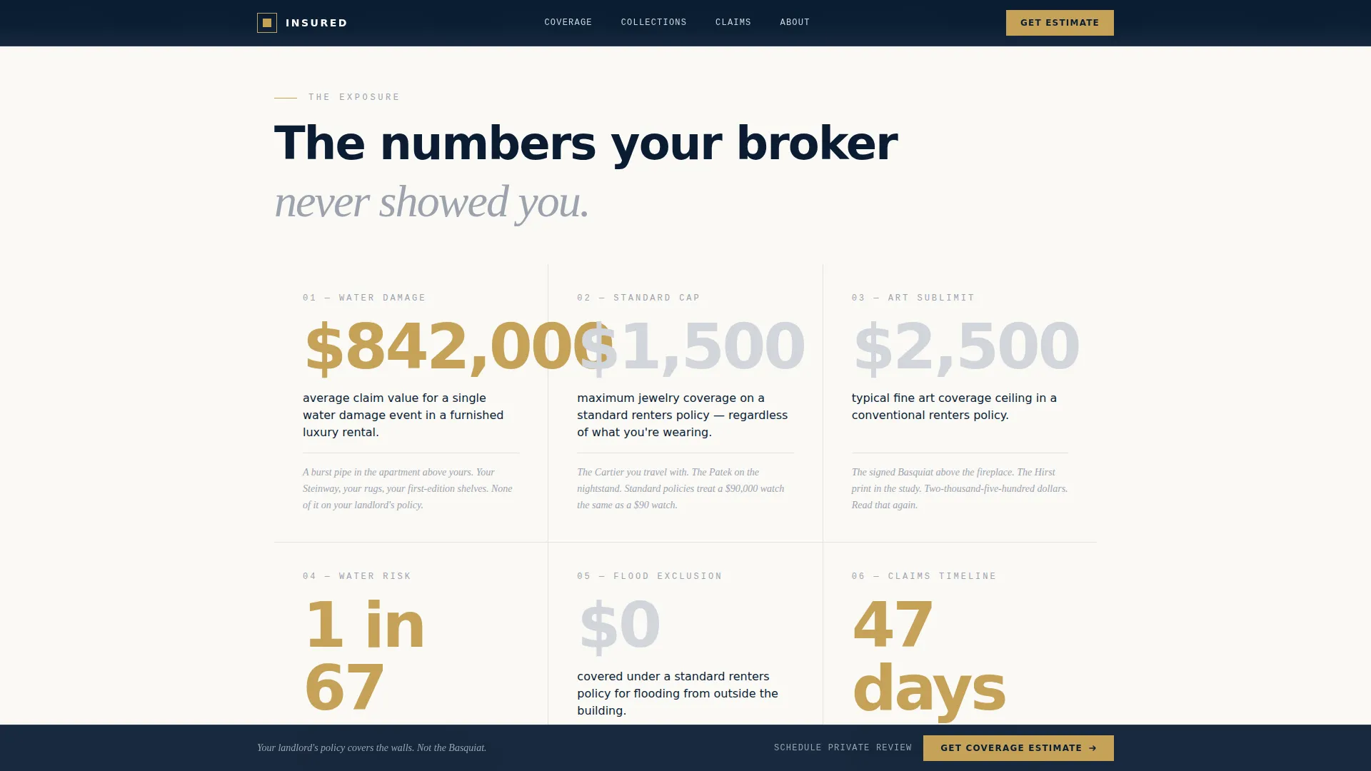
- Visitors arrive without a clear sense of their own exposure, so the template leads with dollar figures that make the risk concrete
- Generic insurance landing pages look identical to commodity products, while this template signals a private, bespoke service from the first line of type
- The three-step form removes friction by asking only for property details and asset categories upfront, not payment or personal data
What you get with this template
The template delivers a fully structured single-column flow with five distinct content sections and a footer. Every section has a defined role in moving a visitor from awareness to form submission, and the visual language stays consistent from the header tower to the final call to action.
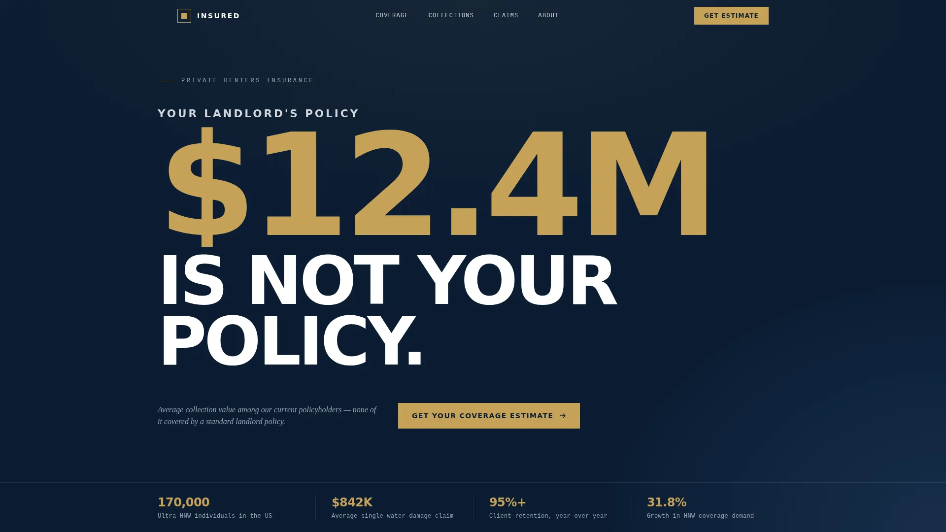
- A Stacked Type Tower hero section with a midnight navy background, typographically proportioned stat display, and a brushed gold primary call to action
- An escalating stats reveal section, a coverage gap comparison panel, a three-step progressive estimate form, and a credibility section with testimonials and retention figures
- A sticky call to action bar that stays pinned to the bottom of the viewport during scroll, keeping the primary conversion path always visible
Feature list
This section outlines the core built-in components and design capabilities included in the Insured template.
Stacked Type Tower Hero
The hero uses three lines of typographic architecture on a midnight navy background. Platinum, gold, and white type are layered to create visual hierarchy without any image or illustration. The words are present on load, giving the page immediate authority.
Stats-First Reveal Sections
Each scroll step surfaces a dollar figure before its explanation. The rhythm of shock, context, and relief repeats across six sections, pairing large formatted numbers with a single sentence that makes each figure personal to the reader.
Three-Step Progressive Estimate Form
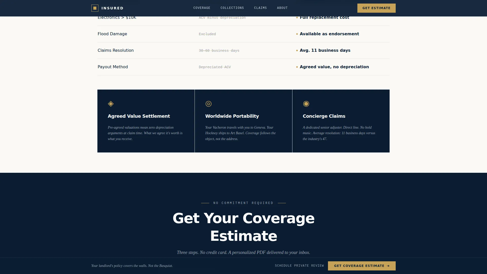
The form opens in three steps: rental property zip code and monthly rent, a visual checklist of high-value asset categories, then an email address to receive a personalized coverage estimate. No credit card is required at any stage.
Sticky Conversion Bar
A call to action bar is pinned to the bottom of the viewport throughout the scroll experience. It keeps the primary conversion path accessible without interrupting the content flow above it.
Coverage Gap Comparison Panel
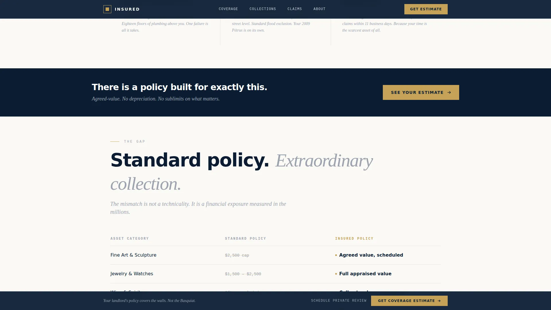
A bento-style section places standard policy limits side by side with the provider's offering. The layout makes the coverage difference visible at a glance, without requiring the visitor to read fine print.
Credibility and Social Proof Section
The template includes a structured section for retention statistics, average claim values, policy count figures, and named client testimonials. A secondary path offers a "Schedule a Private Review" option for visitors whose collections exceed the estimate calculator's ceiling.
Page sections overview
| Section | Purpose |
|---|---|
| Hero Type Tower | Establish authority and surface the landlord coverage gap immediately |
| Stats Reveal | Escalate perceived risk through formatted dollar figures and single-sentence context |
| Coverage Gap Panel | Compare standard policy limits with bespoke coverage side by side |
| Estimate Form | Capture zip code, asset categories, and email across three low-friction steps |
| Credibility Section | Reinforce trust with retention rates, claim figures, testimonials, and a private review path |
| Footer | Provide logo, tagline, and navigation links in a split layout |
Design & branding system
The visual identity follows an Executive Suite theme built around the Navy Authority color system. Every color has a defined role, and none are used interchangeably. The typographic choices reinforce a private banking register.
- Midnight navy (#0B1D33) dominates the header and data-heavy sections, ivory (#FAF9F6) provides breathing space between them, and platinum (#D1D5DB) carries secondary text
- Brushed gold (#C5A258) appears exclusively on calls to action and policy value figures, making every instance of it feel significant
- Typography uses DM Sans for condensed headers, Fraunces for editorial serif accents, and JetBrains Mono for stat labels, creating a layered reading hierarchy
Mobile & speed optimization
The template is built desktop-first to match the primary device preference of high net worth users, and it is fully responsive for tablet and mobile viewports. The animation strategy is deliberate and performance-conscious.
- Scroll-linked stat counters and Intersection Observer number reveals animate only when sections enter the viewport, keeping the experience smooth on all devices
- The static-first build approach avoids external dependencies beyond font files, keeping the page load lean
- The sticky call to action bar reflows cleanly on smaller screens so the primary conversion path is never obscured
How this template helps you convert
The entire page is structured as a single-funnel journey from risk awareness to form submission. Every design and copy decision is calibrated for a visitor who is accustomed to premium service and will not tolerate generic or pushy sales language.
- The header makes the coverage gap personal before the visitor has scrolled a single pixel, using a real average collection value figure to anchor the stakes.
- The escalating stats sections build cumulative urgency, so by the time the visitor reaches the estimate form, they are already mentally inventorying their own apartment.
- The three-step form and secondary "Schedule a Private Review" path offer two distinct conversion routes, capturing both self-serve visitors and those who prefer a concierge introduction.
Other information about this template
The Insured template is designed for the US market with English copy, USD formatting, and localization references suited to markets like Manhattan, Lake Tahoe, and Washington DC. It is built for a high net worth individual renters insurance use case within the broader finance and insurance category.
- The page direction follows a Freemium/Trial model: the coverage estimate itself is the lead product, not a discount or a free trial period
- Animation intensity is set to medium, using scroll-linked counters and Intersection Observer triggers rather than heavy entrance effects that could feel at odds with the understated brand tone
- The footer follows a split layout with the logo and tagline on the left and navigation links on the right, consistent with private banking site conventions
Theme
Executive Suite
Creative direction
Stats-First Impact
Color system
Navy Authority
Style
Single Column Flow
Direction
Freemium/Trial
Page Sections
Stacked Type Tower Hero
Stats-first Impact Sections
Three-step Progressive Estimate Form
Sticky Viewport Call to Action Bar
Coverage Gap Comparison Panel
Credibility and Social Proof Section
Related questions
Who is the Insured template designed for?
Does the estimate form require a credit card?
Can the template support visitors with very large collections?
What makes this landing page different from a standard insurance template?
Is the template built for desktop or mobile first?



