Oncology Medicine Advanced Professional Website Template
A hub-and-spoke oncology clinic landing page built around a five-step intake form that meets patients exactly where they are. Whether someone just received a diagnosis, is seeking a second opinion, or is supporting a loved one, this template guides every visitor through a transparent treatment journey with warm, forest-inspired design and plain-spoken content.
by Rocket studio
Quick summary
This is a single-page oncology clinic landing page built on a hub-and-spoke anchor navigation structure. A multi-step intake form opens the experience immediately, offering three distinct patient paths. Scroll-linked gradient transitions guide visitors through five treatment phases, from first consultation to survivorship, with a persistent bottom bar that advances the form as they read.
Who this template is for
This template is designed for oncology clinics and cancer centers that want to replace cold, clinical web experiences with something genuinely reassuring. It serves practices that treat patient clarity as a clinical responsibility, not an afterthought.
- Oncology centers welcoming newly diagnosed patients who need a steady first impression
- Cancer care teams looking to support caregivers researching options late at night
- Clinics offering second-opinion consultations who want a structured, trust-building intake flow
What problem this template solves
Most oncology clinic pages bury the most important information. They lead with awards and accreditations before telling a frightened patient what actually happens next. This template flips that structure entirely.
- Patients arrive confused and scared; the form immediately gives them a clear path forward
- Caregivers researching at 2 a.m. need fast answers and a human contact option, not a generic homepage
- Clinics lose qualified patients when their site fails to reflect the warmth their care team actually delivers
What you get with this template
You get a complete, single-page oncology clinic landing page with every section pre-built and content-ready for your care team's details. The layout is anchored by a five-step intake form that begins in the hero and travels with the visitor through every phase section.
- Hero section with a three-path multi-step form and morning-fog-to-fern gradient background
- Five hub-and-spoke journey phase sections covering Consultation, Diagnosis and Staging, Treatment Planning, Active Treatment, and Survivorship
- Persistent bottom bar that advances form steps with scroll and ends at a single "Find My Care Team" call to action
Feature list
A brief overview of what makes this template work for oncology clinic pages specifically.
Path-Based Multi-Step Form
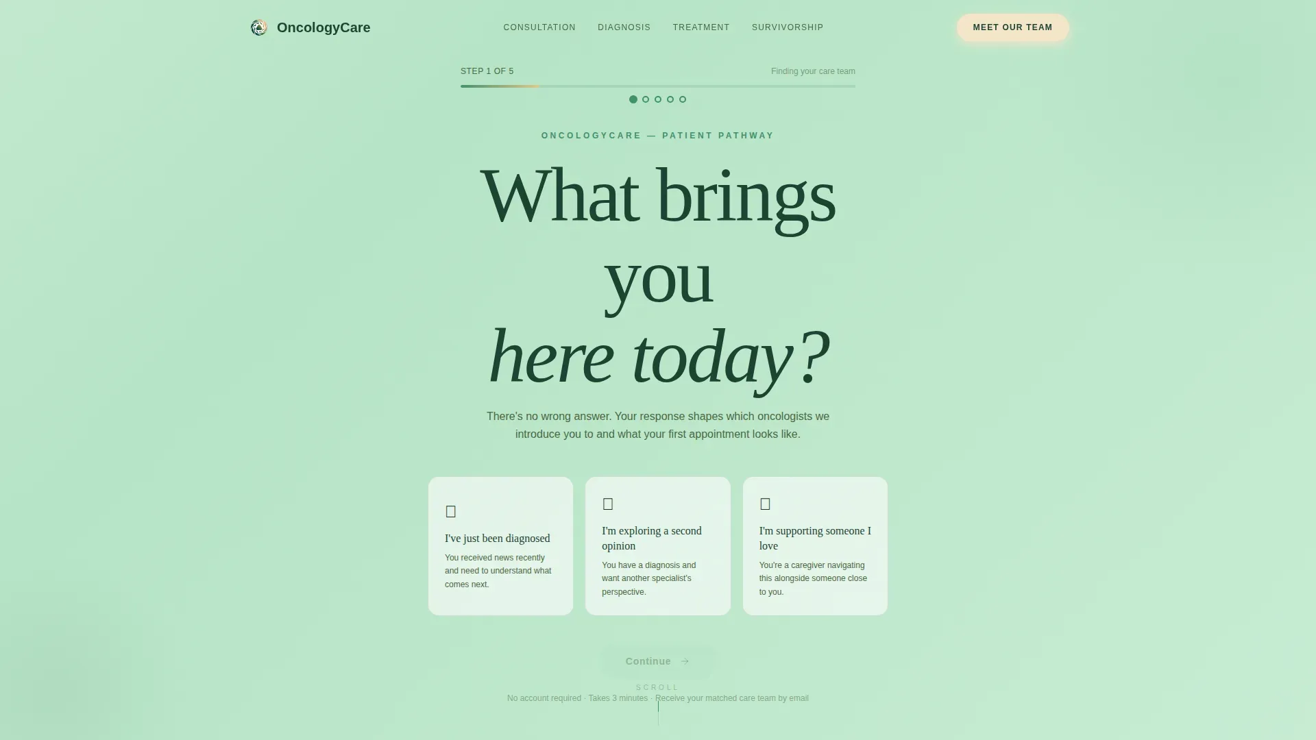
The header opens with a single, unhurried question in large type: "What brings you here today?" Visitors choose from three paths, newly diagnosed, exploring a second opinion, or supporting someone they love, and the page content below gently reshapes to reflect their selection. The form advances through five steps, ending with a low-friction email capture and a matched oncologist profile.
Hub-and-Spoke Anchor Navigation
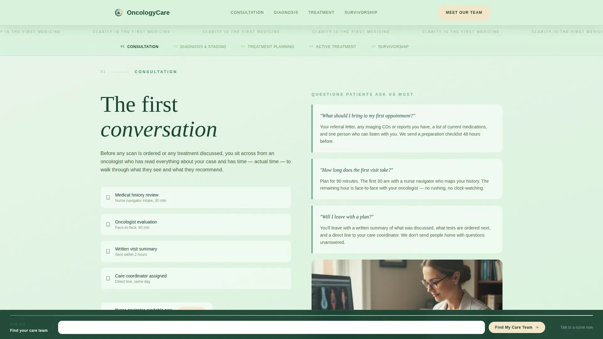
A sticky anchor navigation bar links five treatment phase sections: Consultation, Diagnosis and Staging, Treatment Planning, Active Treatment, and Survivorship. Each spoke section opens with a real patient question answered in plain language, along with details about who the patient will meet, what to expect, and how long each phase typically takes.
Scroll-Linked Gradient Transitions
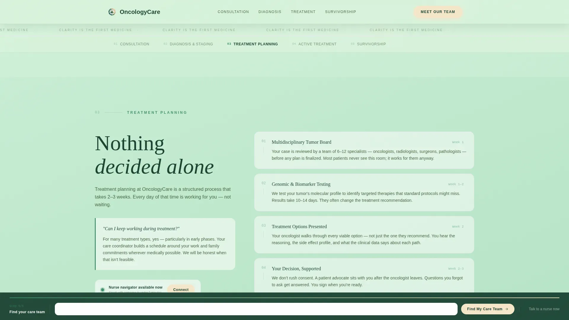
Background gradients shift from morning fog to deep fern as the visitor scrolls deeper into treatment phases, then lighten again toward survivorship. The color itself narrates the journey of moving through treatment and coming out the other side, without a single stock photo or awareness ribbon in sight.
Persistent Bottom Bar with Form Progression
A fixed bottom bar tracks form progress across the entire page. By step three it asks about diagnosis type and known stage. Step four covers geographic preference and insurance. Step five presents one clear action: "Find My Care Team." No phone number is required on first pass, just an email address.
Nurse Navigator Direct Connect
Every spoke section carries a secondary call to action: "Talk to a nurse navigator now." A warm birch button provides direct contact for visitors who arrive in crisis and need a human voice before they are ready to complete a form.
Care Team Profiles Section
A dedicated section displays oncologist profiles with credentials, specialty focus, tenure, and personal approach notes. Social proof appears where patients need it most, inside the phase sections they are already reading, as brief testimonial quotes and case volume indicators.
Page sections overview
| Section | Purpose |
|---|---|
| Hero Form | Opens with the "What brings you here today?" three-path card form on a morning-fog gradient |
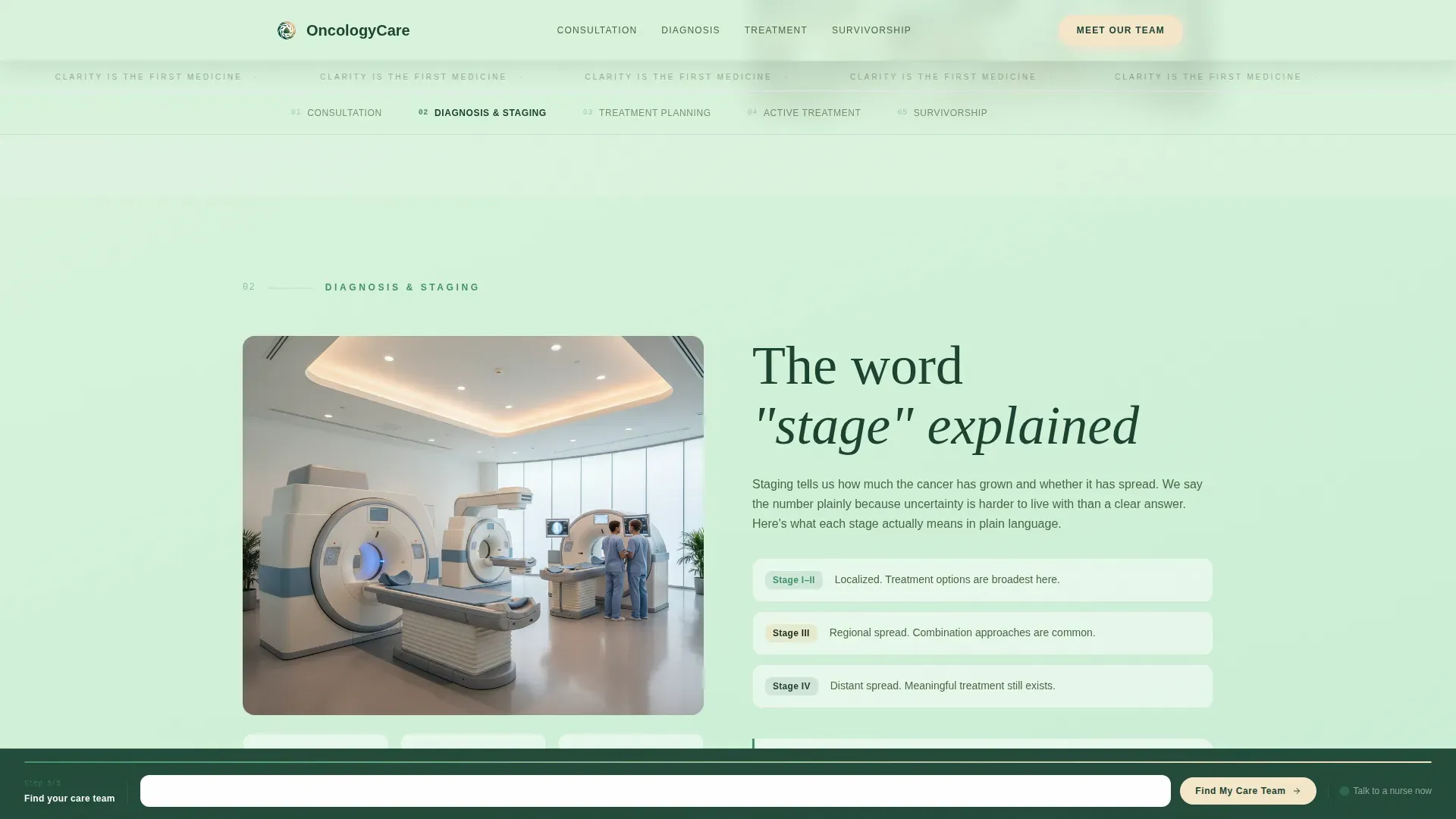
| Sticky Hub Nav | Anchors five treatment phases with persistent navigation that follows the scroll |
| Consultation Phase | Explains first-visit experience, who the patient meets, and common first questions |
| Diagnosis and Staging | Describes the staging process in plain language with patient questions answered |
| Treatment Planning Phase | Outlines how a care plan is built, timeline expectations, and team involvement |
| Active Treatment Phase | Covers infusion, therapy schedules, side effect questions, and work-life guidance |
| Survivorship Phase | Addresses surveillance protocols, emotional recovery, and next steps after treatment |
| Care Team Profiles | Showcases oncologist credentials, specialty, tenure, and personal care philosophy |
| Persistent Bottom Bar | Advances intake form steps and delivers the "Find My Care Team" final call to action |
Design & branding system
The visual identity follows a Soft Gradient theme built on a Forest Trust color system. Every color choice is deliberate. The palette evokes the steadiness of an old-growth forest rather than the sterility of a clinic hallway.
- Deep evergreen (#1B4332) grounds headers and navigation; living fern (#40916C) handles secondary text and section dividers; morning fog (#D8F3DC) washes across backgrounds in gentle gradients; warm birch (#F5E6CA) colors buttons and interactive elements
- Typography pairs Fraunces serif headlines for warmth and authority with DM Sans body text for clean, readable clarity
- Staggered scroll reveals and form step transitions run at a medium animation pace, never rushed, always calm
Mobile & speed optimization
Caregivers and newly diagnosed patients most often reach this page on a phone, sometimes late at night, sometimes in a waiting room. The template is built mobile-first to serve those moments without friction.
- Server Components handle all static phase sections, keeping the page light while Client Components manage form interactivity
- Form steps and anchor navigation are thumb-friendly on small screens, with generous tap targets and clear progress indicators
- Scroll-linked gradient shifts and staggered reveals are tuned for mobile viewports so the visual storytelling lands on any screen size
How this template helps you convert
The entire page is structured around one insight: patients do not convert because of clever copy. They convert because they finally feel understood. Every layout decision supports that moment.
- The multi-step form starts at the top with a low-stakes question, building trust before asking for any contact information, so visitors engage before they hesitate
- The persistent bottom bar means the form is always within reach without being intrusive, and the nurse navigator button in every spoke section catches visitors who are ready to talk right now rather than fill out a form
Other information about this template
This template covers the full scope of a patient-facing oncology center landing page. A few additional details worth knowing before you build.
- The template uses US healthcare terminology throughout, with English copy, USD references, and US date formatting built into the placeholder content
- Placeholder content is written in plain, specific language rather than generic medical copy, making it easier to swap in your clinic's real voice
- The creative direction is labeled Transparent Process, meaning every section is designed to show patients exactly what comes next rather than summarizing benefits in vague terms
- Animation intensity is set to medium: scroll transitions and form step reveals feel deliberate and calming, consistent with the overall tone of the design
Theme
Soft Gradient
Creative direction
Transparent Process
Color system
Forest Trust
Style
Hub & Spoke (Anchor Nav)
Direction
Quiz/Assessment
Page Sections
Path-based Multi-step Intake Form
Hub-and-spoke Anchor Navigation
Scroll-linked Gradient Transitions
Persistent Bottom Bar with Form Progress
Nurse Navigator Direct Connect
Care Team Profiles with Social Proof
Related questions
Does this template include the actual intake form logic?
Can I use this template for a cancer center with multiple specialties?
Do visitors have to complete the form to contact the clinic?
Is the Forest Trust color palette customizable?
What sections are included in this landing page template?



