Dining Room Smart Home Integration Landing Page
Integrate is a hero-dominant landing page template for dining room smart home integration firms. It opens with a dramatic before-and-after case study split, then walks visitors through five engineering phases of a single completed project. The design follows an Engineering Blueprint theme, and the entire page is built to move qualified visitors toward a consultation booking click.
by Rocket studio
Quick summary
Integrate is a single-page, click-through landing page template built for smart home integration firms specializing in high-end dining room projects. The hero fills ninety percent of the viewport with a before-and-after case study reveal. Visitors then scroll through five narrative phases of one real project before reaching a strong, brass-framed call-to-action that leads to a consultation booking page.
Who this template is for
This template is built for firms and specialists who work at the intersection of precision engineering and refined residential design. It speaks directly to people who need to explain complex, invisible work to discerning clients.
- Custom integration firms that specialize in dining room smart home systems and whole-room automation
- Interior designers and custom builders who need a subcontractor capable of speaking both technical specification and finish-material language
- Homeowners mid-renovation who are ready to invest in a properly programmed, multi-zone system and need to trust the firm before booking a call
What problem this template solves
High-end smart home integration firms consistently lose qualified clients because their work is, by design, invisible. A finished room reveals nothing about the fourteen zones hidden behind its wainscoting. The template solves the credibility gap by making the invisible visible through a structured case study narrative.
- Potential clients cannot evaluate complexity or craftsmanship from a portfolio thumbnail, so the template walks them through every engineering phase in sequence
- Busy decision-makers such as interior designers and custom builders need to qualify a firm quickly, and the before-and-after hero does that in under five seconds
- The page removes friction by keeping the call-to-action to a single click rather than a form, which suits high-consideration buyers who resist cold commitment
What you get with this template
The template delivers a fully structured, single-page layout built around one flagship case study. Every section serves the narrative arc from raw construction to seamless reveal.
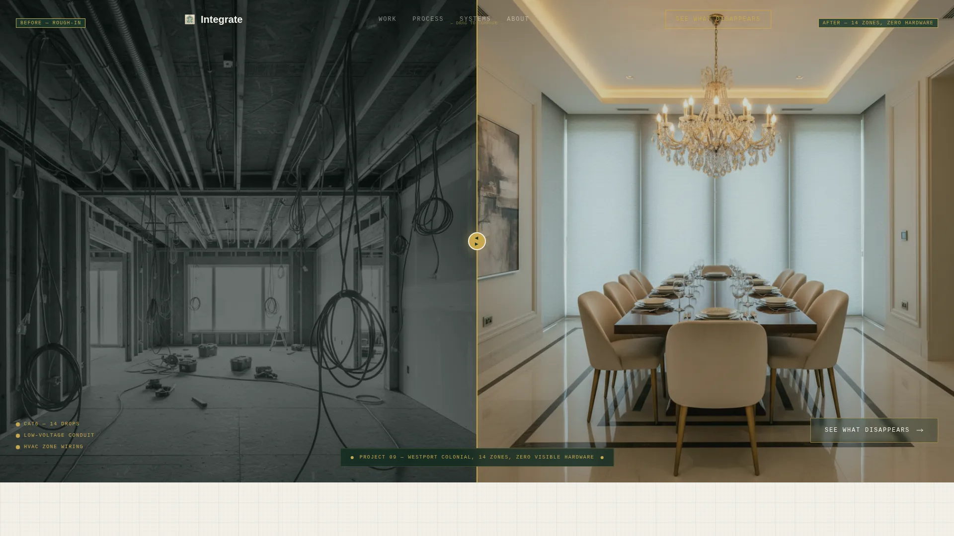
- A ninety-percent viewport hero with a brass-divided before-and-after split image, a drafting-font project annotation, and a ghost-button call-to-action layered over the after image
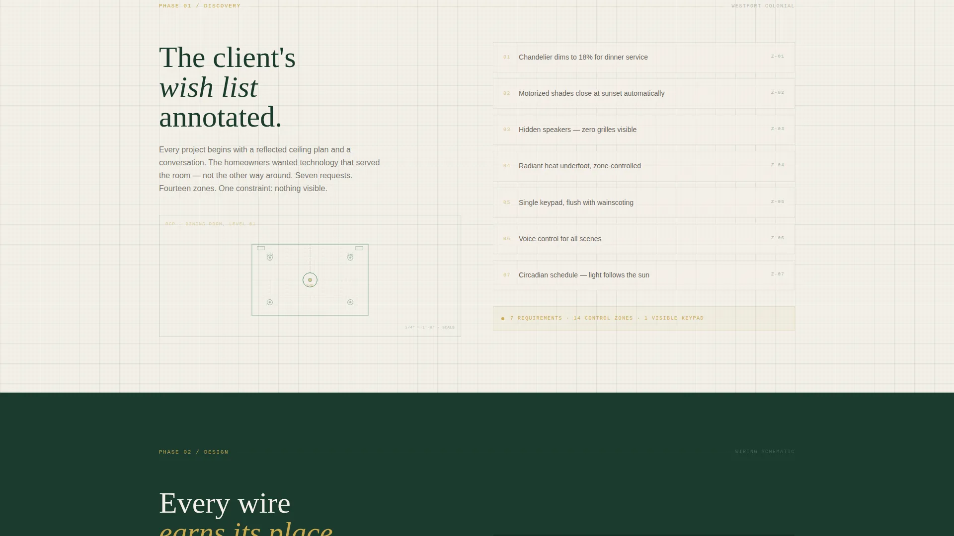
- Five sequential case study phase sections covering Discovery, Design, Rough-In, Programming, and Reveal, each with its own visual treatment and content placeholder
- A solid brass-on-evergreen call-to-action bar after the final Reveal phase, designed to convert visitors who have completed the full narrative journey
Feature list
This section describes the core built-in components and layout capabilities delivered by the template.
Split-Screen Hero with Brass Divider
The hero occupies ninety percent of the initial viewport and splits into two equal halves. The left side holds a raw mid-construction photograph. The right side shows the identical camera angle post-completion. A thin brass-colored divider line separates the halves, and a small drafting-font annotation identifies the project by name, zone count, and hardware visibility status.
Five-Phase Case Study Narrative Flow
Scrolling past the hero moves the visitor through five chronologically ordered sections: Discovery, Design, Rough-In, Programming, and Reveal. Each phase has a distinct visual treatment, from an annotated reflected ceiling plan in Discovery to a slow-pan video placeholder in Reveal. The structure escalates complexity while reinforcing the elegance of the finished result.
Brass Callout Annotation System
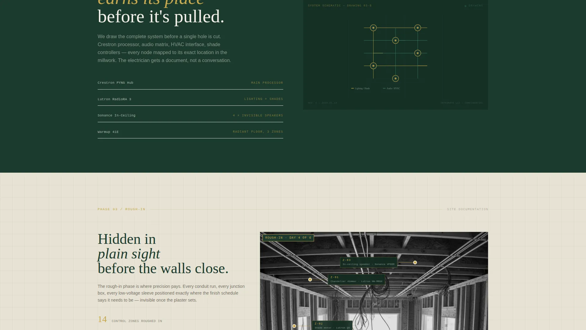
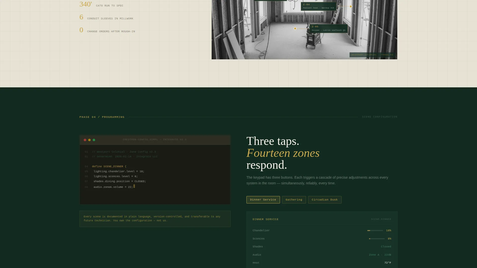
Site photography sections include brass-colored callout lines that identify hidden components within the room. This annotation system mirrors the aesthetic of a professional engineering drawing, making technical detail readable without disrupting the visual calm of the finished photography.
Dual-State Call-to-Action Design
The primary call-to-action, labeled "See What Disappears," appears twice with two distinct visual states. Over the hero it renders as a ghost button. After the Reveal phase it appears as a solid brass-on-evergreen bar. Both instances lead to the same consultation booking page, giving the visitor a clear exit at the right moment.
Engineering Blueprint Visual Theme
The entire layout uses a Forest Trust color system applied with drafting precision. Deep evergreen anchors structural elements, drafting-line teal defines secondary marks, warm linen provides the background, and brass is reserved strictly for callout lines, hover states, and call-to-action borders. No color is used decoratively without purpose.
Form-Free Click-Through Architecture
The page contains no embedded form. The sole conversion action is a click to a qualifying consultation page. This structure reduces friction for high-consideration buyers and keeps the landing page focused entirely on building trust through the case study depth.
Page sections overview
| Section | Purpose |
|---|---|
| Hero Split View | Delivers immediate before-and-after credibility with a brass-divided case study image and ghost-button call-to-action |
| Discovery Phase | Presents the client wish list annotated over a reflected ceiling plan to open the project narrative |
| Design Phase | Shows an animated wiring schematic that builds line by line to illustrate system planning depth |
| Rough-In Phase | Displays site photography with brass callout lines identifying each hidden component in place |
| Programming Phase | Includes a screen recording placeholder showing scene configuration and zone setup |
| Reveal Phase | Closes the narrative with a slow-pan video of the finished room responding to voice, keypad, and schedule |
| Final call to action Bar | Presents the solid brass-on-evergreen "See What Disappears" button as the page's single conversion point |
Design & branding system
The template uses an Engineering Blueprint theme grounded in a Forest Trust color palette. Every design decision mirrors the discipline of technical drafting applied to warm residential photography, so the page feels precise without feeling cold.
- The four-color Forest Trust system uses deep evergreen (#1B3A2D) for structural elements, drafting-line teal (#3E7C6A) for secondary marks, warm linen (#F4F0E8) as the base background, and brass (#C9A84C) reserved exclusively for callout lines, hover states, and call-to-action borders
- Typography follows a drafting-font aesthetic for annotations and project labels, contrasting with clean body text to separate technical notation from narrative copy
- The visual language is intentionally restrained: nothing decorates without a functional purpose, which mirrors the invisible-hardware philosophy of the integration work itself
Mobile & speed optimization
The template layout is structured to translate the hero-dominant desktop experience into a clear, readable mobile flow. The before-and-after split and multi-phase narrative are designed with stacked presentation in mind for smaller viewports.
- The split-screen hero is built to reflow into a vertically stacked before-and-after sequence on mobile, preserving the case study impact without requiring horizontal scrolling
- Phase sections with video and screen recording placeholders are sized and contained to avoid layout breakage across device widths
- The form-free, single-click conversion architecture keeps the mobile experience uncluttered and focused on the narrative rather than data entry
How this template helps you convert
The page is structured specifically as a click-through landing page, where trust is built through depth of narrative and the conversion action is a single, low-friction click.
- The before-and-after hero establishes credibility within the first viewport, giving interior designers and custom builders an immediate signal that this firm understands both construction reality and finished-room elegance, which motivates them to keep scrolling.
- The five-phase case study progressively raises the visitor's understanding of project complexity, so by the time they reach the brass call-to-action bar after the Reveal phase, they are clicking from informed confidence rather than impulsive curiosity.
Other information about this template
This template is designed specifically for the dining room smart home integration niche within the broader construction and home renovation market. A few additional details are worth noting for buyers considering this layout.
- The page is optimized for a click-through flow, meaning it pairs naturally with a short qualifying or consultation-booking page that sits one step downstream
- The single case study format works best when the firm has at least one flagship project with strong before-and-after photography and phase-by-phase documentation
- The template style is Hero-Dominant at a ninety-to-ten ratio, meaning the hero section carries the vast majority of the visual weight and first-impression work
- The case study used in the template prompt references a fourteen-zone colonial project with zero visible hardware as the narrative anchor, making it a strong model for firms with comparable project depth
- This layout suits firms whose clients include interior designers specifying smart-home layers, homeowners managing active renovations, and custom builders sourcing specialized subcontractors
Theme
Engineering Blueprint
Creative direction
Case Study Narrative
Color system
Forest Trust
Style
Hero-Dominant (90/10)
Direction
Click-Through
Page Sections
Split-screen Hero with Brass Divider
Five-phase Case Study Narrative
Brass Callout Annotation System
Dual-state Call-to-action Design
Form-free Click-through Architecture
Engineering Blueprint Visual System
Related questions
What kind of firm is this landing page template designed for?
Does this template include a contact form?
How many sections does the template include?
Can I use this template if I only have photography and no video?
Why does the call-to-action appear twice on the page?



