Supply Chain Risk Management Landing Page Template
Intercept is a supply chain risk management landing page template built for professional services firms serving procurement and operations leaders. It combines a comparison table layout, a stats-first scroll rhythm, and a progressive lead-capture form to communicate platform authority and drive high-intent demo requests from VP-level buyers at mid-market manufacturers and consumer goods companies.
by Rocket studio
Quick summary
Intercept is a single-page template designed for supply chain risk management platforms. It opens with a peer testimonial card, escalates through bold statistics and a twelve-dimension comparison table, and closes with a three-step lead capture form. The visual system is built on deep navy, gunmetal, and amber to project boardroom-level authority without noise.
Who this template is for
This template was designed for professional services firms and platform vendors who sell into procurement and supply chain functions. The intended buyer persona is senior, data-driven, and skeptical of generic marketing. The page speaks directly to decision-makers who have already felt the cost of supply chain disruption.
- VP-level procurement leaders at mid-market manufacturers managing complex, multi-region supplier networks
- Chief Financial Officers at consumer goods companies whose boards require quarterly resilience scoring
- Supply chain risk consultants and category management practices pitching enterprise clients on structured risk frameworks
What problem this template solves
Procurement leaders do not need another feature list. They need to understand, quickly, why their current approach leaves them exposed. This template structures the message around that specific anxiety: the cost of invisible risk, the gap in legacy tools, and the proof that a better approach exists.
- Generic service pages fail to quantify the stakes, so senior buyers disengage before reaching the call-to-action
- Comparison tables buried below the fold lose credibility before trust is established
- Dual conversion paths are rarely built into a single page, leaving early-stage prospects with no way to engage at lower commitment
What you get with this template
This template delivers a fully structured landing page with every section sequenced for persuasion. The layout moves from peer validation through statistical evidence to direct comparison, then closes with two distinct conversion paths calibrated for different buyer readiness levels.
- A testimonial card header with an animated risk score gauge, a twelve-dimension comparison table, and a three-step progressive lead form
- A secondary conversion path offering a gated downloadable benchmark report for earlier-stage prospects
- A fixed mobile bottom bar repeating the primary call-to-action so high-intent visitors on smaller screens never lose sight of next steps
Feature list
This section outlines the core built-in components that make Intercept ready to deploy for a supply chain risk management platform.
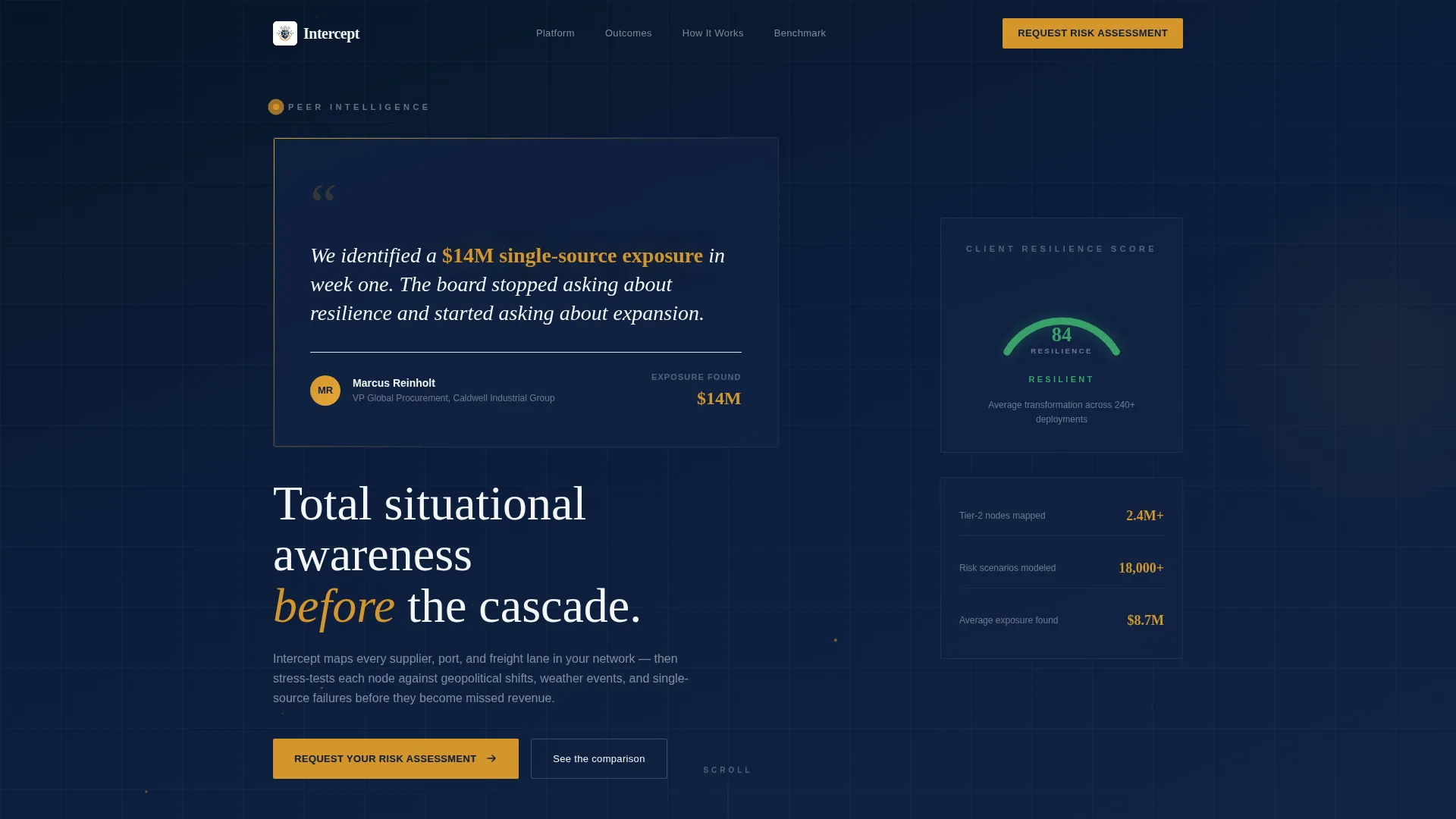
Oversized Peer Testimonial Header
The header opens with a single large-format quote card set against deep navy. The quote is attributed to a named VP of Global Procurement with a bold amber disruption metric in the card body. An animated risk score gauge flanks the card, ticking from red to green to imply transformation before any feature is described.
Stats-First Scroll Architecture
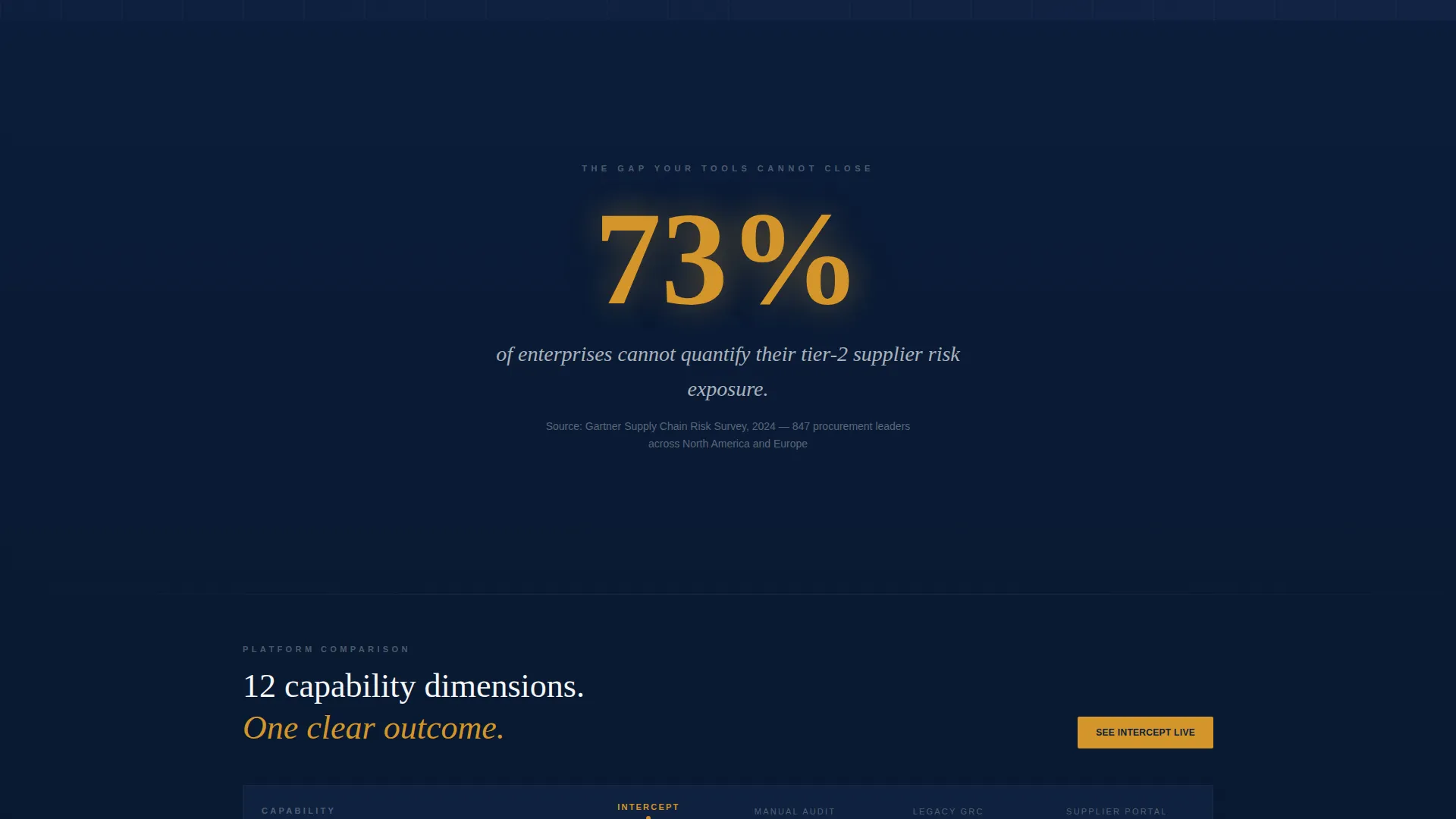
Each scroll section leads with one bold, isolated statistic occupying the full viewport before supporting context appears. This tension-and-release rhythm repeats three times across the page, escalating from the cost of ignorance to gaps in current tools to proof of outcomes.
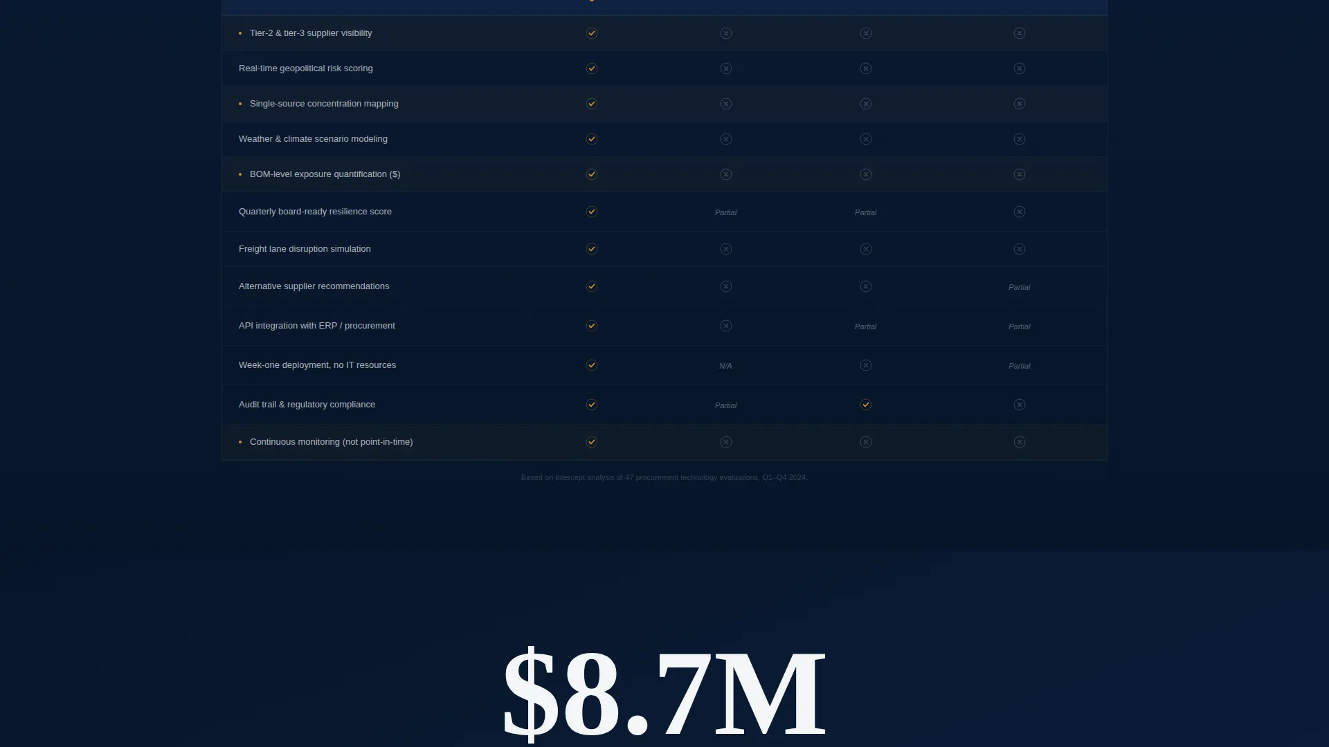
Twelve-Dimension Comparison Table
The comparison table benchmarks the platform against manual audits, legacy governance, risk, and compliance tools, and basic supplier portals across twelve capability dimensions. The table slides in beneath a contextual statistic, connecting the evidence directly to the competitive gap.
Three-Step Progressive Lead Form
The primary conversion path is a multi-step form sequence. Step one collects company name and industry vertical. Step two captures active supplier count and primary sourcing regions via dropdown menus. Step three requests work email and preferred briefing window, reducing friction by staging commitment.
Gated Benchmark Report Download
A secondary conversion path offers a downloadable PDF titled "Get the 2024 Supply Chain Resilience Benchmark" gated behind email only. This path captures earlier-stage prospects who want the data before committing to a call, extending the reach of the page without diluting the primary offer.
Amber-Anchored Call-to-Action System
The primary call-to-action, "Request Your Risk Assessment," appears in decisive amber in the top-right navigation, again after the comparison table, and in a fixed bottom bar on mobile. The amber accent is reserved exclusively for risk indicators and primary actions, so every instance carries weight.
Page sections overview
| Section | Purpose |
|---|---|
| Testimonial Card Header | Opens with peer validation and an animated risk score gauge |
| Stats-First Hero | Lands a single bold statistic to frame the cost of inaction |
| Comparison Table Block | Benchmarks the platform across twelve capability dimensions |
| Second Stats Transition | Escalates stakes by exposing gaps in legacy tool categories |
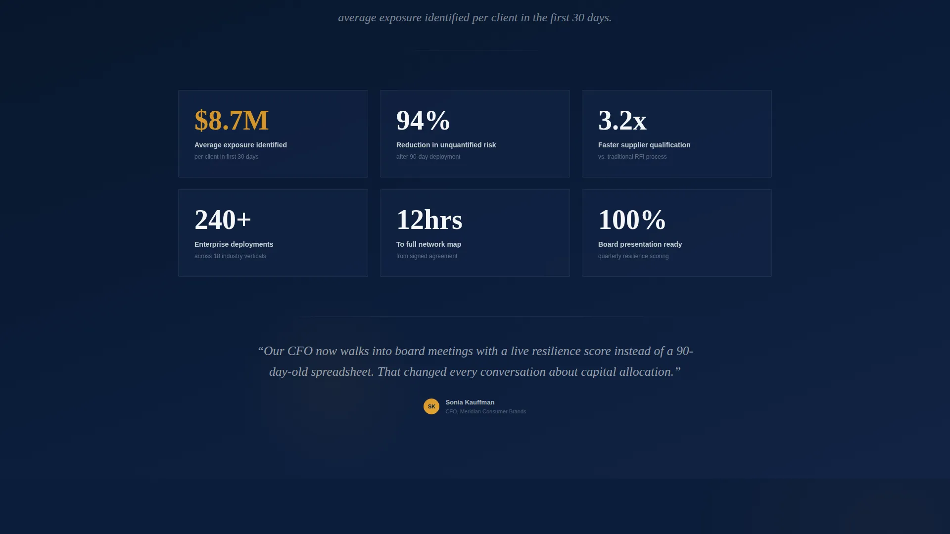
| Outcomes Evidence Section | Delivers proof of results before the conversion ask |
| Primary Lead Capture Form | Three-step progressive form driving demo and briefing requests |
| Benchmark Report Download | Secondary gated path for earlier-stage prospect engagement |
| Fixed Mobile call to action Bar | Keeps the primary action visible on smaller screens at all times |
Design & branding system
The visual identity follows a Corporate Precision theme built on the Navy Authority color system. Every color in the palette has an assigned role, and that discipline is what makes the page feel like a boardroom briefing rather than a marketing brochure.
- Deep command navy (#0B1D3A) dominates section backgrounds; brushed gunmetal (#3D4F5F) anchors secondary text, table borders, and supporting elements
- Crisp boardroom white (#F4F6F8) provides breathing room in data-dense areas like the comparison table and form fields
- Decisive amber (#D4952A) is reserved exclusively for risk indicators and primary calls-to-action, ensuring every instance commands attention
Mobile & speed optimization
The template is structured so that its highest-value conversion element, the fixed bottom call-to-action bar, remains visible on mobile throughout the entire scroll experience. The stats-first layout also naturally compresses into readable single-column sections without losing narrative momentum.
- The fixed amber bottom bar pins "Request Your Risk Assessment" on mobile so the primary action is always one tap away
- Progressive form steps reduce cognitive load on smaller screens by breaking the input sequence into three focused stages
- The comparison table is designed to scroll horizontally on mobile, preserving the twelve-dimension benchmark without collapsing the data
How this template helps you convert
The page is built around two parallel conversion paths, each matched to a different stage of the buying decision. The structure moves the visitor from awareness of their own exposure to a natural, low-friction ask.
- High-intent visitors who recognize their risk posture are directed through the three-step form toward a personalized risk assessment briefing, the primary conversion goal.
- Earlier-stage visitors who want proof before committing can download the benchmark report behind an email gate, entering a nurture path without requiring a sales conversation.
Other information about this template
Intercept was built at the intersection of supply chain and procurement consulting, where the sales cycle is long, the buyer is senior, and the cost of a weak first impression is a closed door. A few additional details are worth noting for teams evaluating this template.
- The template style is a Comparison Table layout, suited to competitive positioning against manual audits, legacy governance tools, and basic supplier portals
- The creative direction is Expert Panel with a Dark Full-Bleed and Glow header concept, consistent with the Navy Authority color system
- The landing page direction is Click-Through oriented, meaning every section is sequenced to move the visitor toward a single high-value action
- The template is categorized under Professional Services, Supply Chain and Procurement, with a niche alignment toward Category Management Consulting practices
- No stock photography or generic imagery is used anywhere in the layout; the header relies entirely on peer language and one bold number to establish credibility
Theme
Corporate Precision
Creative direction
Expert Panel
Color system
Navy Authority
Style
Comparison Table
Direction
Click-Through
Page Sections
Peer Testimonial Card Header
Stats-first Scroll Rhythm
Twelve-dimension Comparison Table
Three-step Progressive Lead Form
Gated Benchmark Report Path
Persistent Amber Call to Action System
Related questions
Who is this landing page template designed for?
What makes the comparison table section effective?
Can the page support two different types of prospects at once?
How does the amber color system work across the page?
Is this template suitable for a consulting firm or only a software platform?



