Job Board & Portal Portfolio Website Template
The Intern landing page template is a comparison-table-driven internship board designed to convert college students and academic advisors into leads. It uses narrative case studies, a three-field email capture form, and an advisor bulk-upload path to earn trust before asking for anything. The layout follows an Educational Guide visual theme in a warm, teal-forward color system.
by Rocket studio
Quick summary
This template builds a single-page internship board landing page where undergrads discover vetted internships filtered by major, location, and pay. Comparison tables tell real student stories. A focused lead-capture form and a separate advisor path drive two distinct conversion goals. The design feels like a well-annotated textbook, warm, calm, and quietly authoritative.
Who this template is for
This template fits anyone running an internship platform or career resource that needs to convert two very different audiences at once. It balances a student-first story with a practical entry point for institutional users.
- College juniors and seniors searching for real, paid internships filtered by field and location
- Academic advisors who need to place full student cohorts before a semester deadline
- Human resources coordinators at mid-size firms tired of reposting openings across multiple platforms
What problem this template solves
Most internship pages ask students to sign up before proving anything is worth their time. Advisors face the same wall, a generic form with no clear institutional path. This template flips that sequence entirely.
- Students scroll through outcome-first case studies before they ever see a form field
- Advisors get a dedicated conversion path instead of being lumped in with individual users
- The comparison table format turns raw data into relatable mini-stories, not dry statistics
What you get with this template
You get a fully structured, single-page layout built around three student case studies and two distinct calls to action. Every section is purposeful and sequenced to build proof before it builds pressure.
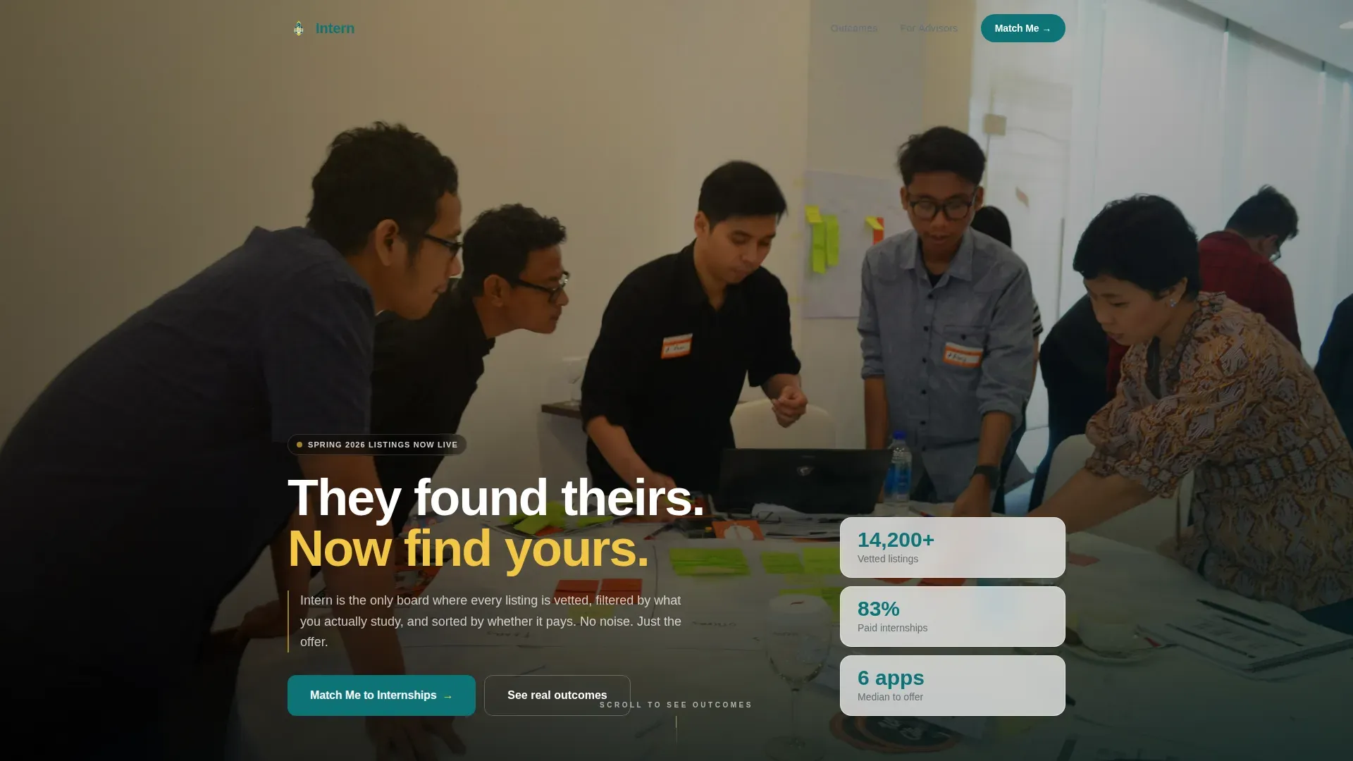
- A cinematic hero section with a team photo header, a fade-in headline, and floating stat cards
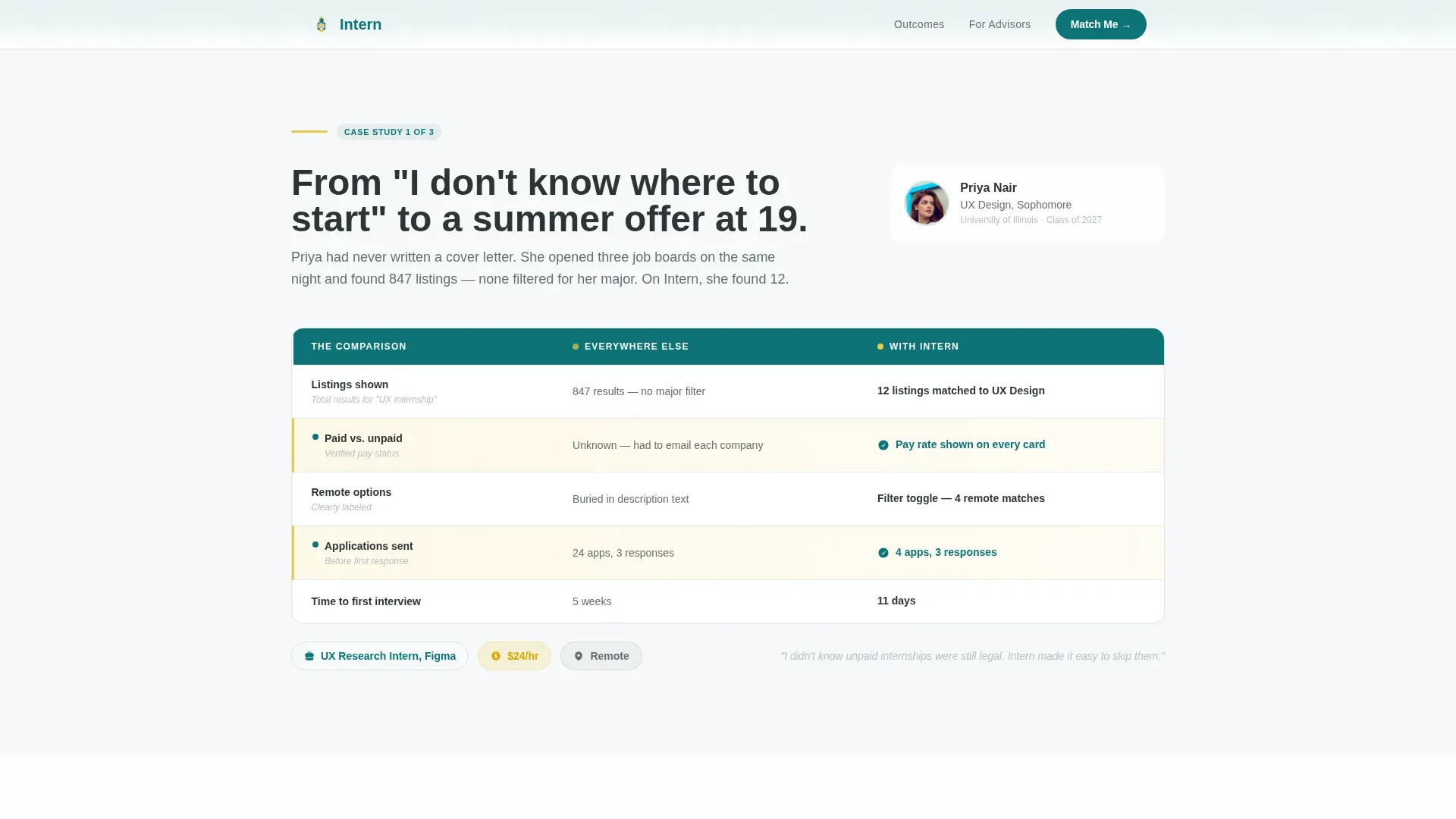
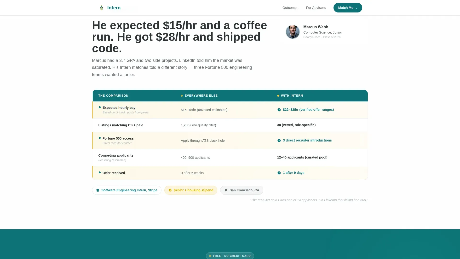
- Three comparison table case studies that escalate from a nervous first-year to a senior signing an offer letter
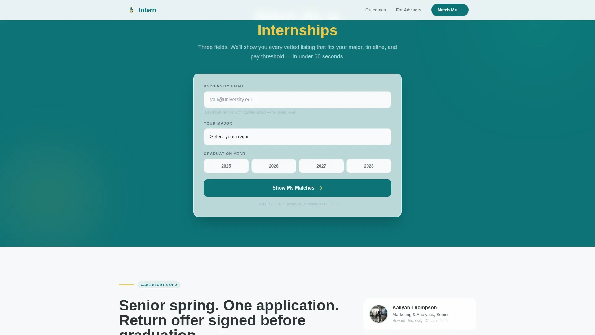
- A primary lead-capture form with three fields and a secondary advisor bulk-upload call to action
Feature list
This template ships with several purpose-built components drawn directly from the source brief.
Comparison Table Case Studies
Each case study is a structured comparison table showing what a student studied versus where they landed, how many applications they sent on other platforms versus how many it took here, and what they expected to earn versus what they actually received. The rows read as mini-stories, not spreadsheet rows.
Three-Field Lead Capture Form
The primary call to action form asks for a university email address, major, and graduation year, nothing more. It sits after the second case study, timed to appear exactly when proof-of-concept peaks for the reader.
Advisor Bulk-Upload Path
Below the final case study, a secondary conversion block invites academic advisors to place an entire student cohort at once. This path is clearly separated from the student flow and uses its own call to action label.
Scroll-Reveal Animation System
Section blocks, table rows, and hero elements animate in on scroll using staggered reveal timing. The hero headline fades in over the team photo. Table rows appear progressively to guide the eye through each comparison.
Mobile-First Responsive Layout
The template is built with mobile as the primary device priority. Tables adapt to narrow viewports, form fields stack cleanly, and the hero image scales without cropping key visual elements.
Educational Guide Visual Theme
Typography uses Plus Jakarta Sans for headings and DM Sans for body text. The color system layers deep teal, highlighter yellow accents, whiteboard white backgrounds, and pencil-graphite text to create the feel of a well-used, well-loved textbook.
Page sections overview
| Section | Purpose |
|---|---|
| Hero with Photo | Introduce the platform and headline with a warm, wide-angle team photo and floating stat cards |
| Case Study One | Show a first student journey from uncertainty to offer using a comparison table |
| Case Study Two | Compare expected versus actual outcomes and application volume across platforms |
| Primary call to action Form | Capture university email, major, and graduation year after proof has been established |
| Case Study Three | Close the narrative arc with a senior signing an offer, escalating the data payoff |
| Advisor call to action Block | Offer a separate bulk-upload path for academic advisors placing full cohorts |
| Footer | Single-row linear footer with navigation and supporting links |
Design & branding system
The visual identity follows an Educational Guide theme. Every design choice references the texture of a well-annotated academic resource rather than a polished corporate product page.
- Color palette: deep lecture-hall teal (#0D7377) as the primary color, highlighter yellow (#F2C744) for accents, whiteboard white (#F7F9FA) for backgrounds, and pencil-graphite charcoal (#2D3436) for body text
- Typography pairing: Plus Jakarta Sans handles all headings with weight and clarity, while DM Sans keeps body paragraphs readable at every size
- The header uses a candid, wide-angle team photo with warm, slightly overexposed golden-hour tones and a glass wall covered in sticky notes visible in the background
Mobile & speed optimization
The template is designed with mobile-first students in mind. College users browse on phones, so every layout decision prioritizes narrow viewports without sacrificing the comparison table experience.
- Comparison tables reflow for small screens so each row remains readable without horizontal scrolling
- Animations use client-side rendering only where interactive behavior is needed, while static content uses server-side components to keep initial load fast
- The three-field form is thumb-friendly, with adequately spaced inputs and clear validation feedback on mobile
How this template helps you convert
The page is engineered around a simple belief: show outcomes first, then ask for something. Every layout decision reinforces that sequence.
- The case study narrative builds trust incrementally, each table adds one more data point until the visitor sees themselves in the numbers, making the form feel like a natural next step rather than an interruption.
- The form placement after the second case study catches visitors at peak proof-of-concept, when emotional resonance and factual confidence overlap, reducing friction at the moment of decision.
- The advisor bulk-upload path creates a separate, low-friction entry point for institutional users who would otherwise abandon a student-focused form entirely.
Other information about this template
This template is part of a broader HR and hiring template category, sitting at the intersection of job board design and career platform user experience. It is particularly well-suited to EdTech products targeting the United States college market.
- Localization defaults are set for the United States, using USD currency formatting and MM/DD/YYYY date display
- The footer follows a Pattern 1 linear single-row layout, keeping the page exit clean and distraction-free
- Interactive elements include hover states on table rows and real-time form validation, both handled client-side
- The template supports both a business-to-consumer lead generation goal (student email capture) and a business-to-business path (advisor cohort placement) within a single page
Theme
Educational Guide
Creative direction
Case Study Narrative
Color system
Teal Catalyst
Style
Comparison Table
Direction
Lead Generation
Page Sections
Comparison Table Case Studies
Three-field Lead Capture Form
Advisor Bulk-upload Call to Action
Scroll-reveal Animation System
Mobile-first Responsive Tables
Educational Guide Visual Theme
Related questions
Can I use this template for a niche internship board focused on one industry?
How does the advisor conversion path work alongside the student flow?
Does the template include actual internship listing data or filter functionality?
Is the comparison table format readable on small phone screens?
Can the three-field lead capture form be extended with additional fields?


