Streamlined Medical Billing Services Landing Page Template
Clarity is a split-screen landing page built for internists who are losing revenue to undercoding, modifier errors, and payer denials. It translates complex billing language into plain English across five data-led sections. The design moves visitors from diagnosis to resolution, earning each click through accumulated proof before presenting a clear call to action.
by Rocket studio
Quick summary
Clarity is a single-page billing resource designed for internal medicine practices. It uses a 50/50 split-screen layout and a stats-first presentation to turn dense billing complexity into plain, actionable language. Five data points specific to internist billing guide the visitor from problem awareness to confident action, ending with a full-width teal call to action.
Who this template is for
This landing page is built for healthcare professionals and their support staff who deal directly with medical billing in small internal medicine settings. It speaks to people who understand the pain before they read the first word.
- Solo internists managing their own patient panels and claim submissions
- Office managers handling billing across two to four physician practices
- Newly credentialed doctors navigating Medicare reimbursement timelines for the first time
What problem this template solves
Internal medicine billing is one of the most technically dense areas in healthcare administration. Current Procedural Terminology (CPT) codes, modifier stacking, and Explanation of Benefits (EOB) documents are written for payers, not physicians. Most internists only discover revenue gaps after months of rejected claims.
- Undercoding and modifier errors go unnoticed until revenue loss becomes significant
- Payer-specific denial patterns are hard to track without clear visual evidence
- Newly credentialed physicians lack the billing context to catch cash flow problems early
What you get with this template
This template delivers a complete, conversion-focused landing page structured around five core sections. Each section is pre-built with a clear visual hierarchy that moves the visitor from awareness through evidence to action.
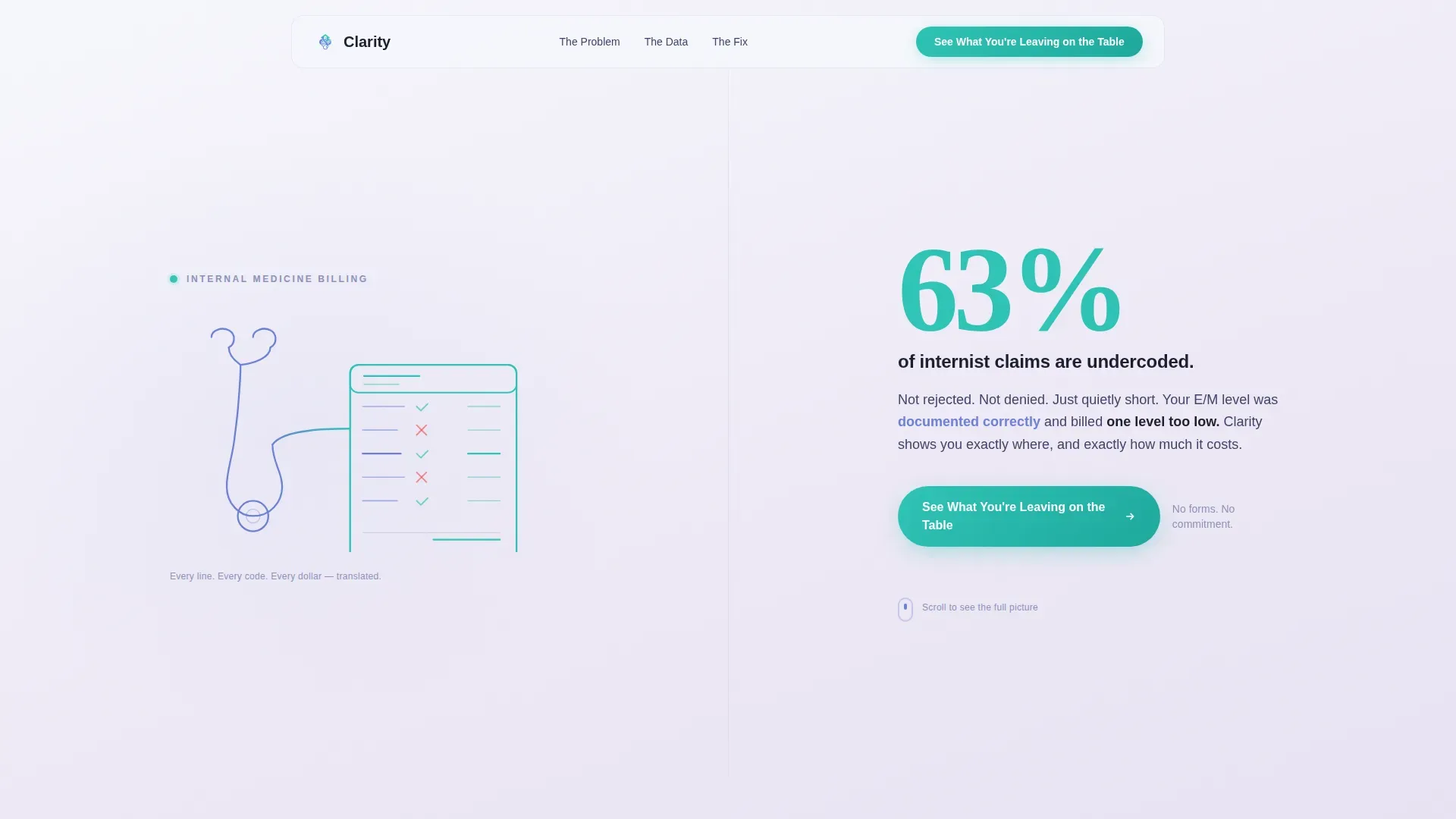
- A hero section with animated line art, a bold undercoding statistic, and a primary call to action
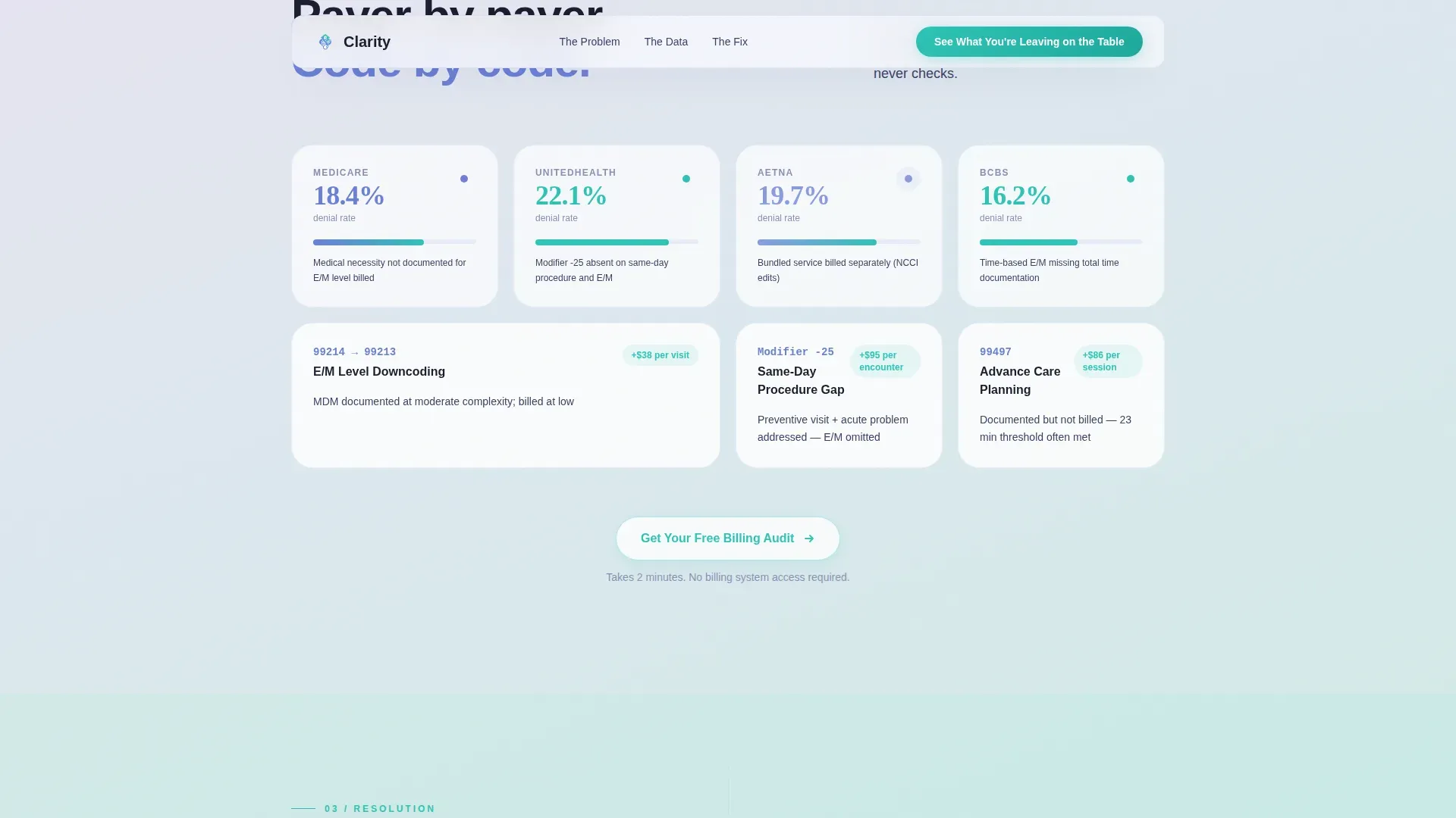
- Three evidence sections presenting billing data points in a stats-first split-screen and bento grid format
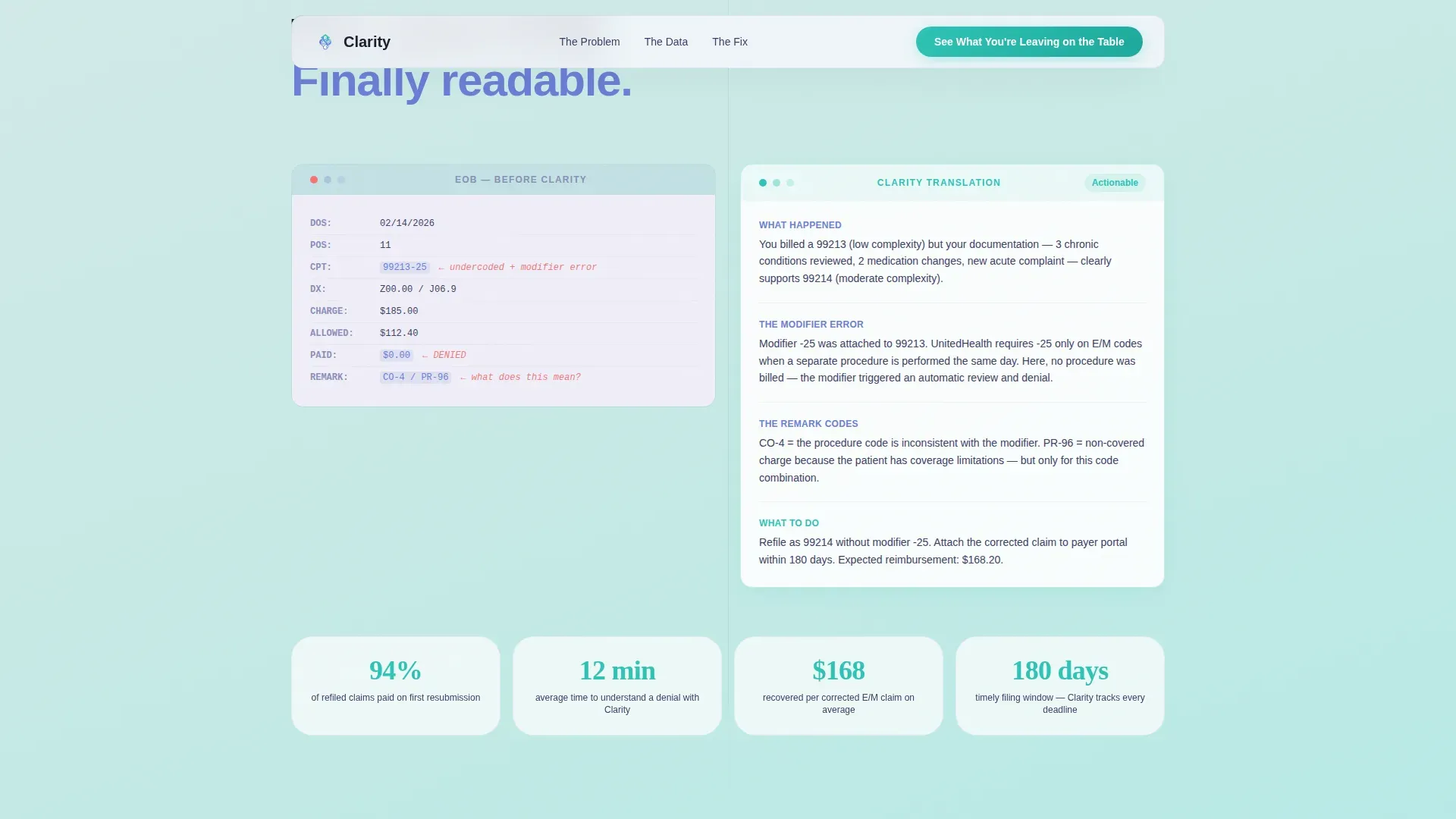
- A resolution section with a before-and-after EOB translation visual and a secondary call to action
- A full-width teal final call to action and a clean single-row footer
Feature list
This landing page template includes several purpose-built components designed specifically for the internist billing use case.
Animated SVG Line Art Header
The header features a continuous-stroke illustration of a stethoscope morphing into a billing statement. The path draws itself left to right over two seconds using SVG animation, landing on a bold stat in confident teal. No stock photography is used anywhere on the page.
Stats-First Split Screen Layout
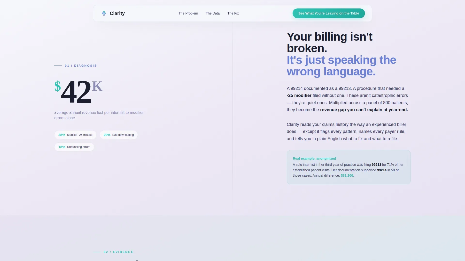
Every scroll transition leads with a large data metric on the left panel. The right panel holds the plain-language translation and the solution. This structure gives each statistic room to land before the context arrives, building trust through specificity.
Scroll-Linked Gradient Progression
The page background shifts gradually from cool lavender to warm teal as the visitor scrolls. This gradient transition is tied to scroll position, so the page physically moves from diagnosis to resolution. The effect reinforces the narrative arc without requiring any text explanation.
Bento Grid Evidence Section
The evidence section uses a bento grid layout to present payer-specific denial rates and Evaluation and Management (E/M) coding gap data side by side. Each cell holds a single data point, keeping the information dense but scannable.
Before-and-After EOB Translation Visual
The resolution section shows a raw EOB document on one side and a plain-English translation on the other. This visual makes the value proposition tangible. It is the moment the page shifts from problem to answer.
Magnetic call to action Button System
The primary call to action, "See What You're Leaving on the Table," uses a magnetic hover interaction. A secondary call to action, "Get Your Free Billing Audit," appears after the third stat section. The final call to action, "Start Recovering Revenue," is placed against the full-width teal gradient at the bottom of the page.
Page sections overview
| Section | Purpose |
|---|---|
| Hero Split Screen | Introduce the undercoding stat and primary call to action with animated line art |
| Diagnosis Split | Present the $42,000 modifier loss metric with plain-language context |
| Evidence Bento Grid | Display payer denial rates and E/M coding gaps across multiple data cells |
| Resolution Before/After | Show EOB translation visual and secondary billing audit call to action |
| Final call to action Strip | Close with full-width teal gradient and "Start Recovering Revenue" button |
| Single-Row Footer | Provide minimal footer links in a clean linear layout |
Design & branding system
The visual identity follows a Soft Gradient theme built around a Cloud Canvas color system. The palette feels clinical and calm, like a clean whiteboard in a quiet office before the day begins.
- Colors: diffused morning white (#F7F8FC) for backgrounds, pale clinical lavender (#E8E3F3) for surface layers, steady-pulse blue (#6B7FD7) for primary interface elements, and confident teal (#2EC4B6) reserved for calls to action and data highlights
- Typography: DM Sans is used for body text and interface elements; Fraunces, a display serif, is used for large stat callouts to give numbers visual authority
- Illustration style: thin, elegant ink-style line art with no stock photography, ensuring the page feels precise and original
Mobile & speed optimization
The template is built desktop-first to match how internists typically review billing information on office workstations. Full mobile support is included so the page remains usable on any device.
- Desktop layout prioritizes the 50/50 split-screen structure with large stat callouts readable from across a room
- Mobile layout adapts the split panels to stacked single-column sections without losing the scroll-triggered gradient effect
- CSS smooth scroll is used for navigation transitions, keeping the experience fluid without additional scroll libraries
How this template helps you convert
The page earns each click through accumulated proof rather than a single persuasive pitch. By the time the visitor reaches the final call to action, they have seen five data points specific to internal medicine billing.
- The stats-first structure places undeniable numbers before explanations, making each section feel like a discovery rather than a sales argument
- Three calls to action are spaced across the page at natural decision points, so visitors who are ready early do not have to scroll to act
- The gradient shift from lavender to teal creates a subconscious sense of resolution, making the final "Start Recovering Revenue" button feel like a logical next step rather than a commitment
Other information about this template
This template is part of the Health and Medical category, specifically designed for the Internist Insurance and Billing niche. A few additional details worth noting before you build with it.
- The page is classified as a Click-Through landing page, meaning its only goal is to move the visitor to a downstream service or enrollment page
- No form is present on this page; conversion happens through click, not submission
- All five data points referenced in the template are framed around United States healthcare billing terminology, including CPT codes, modifier stacking, EOB documents, and Medicare reimbursement timelines
- The animation system uses GSAP ScrollTrigger for stagger reveals and scroll-linked gradient warmth, alongside cursor glow and magnetic button interactions
- Server Components are used for static content sections to keep the build efficient
- The footer follows a Pattern 1 Linear Single-Row layout, keeping the bottom of the page clean and uncluttered
- This template is well suited for healthcare practice management services, medical billing consultancies, and revenue cycle management providers targeting small internal medicine practices
Theme
Soft Gradient
Creative direction
Stats-First Impact
Color system
Cloud Canvas
Style
Split Screen (50/50)
Direction
Click-Through
Page Sections
Animated SVG Line Art Header
Stats-first Split Screen
Scroll-linked Gradient Shift
Bento Grid Evidence Section
Before-and-after EOB Translator
Three-stage Magnetic Call to Action System
Related questions
Does this template include a contact form or lead capture form?
Can I update the billing statistics with my own data points?
Is this template suitable for medical specialties other than internal medicine?
What animations and interactions are built into this template?
Does this landing page work on mobile devices?



