Specialty Construction Advanced Professional Website Template
Isolate is a zigzag landing page template built for recording studio construction companies that work inside real homes. It pairs a neighborhood-framed visual story with performance metrics, alternating exterior and interior photography, and a single click-through call to action. The warm Fire and Earth palette and pastoral layout make acoustic construction feel approachable, grounded, and trustworthy.
by Rocket studio
Quick summary
Isolate is a single-page, click-through landing page template for residential recording studio builders. It uses a zigzag alternating layout to walk visitors from the street to the finished room, anchored by real performance numbers and a warm terracotta-and-wheat color system. The page ends every journey at one clear call to action: a project consultation click.
Who this template is for
This template is built for specialty construction businesses that convert ordinary residential spaces into acoustically controlled recording environments. It speaks directly to builders who work at a neighborhood scale, not on commercial campuses.
- Recording studio construction companies serving singer-songwriters and home producers
- Builders targeting podcast producers, voice artists, and small independent labels
- Contractors who need to show acoustic credibility without a portfolio of commercial facilities
What problem this template solves
Most construction landing pages look like they were built for commercial contracts. They feel too large, too cold, and too far from the reality of a spare bedroom or a detached garage. Residential studio builders lose potential clients because nothing on their page reflects the client's actual world.
- Visitors leave without trusting the builder understands their scale and budget
- Performance claims feel abstract without concrete numbers tied to real homes
- No clear next step guides an interested visitor toward booking a consultation
What you get with this template
You get a fully structured, single-page landing page layout with every section already positioned for acoustic construction storytelling. The design decisions are made. You focus on dropping in your numbers, your photos, and your project details.
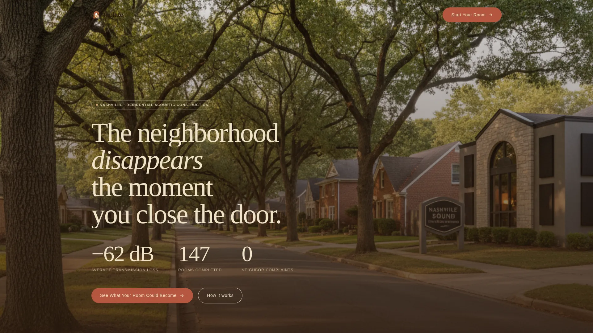
- A stats header section displaying three key performance metrics over a residential street photograph
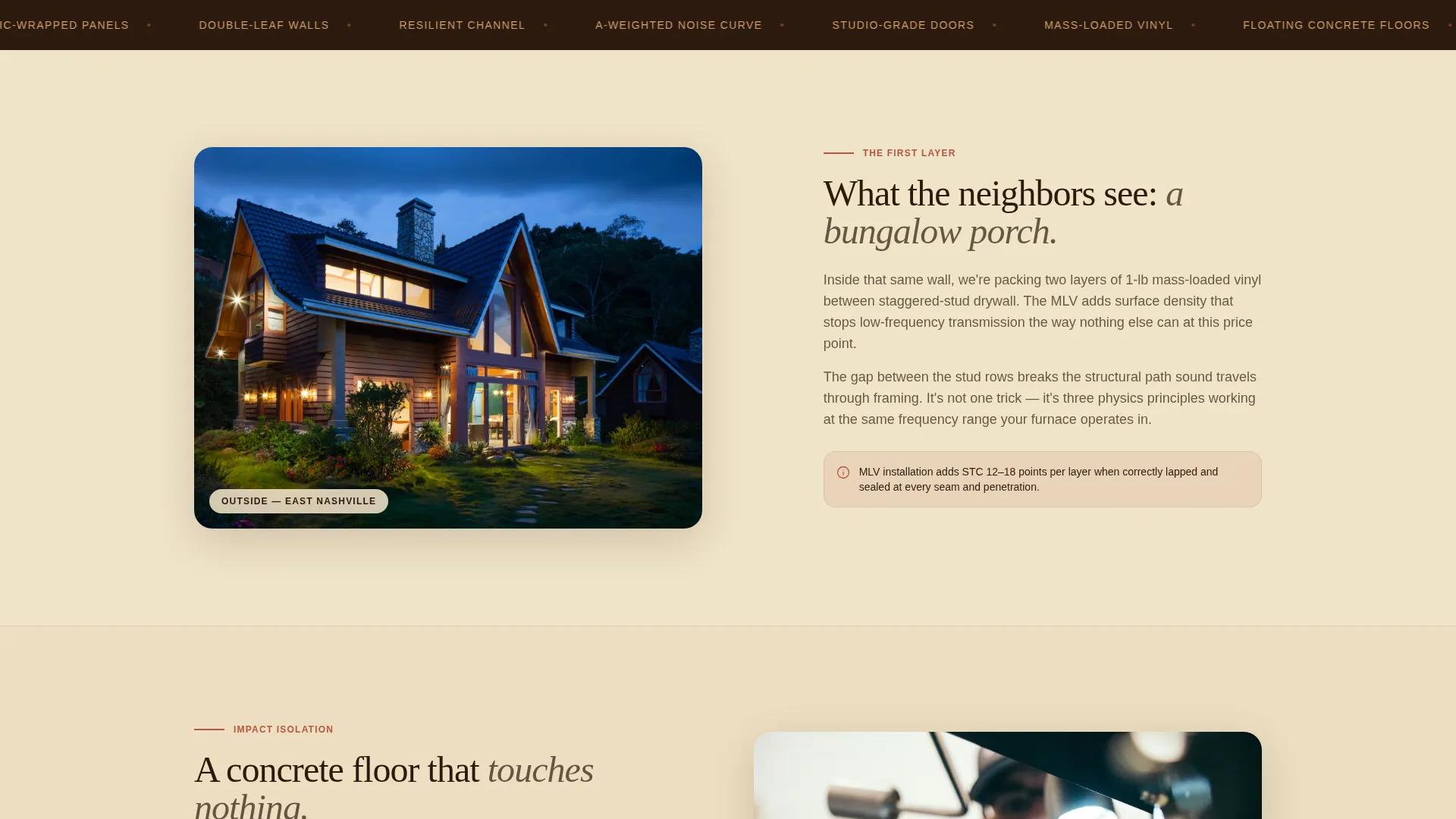
- A zigzag alternating section flow that pairs exterior house photography with interior construction detail
- Terracotta call-to-action buttons placed after the header and at every third section throughout the page
Feature list
This template delivers a focused set of layout and design features grounded entirely in the source brief. Each feature serves the goal of moving a homeowner or independent artist from curious visitor to consultation click.
Metrics Header with Residential Photography
The page opens with a full-width soft-focus photograph of a quiet residential street. Three performance numbers fade in one at a time over the image: average transmission loss in decibels, total rooms completed, and neighbor complaint count. The contrast between an ordinary neighborhood backdrop and extraordinary acoustic figures is the core trust mechanism of the header.
Zigzag Alternating Section Layout
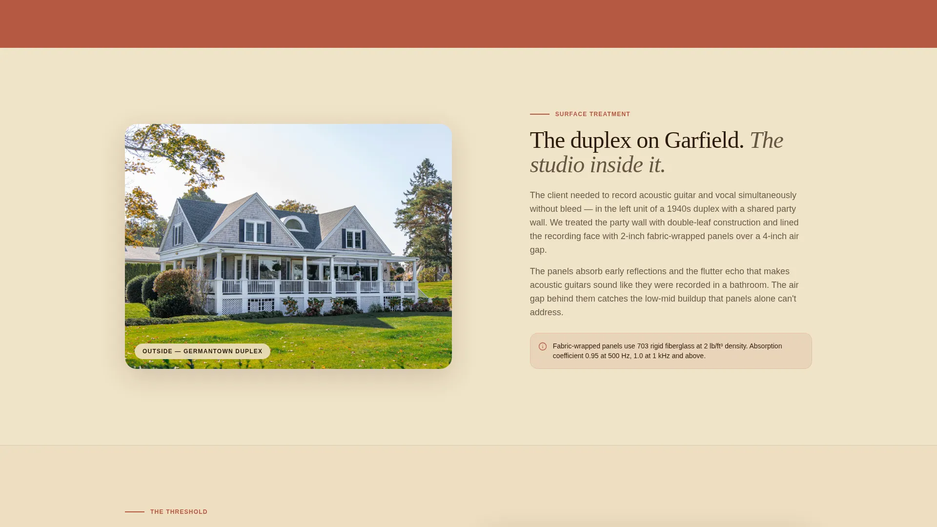
Sections alternate between left-image and right-text, then right-image and left-text. Exterior photography of bungalows, driveways, and converted garages appears on one side while copy explains what is happening inside those walls. The alternating rhythm creates a repeated threshold moment, moving the visitor from street noise to interior silence with every scroll.
Pastoral Calm Fire and Earth Color System
The palette centers on kiln-fired terracotta, sun-dried adobe, deep loam brown, and soft wheat. Terracotta carries all buttons and section dividers. Adobe warms secondary panel backgrounds. Loam grounds body text. Wheat fills open background space. The combination reads warm, handmade, and residential rather than industrial or corporate.
Click-Through Call to Action Structure
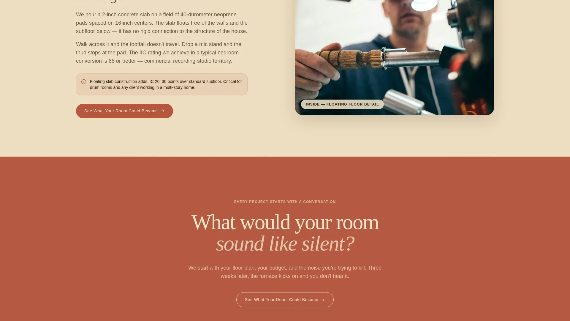
This page contains no contact form. Every call to action is a single terracotta button labeled "See What Your Room Could Become." The button appears first after the metrics header and repeats at every third section. Each click leads visitors to a room-type selector and photo upload consultation flow on a separate page.
Neighborhood-Scale Project Framing
Every visual reference on the page is a real house on a real street, not a commercial recording facility. This framing is a deliberate trust device. Visitors who live in bungalows or own converted garages see their own environment reflected back at them and understand immediately that this builder works at their scale.
Page sections overview
| Section | Purpose |
|---|---|
| Stats metrics header | Opens with residential street photo and three fading performance numbers |
| Primary call to action block | First terracotta button placement directly below the header |
| Exterior left zigzag | Shows outside of a residential build while text describes interior work |
| Interior right zigzag | Reveals finished interior while text explains construction science |
| Repeating call to action button | Terracotta button reappears at every third alternating section |
| Exterior duplex section | Features driveway or detached garage view with paired interior copy |
| Interior diffuser section | Shows acoustic panels and floating floor detail with technical explanation |
| Final call to action section | Closes the page with the consultation click prompt |
Design & branding system
The visual identity follows a Pastoral Calm theme expressed through the Fire and Earth color system. Every color choice reinforces warmth, craft, and residential scale rather than technical sterility.
- Kiln-fired terracotta (#B5563E) for all buttons and section dividers, sun-dried adobe (#D4A373) for secondary panel warmth, deep loam brown (#2C1A0E) for all body text, and soft wheat (#F0E3C8) as the dominant open background
- Photography style focuses on ordinary residential streets and real converted spaces, avoiding any commercial studio glamour
- The overall aesthetic reads like a clay pot cooling on a windowsill in late afternoon light: warm, grounded, and made by hand
Mobile & speed optimization
The zigzag layout is structured to restack cleanly on smaller screens without losing the inside-outside storytelling rhythm. Single-column mobile presentation keeps the image-text pairing legible at any viewport width.
- Alternating sections collapse to full-width image blocks followed by full-width text blocks on mobile
- The metrics header photograph and fading number sequence are designed to render clearly at phone screen dimensions
- Button sizing and tap targets follow comfortable touch interaction proportions throughout
How this template helps you convert
The entire page is engineered around a single conversion goal: getting a visitor to click through to the project consultation page. Every design and content decision supports that outcome.
- The metrics header earns immediate credibility by showing real acoustic performance figures before any sales language appears, pulling in technically minded buyers like audio engineers and producers.
- The zigzag neighborhood walk creates emotional resonance by reflecting the visitor's actual home environment, which removes the hesitation that comes from seeing only commercial-scale portfolio work.
- Repeated terracotta call-to-action buttons at predictable scroll intervals mean a visitor who is ready to act never has to scroll back up to find the next step.
Other information about this template
This template is built for the specialty construction niche where the sales cycle depends on trust at a residential scale. A few additional details worth noting before you build with it.
- The consultation flow linked from every call-to-action button is a separate page not included in this template; this template covers only the click-through landing page
- The page type is a landing page, meaning all content lives within a single scrollable view with no internal navigation to sub-pages
- The outdoor and indoor photography shown in the brief is directional; you supply your own project images to replace placeholder positions
- This layout works particularly well for builders whose completed projects are in suburban or residential neighborhoods, where showing the street-level context is itself a differentiator
Theme
Pastoral Calm
Creative direction
Local & Neighborhood
Color system
Fire & Earth
Style
Zigzag/Alternating
Direction
Click-Through
Page Sections
Metrics Header with Residential Photography
Zigzag Alternating Section Layout
Pastoral Calm Fire and Earth Color System
Click-through Call to Action Structure
Neighborhood-scale Project Framing
Related questions
Does this template include the consultation page it links to?
Can I update the three metrics in the header with my own numbers?
Is this template suitable if my projects are outside the American South?
What kind of photography works best in the zigzag sections?



