Wood & Furniture Manufacturing Professional Website Template
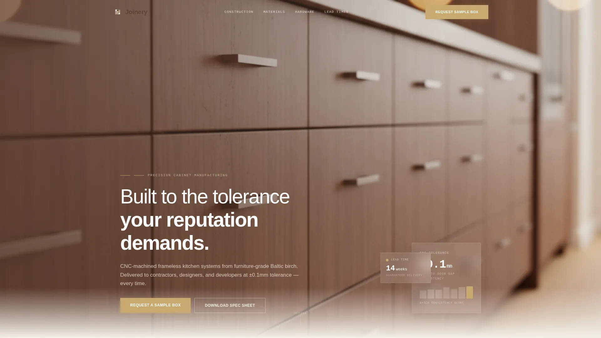
The Joinery Precision Cabinet landing page template is built for kitchen cabinet manufacturers targeting contractors, designers, and developers. A wide panoramic header, alternating zigzag layout, and side-by-side comparison sections work together to present construction quality as hard evidence. The warm stone color system and Corporate Precision theme give every section the weight of a showroom floor.
by Rocket studio
Quick summary
The Joinery template is a single-page landing page for a precision kitchen cabinet manufacturer. It uses a zigzag alternating layout to build a visual case for quality, section by section. Each panel pairs a large lifestyle or macro photograph with focused specification copy. The result feels less like a sales page and more like a product review you can trust.
Who this template is for
This template is designed for kitchen cabinet manufacturers who sell to trade buyers, not retail shoppers. If your clients need specification data before they commit, this layout speaks their language directly.
- General contractors bidding full gut renovations who need lead time and quality guarantees
- Interior designers specifying cabinetry for high-end residential projects who require cut-sheet data
- Property developers fitting out multiple identical units who need consistent delivery on a fixed schedule
What problem this template solves
Most cabinet manufacturer pages make claims without proof. Visitors read bullet points about "quality craftsmanship" and still pick up the phone uncertain. This template replaces vague language with photographic evidence and direct specification comparisons.
- Trade buyers compare multiple suppliers before shortlisting, and generic pages lose them fast
- Designers will not specify a product without cut-sheet data, so the page needs a clear document download path
- Contractors need to see lead times, warranty terms, and construction method before they will request a sample
What you get with this template
You get a fully structured single-page layout built around a prosecutorial comparison rhythm. Every section is designed to answer one more objection before the visitor reaches the call to action.
- A panoramic header section with a full-width image and a headline overlay positioned over the left third
- Six alternating zigzag content sections covering construction method, material grades, hardware, finishes, lead times, and warranty
- Two conversion points: a physical sample request form and a gated specification sheet download
Feature list
This section outlines the core layout components and design capabilities built into the template.
Panoramic Full-Width Header
The header stretches edge to edge at chest height, mimicking an architectural elevation drawing. A shallow depth-of-field image focuses on the nearest cabinet reveal while the far end softens into warm bokeh. The headline fades in over the left third of the image.
Zigzag Alternating Content Sections
Each content section alternates a large image on one side with specification copy on the other. The rhythm mirrors the L-shaped and galley kitchen layouts the manufacturer produces. Six panels escalate the argument from construction method through to warranty terms.
Comparison-Led Section Framing
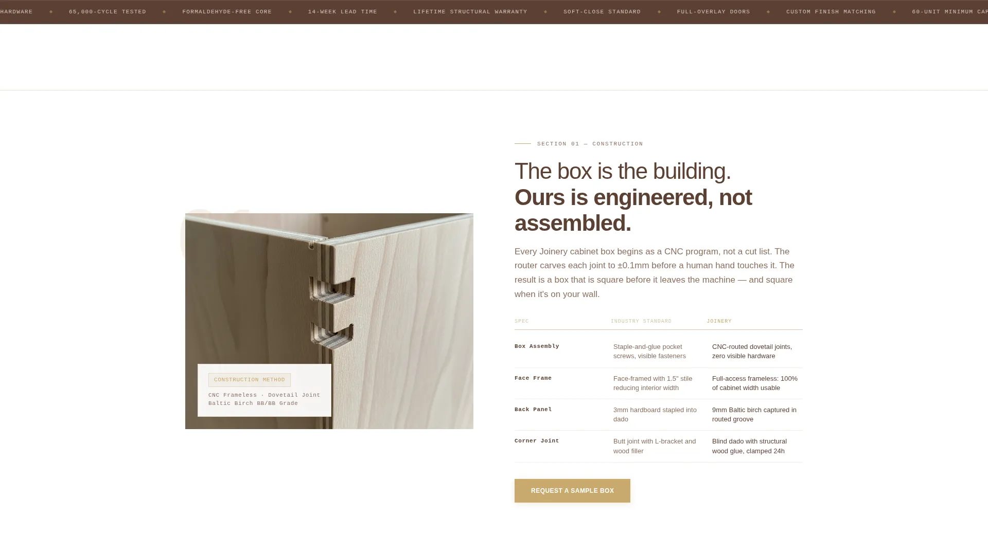
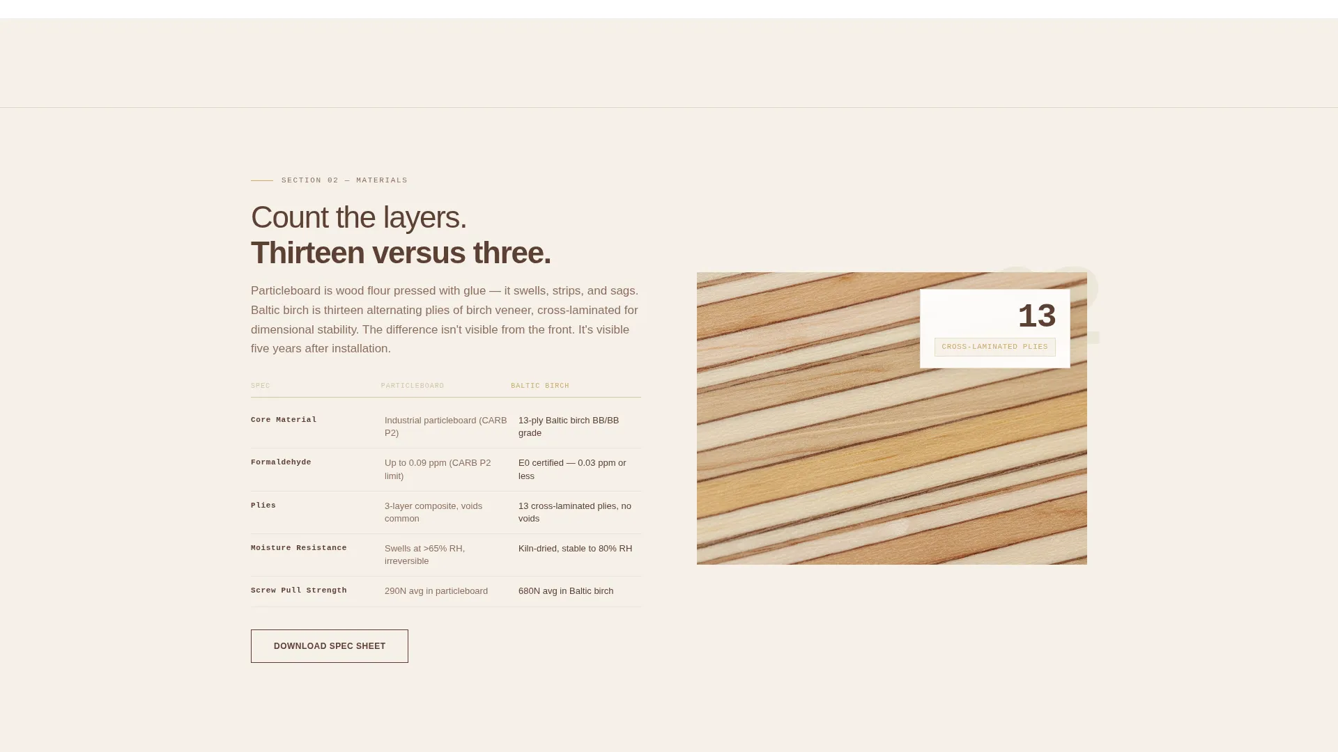
Every panel is structured as a visual "Them versus. Us" comparison without naming competitors. Side-by-side specs, material cross-sections, and exploded axonometric diagrams let the visitor draw their own conclusions from the evidence presented.
Physical Sample Request Form
The primary conversion point is a form that collects name, company, project type, and shipping address to send a physical cabinet sample to the contractor's office. It appears after the construction comparison section and repeats after the warranty section.
Gated Specification Sheet Download
A secondary conversion path offers a downloadable specification sheet as a gated PDF. This targets designers who need cut-sheet data before they will consider a phone call, giving them a clear reason to engage without committing to a sample request.
Warm Stone Branding System
The template ships with a complete color system built around quartzite cream, honed travertine, kiln-dried walnut, and brushed brass. Backgrounds alternate between quartzite cream and pure white. Section dividers use a single-pixel travertine rule that reads like a grout line.
Page sections overview
| Section | Purpose |
|---|---|
| Panoramic Header | Establish precision positioning with a full-width kitchen image and headline overlay |
| Construction Method | Compare box construction versus. frameless with exploded axonometric diagrams |
| Material Grade | Show particleboard core versus. furniture-grade plywood using macro lamination photography |
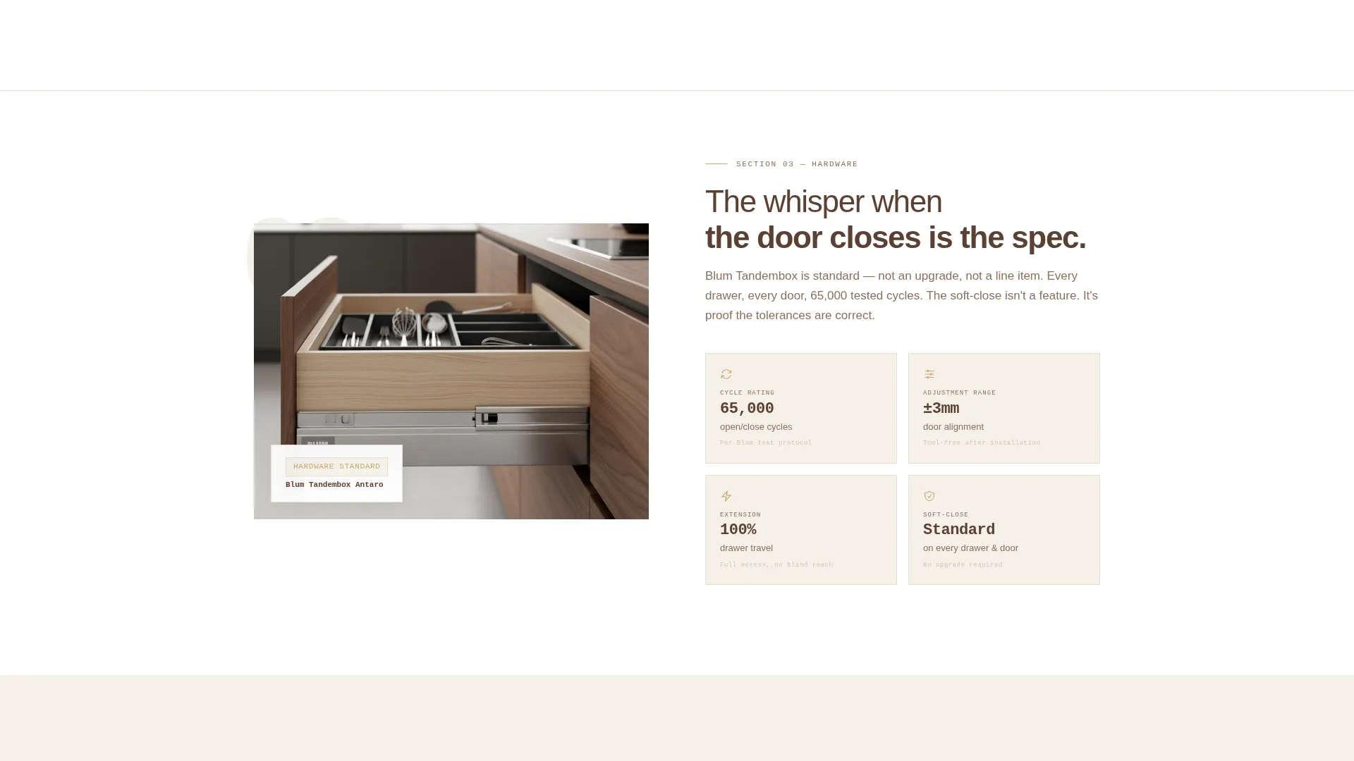
| Hardware Detail | Present hinge and drawer system quality through close-up product photography |
| Finish Durability | Demonstrate surface quality and long-term finish performance side by side |
| Lead Times | Communicate consistent delivery schedules for multi-unit and single-project clients |
| Warranty Terms | Display warranty timelines that reinforce confidence before the final call to action |
| Sample Request Form | Convert trade buyers with a physical cabinet sample shipped to their office |
| Spec Sheet Download | Capture designer leads with a gated cut-sheet PDF download |
Design & branding system
The template uses a Corporate Precision theme grounded in a Warm Stone color palette. The overall feel resembles a showroom kitchen photographed at golden hour, where every surface earns its place.
- Quartzite cream (#F5F0E8) and pure white alternate as section backgrounds; kiln-dried walnut (#5C4033) is used for all body text; brushed brass (#C9A96E) is reserved for call-to-action buttons and interactive highlights
- Honed travertine (#D4C5A9) appears as a single-pixel section divider rule between panels, creating a grout-line visual rhythm that reinforces the architectural tone
- Photography direction follows a Spatial and Architectural creative brief, with macro close-ups for material comparisons and wide lifestyle shots for context sections
Mobile & speed optimization
The layout is structured to remain clear and scannable on smaller screens. The zigzag alternation adapts so image and copy stack vertically without losing the comparison logic.
- The panoramic header image is positioned to keep the headline legible at all common mobile viewport widths
- Each alternating section is built to reflow gracefully, keeping image and specification copy in a readable vertical sequence
- The two conversion forms are compact enough to complete on a mobile device without excessive scrolling
How this template helps you convert
The page is designed to earn the conversion before asking for it. By the time a visitor reaches either call to action, they have already reviewed six panels of photographic and specification evidence.
- The physical sample request form removes purchase hesitation by offering something tangible. A contractor who holds the product in their hands is far closer to a decision than one who read a spec sheet online.
- The gated specification sheet download captures designers who are not ready to call but are actively researching. It turns a passive browser into a named lead with a documented project interest.
Other information about this template
This template is built specifically for the kitchen cabinet manufacturing niche within the broader wood and furniture manufacturing category. It is part of the Manufacturing and Industrial template collection.
- The template style is classified as Zigzag/Alternating, making it well suited to any manufacturer who needs to present product evidence in a structured, side-by-side format
- The header concept is Panoramic/Wide, which works especially well for products where scale and precision are best shown in a single unbroken horizontal image
- The landing page direction is Comparison/Versus, a proven structure for trade-facing manufacturers where the buyer is already comparing multiple suppliers before making contact
- This template can support custom photography swaps while keeping the layout structure and branding system intact
Theme
Corporate Precision
Creative direction
Spatial & Architectural
Color system
Warm Stone
Style
Zigzag/Alternating
Direction
Comparison/Versus
Page Sections
Panoramic Full-width Header
Zigzag Alternating Layout
Comparison-led Section Framing
Physical Sample Request Form
Gated Specification Sheet Download
Warm Stone Color System
Related questions
Who is the primary audience for this landing page template?
What are the two conversion paths included in this template?
How does the comparison layout work without naming competitors?
Can I swap the photography in this template?
Is this template suitable for manufacturers with multiple product lines?