Mid-Century Modern Architecture Specialist Blog Website Template
Joinery is an overlap/layered landing page template for mid-century modern furniture designers. It combines a full-bleed cinematic hero, manifesto-style editorial sections, and a scroll-driven parallax layout to build desire through restraint. The page guides visitors toward a single brass call to action, driving them to explore the full collection catalog.
by Rocket studio
Quick summary
Joinery is a single-page editorial template built for artisan furniture studios working in the mid-century modern tradition. It uses overlapping photography, hand-drawn sketch layers, and typographic declarations to tell a designer's story through restraint. The entire scroll drives toward one purpose: earning a click to the collection catalog.
Who this template is for
This template suits anyone who sells or commissions considered, handcrafted furniture and needs a page that feels as refined as the work itself.
- Design-obsessed homeowners renovating mid-century ranches who want to feel the craft before they commit
- Architects and interior designers furnishing completed projects who need a credible, specification-ready first impression
- Boutique hoteliers sourcing statement pieces that anchor a lobby or suite
What problem this template solves
Most furniture studio pages overwhelm visitors with grids, filters, and competing calls to action. The result is a page that looks like a catalog before the visitor has reason to care. Joinery solves that by sequencing desire first and product second.
- It removes friction and navigation so nothing interrupts the editorial experience
- It builds emotional investment through layered visuals and manifesto copy before asking for any action
- It gives trade professionals a restrained, confident first impression that signals studio-level seriousness
What you get with this template
You get a fully structured, single-page editorial layout with every section pre-composed and ready to populate with your own photography and copy.
- A six-section page flow from full-bleed hero through manifesto, principles bento, parallax declaration, testimonials, and a final call to action moment
- Scroll-driven animations powered by GSAP ScrollTrigger, including staggered reveals, cursor parallax on the hero, and a fixed brass call to action bar that appears after the manifesto opening
- A complete Luxe Minimal design system using a four-color Ink and Paper palette with Fraunces editorial serif and DM Sans for body text
Feature list
Full-Bleed Cinematic Hero
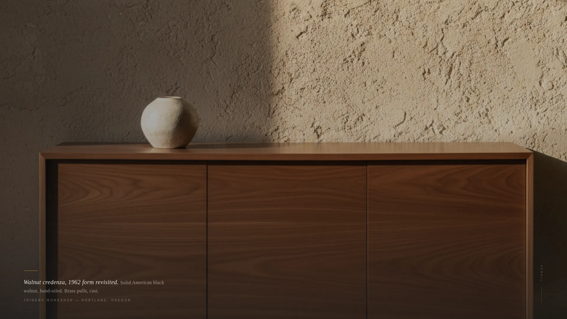
The hero fills the entire viewport edge to edge with a low, wide cinematic photograph. A single line of editorial serif type fades in at the bottom third like a gallery placard. There is no navigation and no logo, letting the piece and the light do all the talking.
Manifesto Editorial Sections
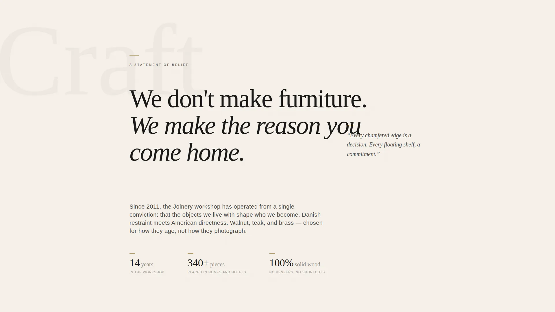
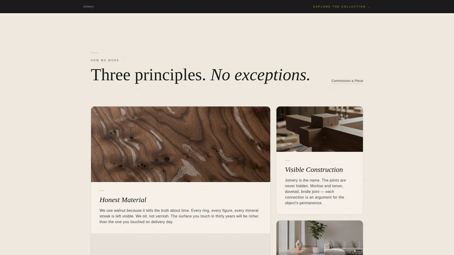
Three principle sections use an asymmetric overlap layout where photography, hand-drawn process sketches, and typographic declarations stack on the z-axis. Each scroll reveal peels back a finished glamour shot to expose process imagery underneath, creating a sense of depth and authorship.
Fixed Brass Call to Action Bar
After the manifesto opening, a subtle fixed bar appears at the bottom of the screen with the primary call to action in oxidized brass on deep ink. It persists through the scroll without interrupting the reading experience, keeping the path to the catalog always within reach.
Parallax Declaration Section
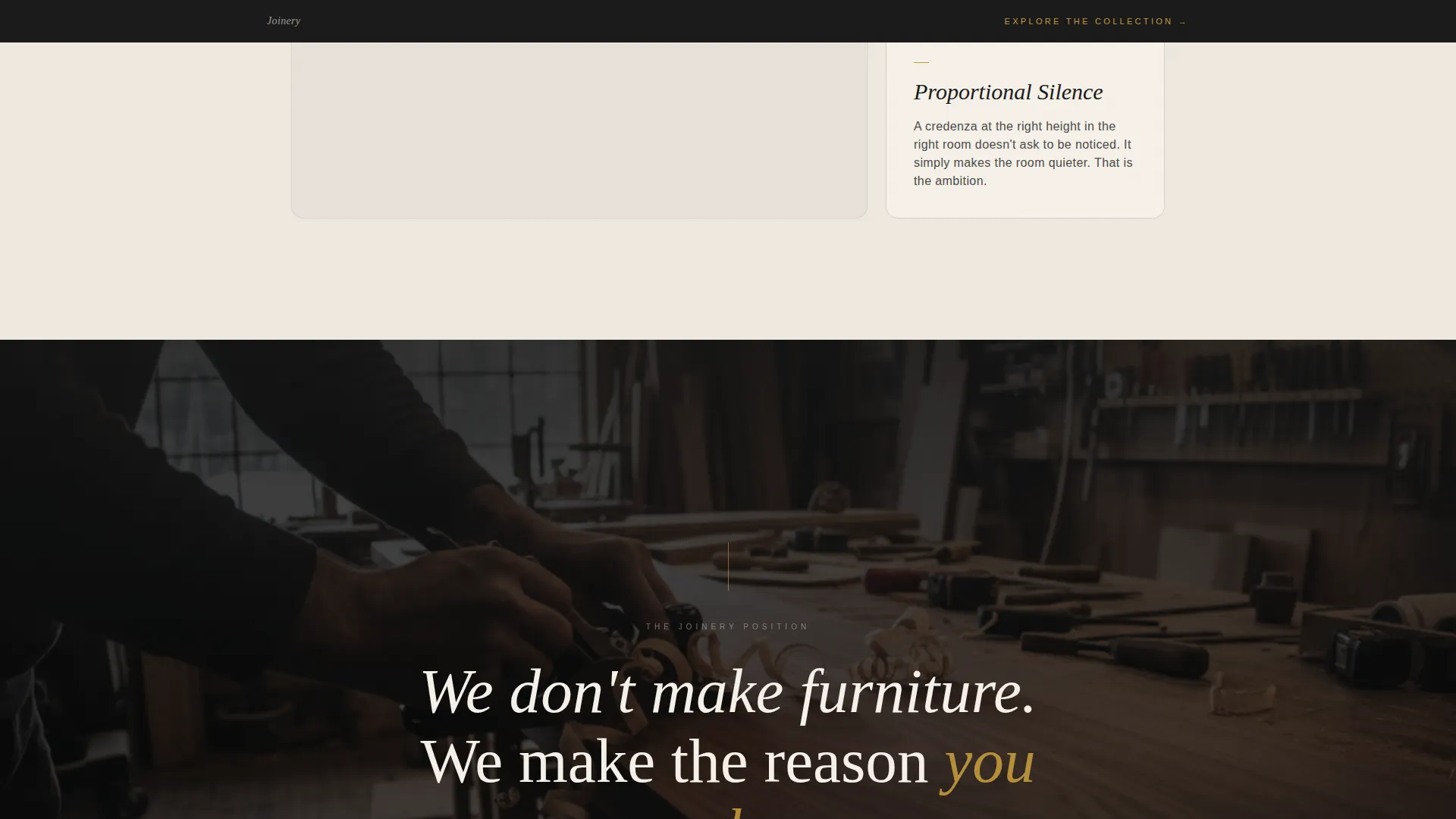
A full-viewport section carries the studio's central belief statement in large editorial type with a parallax background. The pacing slows here deliberately, giving the visitor a moment to absorb the message before the scroll continues.
Client Voices Section
Two testimonials presented in serif italic, one from an architect and one from a homeowner, provide social proof without visual noise. The restraint of the layout gives each voice weight.
Full-Width Collection Call to Action
The final section is a full-width moment with the primary call to action rendered in brass on ink. A secondary text link, "Commission a Piece," appears once here for trade visitors ready to start a direct conversation.
Page sections overview
| Section | Purpose |
|---|---|
| Full-Bleed Hero | Opens with cinematic craft photography and a fade-in editorial placard |
| Manifesto Opening | Establishes studio voice with overlapping type, sketches, and the fixed brass bar |
| Three Principles Bento | Presents Honest Material, Visible Construction, and Proportional Silence in an asymmetric grid |
| Parallax Declaration | Delivers the central belief statement at full-viewport scale with parallax motion |
| Client Voices | Carries two restrained serif testimonials from an architect and a homeowner |
| Full-Width Call to Action | Closes the page with the primary catalog link and a secondary commission text link |
Design & branding system
The template uses a Luxe Minimal visual identity built on an Ink and Paper color system. Every design decision favors intentional marks over decoration, letting white space carry as much meaning as the type and imagery.
- Four-color palette: deep sumi ink (#1A1A1A), warm unbleached cotton (#F5F0E8), pencil graphite (#4A4A48), and oxidized brass (#C49A3C) reserved for hover states, line rules, and calls to action
- Typography pairing of Fraunces for editorial serif headings and declarations, and DM Sans for clean sans-serif body text
- Overlap/layered composition style where photography, sketch assets, and type occupy the same z-axis plane, creating depth without additional user interface elements
Mobile & speed optimization
The template is designed desktop-first to serve architects and design professionals who review references on large screens. It is fully responsive and adapts cleanly to smaller viewports.
- Scroll-triggered animations use GSAP ScrollTrigger with Client Components isolated for interactive behavior, keeping static sections lean
- Image zoom on hover and scroll-linked layer reveals are scoped to client-side rendering so they do not affect the load behavior of static content
- The layout preserves the editorial pacing and white space rhythm on tablet and mobile, so the manifesto experience holds across devices
How this template helps you convert
Joinery converts by building desire before asking for action. The page is structured so every scroll deepens investment, and the call to action only appears once the visitor has earned it through the experience.
- The fixed brass bar introduces the primary call to action early and keeps it visible without interrupting the editorial flow, so visitors always have a frictionless path to the catalog
- The manifesto structure and parallax declaration create emotional momentum that makes the "Explore the Collection" moment feel like a natural conclusion rather than a sales prompt
Other information about this template
This template is part of the Architecture and Design category, within the Mid-Century Modern Architecture subcategory, targeting the Mid-Century Modern Furniture Designer niche.
- The Overlap/Layered template style and Manifesto creative direction make this layout suitable for any luxury artisan studio that leads with craft and point of view before product
- The Click-Through landing page direction means there is no form, no sign-up, and no friction: the only goal is earning the catalog visit
- The footer uses a minimal horizontal pattern (Pattern 3, Vercel Horizontal), keeping the close of the page as considered as the rest of the layout
- The template supports both business-to-consumer and business-to-business paths: the primary call to action serves homeowners, while the "Commission a Piece" text link opens a low-friction route for architects and hoteliers
Theme
Luxe Minimal
Creative direction
Manifesto
Color system
Ink & Paper
Style
Overlap/Layered
Direction
Click-Through
Page Sections
Full-bleed Cinematic Hero
Manifesto Editorial Layout
Fixed Brass Call to Action Bar
Parallax Declaration Section
Scroll-driven GSAP Animations
Dual Call to Action Structure
Related questions
Who is this landing page template designed for?
Can I use this template if I sell pieces beyond walnut and teak?
Does this template include a contact form or booking system?
What makes the scroll experience feel different from a standard furniture page?
Can the calls to action be customized to point to different destinations?



