Carpenter Reviews & Testimonials Landing Page Template
The Joinery landing page template is built for carpenters who earn trust through results. It leads with hard performance stats, a side-by-side comparison table, and verified testimonials structured as mini case studies. The design uses a dark, authoritative palette to frame every review as evidence. Two conversion paths, instant booking and a reviews download, serve visitors at different stages of readiness.
by Rocket studio
Quick summary
This is a single-page landing page template for independent carpenters and joinery specialists. It opens with proof before pitch: a bold stat headline, a structured comparison table, and photo-backed testimonials. Two clear calls to action capture visitors ready to book and those still weighing their options. The design is dark, credible, and built around earned trust.
Who this template is for
This template suits skilled tradespeople who rely on reputation rather than advertising spend. It is designed for carpenters who already have strong client feedback and want a page that makes that evidence impossible to ignore.
- Independent carpenters and joinery specialists seeking their first professional online presence
- Established tradespeople replacing a basic website with a high-trust reviews and testimonials page
- Carpentry businesses targeting homeowners, property managers, and renovation clients who compare multiple quotes
What problem this template solves
Homeowners who have been let down by unreliable contractors do not take promises at face value. They look for specific proof. This template replaces vague claims with structured, verifiable evidence presented in a format that serious buyers actually trust.
- No clear way to differentiate a skilled carpenter from cheaper, less reliable competitors
- Positive reviews scattered across platforms with no single page that compiles and frames them professionally
- Visitors leaving before booking because the page offers no secondary path for cautious researchers
What you get with this template
You get a fully structured landing page that presents your reputation as a professional record. Every section is ordered to raise buyer confidence before asking for a commitment.
- A stat-first hero section with a bold headline, key performance numbers, and a sticky booking call to action
- A three-column comparison table contrasting your standards against industry averages and client expectations
- Testimonial blocks formatted as mini case studies with project photos, scope descriptions, and verified source labels
- A dual-path conversion section: a booking form for ready visitors and a reviews PDF download for those still deciding
Feature list
This landing page template is built around a clear editorial logic: evidence first, invitation second. Each feature below serves that sequence directly.
Stats-First Hero Section
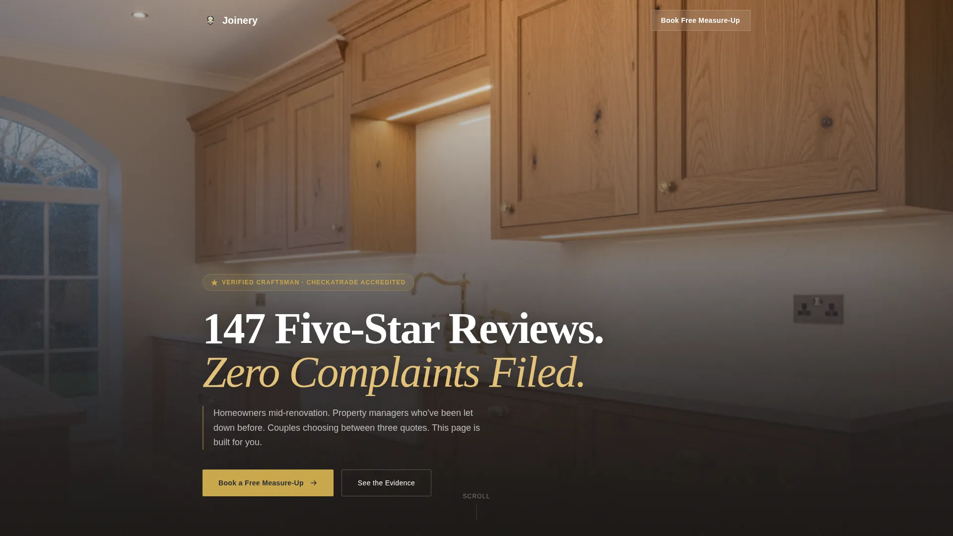
The page opens with a full-bleed dark photograph of a finished carpentry installation. A single oversized stat fades in at high visual weight before any testimonial appears. Supporting performance metrics follow in their own rows, each presented like a line of evidence entered into a formal record.
Side-by-Side Comparison Table
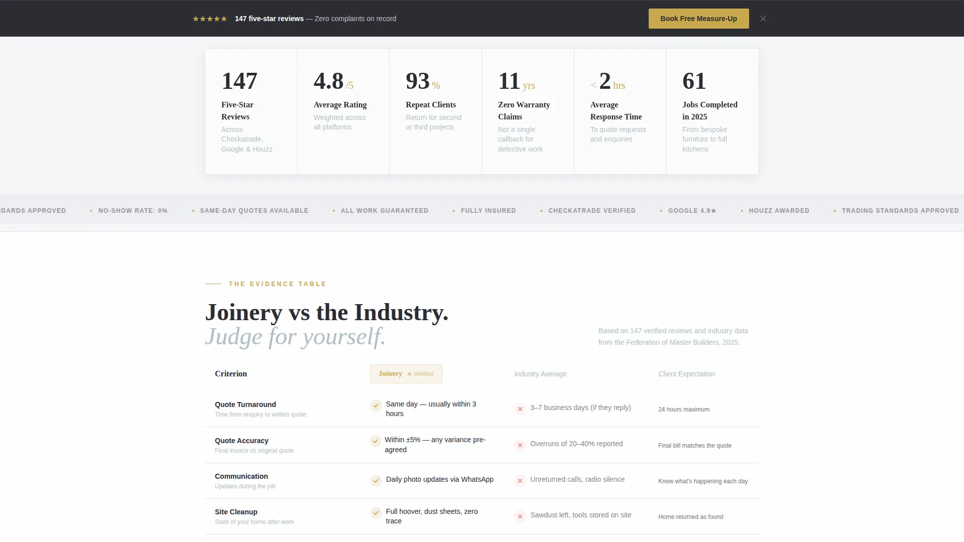
A three-column table compares this carpenter against the industry average and stated client expectations. Categories include communication speed, quote accuracy, cleanup standards, and post-job follow-up. The table gives undecided visitors a structured reason to choose without requiring them to read every review.
Mini Case Study Testimonials
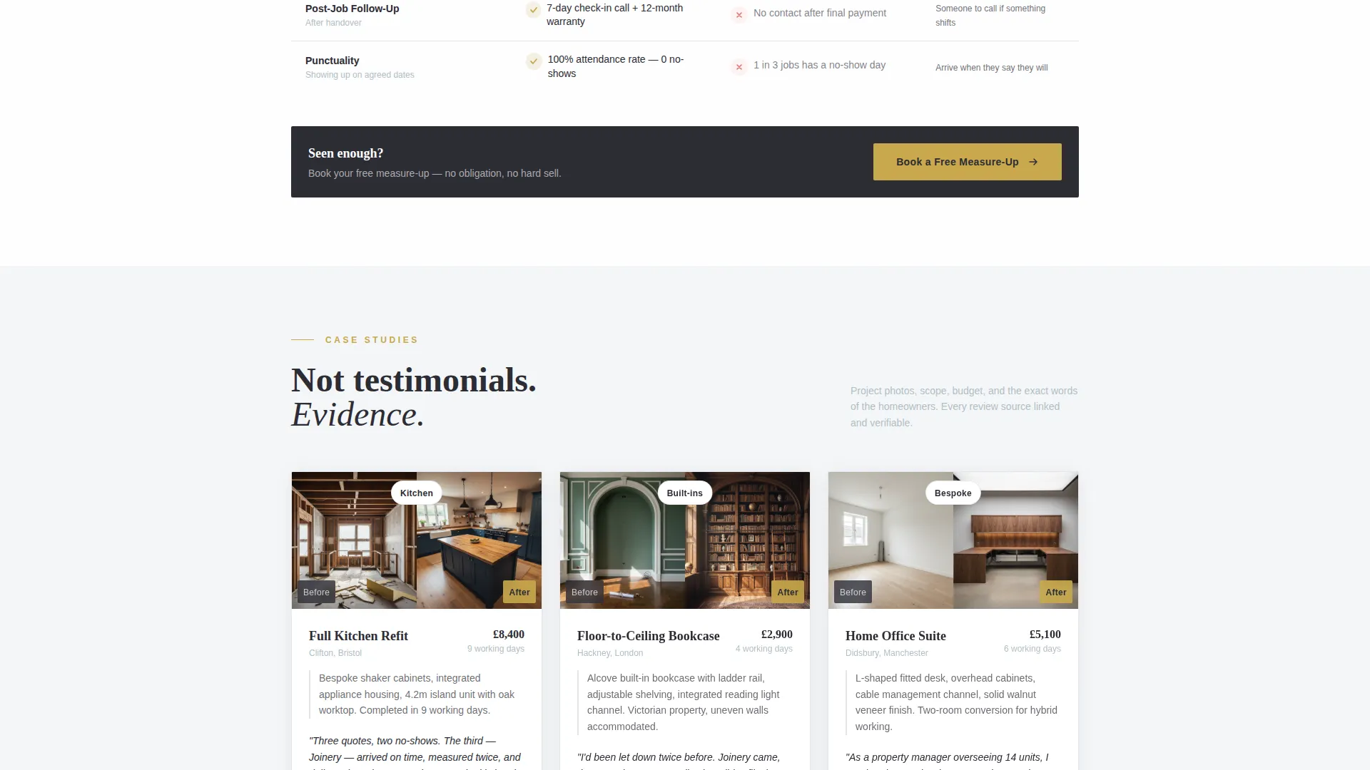
Testimonials are presented as project-led case studies rather than simple praise cards. Each block includes a project photo, a brief scope description, and a verified review source label. This format builds specificity and credibility in a way that generic star-rating displays cannot.
Dual-Path Conversion Design
The primary call to action, "Book a Free Measure-Up", appears three times across the page: pinned to the bottom of the viewport, inline after the comparison table, and anchoring the final testimonial cluster. A secondary option invites visitors to download a compiled reviews document in exchange for their email address, creating a second capture path for cautious researchers.
Structured Booking Form
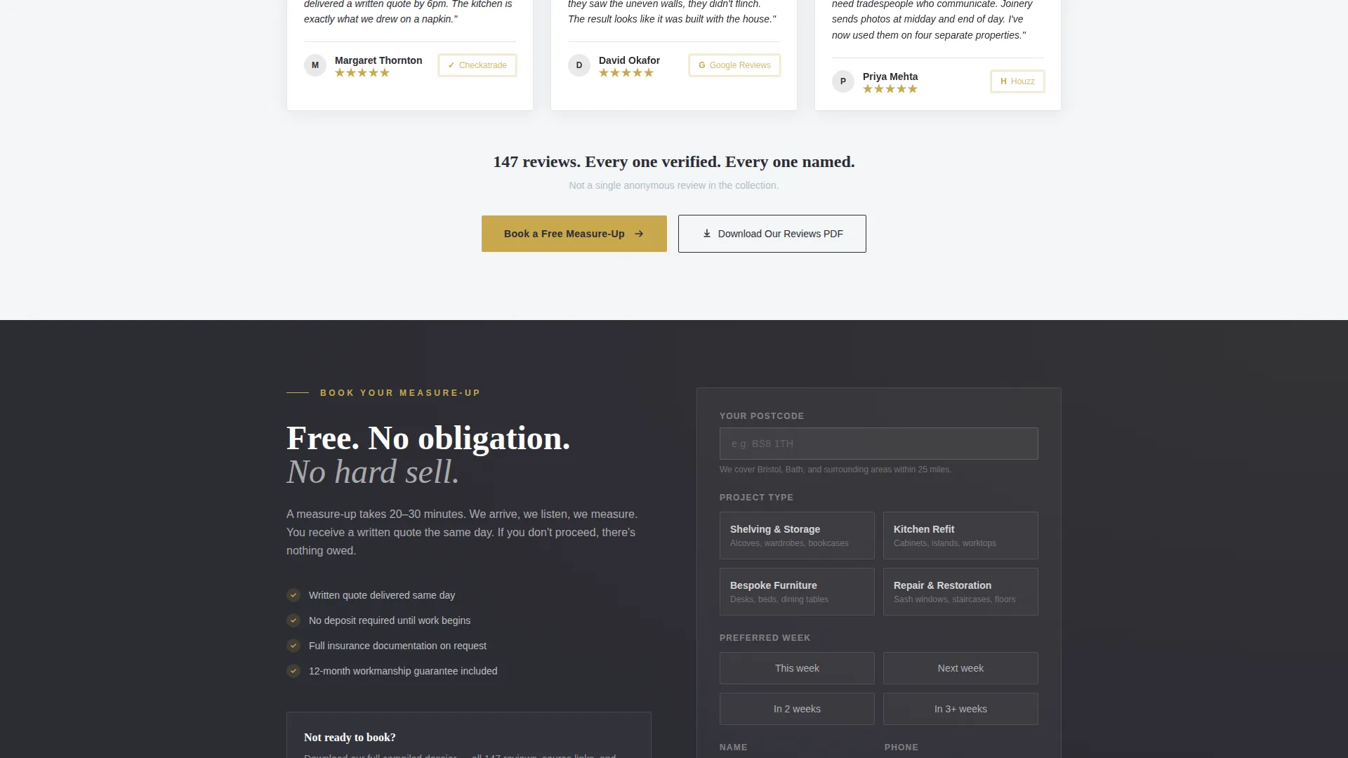
The inline booking form guides visitors through three focused steps: postcode entry, project type selection (shelving, kitchen, bespoke furniture, or repair), and preferred week. The short field sequence keeps friction low while gathering the information needed to qualify the enquiry.
Legal Shield Visual Theme
The design applies a "Legal Shield" visual language where every layout choice reinforces authority and accountability. Notary-seal gold highlights star ratings, verified badges, and the primary call-to-action button. The overall effect feels like a signed document laid flat on a workbench.
Page sections overview
| Section | Purpose |
|---|---|
| Dark Hero Image | Sets authoritative tone with a full-bleed dusk photograph of finished joinery work |
| Stat Impact Row | Delivers hard performance numbers before any testimonial loads |
| Comparison Table | Contrasts this carpenter against industry averages and client expectations across four criteria |
| Mini Case Studies | Presents verified testimonials as project-led records with photos and scope details |
| Inline Booking call to action | Captures ready visitors with a three-step form after the comparison table |
| Reviews PDF Offer | Provides an email-capture secondary path for visitors not yet ready to book |
| Final Testimonial Anchor | Closes the page with a grouped testimonial cluster and the last booking call to action |
Design & branding system
The visual identity follows a "Legal Shield" theme rendered in the Cloud Canvas color system. The palette feels like a signed contract on a workshop bench: authoritative paper tones grounded by the weight of well-used tools.
- Soft cumulus white (#F4F6F8) and overcast gray (#B0BEC5) provide the background and text hierarchy across light content areas
- Deep charcoal woodgrain (#2C2C34) anchors the hero, comparison table rows, and section dividers with a dark, trustworthy weight
- Notary-seal gold (#C9A84C) is used exclusively for star ratings, verified badges, and the primary call-to-action button to preserve its visual authority
Mobile & speed optimization
The layout is structured so that every key trust signal reads clearly on a small screen. The sticky booking button remains accessible throughout the scroll without blocking content.
- Single-column stacking for the stat rows and testimonial case studies keeps mobile reading fast and uncluttered
- The comparison table adapts for narrow viewports so all three columns remain readable without horizontal scrolling
- The booking form uses minimal required fields, reducing tap friction for visitors arriving on mobile devices
How this template helps you convert
Every section is ordered to move a skeptical visitor toward a booking decision. Trust is built before the first call to action appears, and a second path catches visitors who need more time.
- The stat headline and performance metrics establish credibility within the first few seconds of the visit, before a single testimonial is read
- The comparison table gives undecided visitors a clear, scannable reason to choose this carpenter over alternatives without requiring them to read every review
- The dual-path conversion design means no visitor leaves empty-handed: ready buyers book directly, while cautious researchers download the reviews document and stay in the pipeline
Other information about this template
This template is designed specifically for the carpenter reviews and testimonials page use case within the broader carpenter online presence category. It sits within the Professional Services niche and is well suited to trades professionals who want their reputation to do the selling.
- The template style is a comparison table landing page, making it particularly effective for visitors who arrive already comparing multiple tradespeople
- The creative direction is Stats-First Impact, meaning the page leads with numbers and structured data rather than brand storytelling
- The header concept uses a Dark Full-Bleed and Glow approach: a dusk interior photograph with warm light glowing from the finished installation
- Navigation is intentionally hidden on initial load and only becomes visible once the visitor begins to scroll, keeping full attention on the opening stat headline
- The "Download Our Reviews PDF" secondary path is a low-commitment offer that captures contact details from visitors at an earlier stage of the decision process
Theme
Legal Shield
Creative direction
Stats-First Impact
Color system
Cloud Canvas
Style
Comparison Table
Direction
Booking/Scheduling
Page Sections
Stats-first Hero with Sticky Call to Action
Three-column Comparison Table
Mini Case Study Testimonials
Dual-path Conversion Design
Legal Shield Visual Theme
Related questions
Can I edit the stats and numbers in the hero section?
How does the comparison table work?
What if I do not have project photos for the testimonial blocks?
Who is this landing page template best suited for?
Does the template include both a booking form and a secondary lead capture option?



