Historic Home Inspection Landing Page Template
Joists is a card-grid landing page built for historic home inspection specialists. It pairs a typographic stats header with a modular, hover-activated system explorer to turn visitor curiosity into booked appointments. The charcoal and amber palette signals authority without a single stock photo. One persistent call-to-action button closes the loop on every card.
by Rocket studio
Quick summary
Joists is a single-page, booking-focused landing page for pre-war and historic home inspection services. The layout opens with four oversized metric cards, then flows into a modular grid where each card represents a structural system. Visitors explore at their own pace, building confidence card by card, until one amber button moves them to book.
Who this template is for
This template is built for inspection professionals whose entire practice centers on older homes. If your clients arrive already anxious about century-old framing or knob-and-tube wiring, this page meets them at that level of specificity.
- Historic home inspectors serving pre-war, craftsman, or Tudor-era properties
- Preservation-minded inspection firms working with estate attorneys and buyers under contract
- Specialists who want their credentials to speak before a single word of body copy is read
What problem this template solves
Generic inspection websites look the same regardless of whether the inspector has touched a 1924 Tudor or a 2004 townhouse. That sameness costs specialists their most qualified leads. Buyers losing sleep over a sagging parlor floor need a page that speaks directly to century-old construction, not one built for new-build home walkthroughs.
- Visitors cannot quickly tell whether an inspector truly understands historic systems
- A standard contact form feels too casual for high-stakes heritage property decisions
- There is no visual proof of specialization before the visitor loses trust and leaves
What you get with this template
The template delivers a complete, single-page layout structured around one clear goal: earning the booking click. Every section contributes to a building sense of authority, from the opening stats dashboard to the final persistent button.
- A four-card typographic stats header displaying credentials at a glance
- A six-category modular card grid with hover-flip behavior revealing finding excerpts and inspection photo thumbnails
- A persistent amber call-to-action button that follows the visitor through the full page scroll
Feature list
This template is built from deliberately chosen components. Each one does a specific job in moving the visitor from interested to convinced.
Typographic Stats Dashboard
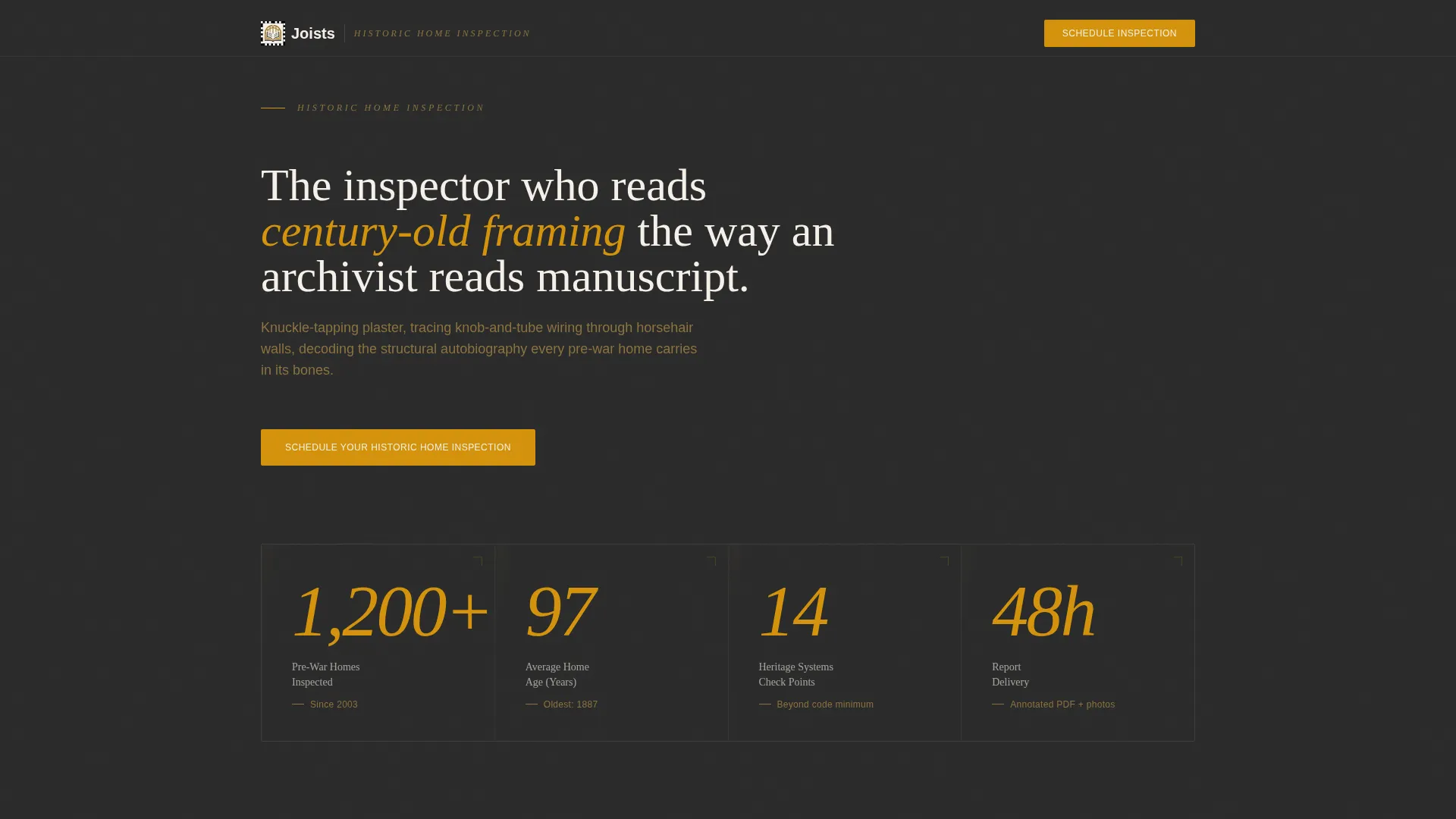
Four oversized cards stretch across the viewport. Each card pairs a dramatically scaled amber numeral with a thin-weight serif label. The figures shown are "1,200+ Pre-War Homes Inspected," "Avg. Home Age: 97 Years," "14-Point Heritage Systems Check," and "48-Hour Report Delivery." No photography competes with the numbers.
Hover-Flip System Grid
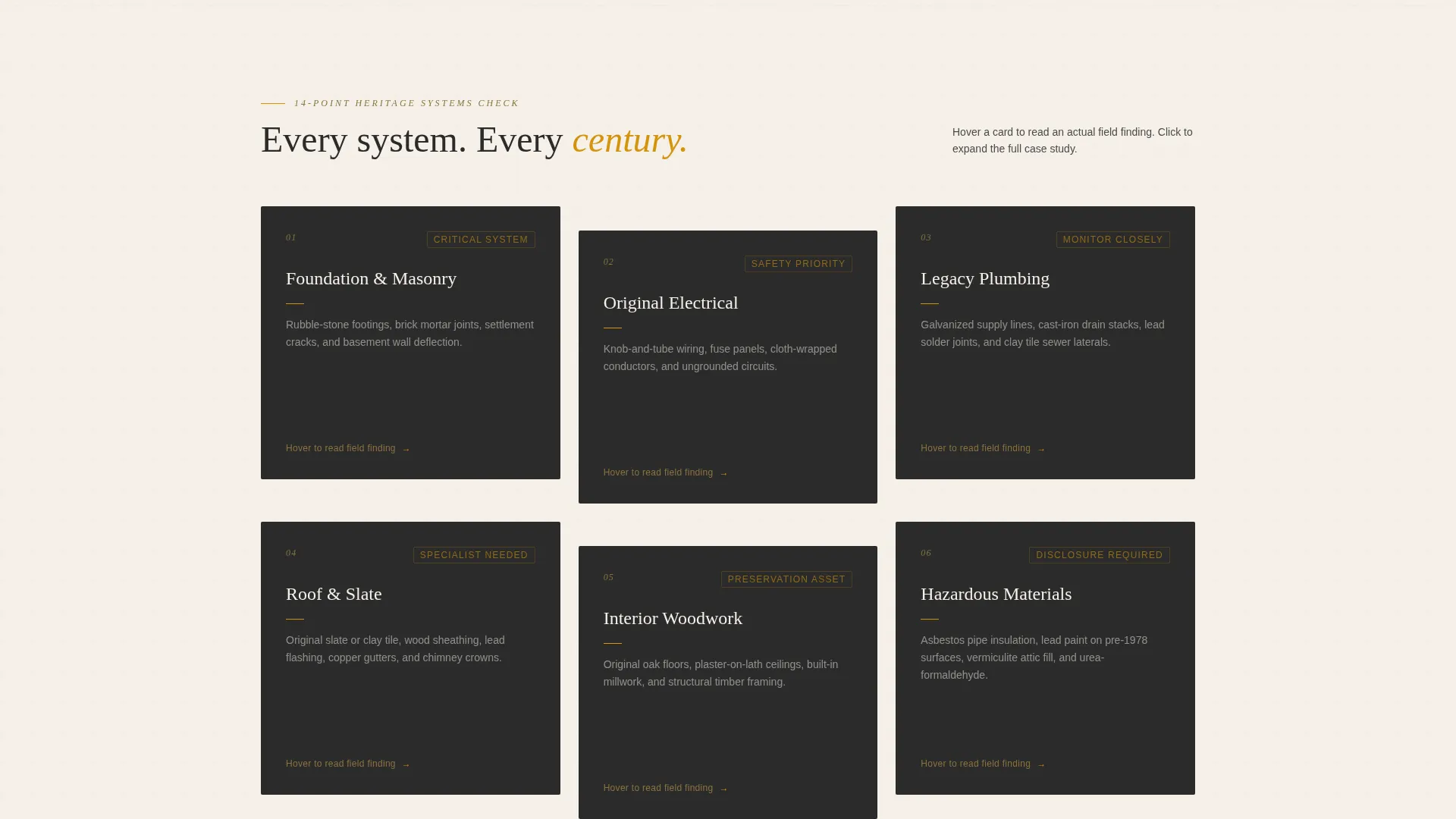
Six modular cards cover the core inspection categories: foundation and masonry, original electrical, legacy plumbing, roof and slate, interior woodwork, and hazardous materials. On hover, each card flips to reveal a short finding excerpt alongside an inspection photo thumbnail. The interaction turns passive browsing into an active walkthrough.
Expandable Mini Case Studies
Each card in the grid can expand into a focused case study view. Visitors see before-and-after detail shots relevant to the system category they selected. The format lets evidence accumulate naturally rather than front-loading every claim on the page.
Persistent Booking Button
The amber "Schedule Your Historic Home Inspection" button appears first beneath the stats header, then remains fixed at the bottom of the viewport as the visitor scrolls. There is no form on this page. The button earns its click through the explorer format alone.
No-Photography Authority Layout
The header section intentionally excludes photography. Credentials are expressed entirely through typography, scale, and the amber numeral treatment. This restraint signals a specialist who trusts their record, not stock imagery.
Page sections overview
| Section | Purpose |
|---|---|
| Stats header cards | Display four key credential metrics at viewport scale |
| Primary booking button | Drive the first call-to-action click below the header |
| System category grid | Let visitors self-select which inspection concern to explore |
| Hover-flip card reveals | Surface finding excerpts and photo thumbnails on interaction |
| Expandable case studies | Deepen conviction with before-and-after inspection detail |
| Persistent floating button | Maintain constant booking access throughout scroll |
Design & branding system
The visual identity follows a Luxe Minimal theme. Every color and type decision is calibrated to feel like a leather-bound survey report open under a banker's lamp: restrained, authoritative, and just warm enough to hold attention.
- Color palette: deep hearth charcoal (#2B2B2B) for backgrounds, aged plaster off-white (#F5F0E8) for text fields, warm amber (#D4930D) for interactive highlights and the booking button, and tarnished brass (#8B7340) for secondary accents
- Typography: thin-weight serif faces carry the headings and numerals, reinforcing the archival, document-like tone throughout the grid
- Visual restraint: no decorative photography in the header; the modular card grid introduces real inspection photos only within the hover-flip reveal layer
Mobile & speed optimization
The modular card grid is built to reflow cleanly on smaller screens. Hover states that trigger card flips adapt to tap interactions on touch devices, keeping the explorer format intact without requiring a mouse.
- Cards stack vertically on mobile so each system category remains fully readable at single-column width
- The persistent floating button stays anchored to the bottom of the viewport on all screen sizes, maintaining booking access throughout the scroll
- Typography scaling ensures the oversized amber numerals in the stats header remain impactful without overflowing narrow viewports
How this template helps you convert
This page converts by doing the convincing before the visitor ever reaches the button. The structure is deliberate: credentials first, evidence second, booking access always present.
- The stats dashboard establishes specialist authority within the first viewport, so visitors know immediately they are not looking at a generalist inspector's page
- The interactive card grid lets visitors self-select their specific concern, which builds personal relevance and emotional investment before any call-to-action is pressed
- The persistent button removes friction at the exact moment conviction peaks, so there is no scroll-back required and no form to fill out on this page
Other information about this template
This template is designed specifically for the historic home inspection niche within the broader real estate and property category. It suits inspection professionals whose practice overlaps with historic home appraisal service contexts, estate settlement work, and preservation consultancy.
- The landing page direction is booking and scheduling focused, with no inline form component; all conversion happens through the single click-through button
- The template style uses a modular card grid layout rather than a split-screen or narrative scroll format, giving visitors direct access to whichever system concern matters most to them
- This template works well for professionals who serve buyers under contract on pre-war properties, estate attorneys managing older estates, and homeowners seeking a specialist before committing to renovation work
Theme
Luxe Minimal
Creative direction
Case Study Narrative
Color system
Warm Stone
Style
Split Screen (50/50)
Direction
Booking/Scheduling
Page Sections
Typographic Stats Dashboard
Hover-flip System Card Grid
Expandable Mini Case Studies
Persistent Floating Booking Button
No-photography Authority Header
Related questions
Does this template include a contact form?
Can I update the stats in the header to reflect my own numbers?
What are the six system categories shown in the card grid?
Who is the ideal client this page speaks to?
Can I use this template if I also inspect newer properties?



