Performancedriven Dark Landing Page Template
Byline is a dark-themed journalist portfolio landing page built on an asymmetric 60/40 grid. It presents story packages as interactive editorial cards, earns trust through work shown first, and closes with a low-friction clips download. The Monochrome Steel palette and amber accent system create a newsroom-after-hours atmosphere that commands attention.
by Rocket studio
Quick summary
Byline is a single-page journalist portfolio designed for investigative reporters and documentary collaborators. The asymmetric 60/40 grid layout, deep darkroom palette, and inline story-card explorer let editors and producers evaluate your work the way they actually read, scanning fast, then slowing when something lands.
Who this template is for
This landing page is built for working journalists who need to show their clips without hiding them behind a navigation menu or a PDF attachment. It speaks to the people hiring you, not to a general audience.
- Investigative reporters pitching national-desk editors and fellowship committees
- Documentary journalists seeking producer collaborators or co-byline partners
- Staff and freelance writers whose work earns attention before any résumé does
What problem this template solves
Most journalist portfolio pages force editors to click away, download files, or wade through a homepage that looks like every other creative portfolio. That friction costs you the hire. This template removes it.
- Clips are readable inline, so evaluators never leave the page to assess your range
- The sticky download bar appears only after three story cards are explored, so the ask feels earned
- Contact options assume the visitor is already interested, cutting generic friction entirely
What you get with this template
You get a complete, single-page portfolio layout built around the journalism workflow, not a generic creative template adapted after the fact. Every section exists because an editor, producer, or fellowship reader would need it.
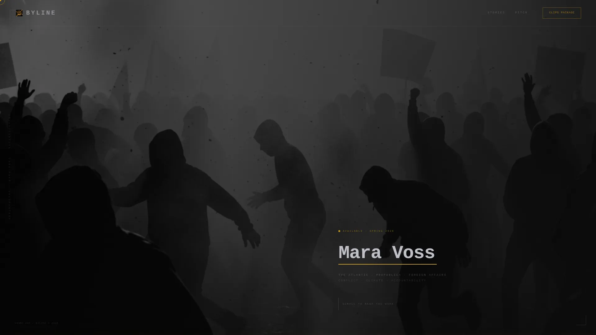
- Full-bleed black-and-white header with off-center composition and monospaced name treatment
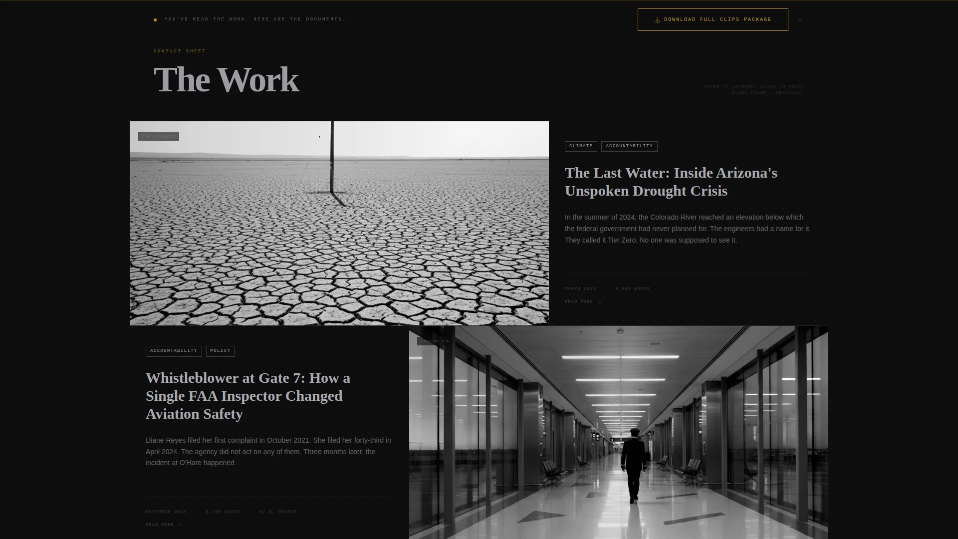
- Asymmetric story-card grid with expandable inline readers, metadata fields, and tag system
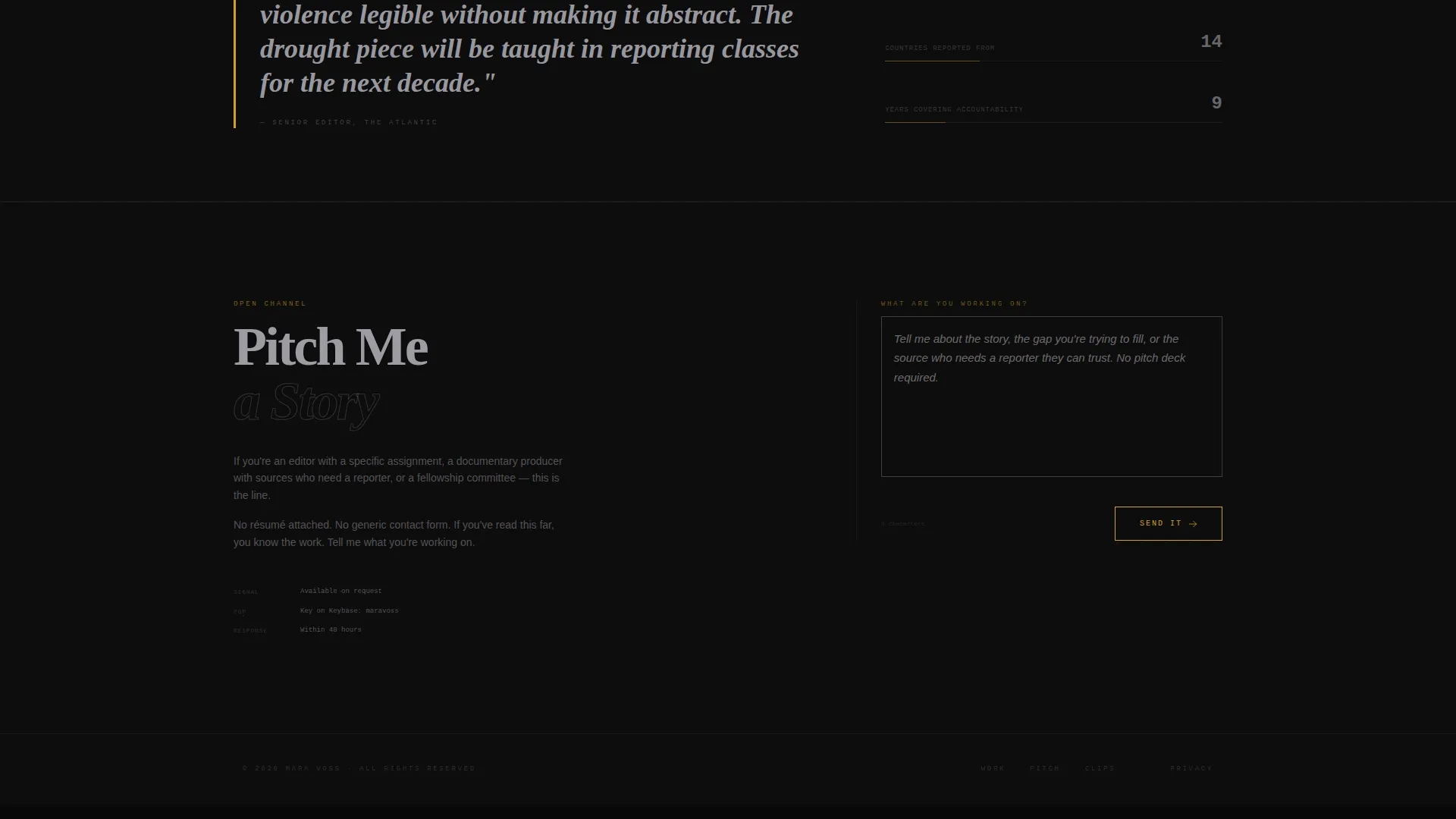
- Sticky "Download Full Clips Package" bar and a sparse "Pitch Me a Story" contact form
Feature list
This section covers the core functional and visual components built into the Byline template.
Full-Bleed Documentary Header
A single black-and-white photograph bleeds past every edge, weighted to the 60-column side. The journalist's name sits in monospaced type on the 40-column side with no title or descriptor. A thin amber underline animates beneath the name on load, mimicking a cursor blink.
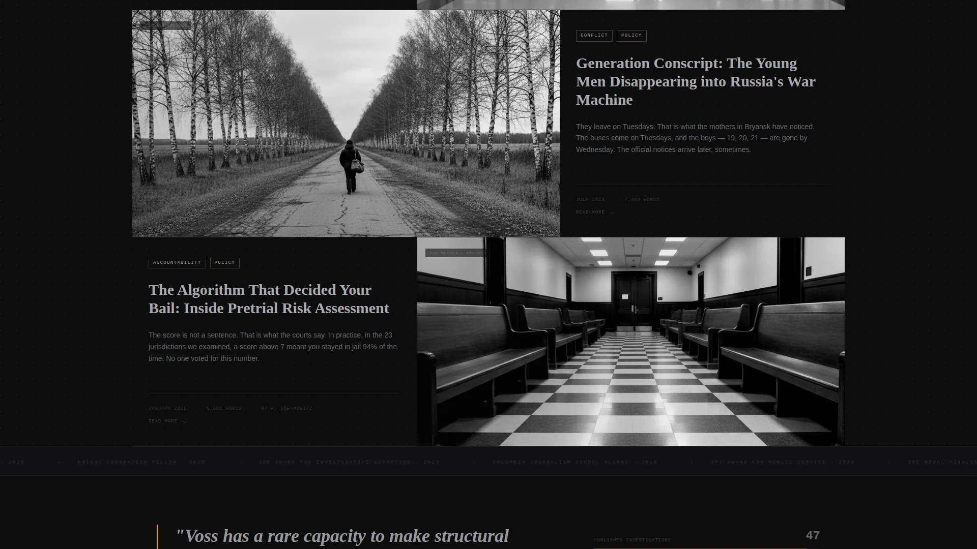
Asymmetric 60/40 Story Grid
Story packages are laid out in alternating asymmetric rows. The wider column holds the lead image and opening paragraph; the narrower column holds publication name, date, word count, co-bylines, and a tag system covering beats such as conflict, climate, policy, and accountability. Each row alternates which side gets the image, creating a magazine-page rhythm.
Inline Card Expansion
Clicking a story card does not navigate away from the page. Instead the card expands in place, revealing the full lede, key excerpts, embedded pull quotes, and a direct link to the published piece. Editors can read and evaluate without losing their place in the scroll.
Ken Burns Hover Animation
Hovering any story card triggers a subtle Ken Burns drift on the lead image. The amber accent simultaneously bleeds into the card border, signaling interactivity through the same color logic that governs the entire palette.
Earned Sticky call to action Bar
The "Download Full Clips Package" sticky bar appears only after the visitor has engaged with at least three story cards. The download form requests only three fields: name, outlet, and email. The restraint is intentional and reduces abandonment.
Sparse Pitch Contact Form
A secondary contact path offers a single long-text field with the prompt "What are you working on?" It assumes the visitor is already a qualified lead. There is no résumé download link and no generic contact button anywhere on the page.
Page sections overview
| Section | Purpose |
|---|---|
| Full-Bleed Header | Establish identity through documentary photography and name |
| Story Card Grid | Present clips as scannable, expandable editorial packages |
| Inline Card Reader | Let evaluators read excerpts and pull quotes without leaving |
| Sticky Download Bar | Deliver clips package after earned engagement threshold |
| Pitch Contact Form | Open a direct conversation with a single open-text field |
Design & branding system
The Monochrome Steel color system keeps the page grounded in a newsroom-after-hours atmosphere. Backgrounds stay in deep black, body text lives in silver halide, and the single warm accent only appears through interaction.
- Color palette: darkroom black (#0D0D0D), gunmetal (#2A2D34), silver halide (#C0C0C8), and developing-tray amber (#D4A017) reserved for hover states, active links, and the cursor trail
- Typography: monospaced typeface for the journalist's name in the header; body type in silver halide for readability against dark backgrounds
- Visual rhythm: alternating 60/40 card rows, grain-visible photography, and off-center compositions give the page the feel of turning magazine pages
Mobile & speed optimization
The layout is structured to translate the editorial desk experience to smaller screens without losing the visual weight of the dark palette or the card-grid rhythm.
- The asymmetric grid adapts so story card metadata and lead content remain readable on narrower viewports
- Amber hover states translate to tap states on touch devices, preserving the interaction logic across screen sizes
How this template helps you convert
The conversion strategy is built into the page structure itself. Nothing asks for anything before it has demonstrated value.
- The story-card grid lets editors evaluate clip quality and beat range before any form appears, building confidence in your work on their terms.
- The sticky download bar surfaces only after three cards are explored, so the request for name, outlet, and email arrives at the moment of highest interest.
- The "Pitch Me a Story" form strips friction to a single question, making it easy for producers and editors to start a real conversation immediately.
Other information about this template
This template sits within the Portfolio and Agency category, specifically designed for the journalist dark theme portfolio niche. It is a strong fit for reporters building a presence that reflects the seriousness of their beat coverage.
- The Lens and Frame theme and Interactive Explorer creative direction make this more than a static clips page; the scroll itself functions as an editorial experience
- The template style is a single-page asymmetric grid landing page, not a multi-page site, so all content and navigation live within one focused scroll
- The lede-focused card structure and tag system support journalists covering multiple beats without creating a confusing portfolio architecture
Theme
Lens & Frame
Creative direction
Interactive Explorer
Color system
Monochrome Steel
Style
Asymmetric Grid (60/40)
Direction
Content/Resource
Page Sections
Full-bleed Documentary Header
Asymmetric 60/40 Story Grid
Inline Card Expansion
Earned Sticky Download Bar
Ken Burns Hover Animation
Sparse Pitch Contact Form
Related questions
Can I add more story cards to the grid?
Does the inline card expansion work for both long and short pieces?
What does the clips download form collect?
Can I customize the story tag categories?
Is this template suitable for a photojournalist or documentary filmmaker?



