Medical Tourism & Concierge Reviews Website Template
A zigzag landing page template built for cardiac surgery tourism programs. It guides anxious patients through a five-step visual journey, from free file review to post-op follow-up, while surfacing cost comparisons and surgical credentials before asking for personal details. The Medical Clarity design system and progressive lead form work together to convert high-stakes research visits into qualified inquiries.
by Rocket studio
Quick summary
This is a single-page lead generation template for international cardiac surgery programs. It uses a five-step zigzag layout to walk prospective patients through the full care journey. Cost transparency comes before the contact form. The result is a page that earns trust before it asks for anything.
Who this template is for
This template is built for healthcare providers and medical tourism programs that perform complex cardiac procedures for international patients. It fits operators who need to convert anxious, cost-sensitive visitors into qualified surgical inquiry leads.
- Cardiac surgery programs seeking patients from the United States, Canada, or Gulf-state markets
- Medical tourism coordinators managing international patient acquisition for accredited hospitals
- Healthcare marketing teams that need a credible, conversion-focused landing page without starting from scratch
What problem this template solves
Patients researching cardiac surgery abroad face a specific kind of fear: cost uncertainty, safety doubts, logistical confusion, and worry about continuity of care after they return home. A generic medical page does not dissolve those fears in the right order. This template addresses each one, step by step, before the visitor even sees the contact form.
- No clear cost signal early in the page means visitors leave before they trust the program
- Patients cannot visualize the care journey, so they stall and never submit an inquiry
- A single long form feels intrusive when someone is still deciding whether to trust you
What you get with this template
You get a fully structured, single-page layout with every section purpose-built for cardiac surgery patient acquisition. The design is clinical and calm, the copy architecture is sequential, and the form funnel is broken into three progressive screens so it never feels overwhelming.
- A floating testimonial card header with real patient detail, procedure name, cost comparison, and outcome stat
- A five-phase zigzag journey section with alternating text-and-image blocks for each step of the patient experience
- A three-screen progressive lead form that collects procedure type first and personal contact details last
Feature list
This template includes the following built-in capabilities drawn directly from the source brief.
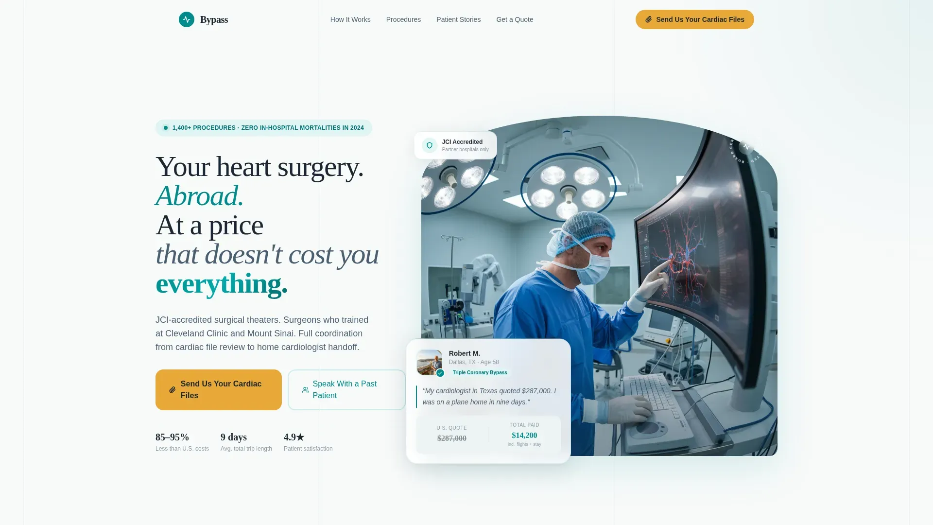
Floating Patient Testimonial Header
The hero section renders a single patient story as an oversized floating card against a sterile white background. It includes the patient photo, name, home city, procedure, total cost, and a direct quote. Below the card, a single outcome line states the program's 2024 procedure count and mortality record. This section replaces stock hospital imagery with human proof.
Five-Step Zigzag Journey
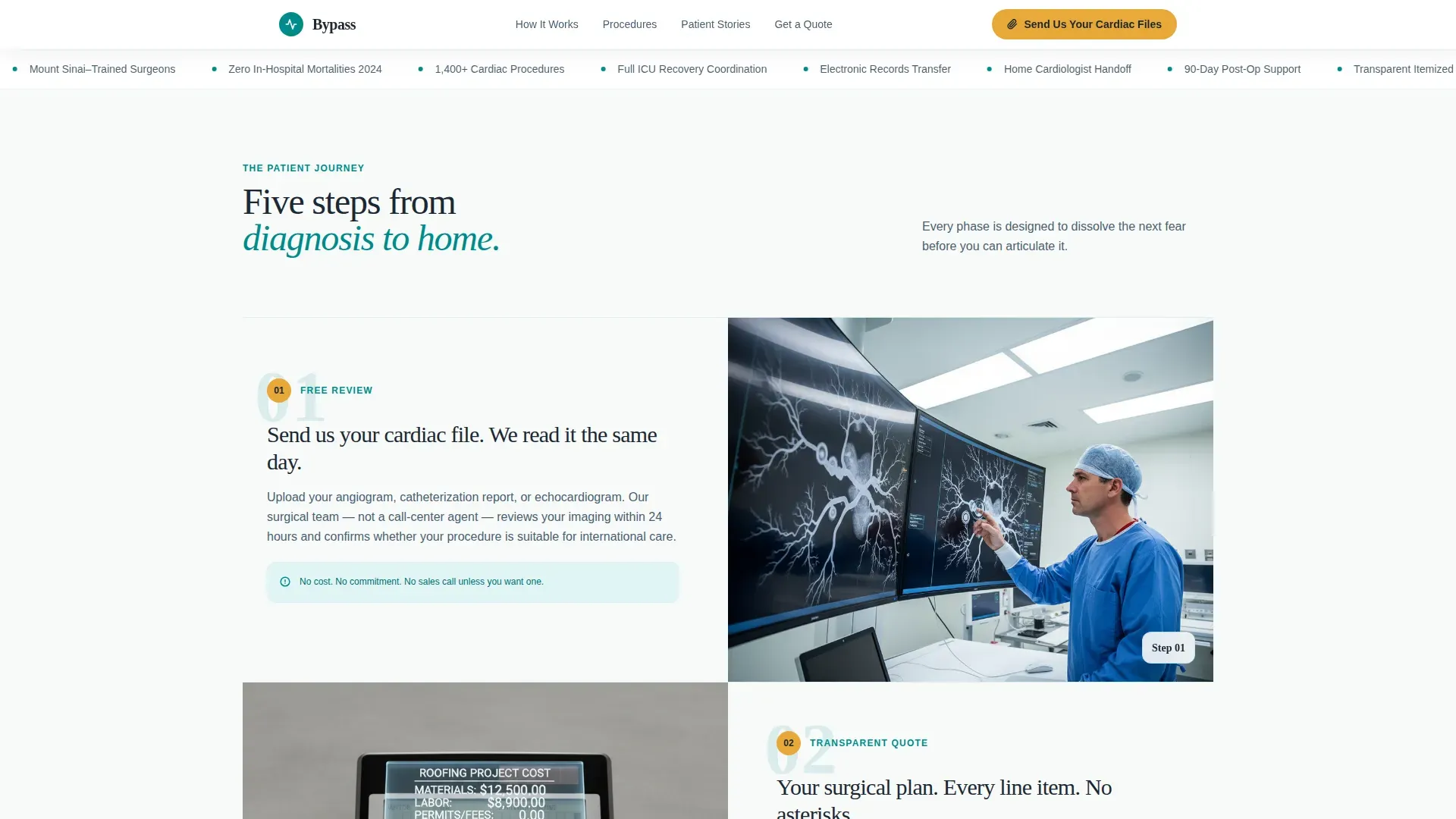
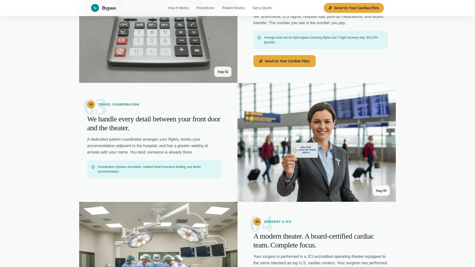
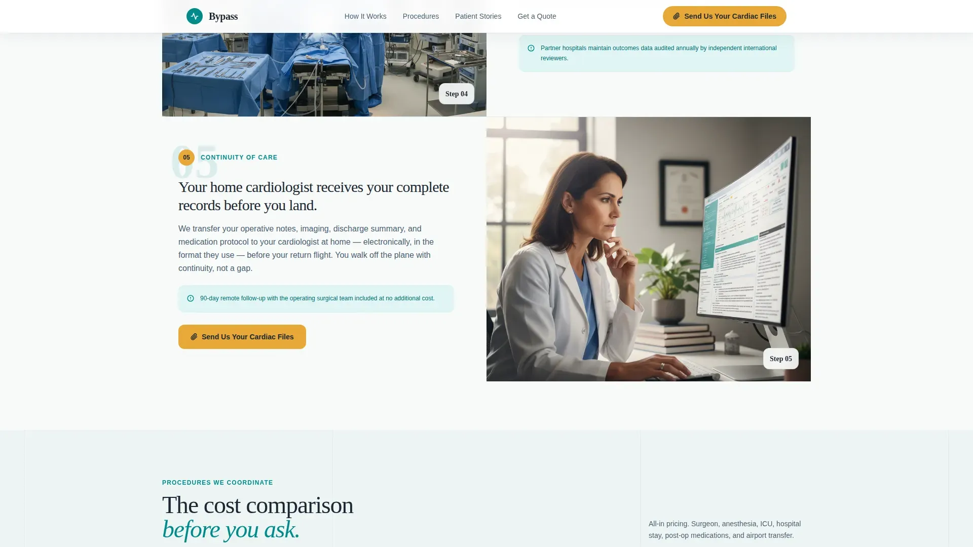
Each scroll section represents one phase the patient will actually live through: free cardiac file review, surgical plan and transparent quote, travel and arrival coordination, surgery and intensive care unit recovery, and post-op follow-up with the home cardiologist. Text and image blocks alternate left and right. Each step is designed to dissolve the next fear before the visitor can articulate it.
Three-Screen Progressive Lead Form
The form opens with a simple procedure-type dropdown and country of residence. The second screen requests an angiogram or catheterization report upload. The third screen collects name, email, and phone number. Showing price before asking for a name is a deliberate design choice built into the layout.
Past Patient Peer Connection Path
A secondary conversion path labeled "Speak With a Past Patient" connects prospective patients to a vetted alumni volunteer. This path sits alongside the primary call to action and addresses the trust gap that design alone cannot close.
Mobile-First Fixed Call to Action Bar
On mobile, the primary call to action, "Send Us Your Cardiac Files," appears as a fixed bottom bar so it stays reachable during scroll. The page is built with mobile-first priority for patients researching during diagnosis stress on their phones.
Trust Bar with Credentials
A dedicated trust section presents the procedure count, mortality outcome stat, accreditation indicators, and surgeon training credentials. This section is built as a marquee-style bar that reinforces credibility immediately after the hero.
Page sections overview
| Section | Purpose |
|---|---|
| Hero Testimonial Card | Opens with a real patient story, cost comparison, and outcome stat to establish immediate credibility |
| Marquee Trust Bar | Displays procedure volume, safety record, accreditation signals, and surgeon credentials |
| Step One: File Review | Introduces the free cardiac file review with a surgeon-at-monitor image |
| Step Two: Surgical Quote | Shows a transparent, itemized cost sheet and triggers the primary call to action |
| Step Three: Travel Coordination | Covers logistics with an airport greeter image to reduce arrival anxiety |
| Step Four: Surgery and Recovery | Depicts the operating theater and intensive care unit stay through observation-window imagery |
| Step Five: Post-Op Follow-Up | Shows digital records transfer to the home cardiologist, closing the continuity loop |
| Progressive Lead Form | Three-screen funnel collecting procedure type, file upload, then contact details |
| Past Patient Voices | Three testimonial cards with specific procedures, savings, and patient origin cities |
| Footer | Minimal split-layout footer with functional navigation links |
Design & branding system
The visual identity follows a Medical Clarity theme. Every color choice is deliberate: the palette mimics the physical environment of a surgical suite, with one warm accent that reminds visitors this is still a human experience.
- Surgical teal (#008B8B) is the primary action color used for section accents and interactive elements; sterile white (#F8FAFA) keeps backgrounds open and uncluttered; deep charcoal (#1C2833) anchors all body text for sharp readability
- Warm catalyst amber (#E8A838) is reserved exclusively for calls to action and trust badges, creating a clear visual signal for every decision point on the page
- Typography pairs DM Sans for body text and user interface elements with Fraunces for editorial headlines, giving the page a precise yet human editorial tone
Mobile & speed optimization
The template is built with a mobile-first layout priority. Patients often research cardiac procedures from their phones during or shortly after a diagnosis appointment, so the page is designed to perform on small screens without sacrificing clarity.
- The hero testimonial card, zigzag sections, and progressive form all reflow cleanly for single-column mobile layouts
- The primary call to action appears as a fixed bottom bar on mobile so it is always one tap away regardless of scroll position
- The hero section uses server-side rendering for fast initial load, while the interactive form and scroll-reveal animations run as client-side components
How this template helps you convert
The page is engineered around a specific conversion logic: dissolve fear in the right sequence before asking for commitment. Each section removes one objection, then hands the visitor to the next section with less resistance.
- Cost is shown first, before credentials and before the form, because price uncertainty is the primary reason high-intent visitors leave without making contact
- The progressive three-screen form reduces perceived commitment by starting with the least personal information (procedure type and country) and building toward contact details only after the visitor has already invested in the process
- The peer connection path gives visitors a human alternative to the form, capturing leads who need social proof from another patient before they will share their medical files
Other information about this template
This template is designed for programs operating in the cardiac surgery tourism space, where the buyer journey is longer, more emotionally charged, and more research-intensive than typical service purchases. A few additional details are worth noting.
- The zigzag alternating layout rhythm is intentional: it mimics the steady, predictable beat of a cardiac monitor trace, creating a subconscious sense of calm and forward motion
- The template supports scroll-reveal animations for each zigzag section, a floating card entrance animation for the hero, and hover states throughout interactive elements
- Scroll-reveal timing and the marquee trust bar animation are handled as client-side components, separate from the server-rendered hero, to keep initial load perceptually fast
- The footer uses a split-layout pattern (Arc Browser Split style) designed to be minimal and functional without distraction
- This template is well suited to programs that perform valve replacements, coronary bypass procedures, pediatric cardiac repairs, and other open-heart surgeries for international patients seeking care in Joint Commission International (JCI) accredited facilities
Theme
Medical Clarity
Creative direction
Step-by-Step Guide
Color system
Teal Catalyst
Style
Zigzag/Alternating
Direction
Lead Generation
Page Sections
Floating Patient Testimonial Header
Five-step Zigzag Journey Layout
Three-screen Progressive Lead Form
Past Patient Peer Connection Path
Mobile Fixed Call to Action Bar
Marquee Trust Bar with Credentials
Related questions
What type of healthcare program is this landing page template built for?
How does the template handle cost transparency for prospective patients?
Can I edit the five steps in the zigzag journey section?
Is the peer patient connection path a separate page or a section on this landing page?
What color system does this template use, and can I change it?



